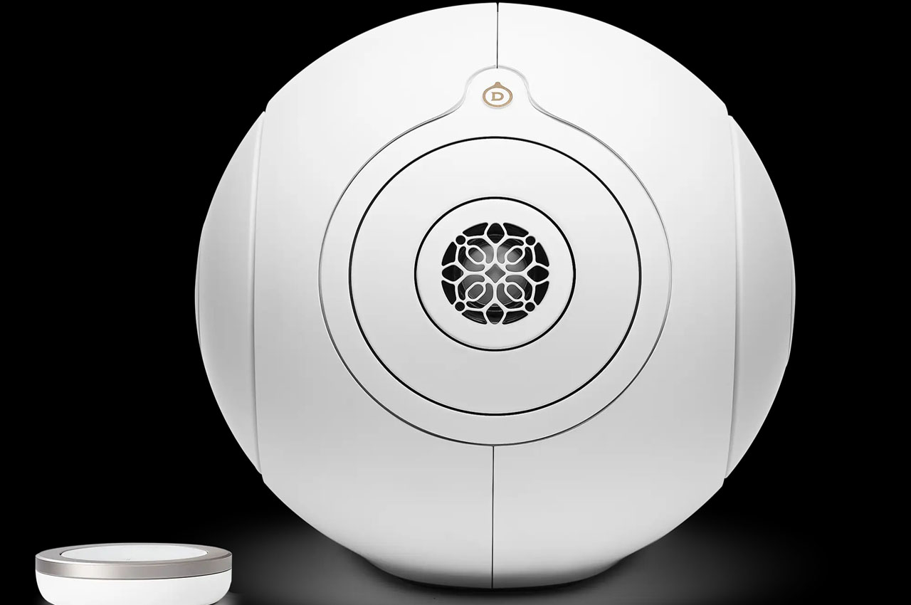
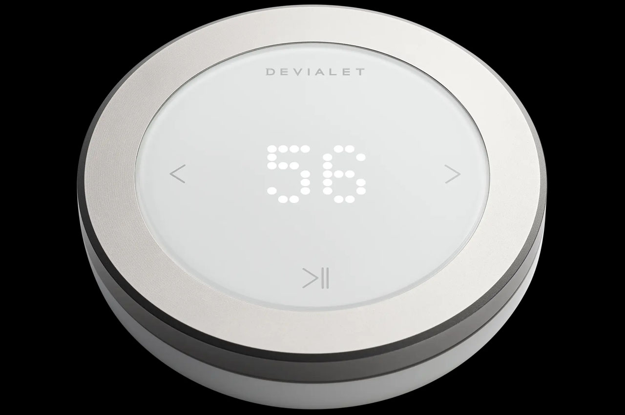
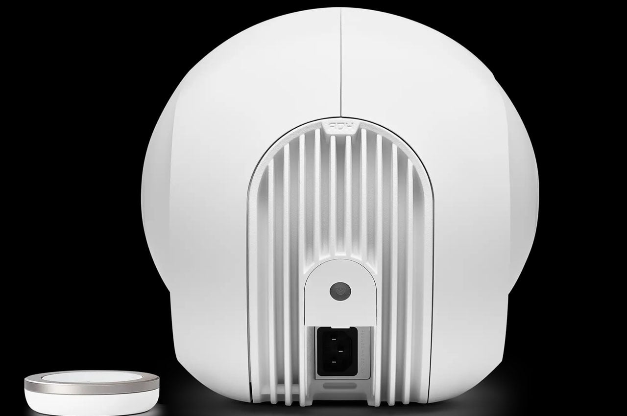
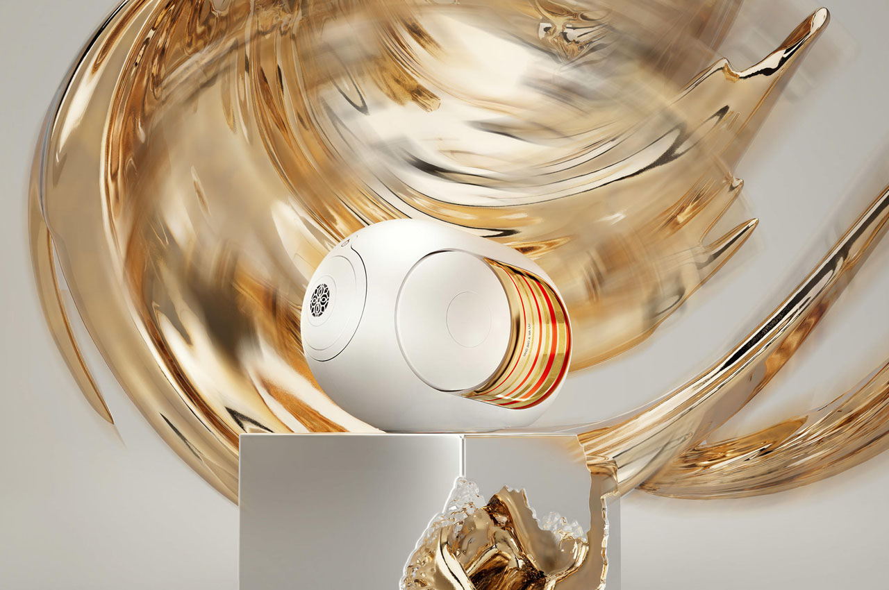
French audio brand Devialet’s Phantom I is already a celebrated wireless speaker with side-firing bass reflex ports and subtle color variants. Fittingly, two eminent artists have been summoned to give this iconic speaker a stunning new vibe for the Chinese Year of the Dragon, a festivity that marks the end of winter and the beginning of spring.
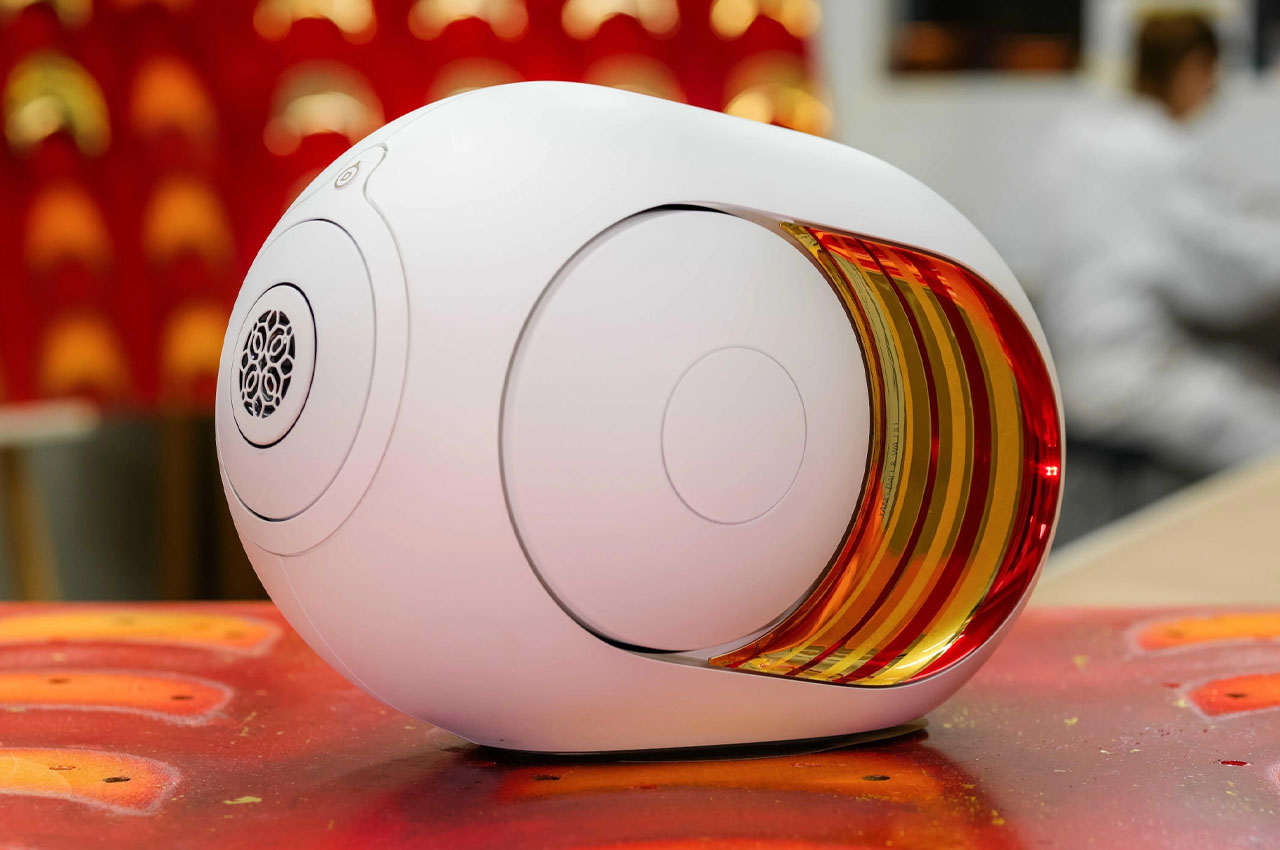
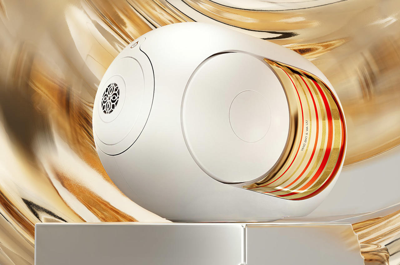
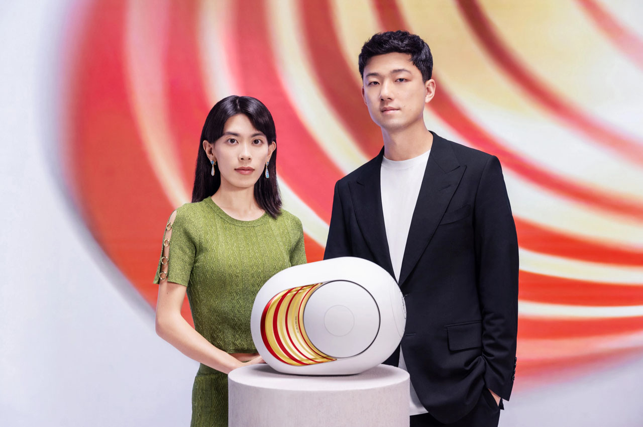
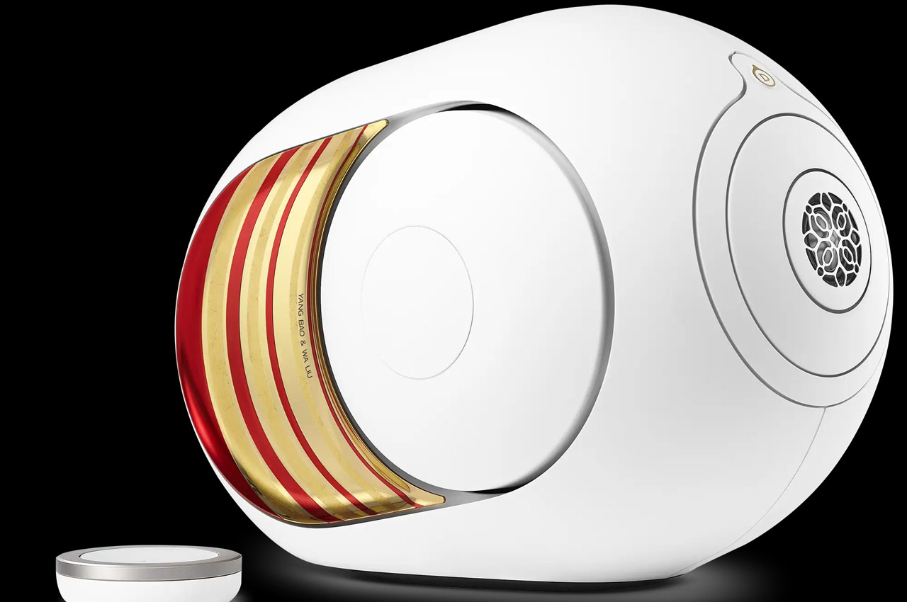
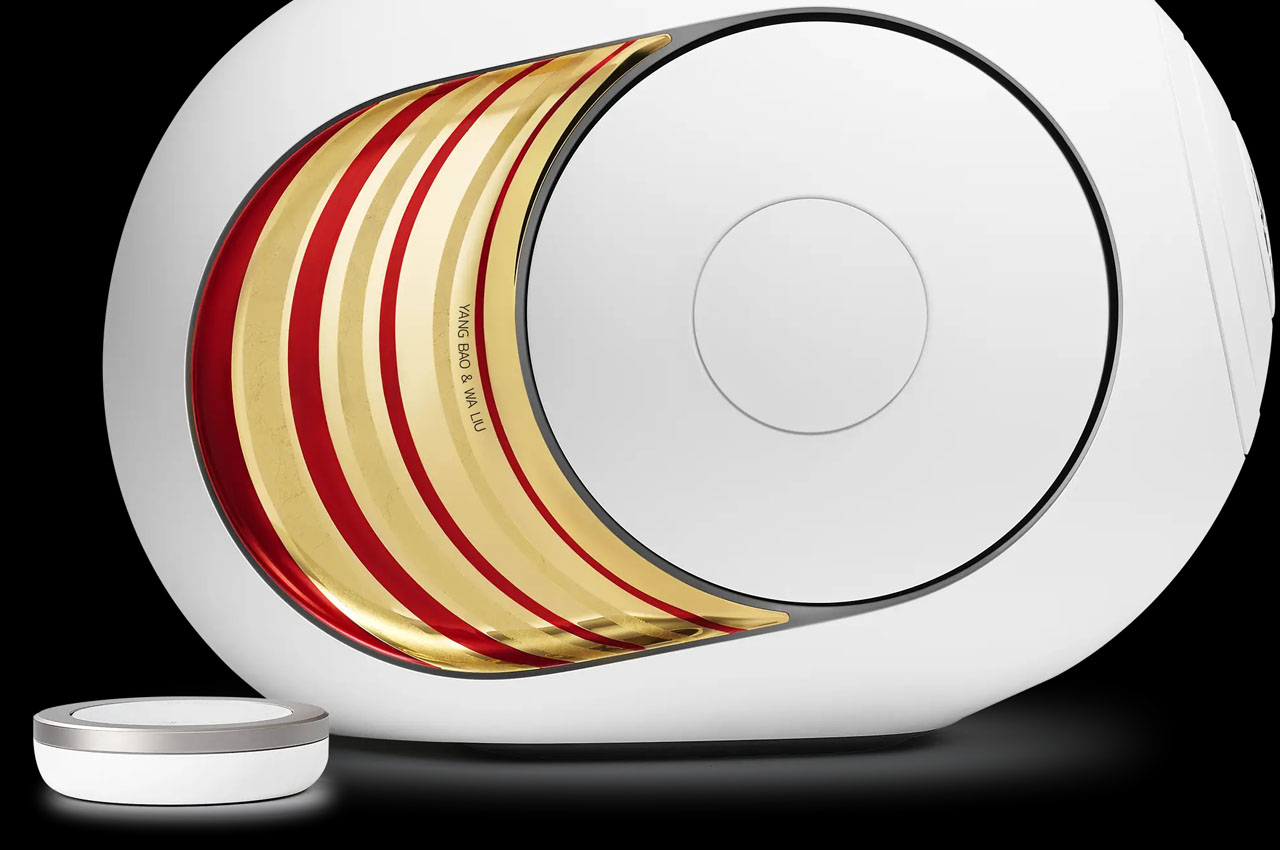
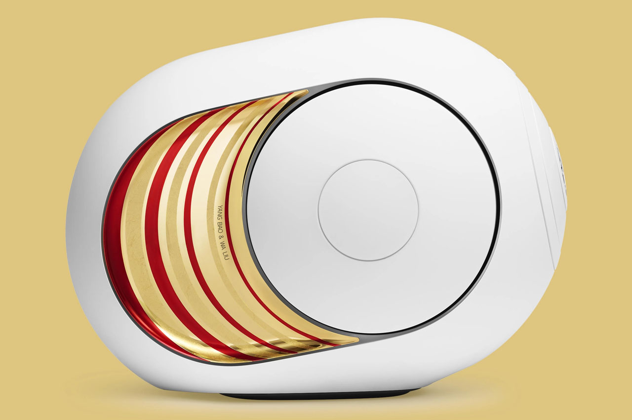
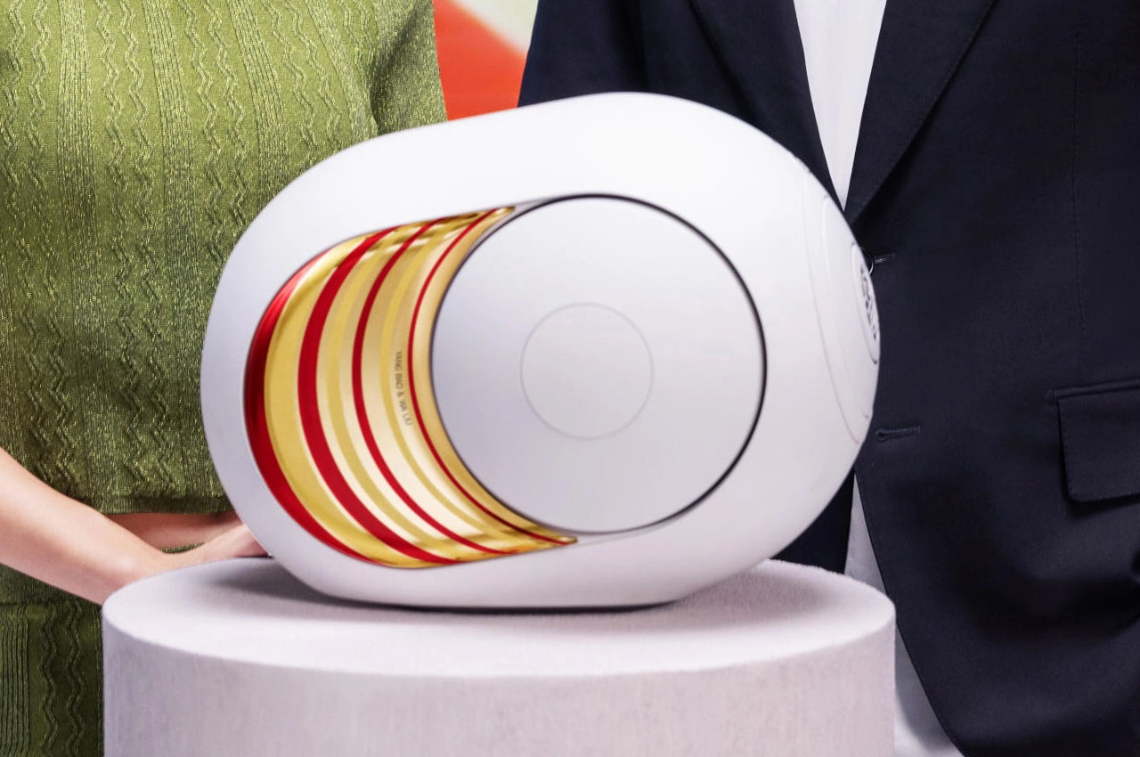
Dubbed the Phantom I 108 dB by Yang Bao & Wa Liu, after the designers behind the new gold and red colored speaker, this lustrous take on the Devialet flagship creates a nice, visible amalgamation of physical and analog connections. To be available in limited edition between 23 January 2024 and 23 April 2024 (or until the stock lasts) this speaker also dubbed ANIMAL impresses with its “colors and textures reference the dragon of our cultural imagination” designer Wa Liu says.
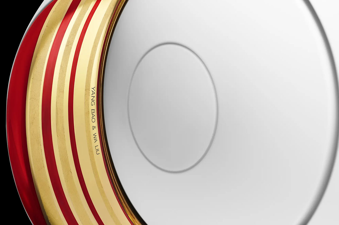
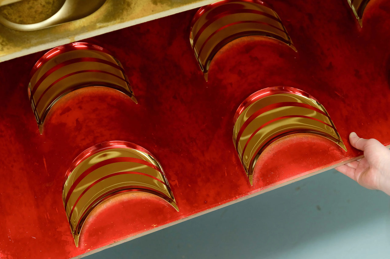
On the back of the hand-crafted speaker come the 22.5-carat gold leaf accents complemented by the red strokes. This artistic element replicates the rippling motion of the dragon’s movement. It’s more of a musical instrument that seems to have a personality of its own. According to Bao the play of light and shadows helps it cryptically blend into the surroundings. Another good reason it has a deliberate sculptural design to evoke a subtle presence.
The limited-edition Phantom I, justifies the symbol of the dragon with its intimidating presence as opposed to the Western counterpart. In a way, it mixes nature and music, power and serenity all in one go. Creating this version takes around two weeks which explains the attention to detail put in the making. As the artists explain, ‘We obviously work on a number of units at the same time.’ To this end, two gilders showcase their craft, brushing hammered gold leaf onto the surface of the Phantom, juxtaposing it with the thin lines of red lacquer. The intricate design is not only a visual combination of gold leaf and red lacquer, but the lacquer itself requires three painstaking layers of application!
No wonder the Phantom I 108 dB by Yang Bao & Wa Liu will set you back a mind-numbing $6,700 a piece.
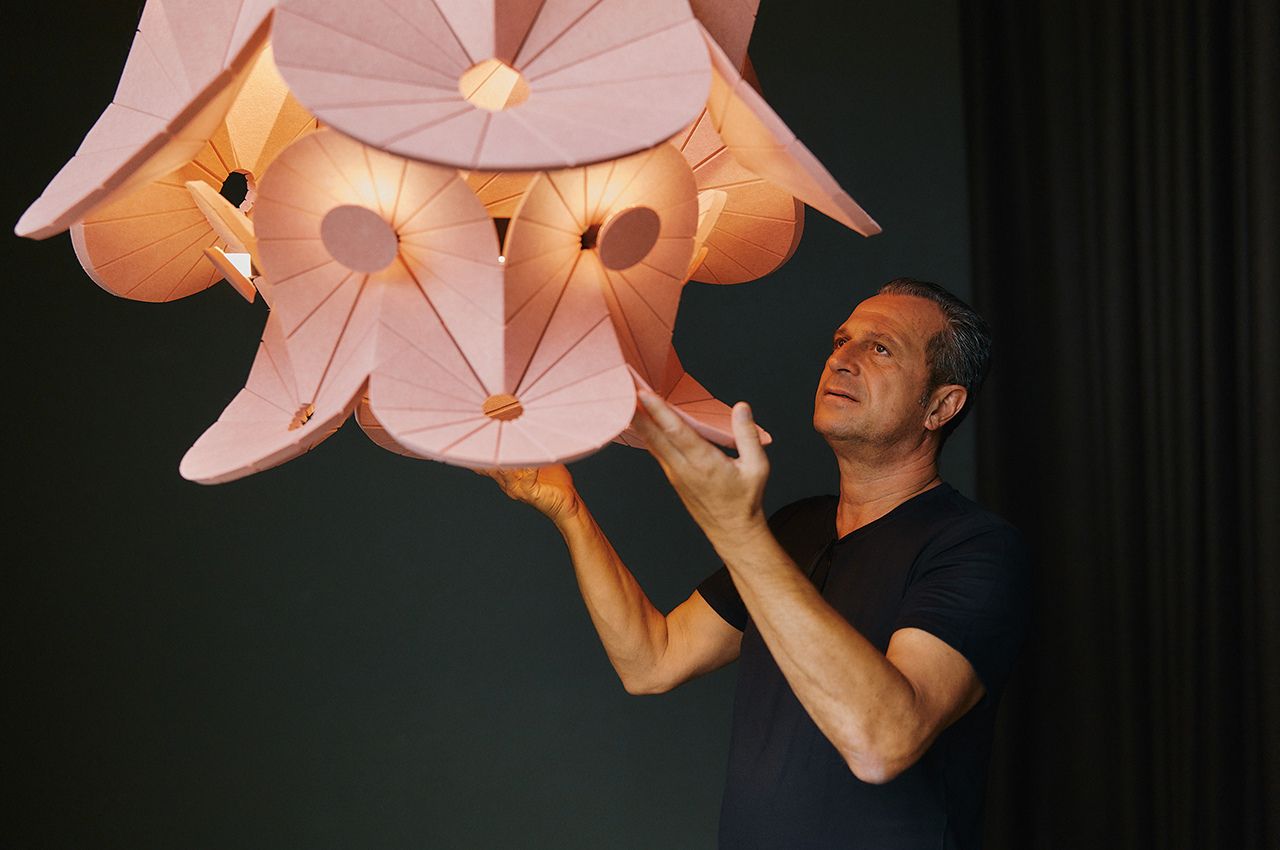
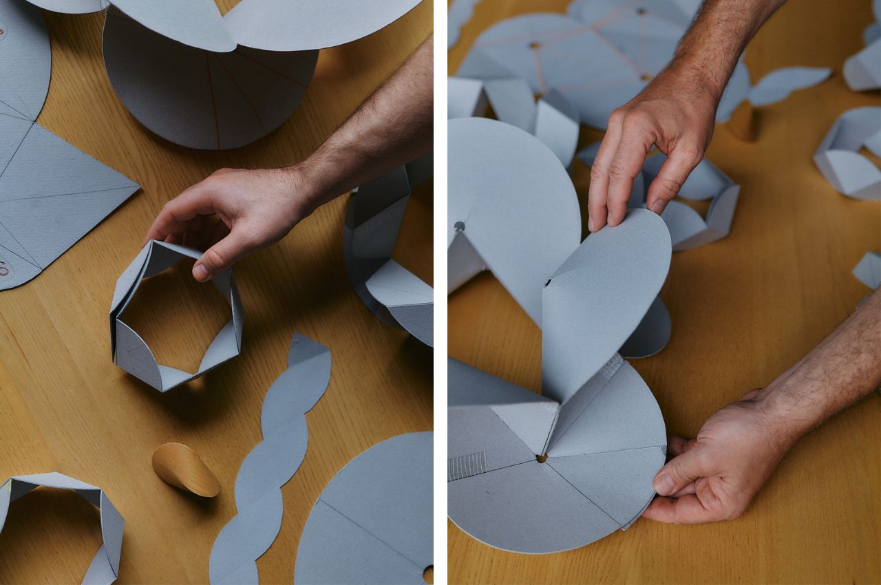
In the ever-evolving landscape of technology and design, the fusion of functionality and artistic expression continues to yield groundbreaking innovations. One such marvel is Oloïd, a sustainable acoustic luminaire born from the collaborative synergy of Impact Acoustic; a provider of sustainable acoustic solutions, and the esteemed design studio atelier oï. This unique lighting fixture not only delivers exceptional sound absorption but also redefines the way light and sound interact, creating a transformative experience that enhances the ambiance of any space.
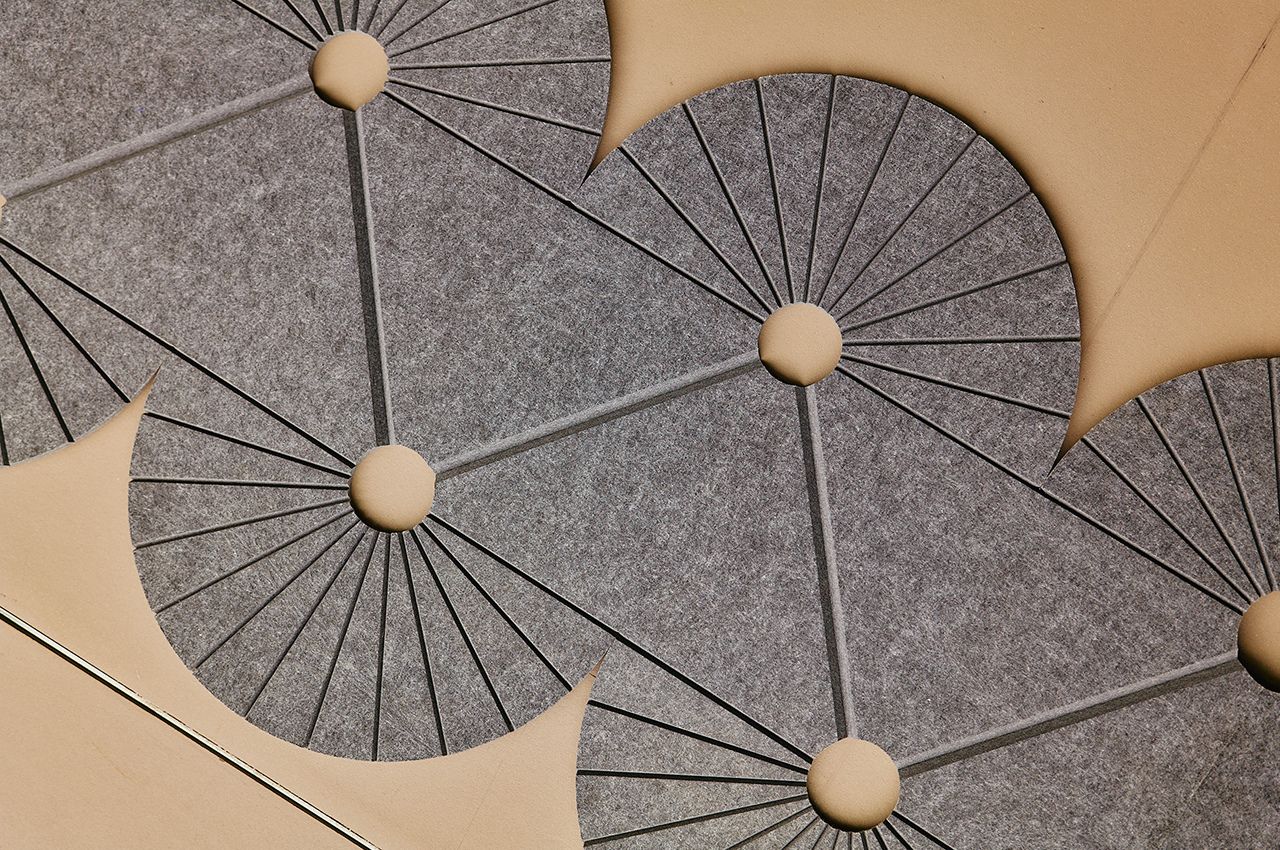
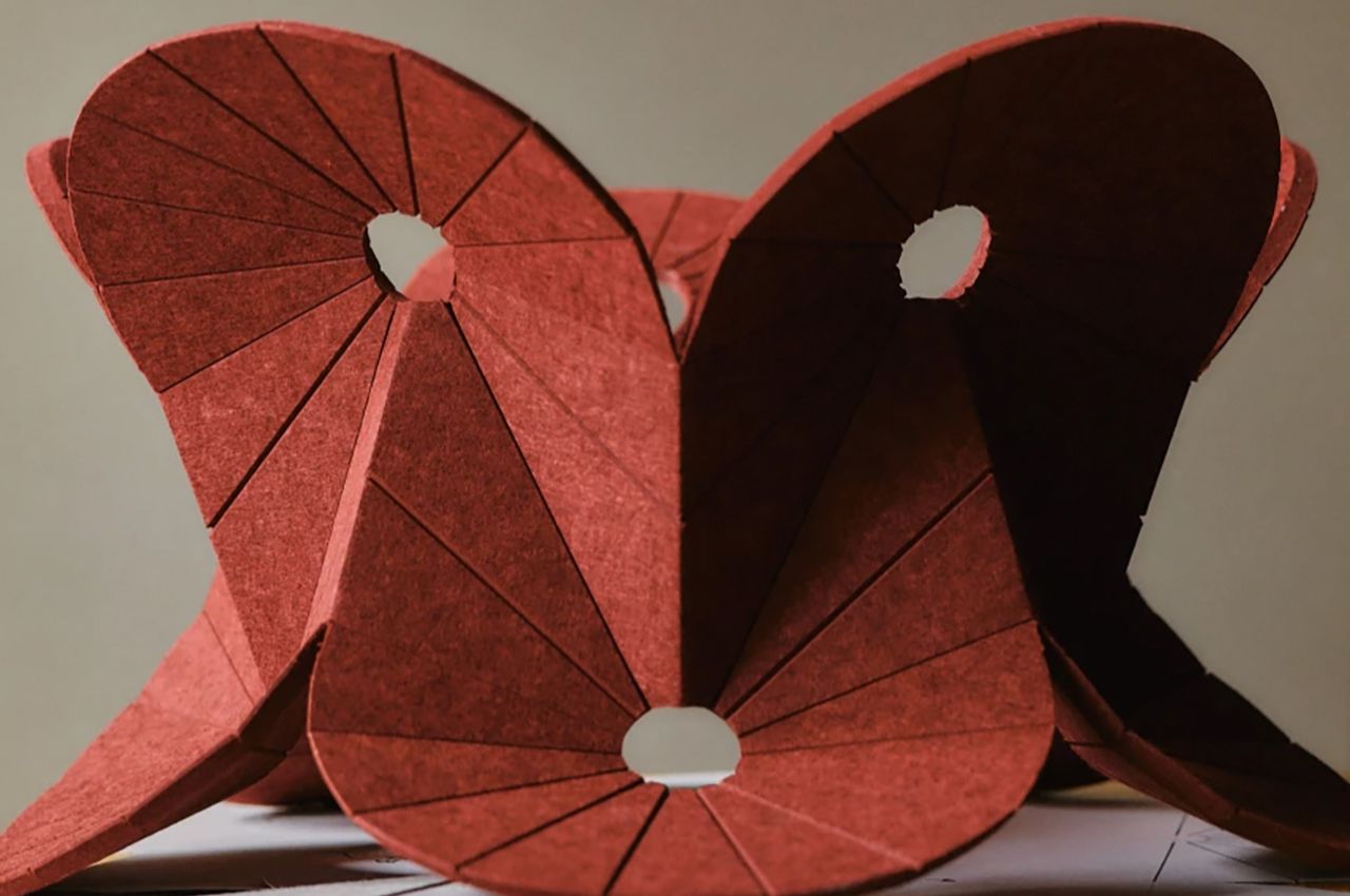
At the heart of Oloïd’s revolutionary design lies Archisonic Felt, a high-performance sustainable acoustic absorber crafted from upcycled PET bottles. This versatile material demonstrates outstanding sound absorption capabilities and embodies a commitment to sustainability and responsible material sourcing. The Cradle to Cradle certification and LEED accreditation of Archisonic Felt underscore its eco-friendly credentials, aligning with the growing demand for environmentally conscious design solutions.
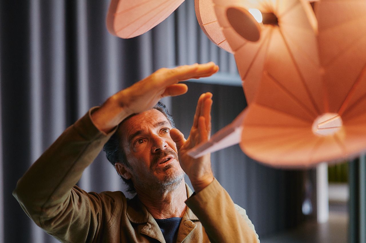
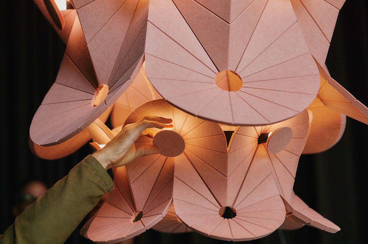
Oloïd distinguishes itself by offering a transformative lighting experience that seamlessly integrates functionality with artistic expression. The collaboration between Impact Acoustic and Atelier oï is not merely about illuminating a space but about creating an immersive environment where light and sound harmonize effortlessly.
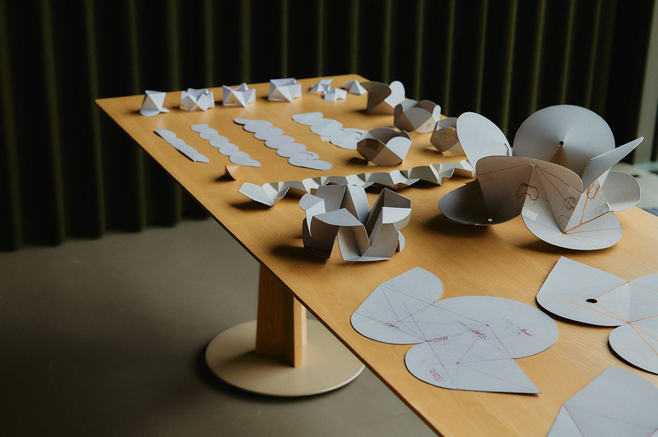
Aurel Aebi, a key figure at Atelier oï, highlights the creative process that brought Oloïd to life. “At atelier oï, we often begin our creative process with an encounter with the material,” Aebi explains. “Our goal was to find a way to make the sustainable material speak in a new way.” This innovative approach involved working with the material’s stiffness and flatness to create organic shapes that redefine conventional luminaire design.
Oloïd is available in a stunning array of 32 colors, presenting a curated selection from the Archisonic Felt range. This diversity empowers users to personalize their spaces, allowing for the creation of bespoke environments that reflect individual tastes and preferences. The luminaire’s design seamlessly integrates the organic shapes derived from the unique qualities of Archisonic Felt, transcending two-dimensional panels into captivating three-dimensional entities.
Sven Erni, co-founder of Impact Acoustic, expresses his fascination with the collaborative process that transformed their material. “The collaboration fascinated us as we witnessed the metamorphosis of our material,” Erni notes. “This was made possible using a distinctive cutting technique at specific angles and the skillful folding of the panels. This creative approach seamlessly transformed the two-dimensional panels into fascinating three-dimensional entities, transcending surfaces to tangible bodies.”
Oloïd not only sets a new standard for sound-absorbing luminaires but also stands as a testament to the potential of sustainable design in reshaping our surroundings. With its commitment to responsible material usage, innovative design, and the seamless integration of light and sound, Oloïd emerges as a beacon of eco-conscious creativity, inviting us to reimagine the possibilities of our illuminated spaces.
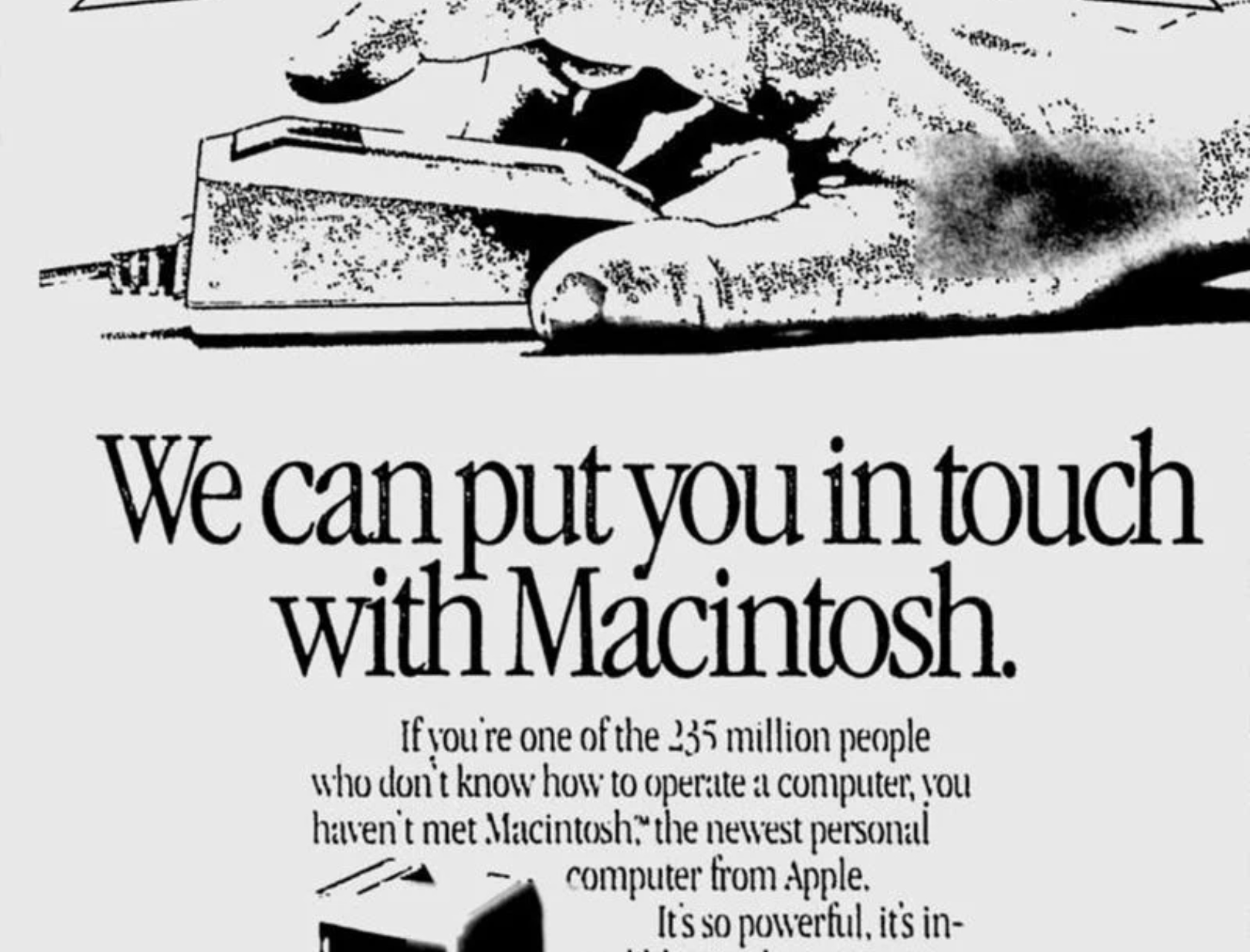
As we celebrate the 40th anniversary of the Apple Macintosh, we reflect on how this technology has transformed our lives. The Macintosh changed how we interact with computers and redefined our relationship with technology. In 1984, Apple introduced the Macintosh, a computer that put the future at our fingertips. It embraced the philosophy of human-centric design long before it became a popular term in design circles.
Designer: Apple Computer, Inc.
Its graphical user interface (GUI) was a significant departure from the cumbersome command-line interfaces of the time. Using icons, windows, and a friendly desktop metaphor made technology accessible and approachable. This leap was not solely about technology but also about how humans interact with it.
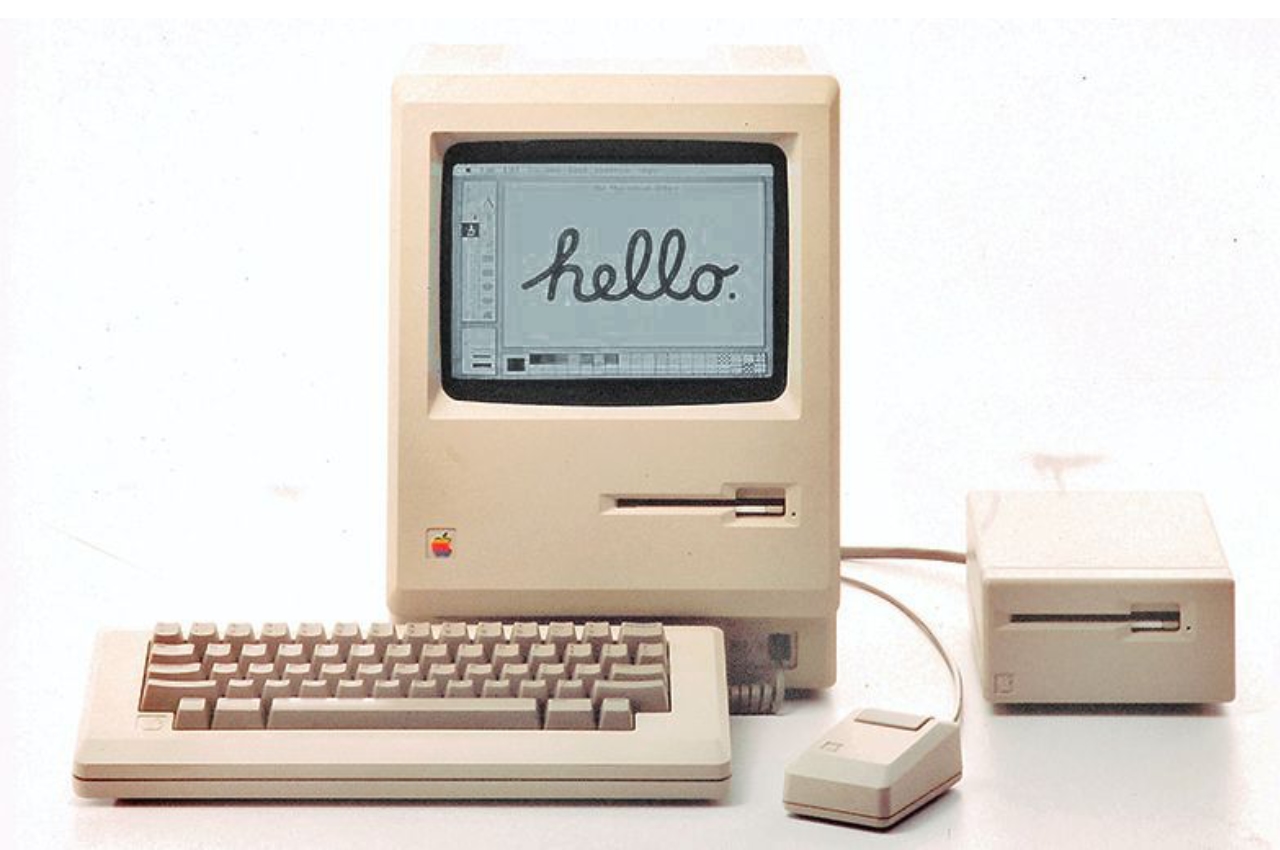
On January 24, 1984, Steve Jobs famously unveiled the first Macintosh by dramatically pulling it out of a bag. The personal computer boasted a 9-inch black and white display powered by an 8MHz Motorola processor and 128KB of RAM. In classic Steve Jobs style, he then produced a 3.5-inch floppy drive and inserted it into the computer, much to the delight of Apple shareholders. Jobs had famously said, “We want to put an incredibly great computer in a book that you can carry around with you and learn how to use in 20 minutes.” At its launch, the original Macintosh cost $2,495.
Design Aesthetics: More Than a Machine
The all-in-one design of the Macintosh broke the mold. Its compact, boxy frame, complete with a built-in 9-inch screen, was an object of desire – sleek, stylish, and something you wouldn’t mind having on your desk. Looking back, it was more than a machine; where multiple layers of innovation and thoughtful design choices distinguish it from anything else of its time, it was a piece of art that complemented the user’s space.
The Macintosh computer differed from the early personal computers as it didn’t have a bulky, segmented design with separate units for the monitor, CPU, and keyboard. Instead, it had a compact, all-in-one design. This unique design of integrating the monitor and computer into a single unit was not only space-efficient but also symbolically significant. It represented a unified, holistic approach to computing, aligning with the philosophy that technology should seamlessly integrate into people’s lives without complicating them.
The friendly beige plastic casing, rounded edges, and compact size make it appear warm and approachable. The designers wanted to communicate that technology can be pleasant and welcoming rather than intimidating and alienating. Steve Jobs, known for his attention to detail regarding aesthetics, believed that good design was integral to the user experience. He famously said, “Design is not just what it looks and feels like. Design is how it works.” He believed good design, not just a superficial veneer, was essential to make things look good.
Did you know that the Macintosh had some fantastic design elements? One of the most unique features was the handle on the computer’s top. Not only was it functional, but it also represented portability and personal ownership. It made you feel like the Macintosh was your personal computer, one you could take charge of and create your own. This feature reflected a shift in how we see computers, from impersonal corporate machines to personal tools for creativity and expression.
The Macintosh’s 9-inch screen may seem tiny now, but it was a big deal in the day. It’s what made the Mac look so cool and funky. The cool thing about it was that it showed graphics and text in a way that had never been seen before. It was like a window into the heart of the Macintosh, showing everyone what made it unique and innovative.
Bridging Human and Machine: The Mighty Mouse – A Closer Look
When Apple Macintosh introduced the mouse, it wasn’t just another peripheral device. It changed the way we interact with machines. This tiny device played a massive role in connecting the digital world with its users. It transformed the personal computer from a specialized tool to an accessible and creative medium.
The mouse, tailored for the human hand, turned physical gestures into digital actions. Its design was simple yet effective – a small, palm-sized device with a single button, embodying the principle of simplicity and ease of use. This approachability was crucial. It invited users who might have been intimidated by the complexity of computers to explore this new world. Steve Jobs, ever the proponent of intuitive design, understood this connection, emphasizing, “We made the buttons on the screen look so good you’ll want to lick them.” The mouse was an extension of this philosophy, making the digital environment tangible and inviting.
Before the Macintosh, interacting with computers mainly involved typing commands – an efficient method for experts but alienating for novices. The mouse changed that, making computing a more intuitive, point-and-click experience. This change was akin to learning a new language where actions and commands became visual and direct. The mouse demystified the computer, aligning its use more closely with natural human behavior and less with the need to learn complex command languages.
The mouse was integral to the success and functionality of the Macintosh’s GUI. It allowed users to navigate the interface easily, interact with icons, open windows, and use menus. This ease of navigation made the computer’s advanced capabilities accessible to a broader audience, fostering a more inclusive digital culture. The mouse and GUI combination was a powerful duo that set the standard for future user interfaces, influencing the design of operating systems and software for decades. Applications became more visually oriented, focusing on ease of use and accessibility. Programs like MacPaint and MacWrite showcased what was possible with this new form of interaction, allowing users to create graphics and documents in previously unimaginable ways on a personal computer.
Over the years, the mouse has evolved, gaining more buttons, adopting new technologies like laser tracking and wireless connectivity, and even transforming into touchpads and touchscreens in modern devices. However, the core principle remains: technology should adapt to human needs, not vice versa.
In celebrating the 40th anniversary of the Macintosh, the significance of the mouse in bridging humans and machines cannot be overstated. It was a bold step towards making technology more personal, intuitive, and human. The Macintosh’s mouse was a harbinger of a future where technology becomes an extension of ourselves, seamlessly integrated into our daily lives, facilitating creativity, productivity, and exploration in the digital realm.
Echoing Steve Jobs’s vision, he said, “It’s in Apple’s DNA that technology alone is not enough — it’s technology married with liberal arts, married with the humanities, that yields us the result that makes our heart sing.”
The Macintosh made our hearts sing then, and forty years on, its legacy continues to inspire.
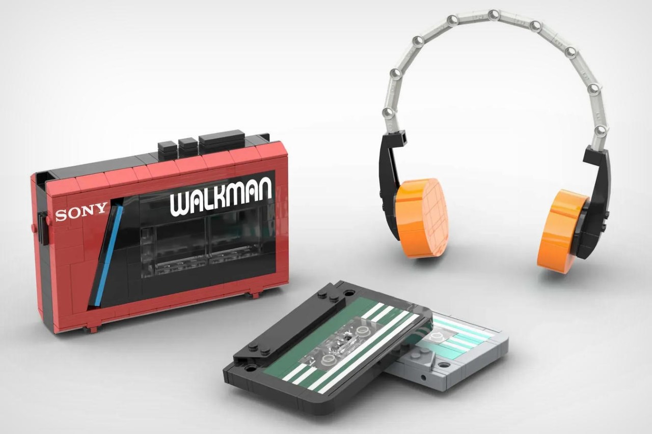
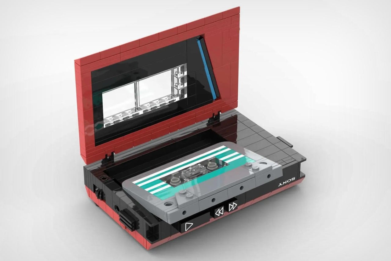
Fashion is cyclical and it seems like cassettes may just be making their comeback. Audio manufacturer Fiio just debuted their latest retro CP13 cassette player at CES this year, and it shouldn’t be long before people are making mixtapes again. Just to prime us for that retro-resurgence, LEGO builder Srta.JirafaEnfadada designed a to-scale Sony Walkman made entirely out of LEGO bricks… and the best part, it actually fits LEGO cassettes in!
Designer: Srta.JirafaEnfadada
Before MP3 players and iPods pretty much changed the game, cassettes were the gold standard in music playback. Cars had cassette players, people owned boomboxes, and for a brief while, the Sony Walkman was one of the coolest products you could own. Designed to play cassettes on-the-go, the Walkman walked so the iPod could run. You could make your mixtape, pop it in, and listen to music either on the Walkman’s built-in speaker (if it had one), or on a pair of headphones or earphones for a private music experience.
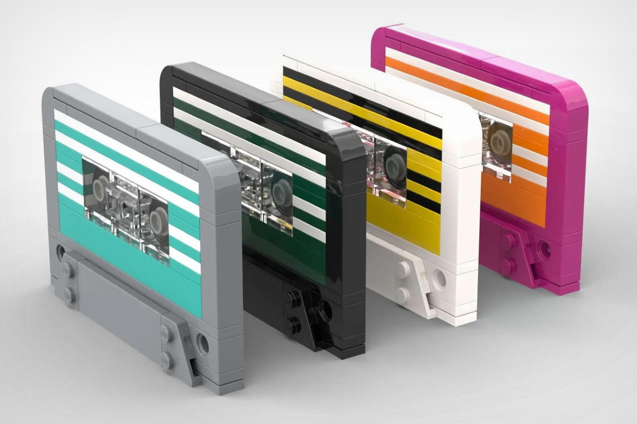
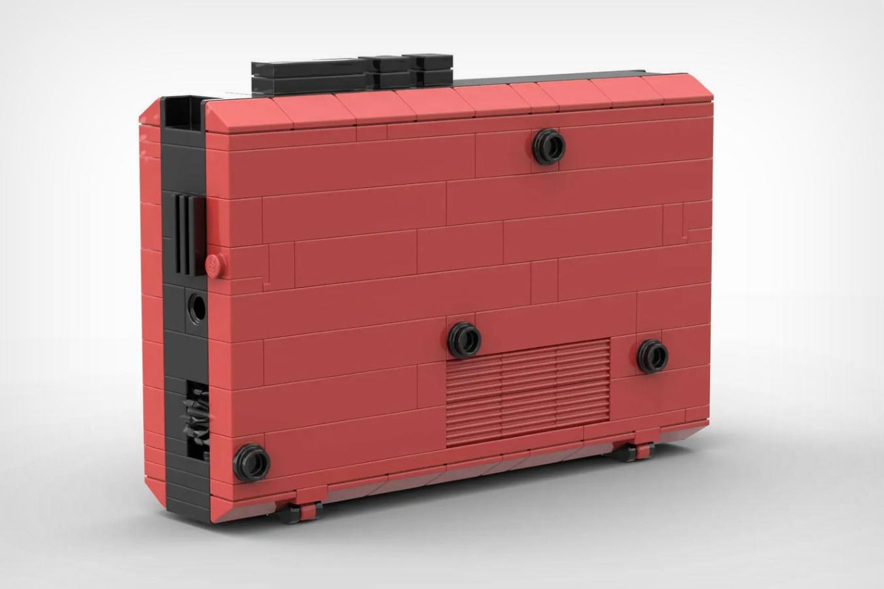
This entry into the LEGO Ideas forum is based on the WM-22 Walkman, available in the iconic red colorway. It features the classic opening flap on the front that lets you put cassettes in and take them out between plays, with a transparent window that even lets you peer into the walkman’s insides to see which cassette’s loaded. Around the periphery are its play-pause and rewind/fast-forward buttons, and a simple rotary dial to adjust volume. The WM-22 didn’t sport a record button, which most costlier models had, allowing you to even capture audio directly to the cassette. However, it did have a 3.5mm jack, which can be found on this LEGO version too (right above the volume button), allowing you to hook a pair of headphones in. You’ve also got 4 different LEGO cassettes to choose from with the build, adding variety to your music library!
The Sony Walkman was submitted to the LEGO Ideas forum, an online dashboard where LEGO enthusiasts can share their own LEGO-based creations. The forum allows the LEGO community to vote for their favorite designs, with the top-voted ones getting turned into box-sets for us regular-folk to buy. The Sony Walkman sits at 2,068 votes as of writing this article, and if it hits the coveted 10,000 mark, it could potentially be made into a retail set! You can vote for the Sony Walkman or any of your other favorite designs on the LEGO Ideas website.
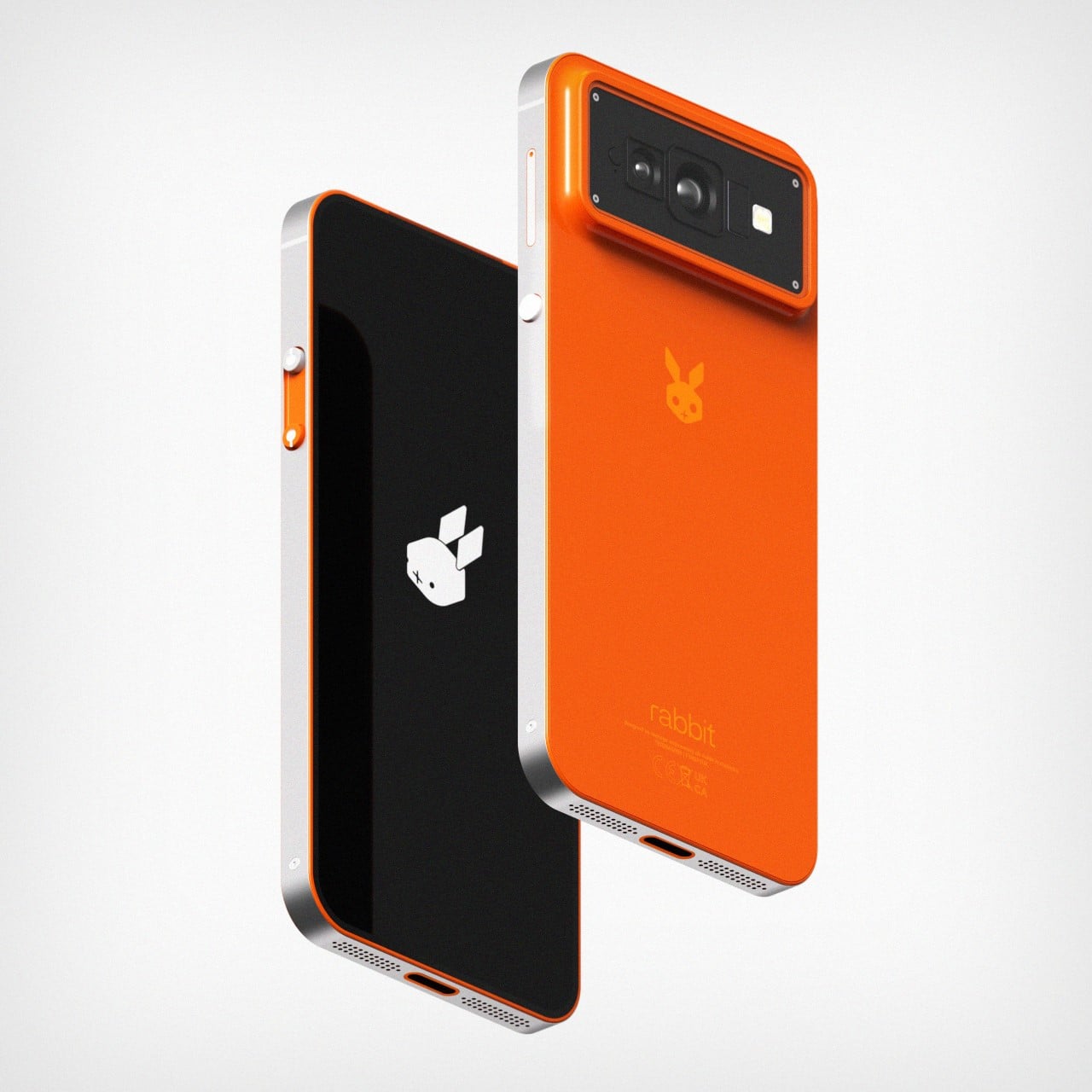
Smartphones aren’t dead, they’ve just stagnated. Over the years, companies have tried hard to develop ‘the next thing’, experimenting with folding phones, AI wearable pins, and even AR/VR headsets… but here’s what nobody’s realized yet. There’s nothing wrong with the smartphone’s format. It’s just lacking the next big technological leap. And that leap doesn’t mean redesigning the smartphone, it just means making it, well, smarter. After all, Spike Jonze’s film Her shows exactly this – a smartphone with a sentient AI that works flawlessly at interacting and executing tasks.
Rabbit’s first-gen R1 device was arguably the most discussed piece of tech at CES 2024. a surprising feat for a product from an absolutely brand-new company. Every blog, YouTuber, and tech writer seemed to be excited not just by the product’s pitch, but also its design and even its capabilities. Moreover, with its ultra-affordable price tag, the R1 felt like an absolute no-brainer… the only problem was the fact that it was yet another device you needed to carry with you.
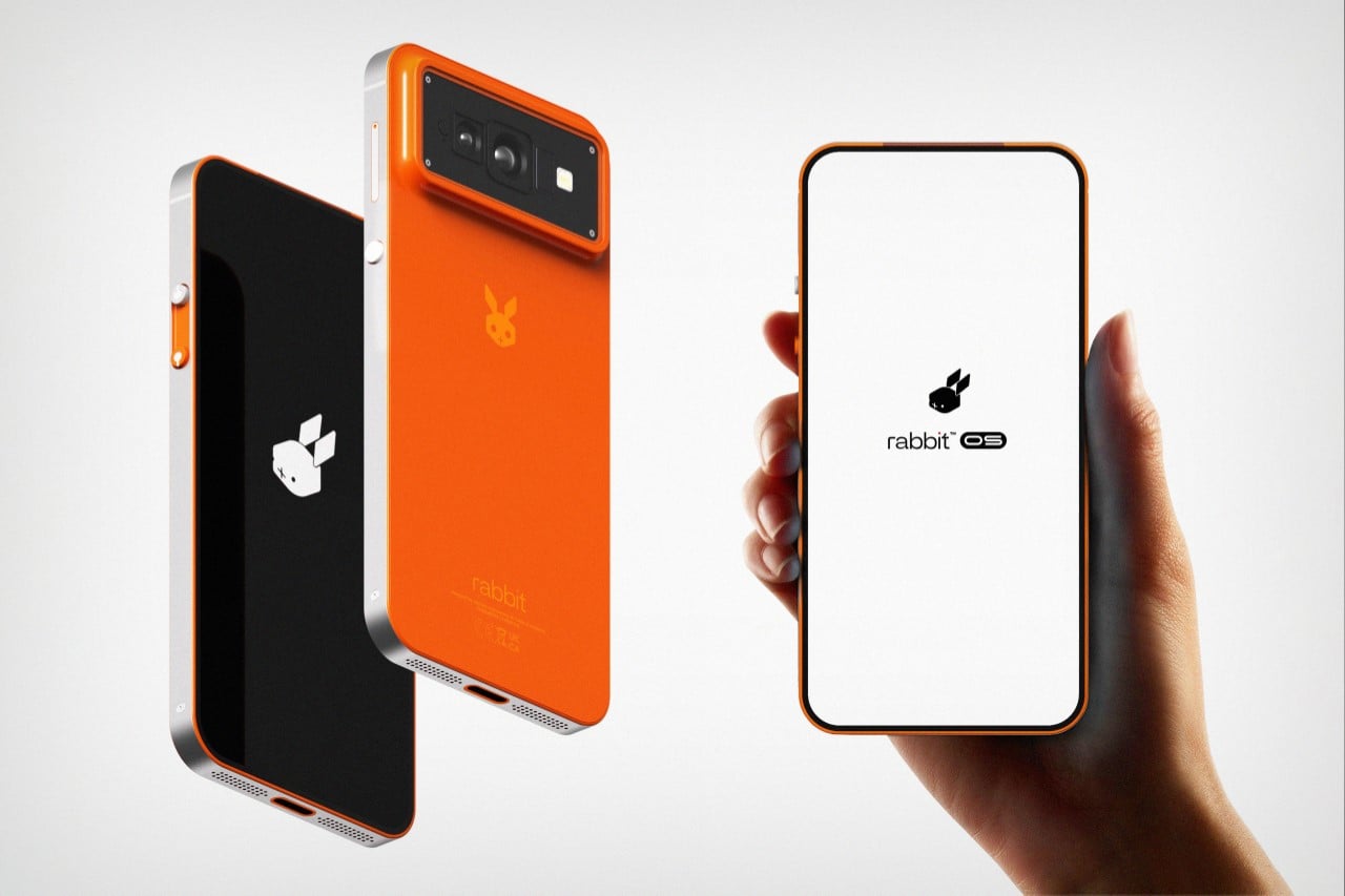
Designer: Shreyansh Onial
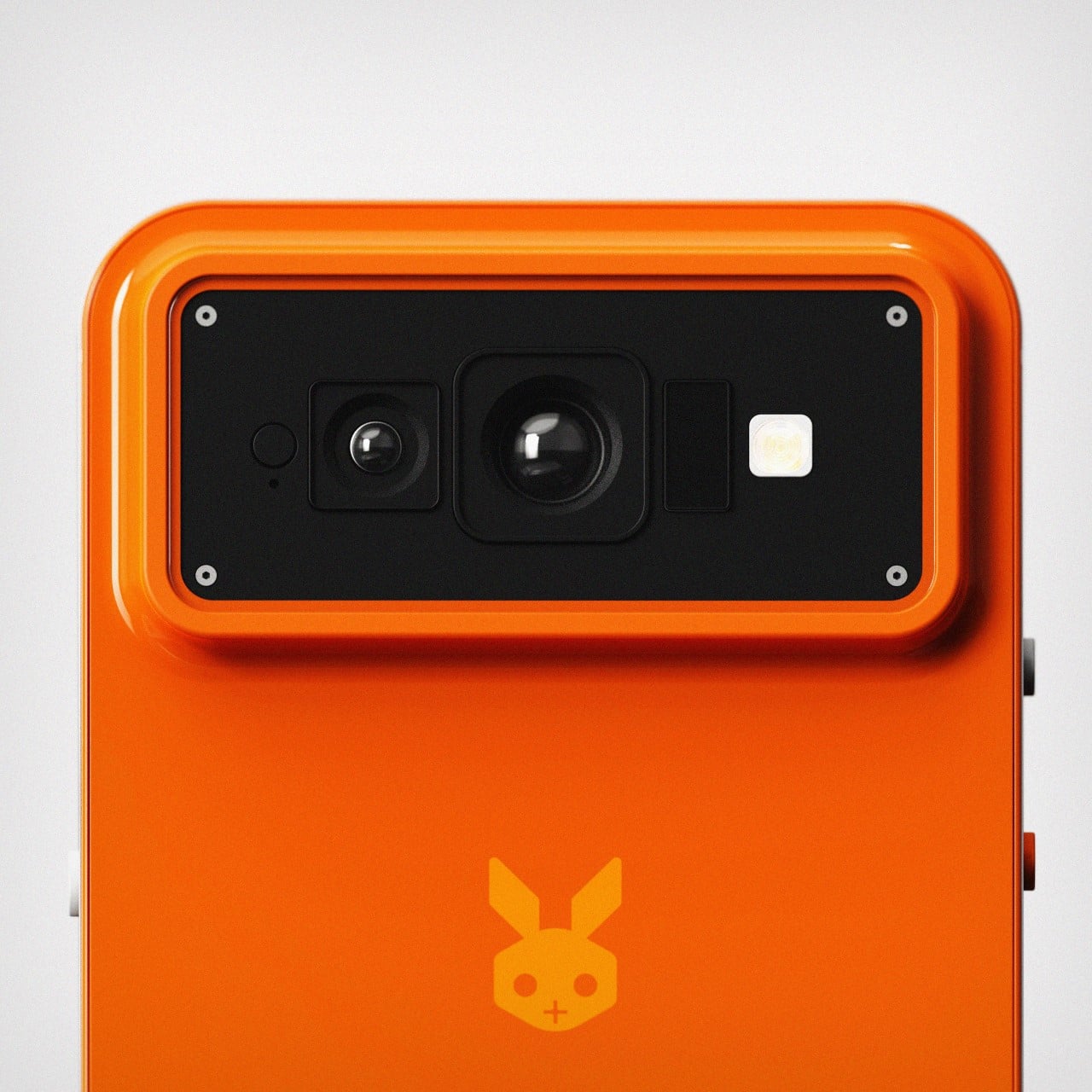
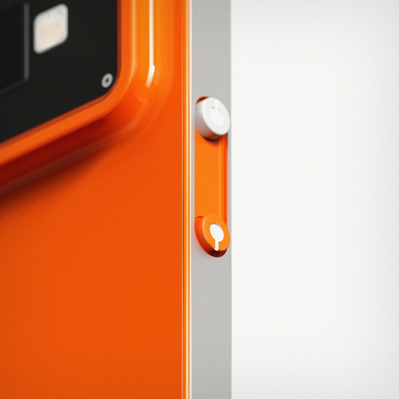
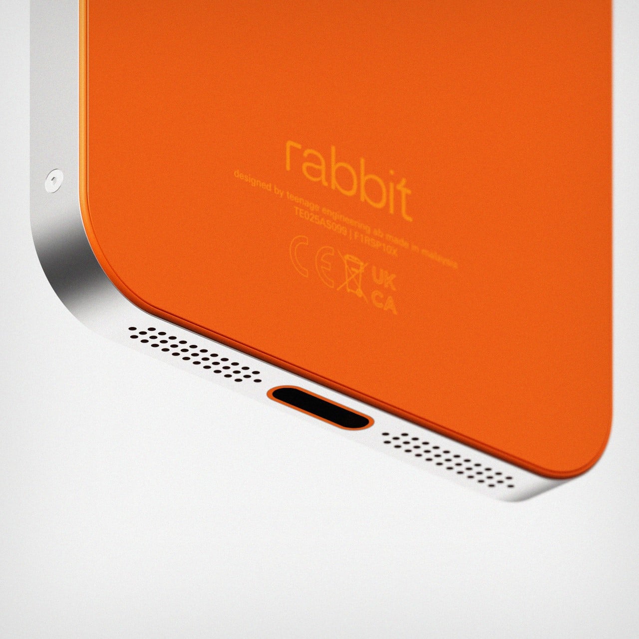
Make no mistake, the R1 was still a brilliantly designed piece of gear. Crafted by the fine folks at Teenage Engineering, it was a work of art with how adorable, vibrant, tactile, and unmistakably iconic it looked and felt. However, its form factor brought about a few limitations that led a few tech experts to ask the question – why was the R1 an independent device? The answer was simple – making an R1 app wouldn’t be as impactful as designing a dedicated device to handle all your tasks. The trick worked, with the R1 selling out not once, but twice in just the week after CES. However, we aren’t here to talk about the R1… we’re here to ask another important question – what’s the logical next-step?
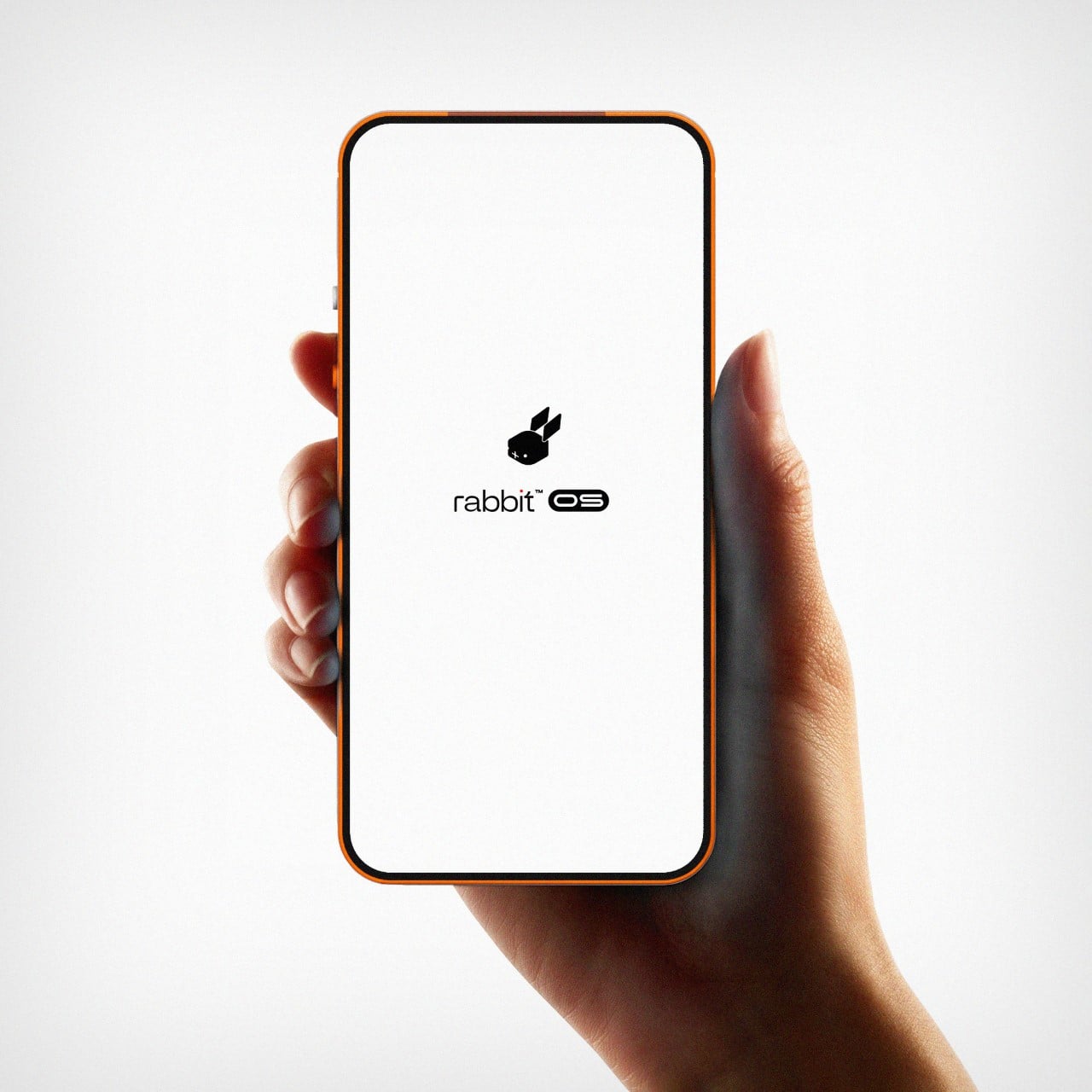
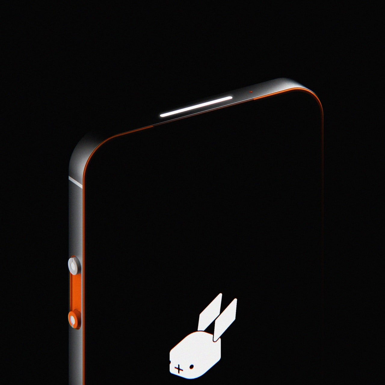
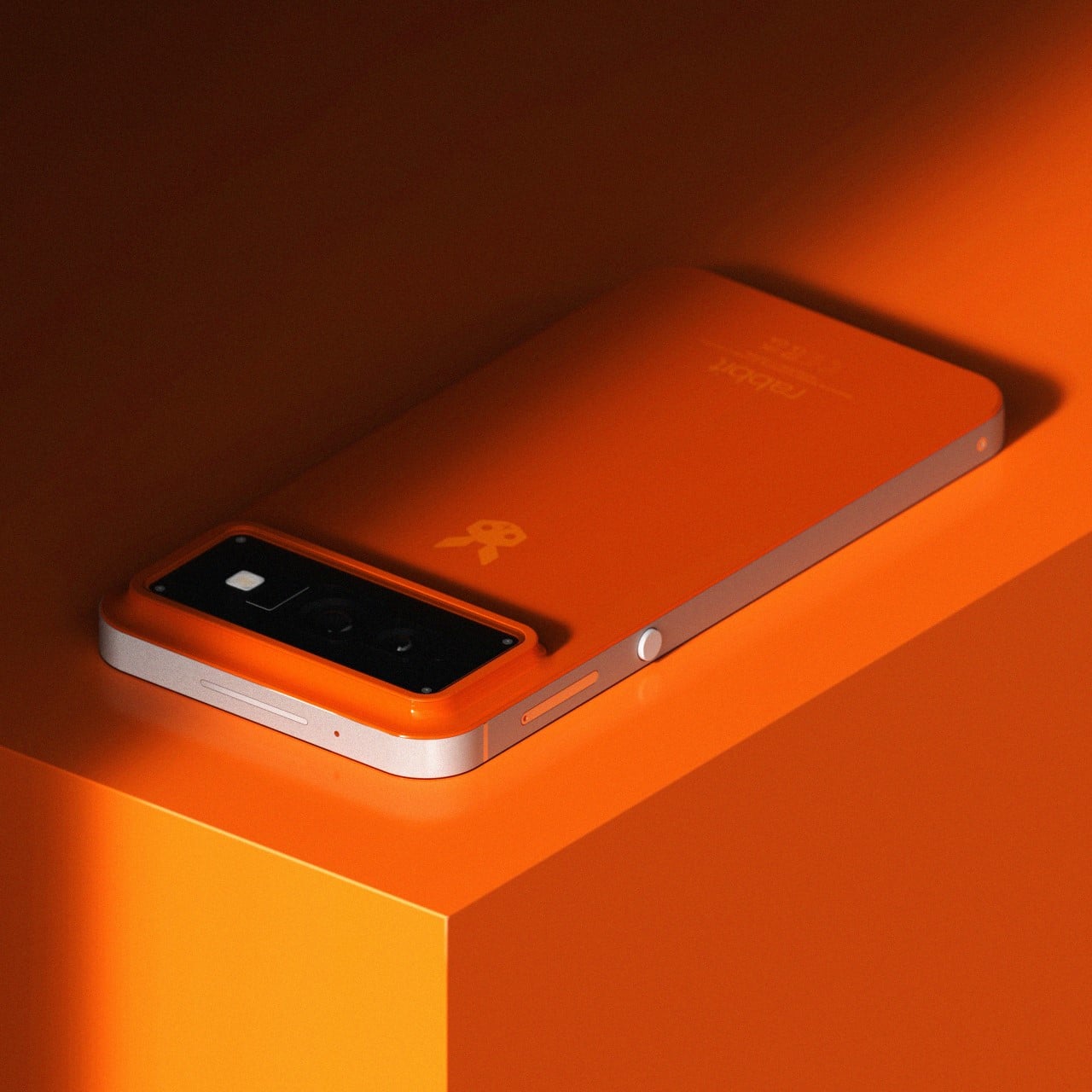
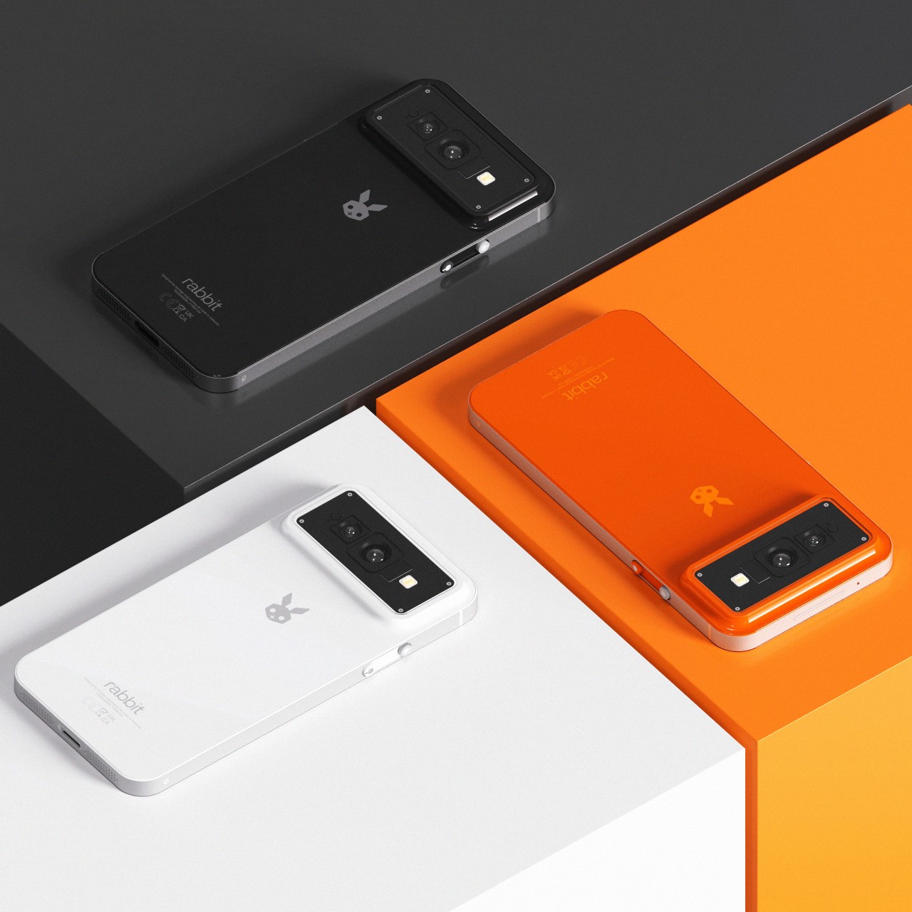
Young designer Shreyansh Onial seems to have just the right answer – a smartphone. Aptly named the Rabbit R2, this concept phone outlines the most sensible future for the Rabbit brand, and for smartphones themselves. Phones for too long have remained dumb devices that can only respond to limited queries like “What’s the temperature?” or “How old is Leonardo Di Caprio’s new girlfriend”, but with the R2 these limits simply get shattered. In 2007, Steve Jobs unveiled the app store, which brought about the biggest change phones had ever seen. With the R2, Rabbit brings that moment back to phones again, offering not apps, but a form of AGI (Artificial General Intelligence).
The Rabbit R2 looks like a smartphone, but underneath the surface, it’s so much more. It’s your own virtual assistant that does everything you need it to… while still offering the benefits of a smartphone. It comes with a screen, a camera, a USB-C port, and basic hardware, but also runs the ultra-powerful AI that made the Rabbit R1 so compelling just a few weeks ago.
Now, instead of carrying the R1 along with your phone, the R2 BECOMES your phone. Sure, it outwardly seems like quite a herculean task… but from Shreyansh’s POV (and mine too), a smartphone seems like the next logical step for Rabbit. Not an app, not a headset, not a watch, but a smartphone that offers the best of existing phone tech, alongside the most advanced assistant you’ve ever seen; capable of handling complex tasks simply through verbal cues and intuition. Of course, we’d have to find a new term for the R2 because the term smartphone has already been used to describe existing tech for the past 15 years. I’ll leave that creative endeavor to you…
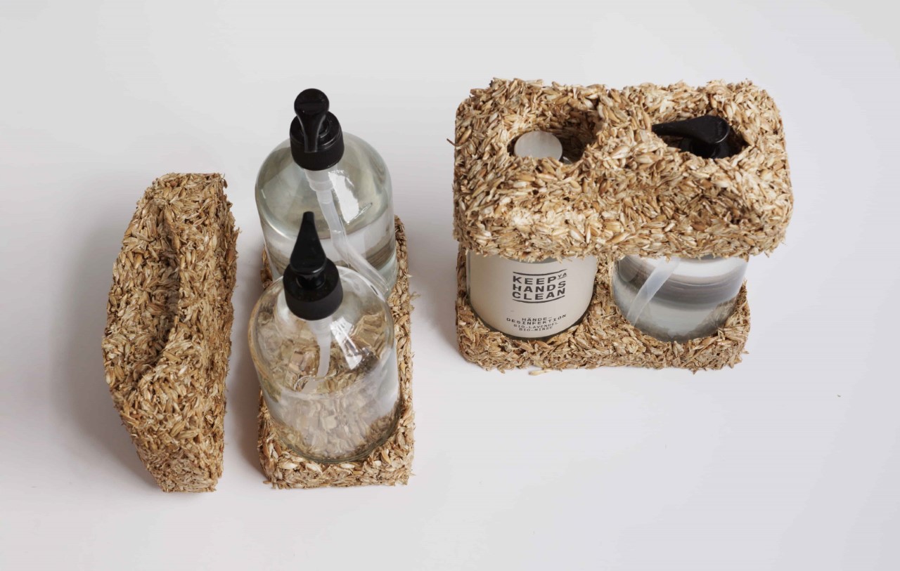
While there’s a conscious effort to remove plastic from our regular consumption, it still manages to play a pretty large (and unavoidable) role in packaging. Whether it’s shrink wrap, bubble wrap, sellotape, or even styrofoam… it seems like getting plastic out of packaging may just be an impossible task. However, a German company is working on an alternative to replace styrofoam in packaging. Their solution? A cushioning material made out of grain husks.
The intended purpose of a product’s packaging is simply to help it cover the journey from factory to consumer. After it’s made this journey, a product’s packaging ends up becoming waste. Scale that up to account for the population of the world and just how many products we buy in a single given day or week, and you’ll realize what a massive problem we have on hand. Sure, it’s easier to recycle cardboard boxes and I can even stretch that argument to bubblewrap or foam peanuts… but it’s nearly impossible to recycle molded styrofoam pieces because they’re specifically designed to hold a certain product and can’t be used anywhere else. Conventional styrofoam is made by passing a foaming agent through plastic, causing it to bubble up into the lightweight styrofoam you use today. Given that it’s essentially made by combining plastic and air, recycling styrofoam as a material is borderline impossible… but replacing it isn’t.
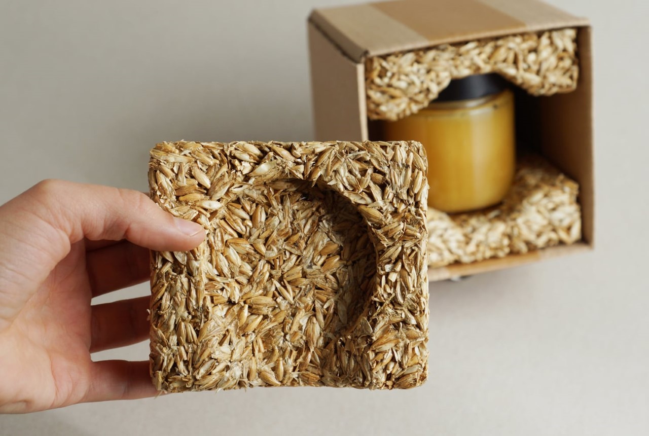
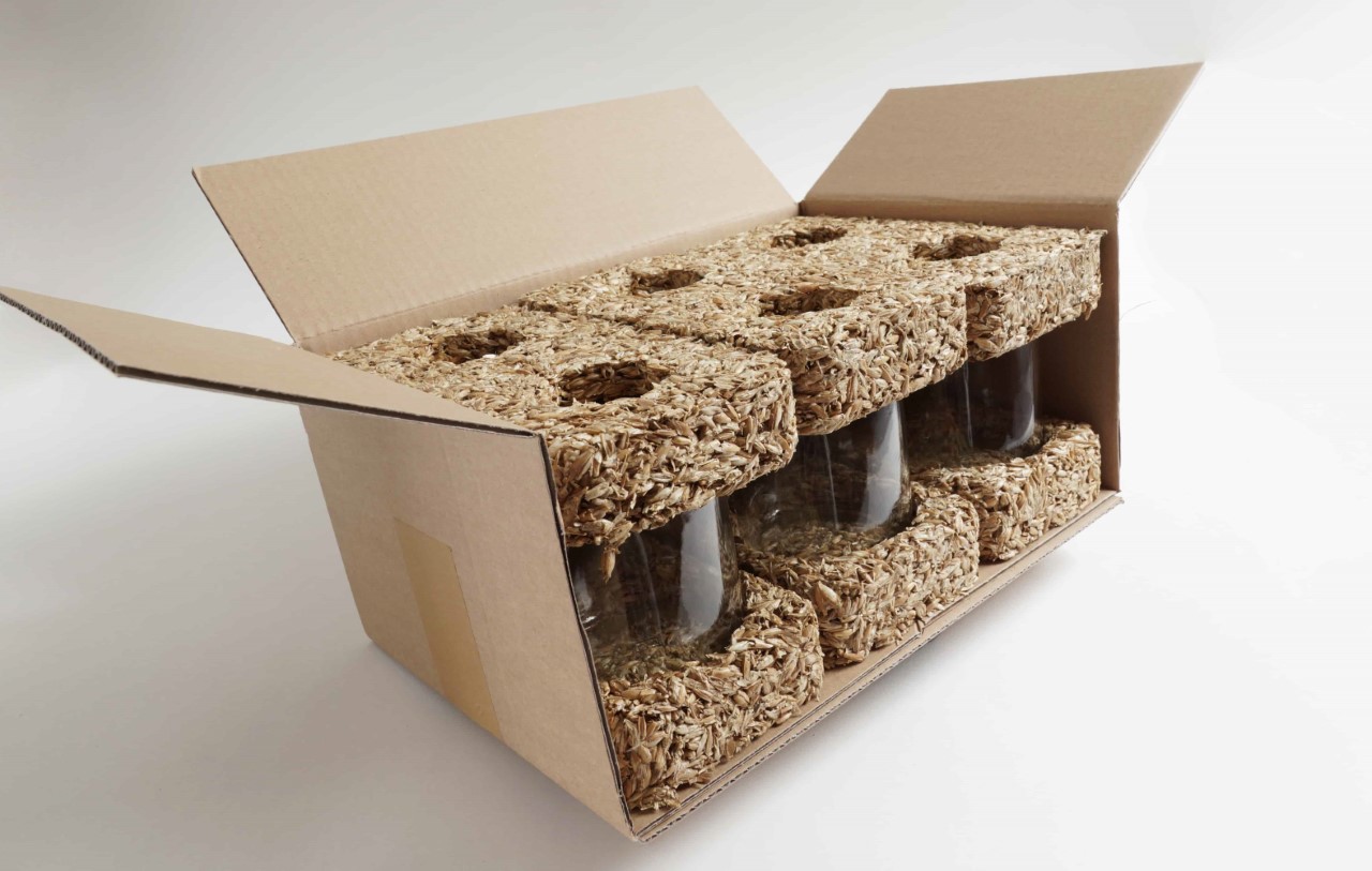
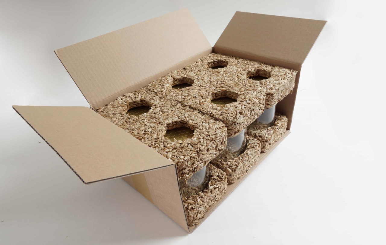
Proservation’s solution is a product called Recou – a ‘molded’ packaging material that’s made from grain husk (which is also what nature uses to package grains!) When grains are harvested, the husk or chaff is removed and either discarded, burned, or used as animal bedding. Proservation has a clever alternative solution – upcycle this husk into a soft, impact-resistant material that does the job of styrofoam, while essentially being biodegradable. The husk is collected and bound together using a proprietary bio-based binder. The overall product has the same properties as styrofoam, but can be easily discarded or even composted.
“Thanks to our specially developed ecological binder, RECOU can be shaped as desired, and due to comparable material properties, it has the potential to substitute petrochemical packaging solutions such as EPS (Styrofoam) and represent an ecologically sound alternative for many applications,” says Proservation.
Proservation is hoping that Recou can replace a major bulk of styrofoam in the current packaging ecosystem. The material has the ability to be molded just like styrofoam, albeit with a few limitations given the size of an individual husk. It takes anywhere from 6-8 hours to make each piece, and the overall product has a density of 120 to 150 kg/m³, which seems to be the one significant limiting factor, given that styrofoam weighs nearly 70% less. Recou is also designed to resist moisture and humidity, showing no signs of mold when stored at 70% humidity for up to a week… “However, if the material is permanently exposed to high humidity or moisture, the decomposition processes start and mold may occur,” the company says.
For industries/companies interested in transitioning to Recou, Proservation does sell a few standard products like corner-cushions for palettes, and is also open to molding specific products based on requirements. The company plans to have an industrial plant operational by some time in 2024, scaling up production for this unique no-waste bio-based alternative to styrofoam.
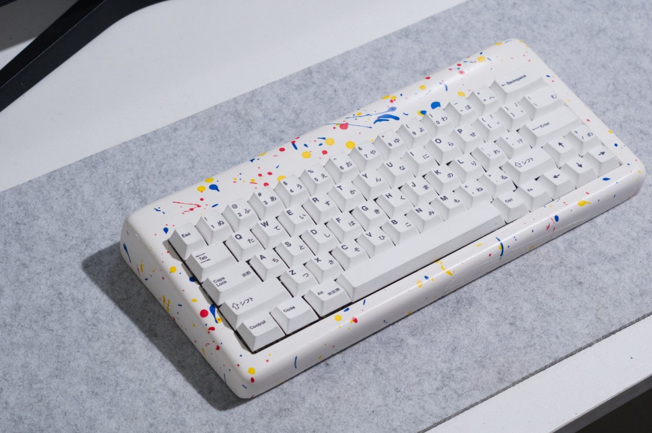
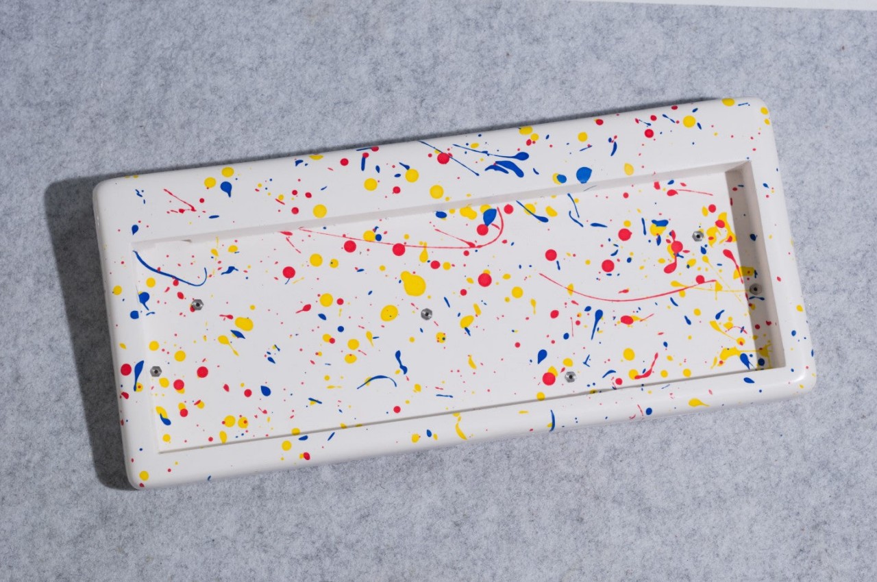
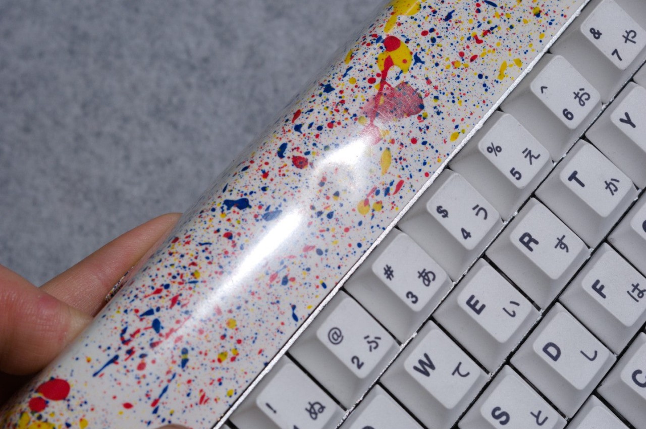
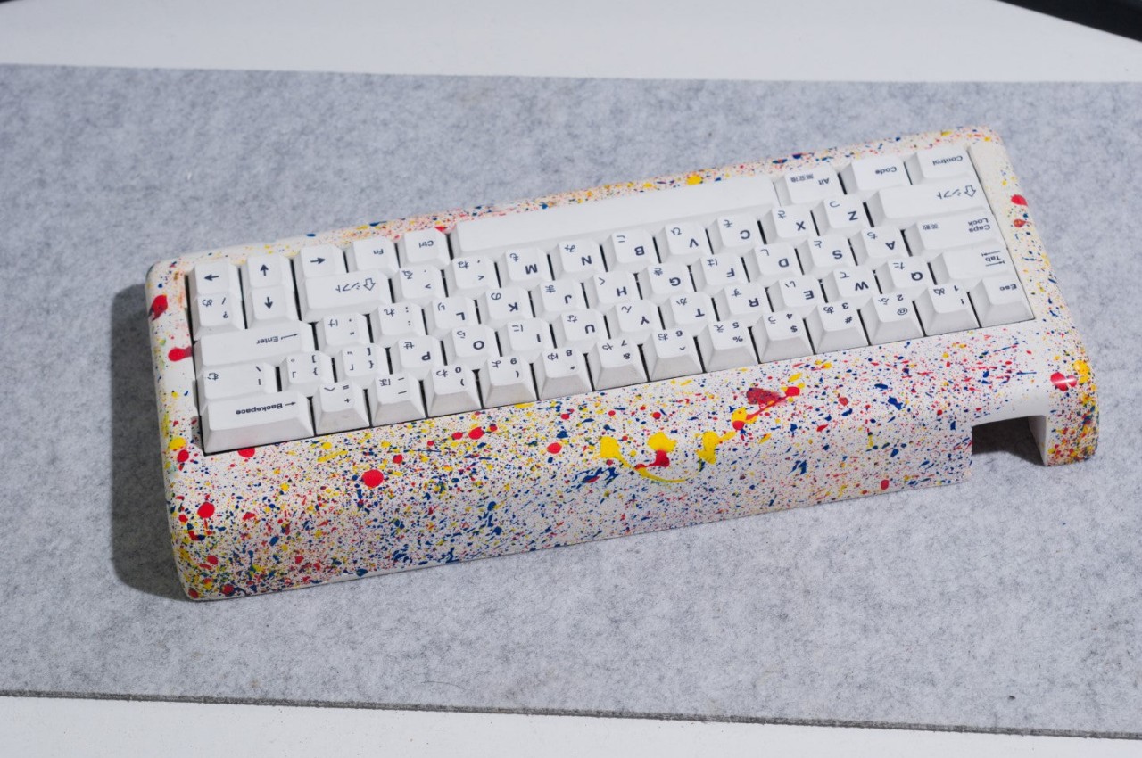
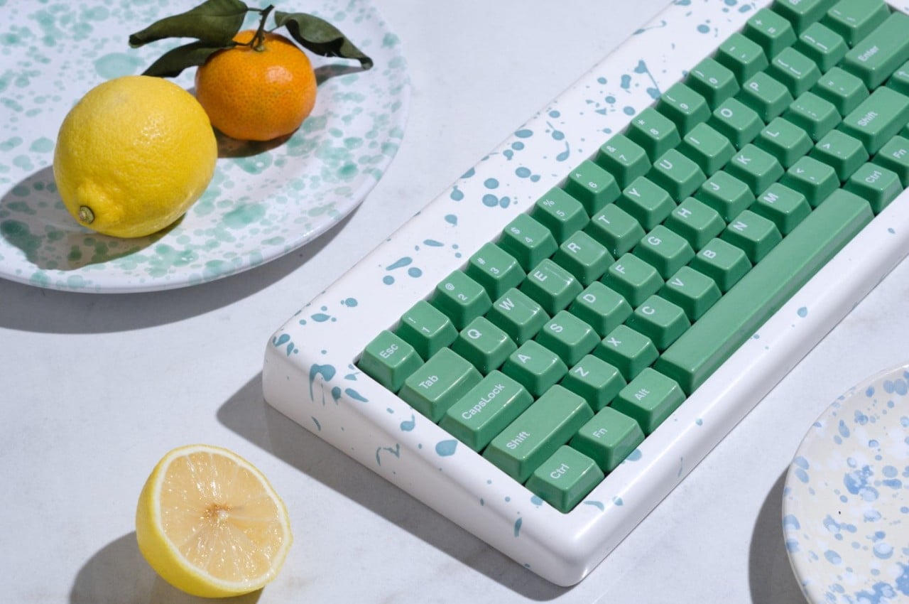
Computer keyboards are often regarded as purely utilitarian products. Aside from the RGB lighting that gaming-focused keyboards have, the majority of the designs tend to lean towards black or white color schemes, with a few colorful exceptions here and there. These input devices are rarely considered works of art, or even anything related to art. Of course, there is a very small number that doesn’t fit inside this box, putting as much attention to aesthetics as is paid to performance and ergonomics. This rather peculiar keyboard design, for example, splatters a variety of colors on the case, recreating an artistic style used by Italian artisans to create their rather unique and artistic ceramic.
Some people might have preconceived notions of what ceramic products look like, either completely brown like clay jars or pure white with elaborate patterns painted on their glossy surfaces. Italy, however, has another and rather unique variation to that design, employing a technique called “schizatto,” which literally means splatter, to glaze and decorate their ceramics. The end result is, as the name suggests, a splattering of paint drops with random shapes and volume, giving the design a unique and whimsical character.
That’s the kind of unconventional appearance that the Mason60 keyboard cases deliver, adding not just visual interest but also an element of fun to your computer use. Each keyboard case is individually hand-crafted using this artistic technique, making every single one an exclusive limited edition product of sorts. And since no two splatters will ever be the same, each case carries its own personality, reflecting not just physics but the artist’s “brush” during the time of its creation as well.
The Mason60 Schizzato series doesn’t stop at just mimicking the appearance of those artisan ceramics. Made from gypsum resin composite, the cases give keyboards a heft that’s not unlike those very same ceramic products. The material is also polished to give it a glossy finish that one might even mistake for real marble. In other words, the Mason60 will really make your keyboard look and feel like an authentic Italian ceramic product, or at least something that definitely looks artistic from any angle.
It’s too easy to take for granted how a simple change to the keyboard’s appearance could affect your use of the computer. Yes, it won’t directly affect your typing experience, at least depending on the kind of keys and switches you will be pairing with these cases, but it will affect your mental state at the very least. If you spend a lot of time in front of the computer, having something beautiful and interesting always in your sight could definitely help perk up your mood and stimulate your brain. Plus, it never hurts to have something so novel and unique as a conversation starter and maybe even a source of envy among your friends.