Using a keyboard is universal – touchscreens and smartphones have brought this tool to almost every fingertip. What often surprises me is the innovation behind this humble design that was first invented in 1876! The QWERTY layout we type away on is over a century old and remains a trusted format whereas what has changed are the things we can do other than just typing on our keyboard. Keyboards are now the portable go-between your trusted typing accessory to everything you need on your machine – it doubles as a USB hub or even has sliding compartments that are notepads or Num pads to be used as needed – whatever your problem, we have a keyboard design that solves it!
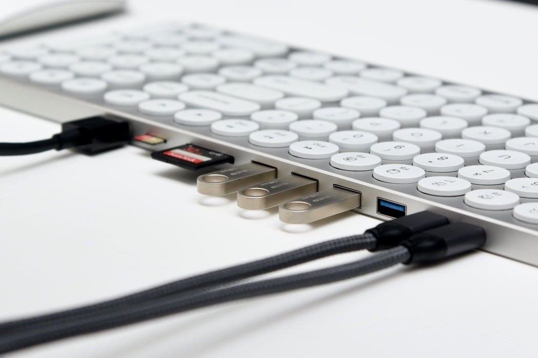
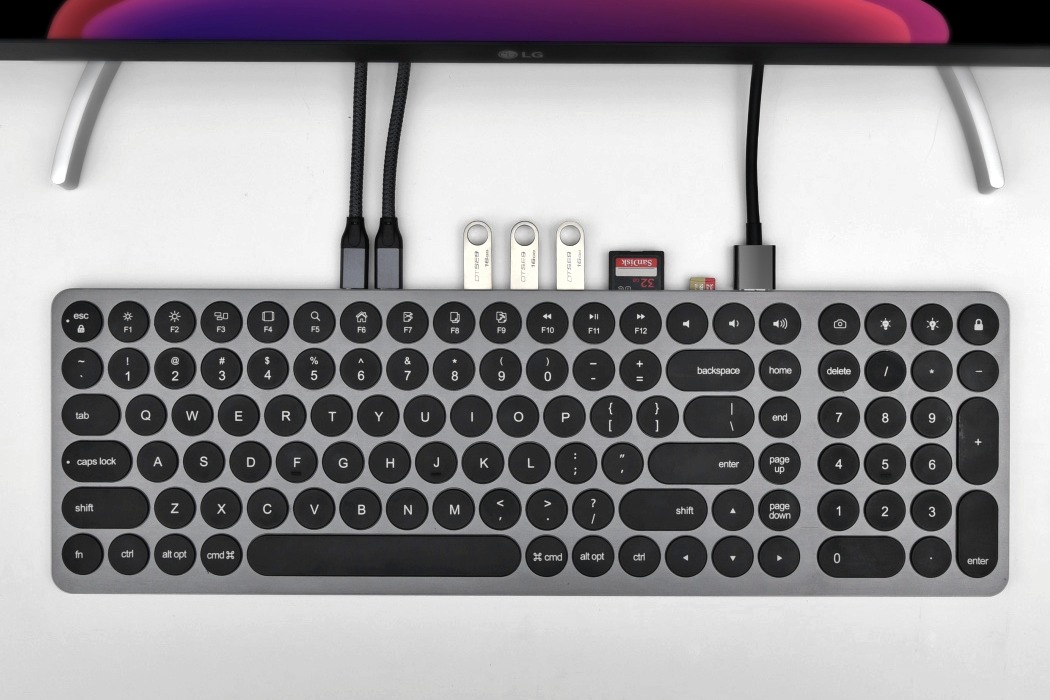
Say hello to the Kolude KD-K1 by Jeremy Lin, a sleek external keyboard with a pretty interesting twist. With circular keys that sit within a machined aluminum base giving it a neo-retro vibe, the Kolude KD-K1 keyboard is a visual treat with tactile scissor-switch keys that make it a great keyboard to type on too. Built right into the back-face of the KD-K1 is a USB hub, complete with USB-A and USB-C ports, an HDMI port, and two card-reader slots. Designed to be the Swiss-Army-Knife of keyboards, the Kolude KD-K1 makes sure you’ll never have to bend over and reach behind a CPU to plug a pen-drive in again. Connect it to your laptop or desktop using the USB-C port and the KD-K1 comes alive with a myriad of possibilities. The multitude of ports allows you to maximize productivity by connecting drives, devices, displays, or cards to your main computer, right through the keyboard.
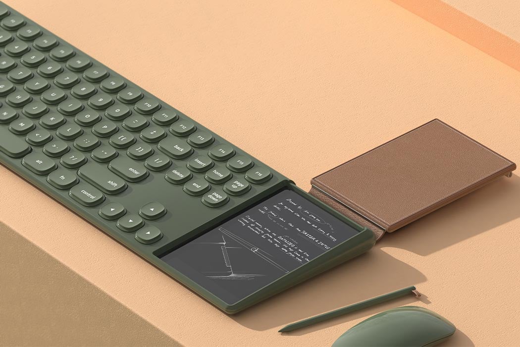
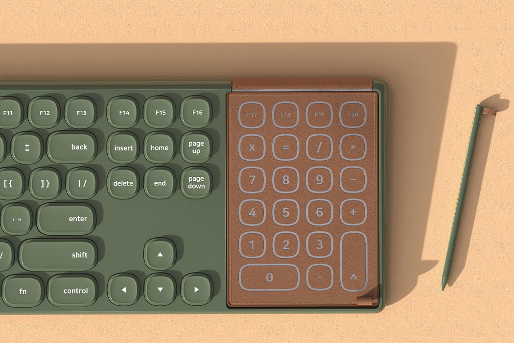
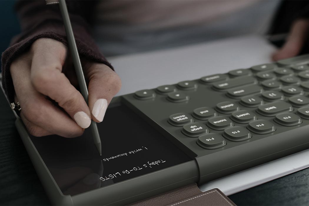
As a reflex, we always tend to frantically search for a notepad to jot down a number, address, meeting feedback, last-minute lists, or notes during a class. To integrate this existing behavior with the technology we already use, designer Jeong Woo Kim created Ouverture – a conceptual keyboard accessory that is a number pad + a digital notepad when you flip the cover. It has a typing mode which is the number pad and a memo mode which is the writing pad. “The leather cover acts as a number pad on a conventional keyboard. Current from the fingertips passes through the special conductive fiber to the touchpad inside the leather cover,” explains Kim.

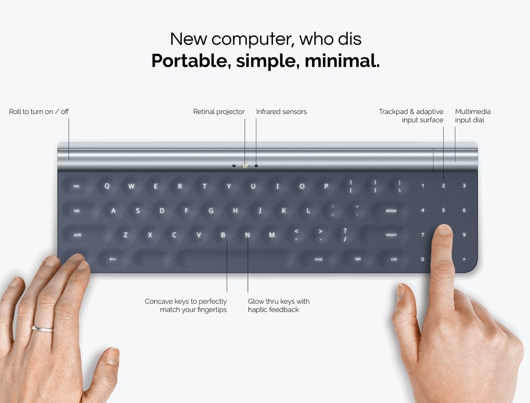
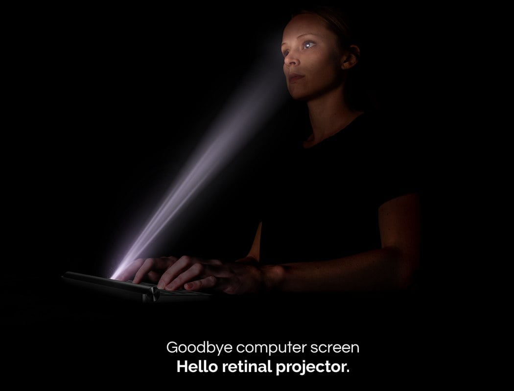
We love seeing concepts that challenge our perception of the future of technology by forcing us to rethink how we will one day interact with devices. Aura by Vince Wang certainly achieves this, and it does so by transforming the humble laptop into an ultra-portable, productivity station! So, you may be asking yourself how it functions without a screen, well that’s all down to the rather clever Eye-tracking Infrared Illuminators that locate eye-details and reflection patterns to project the image directly onto the user’s retinas! The futuristic technology doesn’t end there; in addition to the lack of screen, there is also concave keyboard with Glow Thru keys that’s been paired with an adaptive input service for maximum productivity!
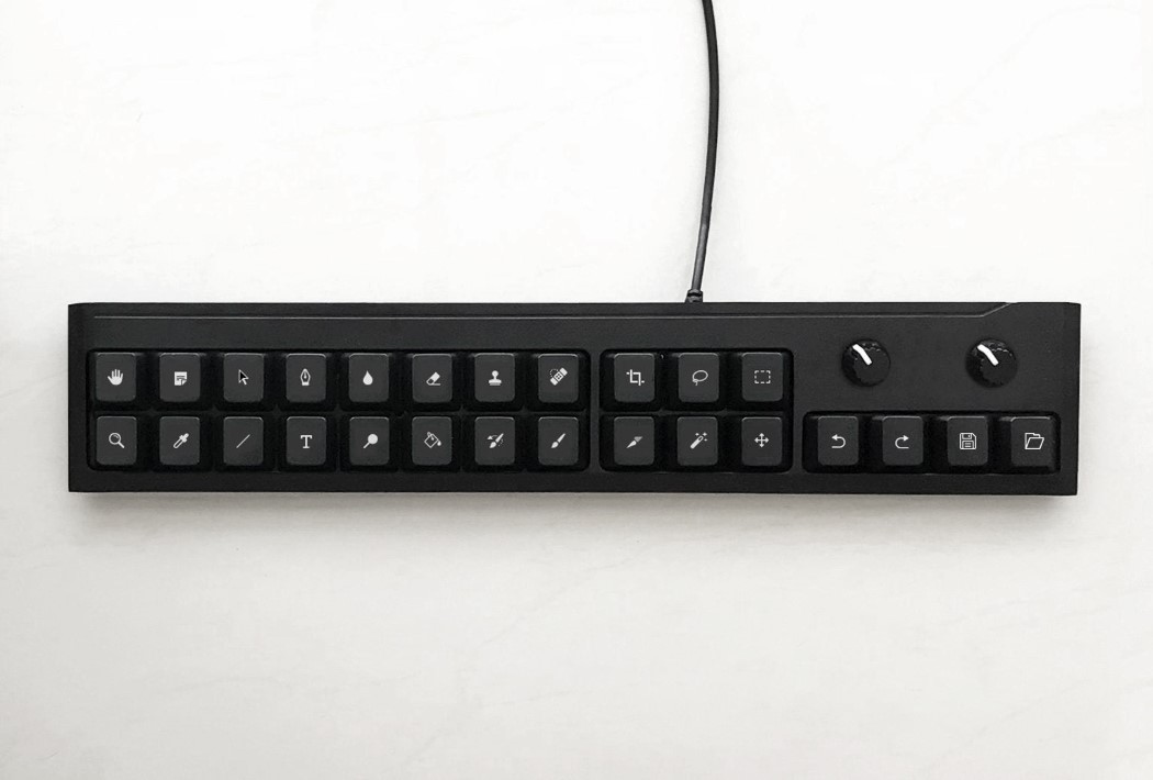
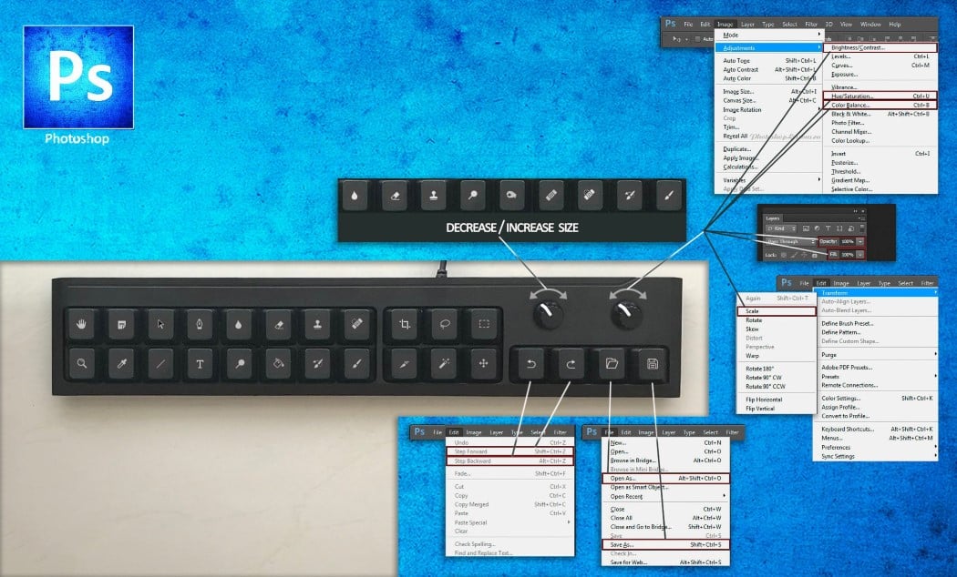
You can find all of Photoshop’s commonly used tools in the key-layout, along with quick-access keys for undoing and redoing, as well as for saving and opening files. There are even custom-mappable knobs for controlling features such as brush sizes, hardness, or even for zooming in/out. The keyboard can be mapped as per your requirements, and for people who don’t want something this elongated (that’s not what she said), there’s even a smaller, square-shaped Numpad-esque keyboard with a few extra buttons that unlock more features… and while products like Loupedeck’s Creative Tool exist, it’s nice knowing that this particular variant, created by Etsy-maker 3dDecors, is close to 5 times cheaper. Forget the MacBook and its Touch Bar, just buy me this slim custom keyboard and I’ll be on my way.
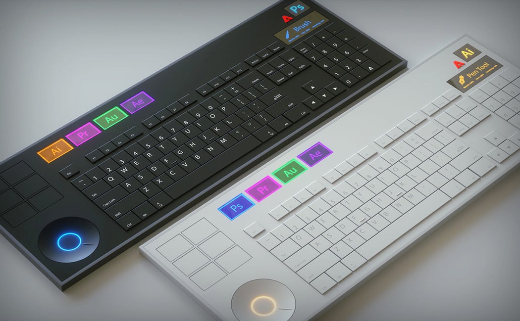
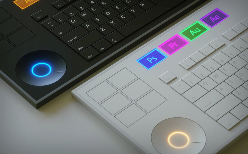
Vinicius Araújo has designed a gorgeous keyboard to aid in the transition between each Adobe program, saving the user hours of switching between Photoshop to Indesign to Illustrator to Lightroom. Accented with stylish LED colors and eye-catching material changes, the Adobe Keyboard is the designers’ must-have.
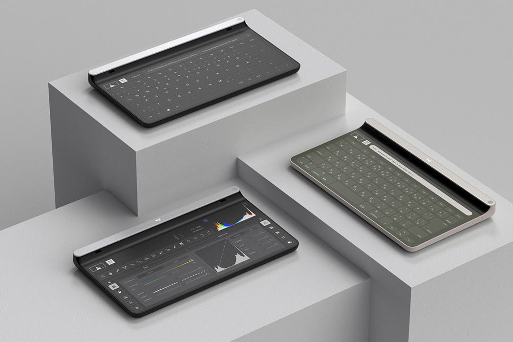

The Red Dot Design Concept 2020 ‘Best of Best’ award-winning Logitech Ultra combines the best of both worlds. At first glance, the device looks like a touch-screen product, which allows you to swipe between windows, including a calendar/to-do list, a virtual meeting room, or various keyboard interfaces. The screen has IR-Cameras built-in, which tracks users’ finger gestures across the surface. This finger-tracking ability is similar to the controls on a smartphone or tablet. Underneath the touch screen lies a bed of small press-able points that give you the haptic feedback of a keyboard without the limitations of a specific keyboard arrangement. Basically, any point on the tablet’s surface can function as a key.
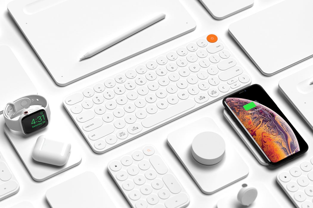

Having a visually harmonious, intuitive, and efficient set of tech accessories allows the user to keep all devices and peripherals charged and in sync at all times – its the same calm you experience when you start your day on a clean, organized desk! Link is a collection of essential computer accessories that are integrated to work together to optimize functionality for the user right from wireless charging devices to compact input devices. “The goal of this project was to design an ecosystem of peripherals that aims to deliver an experience that is customizable, easy to use, and adaptable to the computer users’ needs at a moment’s notice,” says the designer. So no more scampering around for a certain jack if you have to plug in a non-Apple device or having a network of cables that just take up more space + energy!
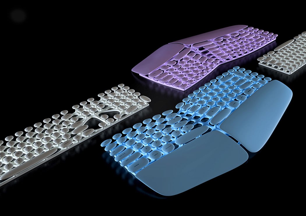
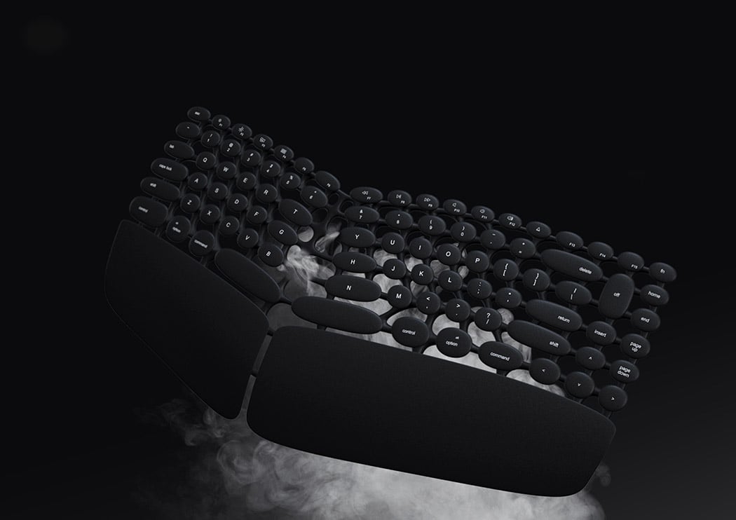
The Off keyboard by Marko Oljaca comes with soft, rounded keys that are elevated on independent “stems” rather than recessed into a solid surface. Not only easy to clean, but it also prevents the buildup of dirt and residue. Better yet, its seamless design makes it spill-proof and water-resistant. Its organic form is also ergonomically adapted to maximize wrist comfort.
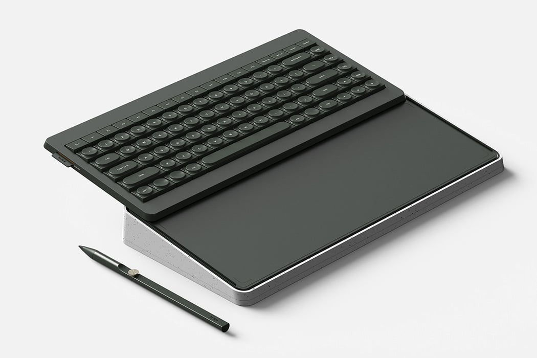
South Korean product designer Cheolsu Park designed ‘Slide’. Slide is a keyboard that doubles up as a tablet. A combination of a keyboard and tablet, Slide, as its name implies comes with a ‘sliding’ element. The tablet can be easily pulled out or pushed in, enabling it to hide sneakily below the keyboard. With two products being packed into one, space is efficiently saved, bringing the usual clutter of your desk to a minimum. When you’re only using the keyboard, the tablet snugly remains a part of it. Park added a lock button to the product, pressing it prevents the keyboard from sliding up and down, keeping it firmly in position. The edges of the product have been centered using a weighty material, ensuring that the product does not tilt in its extended form, especially when you’re typing on the keyboard.

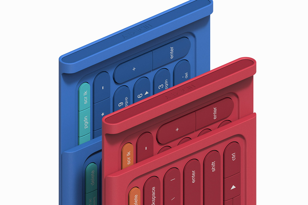
Most Bluetooth keyboards aren’t equipped with a number pad. On the other hand, they are extremely space-efficient. And there comes in Yeong Seok Go’s ‘Hidekey’. But Hidekey has a secret! Its number pad is in hiding. Tucked away on the backside of the keyboard, a quick sliding movement reveals the number pad. The pad can be easily pulled out whenever needed. Once it has been used, you can effortlessly slide it back in. This ensures you always have a number pad at your disposal, improving the efficiency of your work, without taking up too much space.
Check out more products designed to amp up your productivity here!
via https://ift.tt/2nqSsIm
Post a Comment
Note: Only a member of this blog may post a comment.