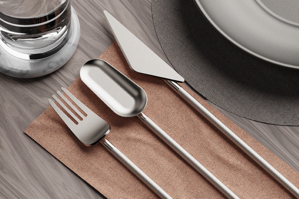
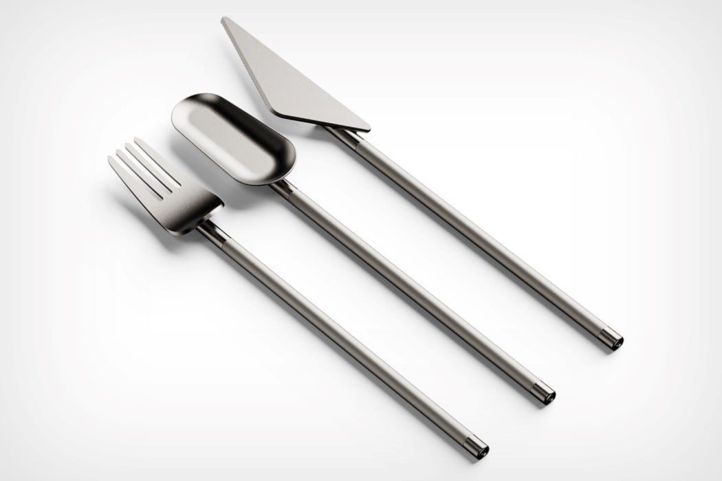
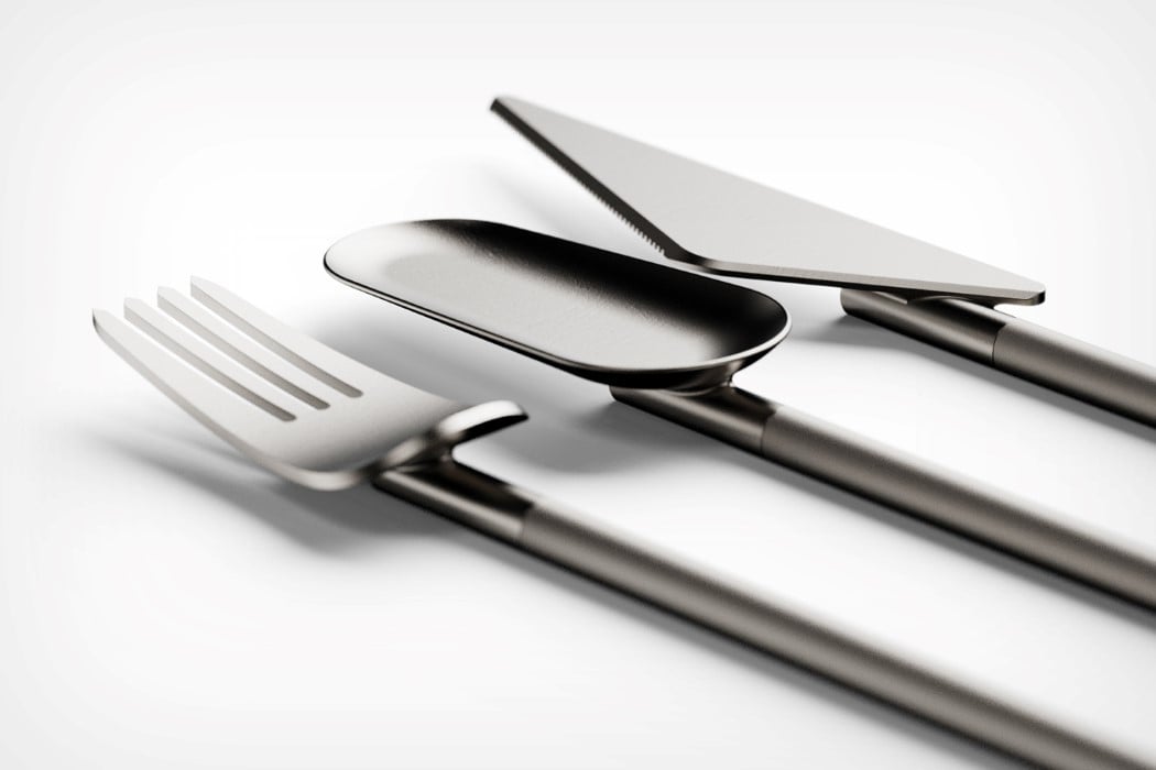
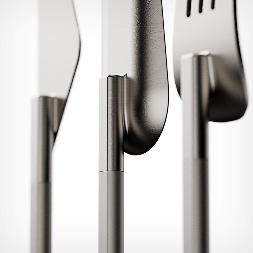
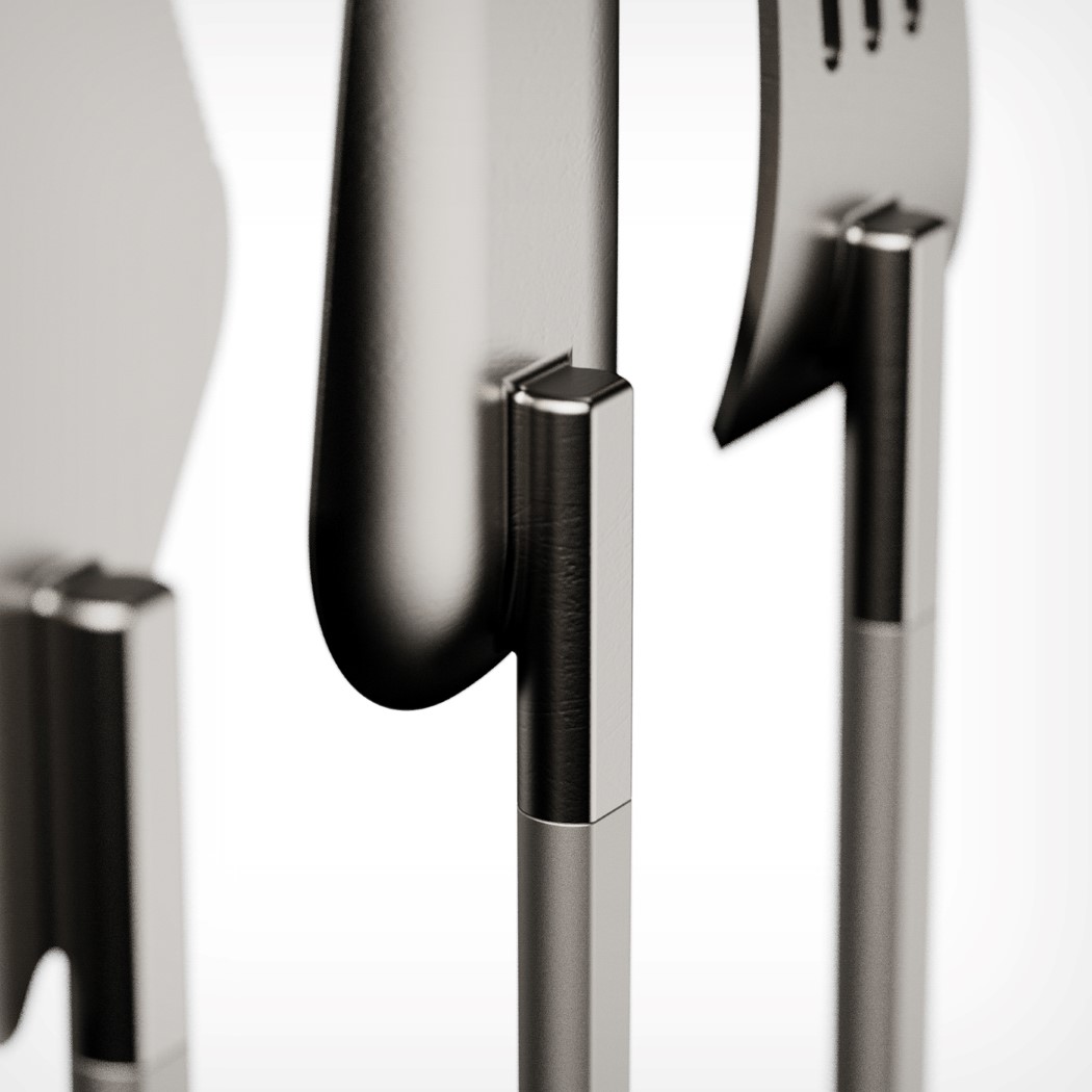
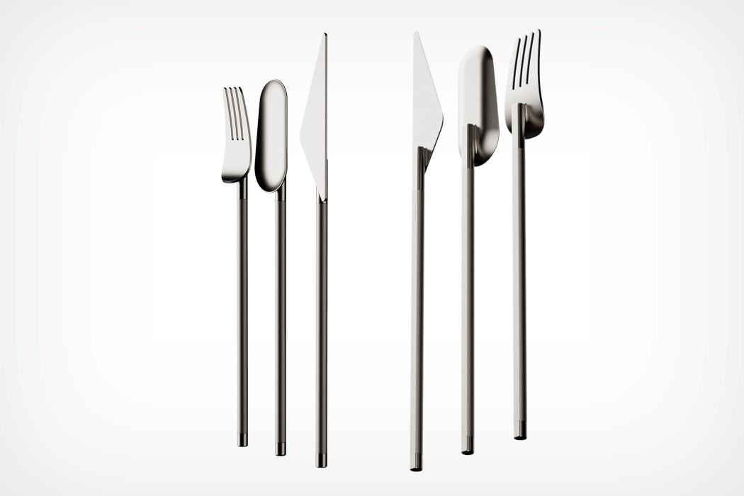
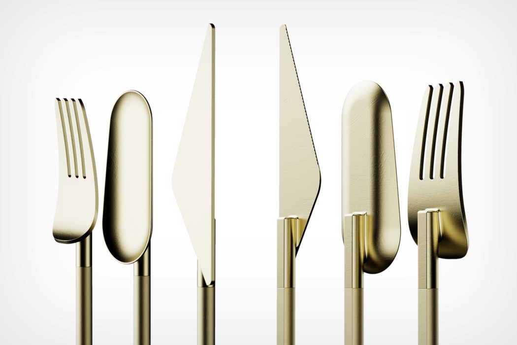
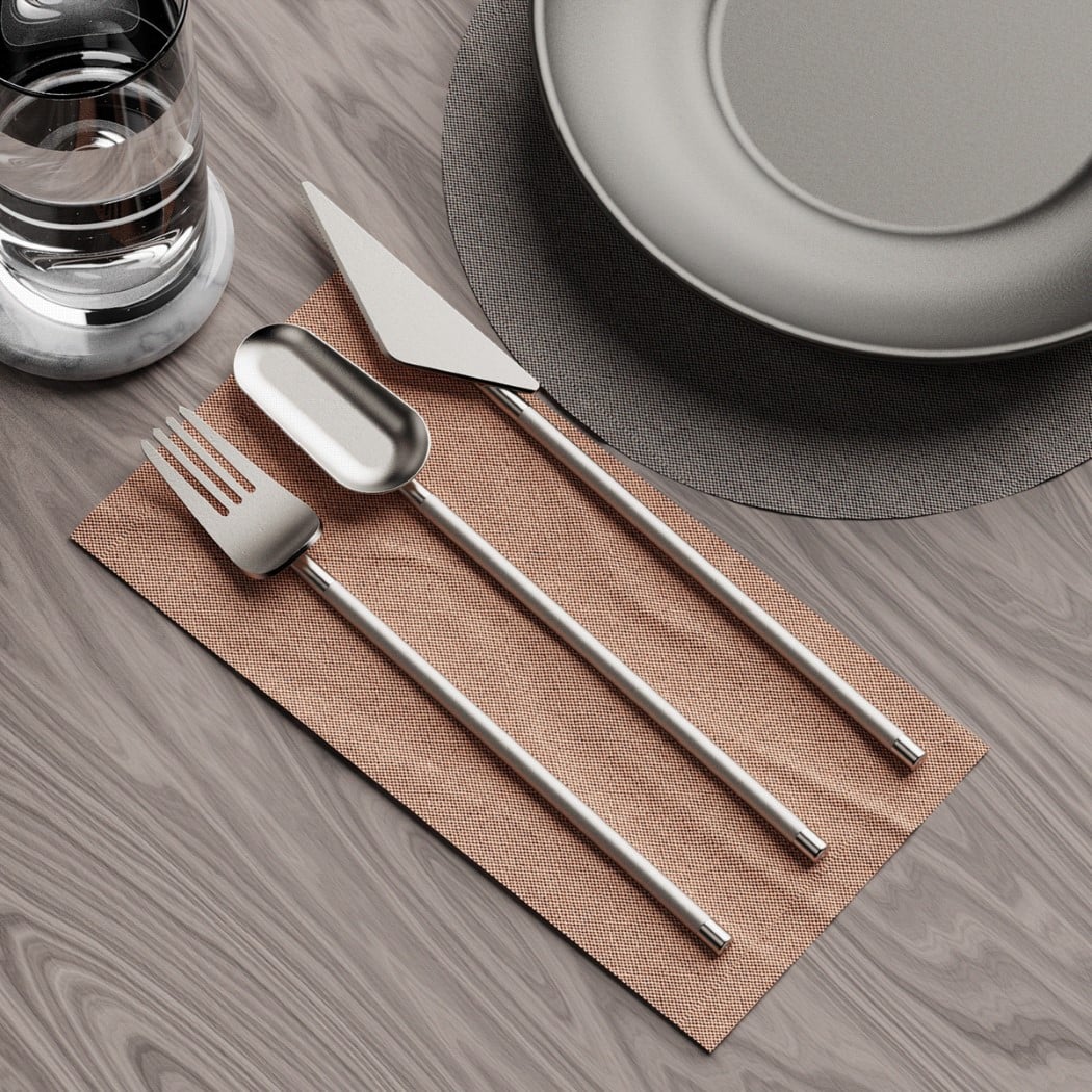
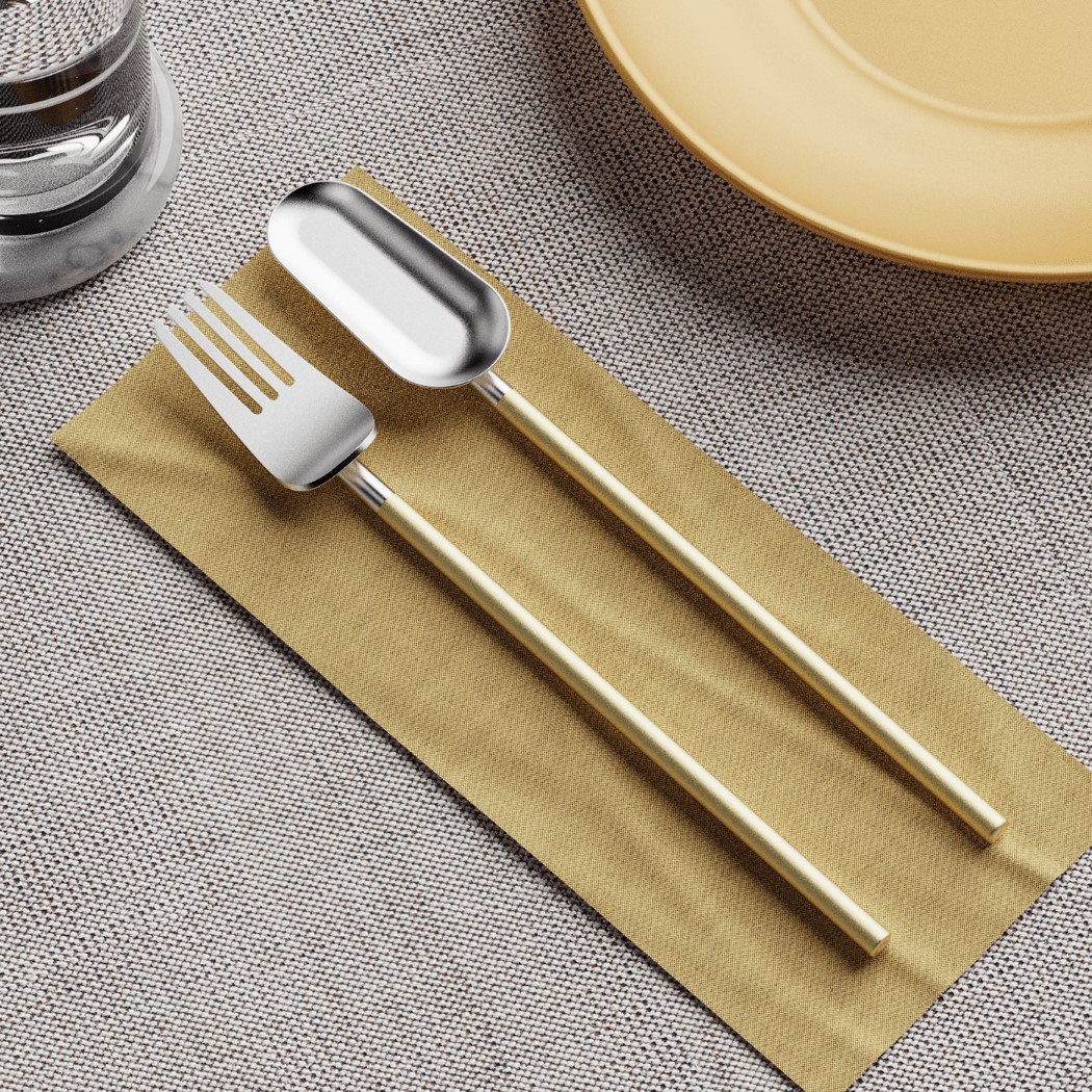
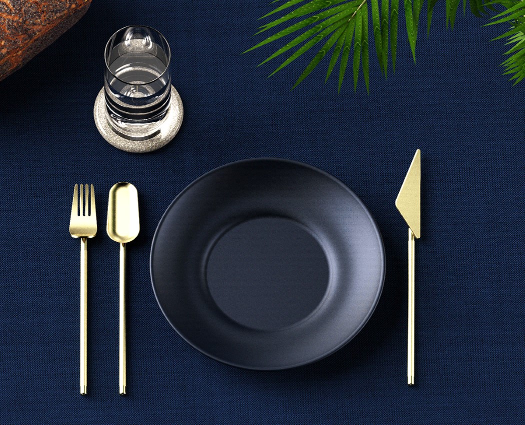
The Disconnect series was created as a part of a Render Weekly challenge, but to be honest, it looks like something from the mind of Nendo. By separating the two elements of cutlery (the part that interacts with food, versus the part you grip), the Disconnect creates a form that is distinctly twofold. The two elements of the cutlery get individual treatment, instead of being like regular cutlery, where elements blend into each other to create a singular, homogenous form.
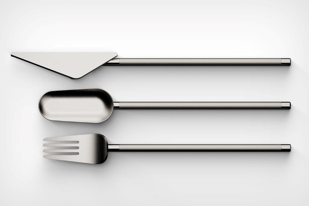
Designed by Francesco Brunetti, the Disconnect series breaks down cutlery into its separate elements, but at the same time retains a sense of minimalism. The slick handle comes with a slim, cylindrical design and a matte-finish, while the functional end of the cutlery uses a balanced, geometric approach with a slight satin finish. The cutlery series was envisioned in silver, space-grey, gold, and rose-gold, and I can’t really testify to whether it would be comfortable to use, but I’ll be damned if I don’t admit how incredibly eye-catching they are!
Designer: Francesco Brunetti


via https://ift.tt/2nqSsIm
Post a Comment
Note: Only a member of this blog may post a comment.