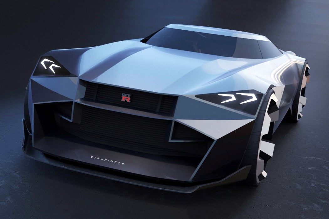
On paper, the combination sounds weird… but looking at those marvelous renders, it works.
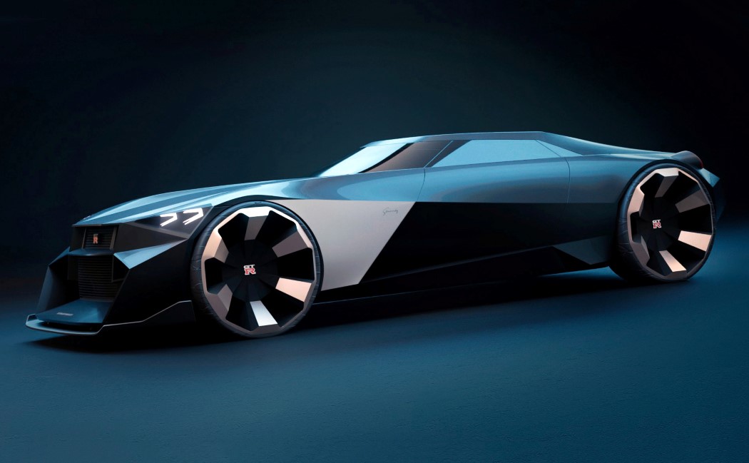
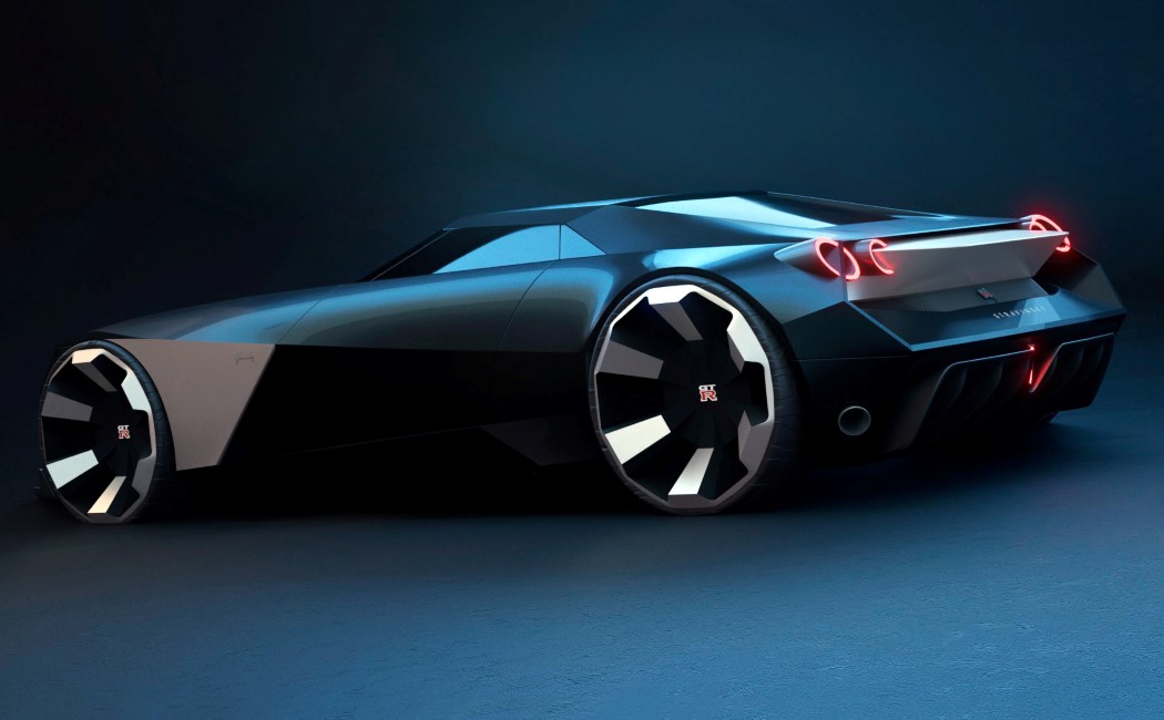
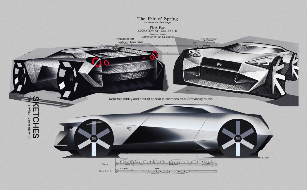
The Nissan GTR Stravinsky was designed inspired by popular Russian composer Igor Stravinsky who had an unusual way of visually expressing his musical compositions. Stravinsky’s unconventional approach to documenting his music was a discordant mess of angled lines, and even though it strayed away from traditional music styles, it made absolute sense… Similarly, the GTR Stravinsky is far from conventional, but it looks like a perfect combination of sinewy grace and aggression, just like any good muscle car.
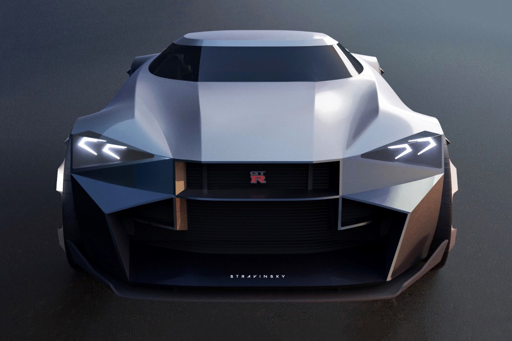
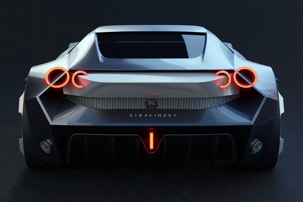
The Nissan GTR Stravinsky concept comes from the mind of Moscow-based automotive designer Timur Dautov. The idea for the car came to him while watching an episode of Top Gear, when Jeremy Clarkson described the Nissan GTR R35 as something Stravinsky would have designed. Finding that to be an interesting design brief, Dautov began working out what “Stravinsky’s GTR” would really look like. The results amplify the edgy incongruous aesthetic of the GTR R35 to the extent that the car looks too unreal for this world.
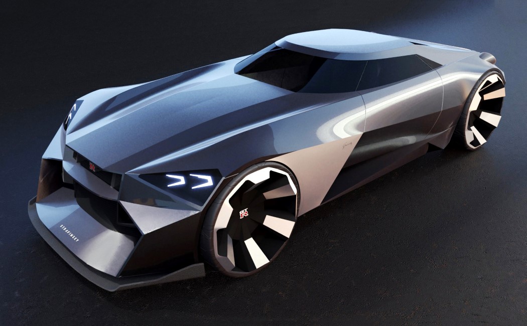
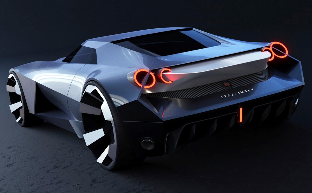
The comparison to the Cybertruck is unavoidable. The origami-inspired surfacing, the nude silver paint-job, these details help propel the Stravinsky into a cyberpunkish future. The car’s design feels almost like a really basic low-poly model, and the way it reflects light is rather atypical of most cars which create highlights and shadows that define the car’s curves. The Stravinsky, on the other hand, looks like it’s deliberately breaking the rules. Igor Stravinsky would have loved that. Plus, that silver paint job is perfect for this car – I can’t imagine its design really working with any other color. Perhaps a matte black or a pearlescent purple.
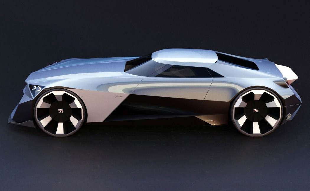
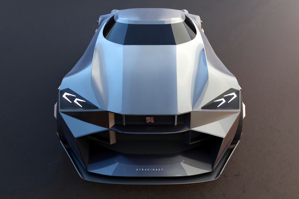
The car manages to find order and beauty in chaos. It uses a paneling-style design but still manages to create an engaging 3D volume. The aesthetic is dominated by straight lines, although designer Timur Dautov carefully uses curved lines and surfaces to create a contrast that looks wonderful. The headlights and taillights are both simple yet iconic in their own right, while the extended lower lip on the front bumper really defines the car’s front as well as its side. Plus, can we just admit that there’s something undeniably hypnotic about those beautiful rims??
Designer: Timur Dautov
via https://ift.tt/2nqSsIm
Post a Comment
Note: Only a member of this blog may post a comment.