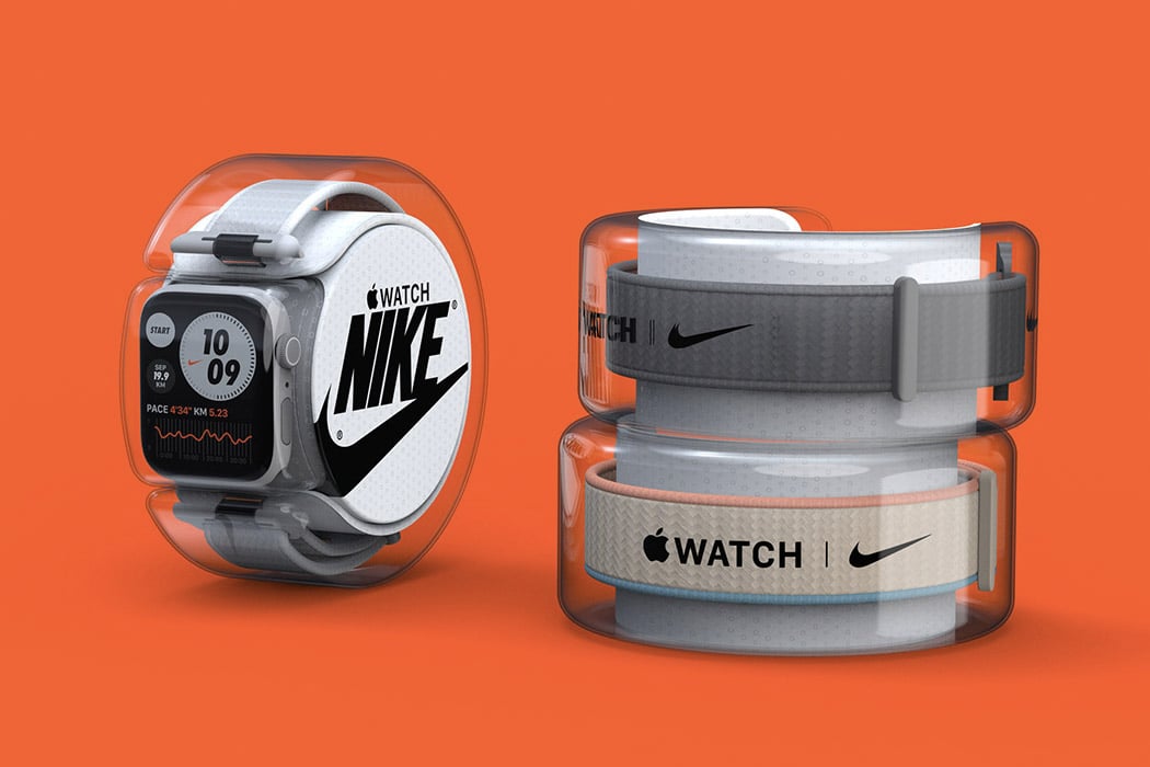
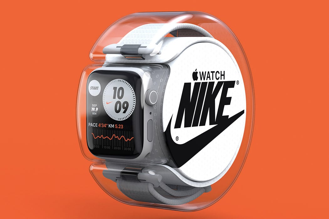
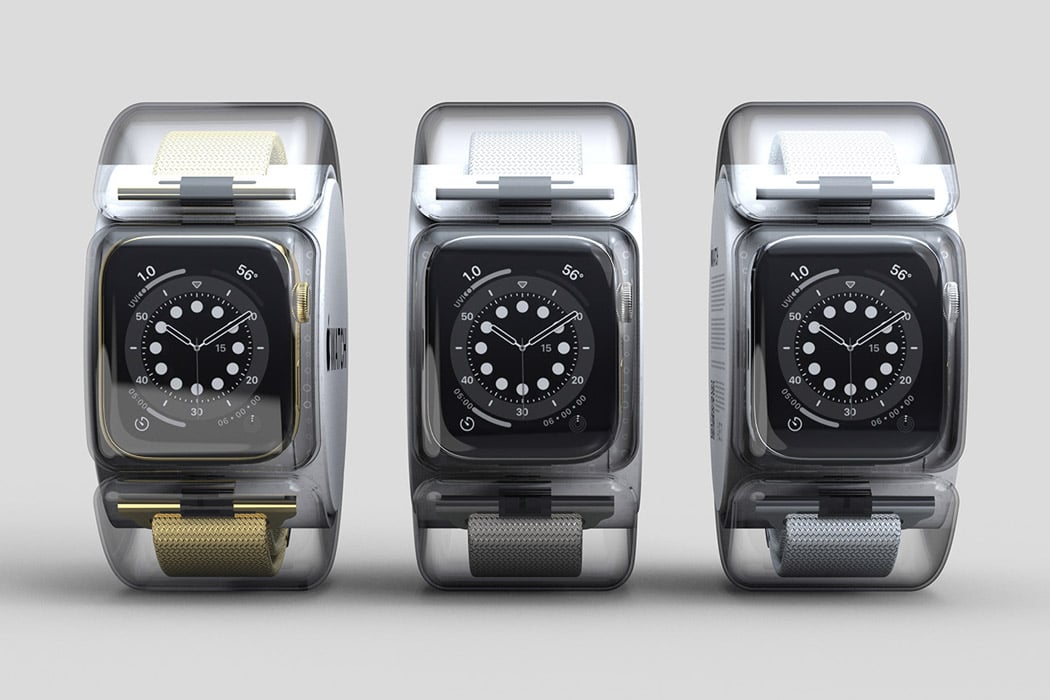
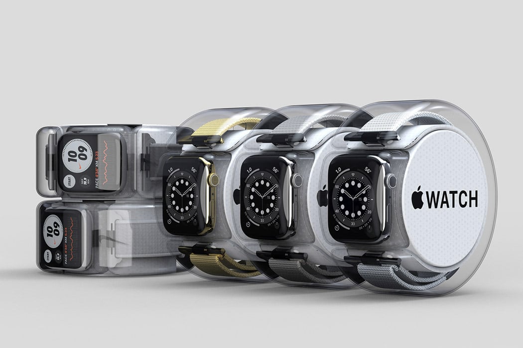
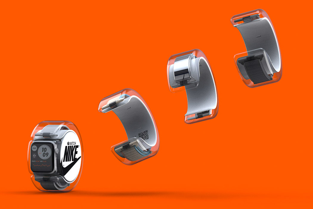
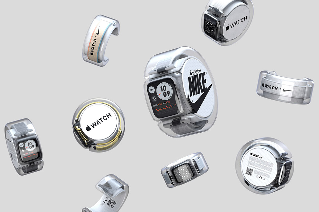
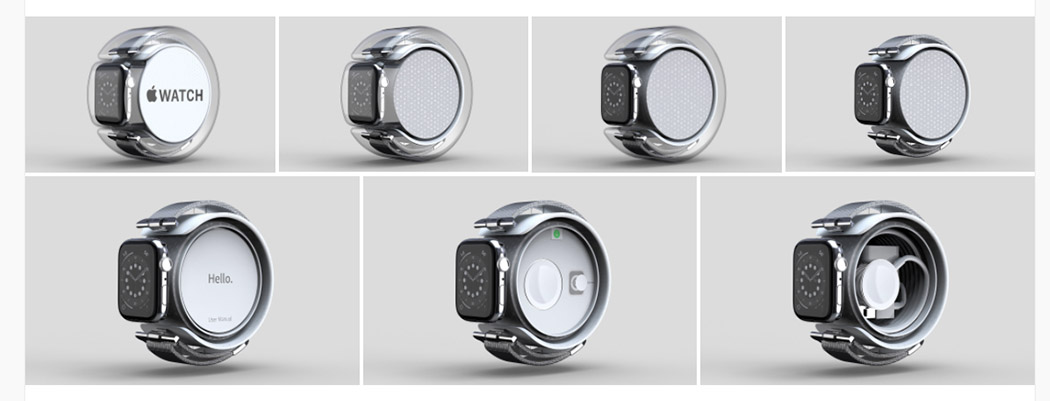
A lot of designers are coming up with cool packaging designs for various products, but this packaging concept by Nolan Nisbet for the Apple Watch is particularly intriguing! Inspired by the packaging design for the iPod, Nisbet adopted a clear and transparent package for the Apple Watch as well. The transparent packaging comes in two parts, one protects the screen of the watch, whereas the other part forms a protective layer around the strap. But here’s where it becomes interesting, the packaging of the strap has been designed in such a way, that you can slide it on and off! This allows you to try on straps of different styles, letting you mix and match, till you settle on a combination that you like. You can try on the various packaged straps on your hand, so you can see how they would actually look on you! The clear protective layer ensures that no one actually ends up touching the straps, and they are in pristine condition, preventing them from getting dirty or contaminated before they are even sold (especially useful in these COVID-19 times).
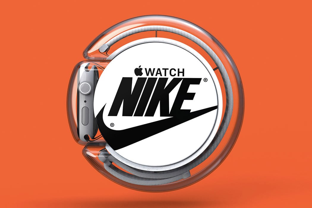
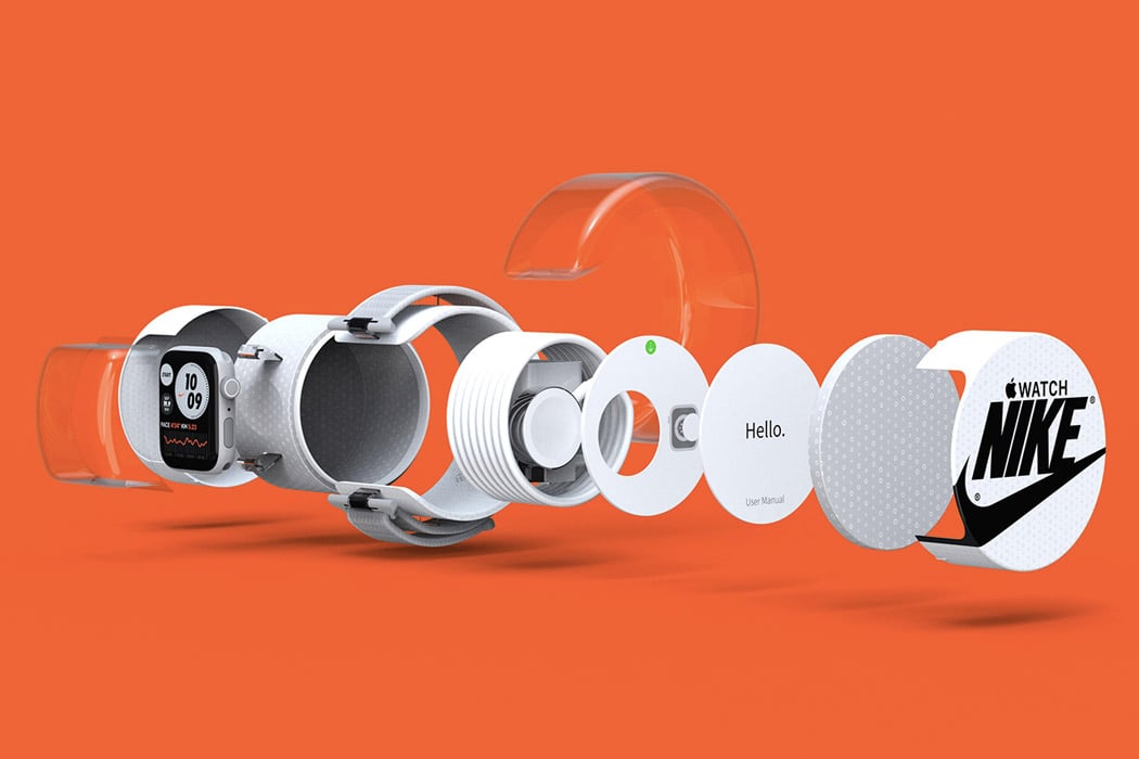
When it comes to the straps, Nisbet has branded them with Nike! He’s presented an innovative idea, wherein Apple and Nike collaborate to create some pretty cool straps for the watch. The different straps come in diverse colors and patterns combined with Nike’s sporty and funky design philosophy. In fact, even the packaging has been integrated with Nike’s branding. The center of the package showcases Apple and Nike’s logos. And, this center portion has a little secret compartment! The user’s manual and the charger have been placed within the compartment. These two essential add ons have been compactly integrated within the packaging of the watch.
Nisbet’s packaging concept for the Apple Watch is not only innovative and unique but also extremely functional and convenient! He’s taken the buyer’s comfort into consideration as well, creating a packaging design that eases up and supports your buying process. This inventive packaging is the type you use even after you purchase the product, it’s not something you throw away in the bin, once you unravel the new product. Not to mention, the collaboration of Apple and Nike seems like a match made in heaven. This is one concept I would love to see in an actual Apple store someday!
Designer: Nolan Nisbet
via https://ift.tt/2nqSsIm
Post a Comment
Note: Only a member of this blog may post a comment.