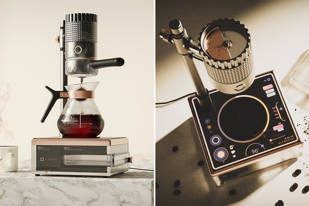
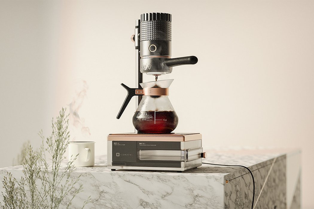
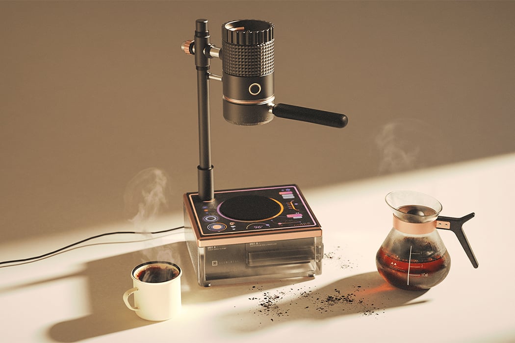
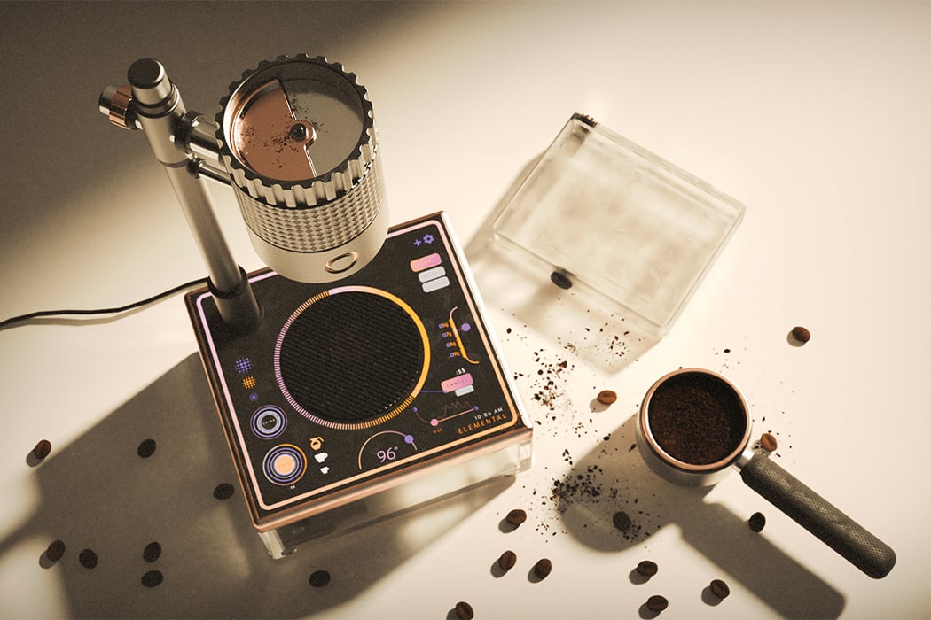
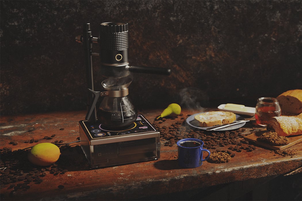
I love coffee, I love Apple and I love Star Trek, and thereby I love the Elemental coffee machine because it combines ‘elements’ from them all! The sleek machine has a silhouette of an espresso group-head with an intuitive modern touch interface. The clean form is a nod to how easy it is to use and a freshly brewed pot of coffee is still the center of attention here.
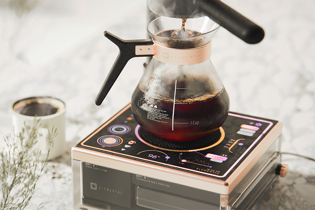
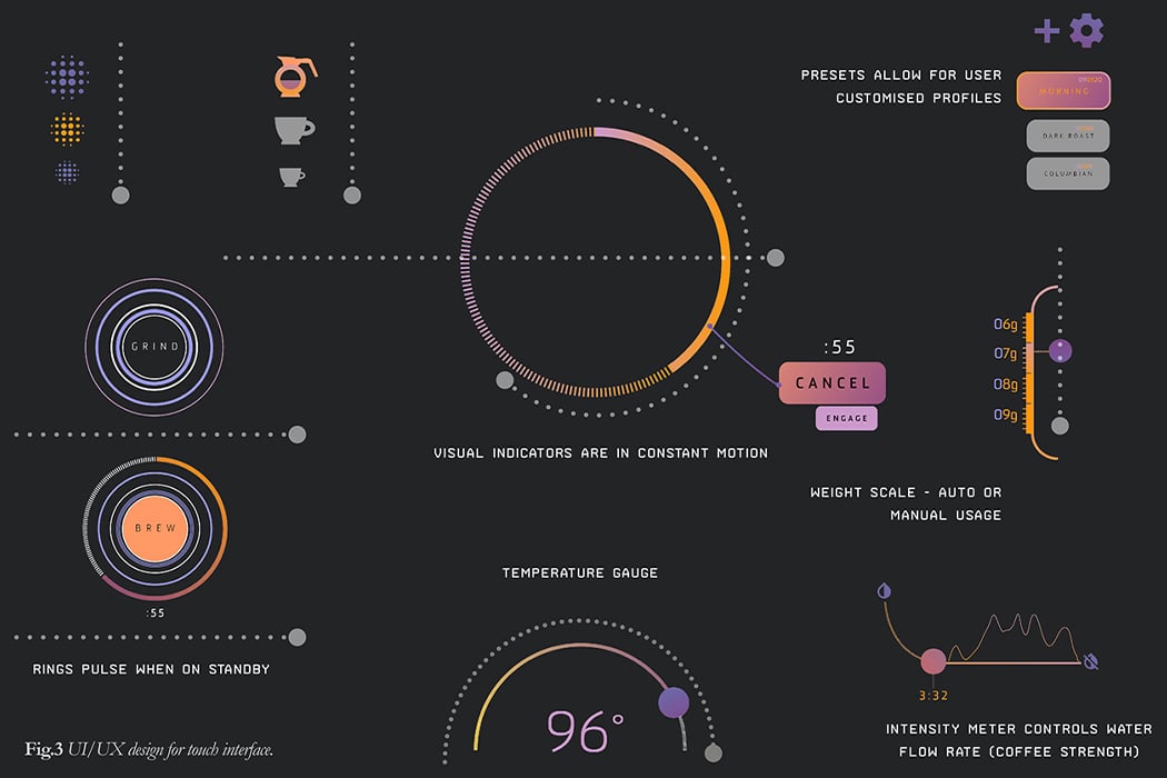
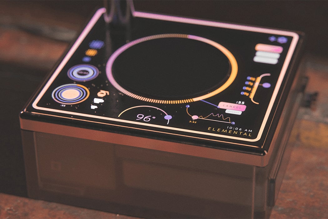
Torres takes a very stripped-back, modernist approach, with nothing hidden in terms of the machine’s function. You can see everything you need to make a good cup of coffee which adds clarity to the simple form. The interface is completely touch-based and therefore the UI had to be intuitive while still communicating movement as well as a sense of urgency. The UI is a homage to the ‘okudagrams’, an loving name given to the interactive and usually re-organizable displays found on control panels and computer interfaces in 23rd and 24th-century starships. It started with Star Trek and then spread to every sci-fi thing ever. The idea of integrating it here was to alleviate the comparatively long time it takes for filter coffee to brew, it almost gives the illusion that more is happening than there actually is.”I wanted to avoid the basic – almost traditional at this point – style of touch UI so I went with more of a sci-fi theme inspired by TNG LCARS, but actually, you know – usable,” says Torres.
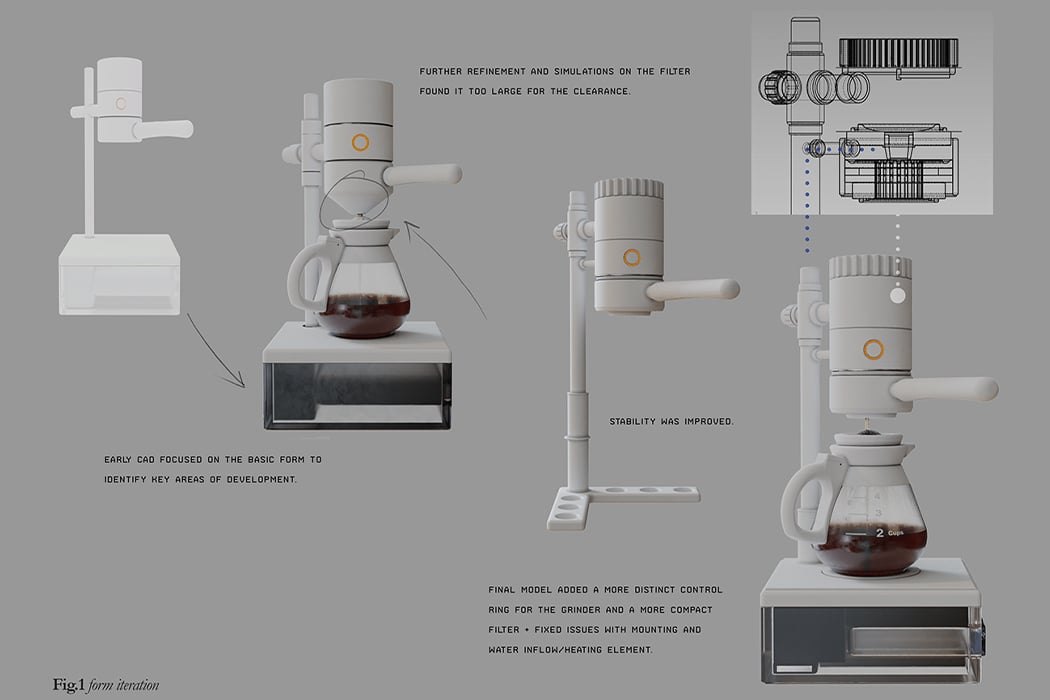
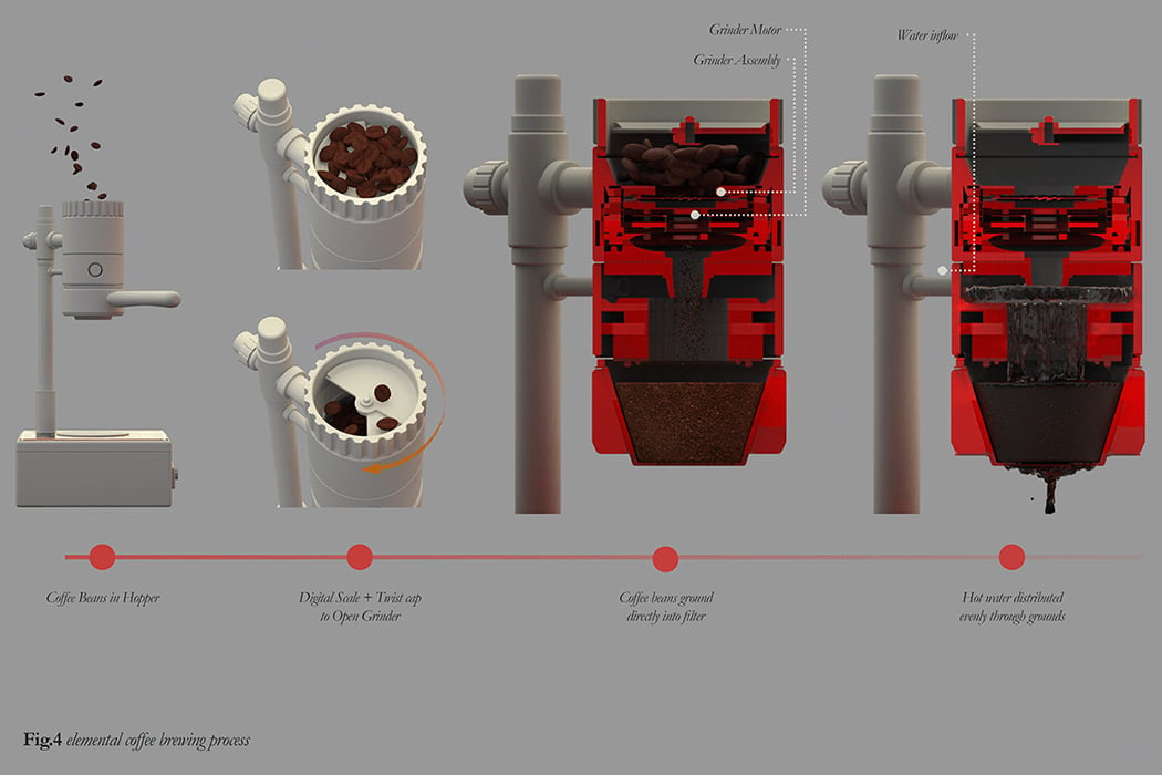
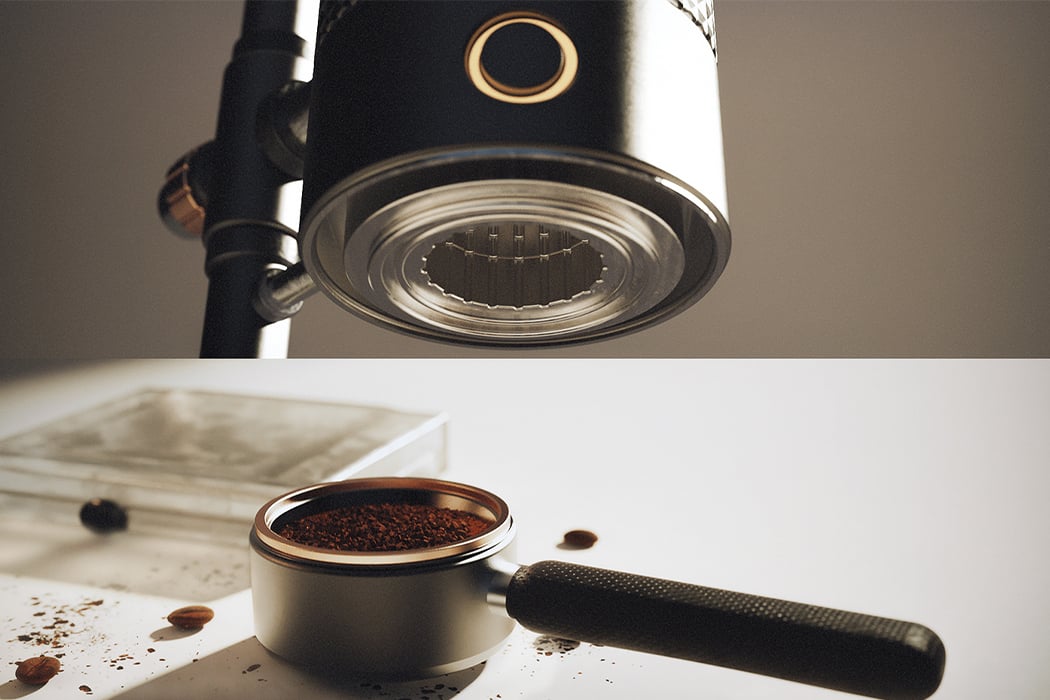
The conceptual coffee maker also incorporates a digital scale to the hopper lid and a simple twist will push the beans into the grinder. The latch would also have a switch to activate the grinder and the cover has to be shut in order to complete the circuit. There is a sneaky little MacPro reference in the internal compartments because it looked much neater than bare PCBs and offered more protection from any potential leaks. The intricate grooves on the dripper were an attempt to avoid having a sprinkler in order to distribute the water evenly to the coffee grounds. The heating element is also woven into this section to prevent hot water from needing to be pumped up the exposed pipe and potentially causing a safety hazard.
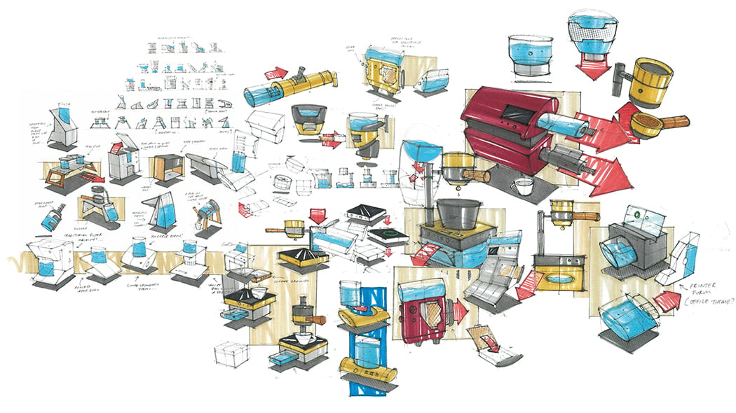
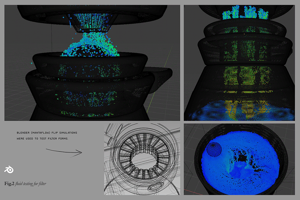
“There was limited capacity for physical prototyping, so CAD + simulation software was used to quickly iterate and solve problems with the design. Surprisingly, this actually worked fairly well, at least in this case. Blender mantaflow simulations were used on the CAD models were used to help drive the water channels and filter arrangement,” explained Torres. Now, all I can think of is getting a good cup of coffee and watching sci-fi movies.
Designer: Leo Torres

via https://ift.tt/2nqSsIm
Post a Comment
Note: Only a member of this blog may post a comment.