Apple’s WWDC21 is just around the corner! The air is buzzing with excitement, as we eagerly await to hear what Apple may announce. As we find ourselves biting our nails, and squirming in anticipation of what Apple has in store for us, let’s take a moment to appreciate all the inspiration this groundbreaking tech giant has provided. Apple’s ingenious and mesmerizing designs and design philosophy have inspired and influenced designers all over the world, resulting in some pretty unique Apple concepts! And, we’ve put together some of the very best. Enjoy these innovative Apple-inspired designs, as you count down the days to the WWDC!
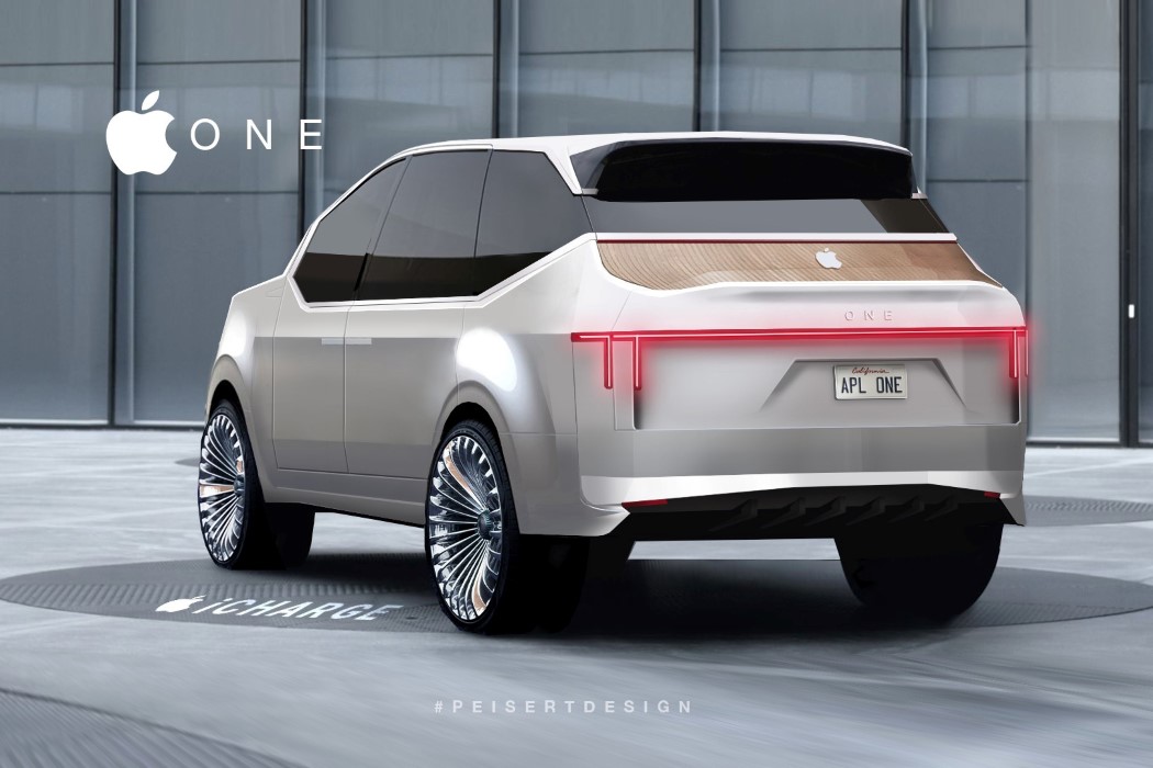
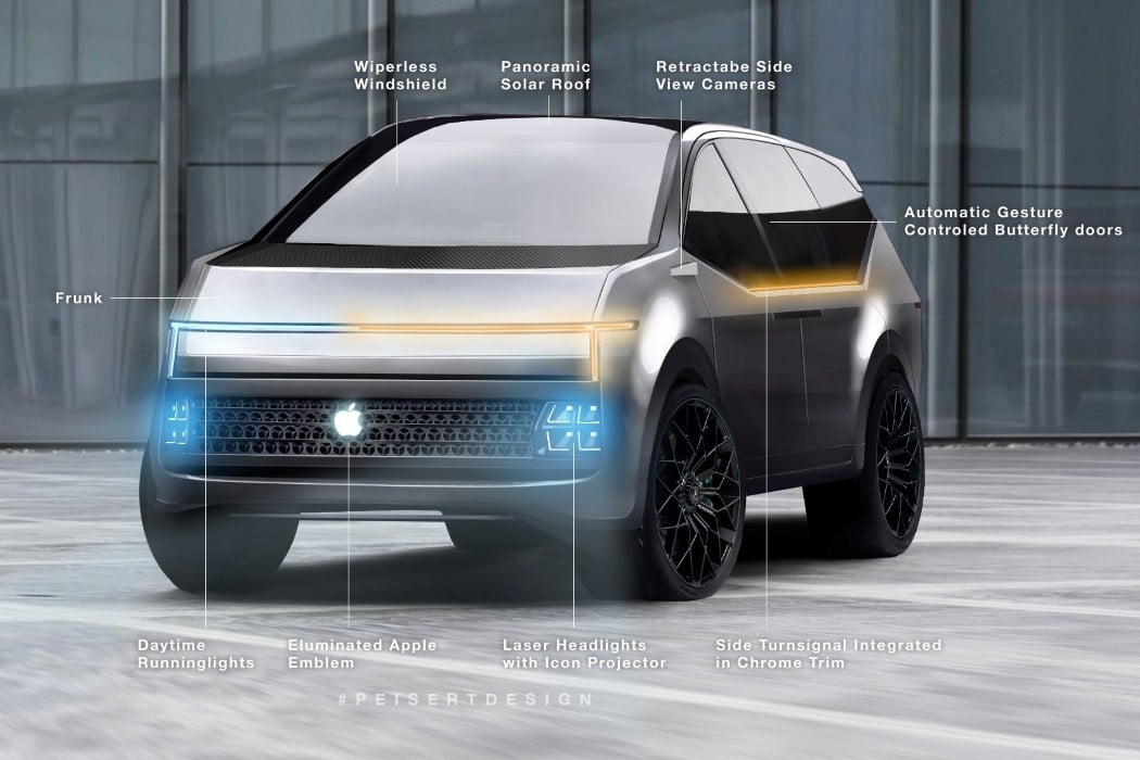
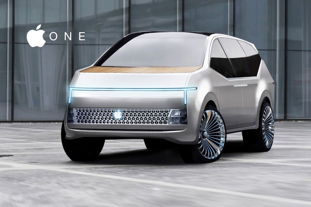
Peisert’s Concept One embodies all the good aspects of Apple (and a few unsavory ones) into a design that’s meant for the entire family. It’s a luxury car, but it isn’t a sedan. Instead, the Apple One is a one-for-all sort of SUV that accommodates 4 or more people pretty spaciously. Its proportions (and especially that headlight) feel slightly like a cross between the Tesla Cybertruck and the Rivian SUV. The design is mildly angular but doesn’t come with any edgy surfaces or straight lines. Instead, everything curves rather organically… a feature also seen in the continuous curves found on Apple products. Speaking of Apple products (and also of unsavory aspects), the Apple One sports that infamous cheesegrater grille on the front. One could argue that an electric SUV wouldn’t need a grille, but Peisert probably took a creative call with that one there.
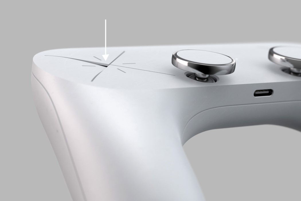
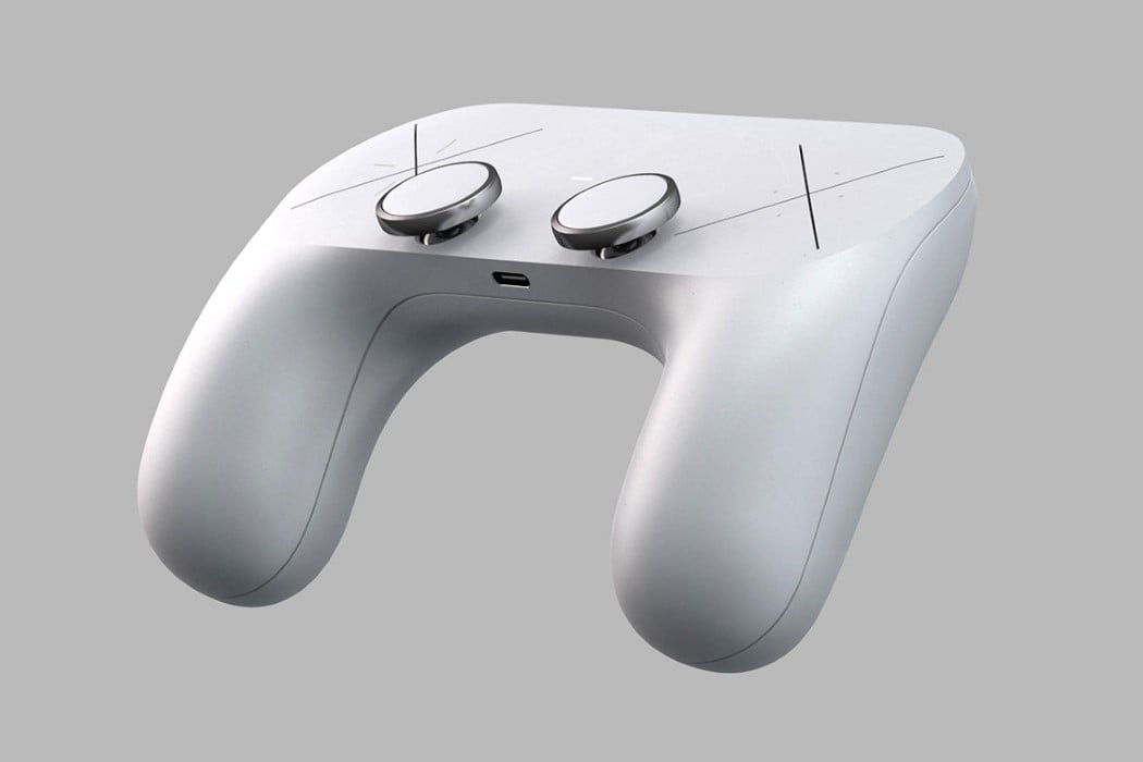
Sleek, with minimal details, and controls that are as baffling as the AppleTV Remote yet equally appealing. This may be Designer Hannes Geipel’s version of a Microsoft Surface Gaming Controller, but it definitely has a very strong Apple-esque vibe to it. The Surface Gaming Controller concept by Hannes Geipel boasts a brilliantly simple form. With absolutely no-frills, textures, accents, or color separation, the Surface Gaming Controller has a clean look to it that is a major contrast to Microsoft’s own Xbox controller. The Surface Gaming Controller comes with a soft, satin finish, and sports two rather slick-looking joypads with a metallic ring around them. The joypads lie perfectly in reach of your thumb, while two large X signs sit where you’d expect the D-pad and the XYAB buttons.
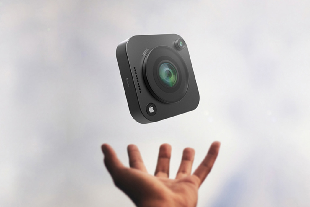
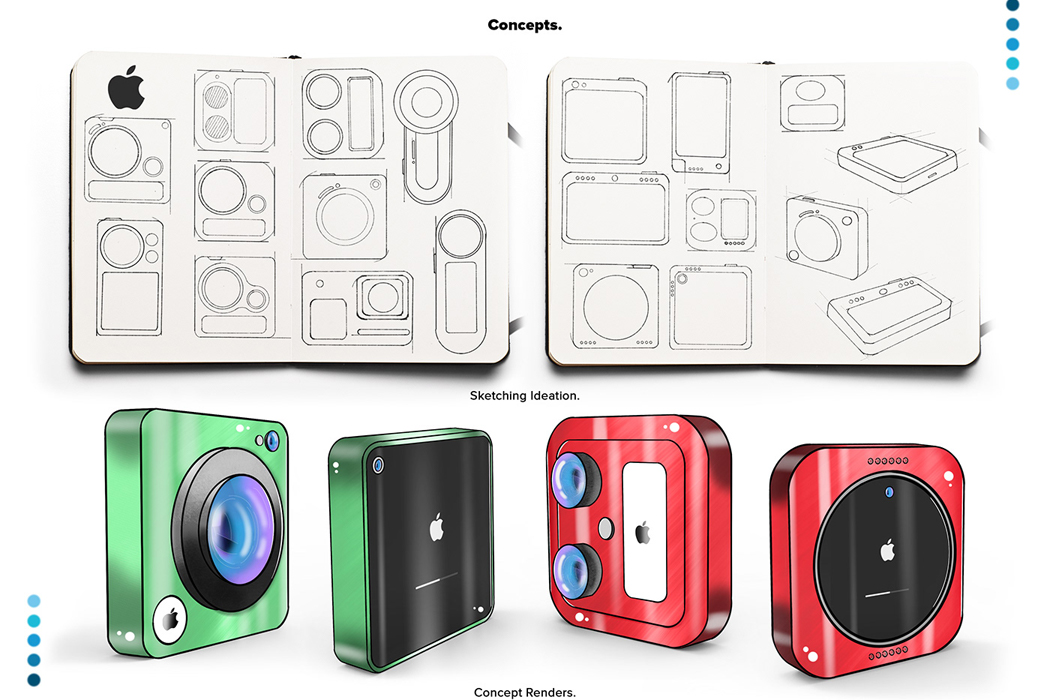
Inspired by living life on the edge and documenting travels along the way, the iCam Pro was conceptualized using top-grade technology fit for the adventure seeker who isn’t about to be held back by limiting camera setbacks. Equipped with Apple’s A12Z Bionic Chip, the concept of iCam Pro boasts lightning-fast feedback and the same power efficiency we’ve all come to expect from Apple. In addition to its ultra-fast microchip, the iCam Pro comes outfitted with LiDAR sensors, an advancement in camera technology that fills out Apple’s camera to take videography to another level. LiDAR sensors essentially use remote sensing to examine the Earth’s surface, and all of its nooks and crannies to deliver photos that are as close to the real thing as you can get from phone cameras. In a similar vein, a 12 MP ultra-wide sensor expands the camera’s view to deliver fuller photos, while the iCam Pro’s 22 MP wide camera captures crystal clear colors for more realistic documentation.
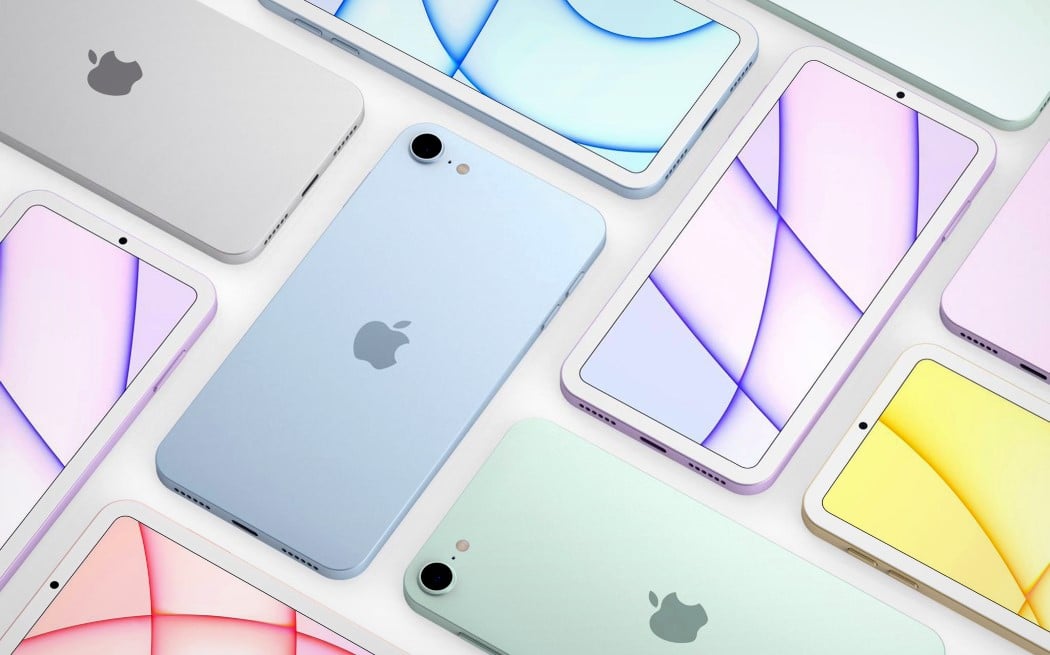
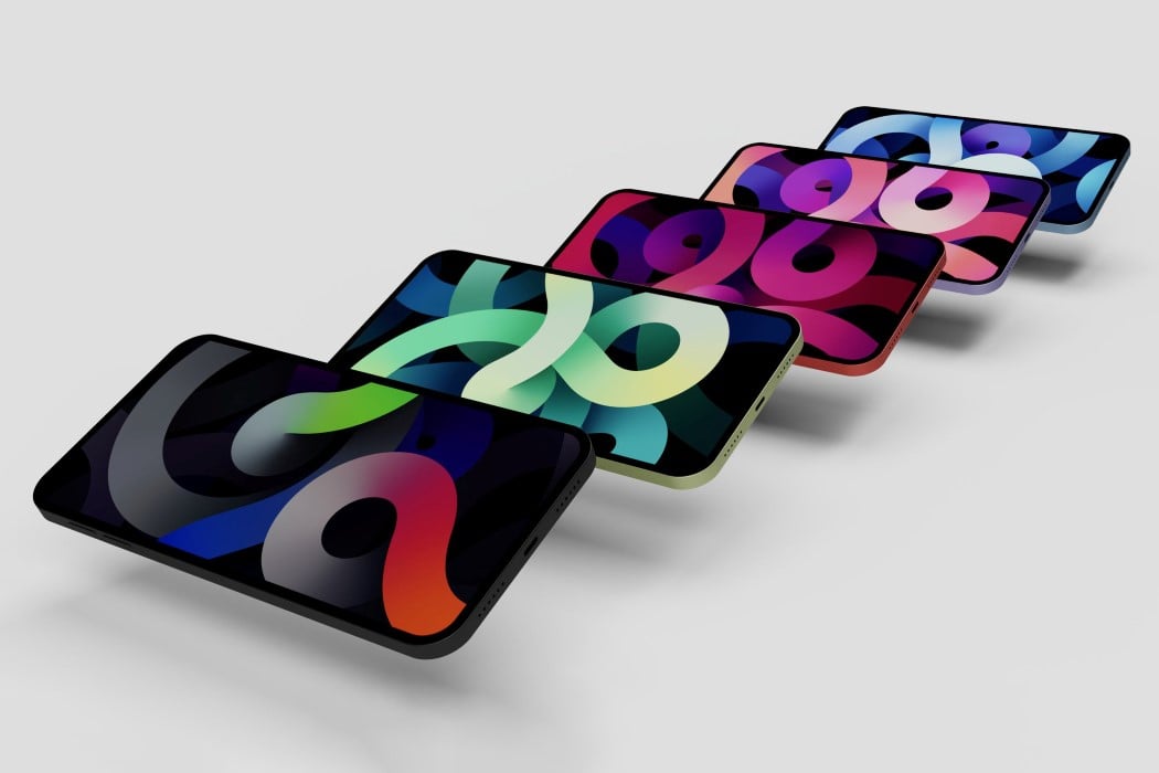
Apple announced that lossless audio was coming to Apple Music. With a new iPod, it’ll be like Apple going into the music-streaming war guns-a-blazing. Spotify’s slowly but surely dominated this space, and the new iPod could almost be Apple signaling that it’s taking the music domain pretty seriously. The iPod could drum up major interest the same way the Moto RAZR did – nostalgia is a powerful force. Moreover, the hardware would be no different from the iPhone 5 or the iPhone SE, given that the renders look pretty much exactly like those devices. Secondly, the new iPod has the ability to become Apple’s gateway device for a variety of iOS features (and probably even MagSafe, who knows). Kids could use it for listening to music, but could also potentially use the iMessage service on it. The iPod could leverage the power of Apple Arcade too, becoming a very affordable device that parents would buy for their kids in a heartbeat, tying them into the Apple ecosystem at an early age.
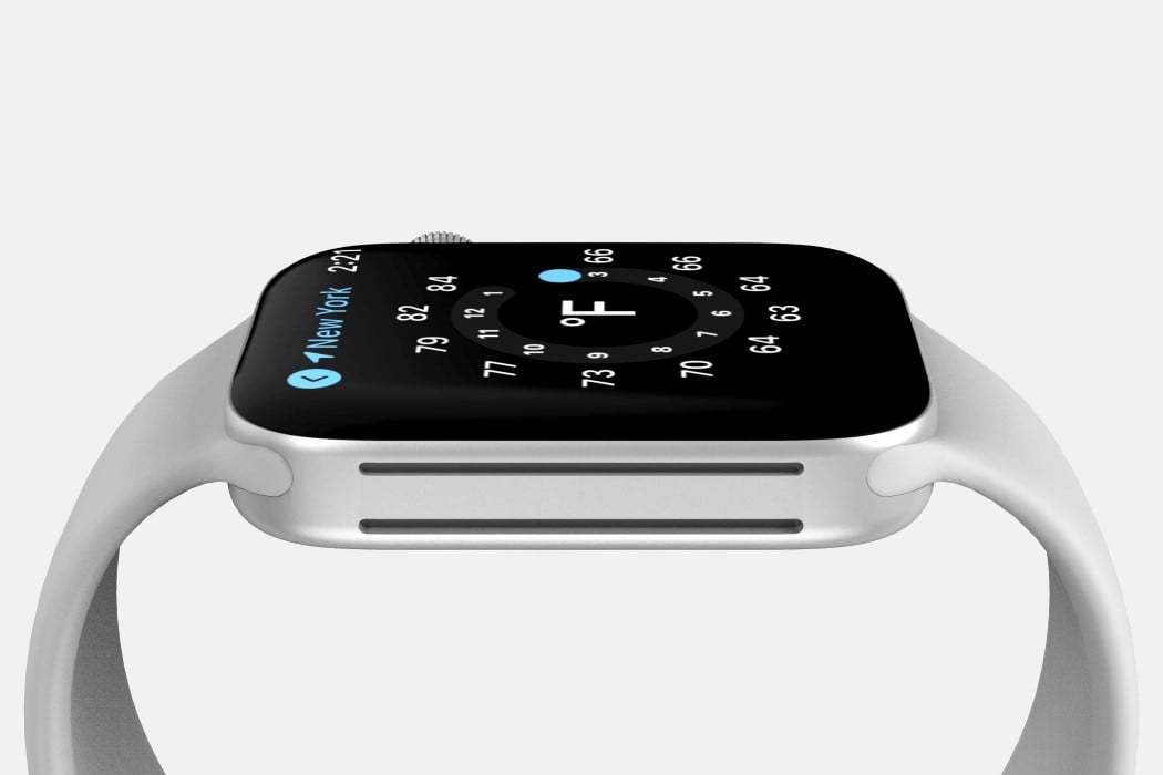
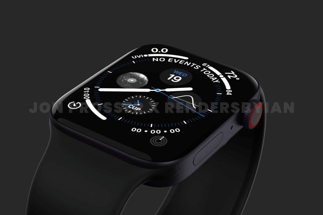
The rumor-mill of a new Apple Watch started back in 2020 when prominent Apple Analyst Ming-Chi Kuo hinted that a new design was in the works and could drop as soon as 2021. Now that we’re well into the year 2021, Prosser’s collaborated with Ian Zelbo to bring rumors and leaks to life in the form of pretty life-like renders. The renders are based on real images and CAD file screenshots supplied to Prosser by his network of sources. In order to protect the sources yet still share the designs with everyone, Prosser and Ian created these renders to show us exactly what they saw, and it seems like Apple is really beginning to streamline their design language. The ‘magical slab of glass’ analogy seemed to work really well for the iPad and its flat-edge design language finally carried onto the iPhone 12 last year and the iMac this year. According to the renders, the Apple Watch is getting a similar design upgrade with flat sides as opposed to the rounded ones, giving its screen a larger-than-life presence with minimal bezel interference.
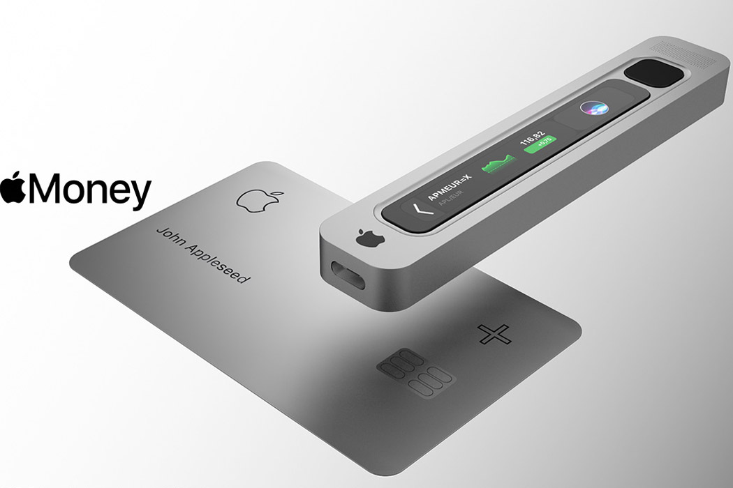
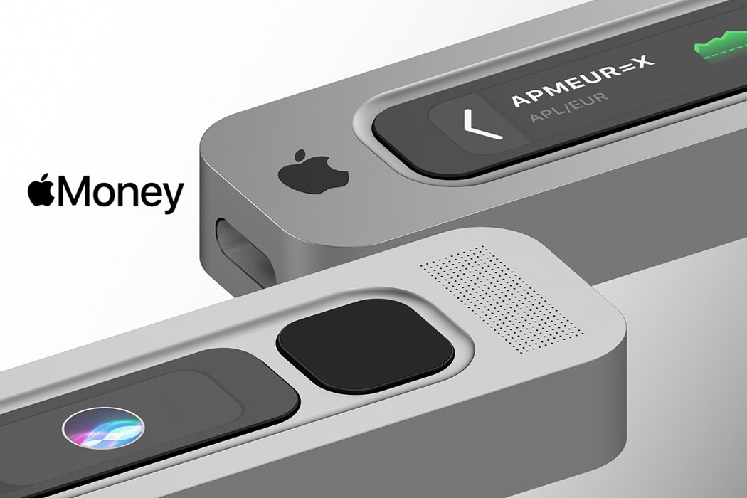
Creative director Antonio De Rosa gives our imagination wings with his ideation for Apple Money, the currency, and the electronic wallet that’ll make it all possible. The designer believes Apple Money will be available on the Apple Card+, scanned via the sleek gadget made out of aluminum, carrying the company’s signature design language. It’ll be connected to the Apple devices to create a mining ecosystem, one which is found in a decentralized family ecosystem. The device will be powered by the Apple Security Chip S2, capable of managing 27 assets and ERC20 tokens. Connected and approved devices will mine the digital money via a seamless app, keeping everything in the Apple ecosystem.
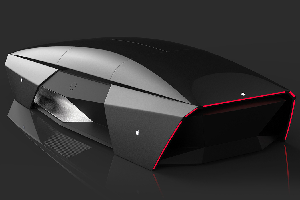
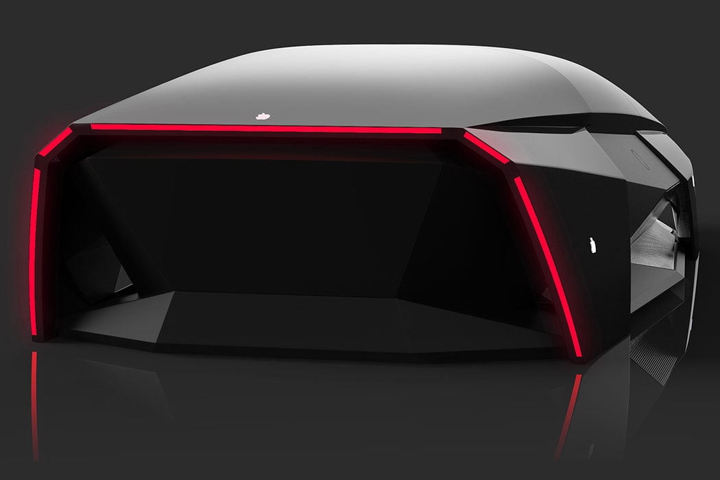
According to some sources, the Apple Car will not have any driver’s seat or even driving controls which could be a bummer for motorheads who love the feel of controlling their machine. What the Apple Car will look like is anybody’s guess but to give a close idea of what it may be like, Ali Cam’s Apple Car 2076 is a good reference point to take home some inspiration. Adopting Apple’s sharp design aesthetics, the car looks like a mouse shaped like a car at first glance, but then you realize it’s actually a minimal car concept. Loaded with advanced driving systems Ali envisions the blueprint far in the distant future – the year 2076 to be precise. The choice of year apparently is the 100the anniversary of Apple ever since it was founded by Steve Jobs, Steve Wozniak, and Ronald Wayne.
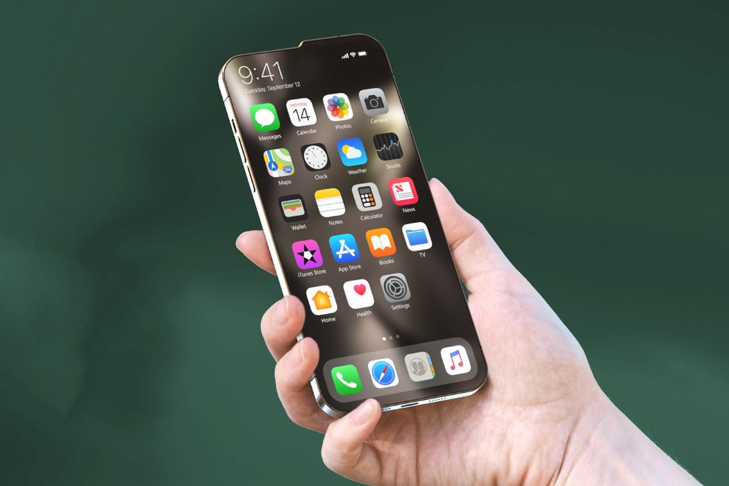
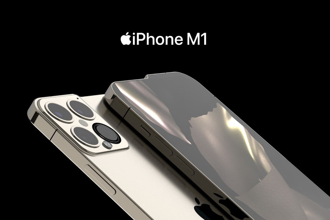
No matter how you cut it, the iPhone 13 looks unique – from the front, the back, and even the sides. The bump serves a practical purpose too. For once, the modern iPhone doesn’t have a notch. The iPhone 13 comes with a complete screen, as all the cameras and sensors that enable FaceID to sit on top, within that tiny 3-4 millimeter bump. Looking beyond it, however, the phone comes with speakers on the top as well as the bottom. The camera bump shifts slightly upward too, ensuring it’s perfectly aligned with the raised edge, thanks to the bump. Lastly, the conceptual phone flexes its muscles with its greatest feature yet, the Apple-made M1 chip.
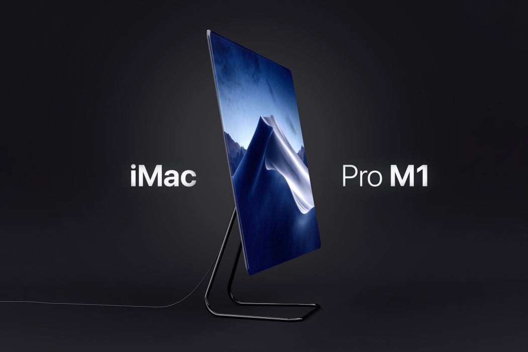
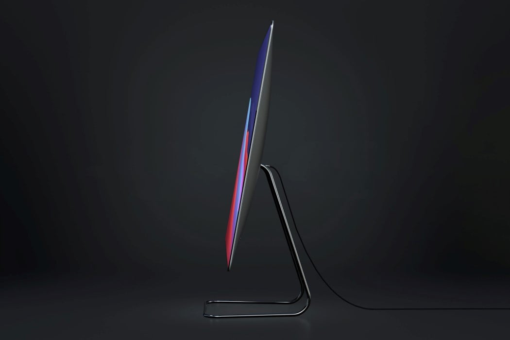
Instead of opting for a radical overhaul, Arlaud’s iMac Pro M1 concept takes the classic iMac Pro design and gives it minor yet significant visual upgrades. The conceptual all-in-one computer sports the crowd-favorite wedge-shaped profile with that slightly bulbed back. However, it absolutely gets rid of the bezels and chin on the front, sporting a gloriously infinite edge-to-edge display that’s an absolute pleasure to look at. Sure, the M1 may be the highlight of this computer, but that screen is the icing on the cake. If the M1 works behind the scenes to give you a great computing experience, that 100% screen on the front amplifies it, surrounding the user in Apple’s incredible, unmatchable UX.
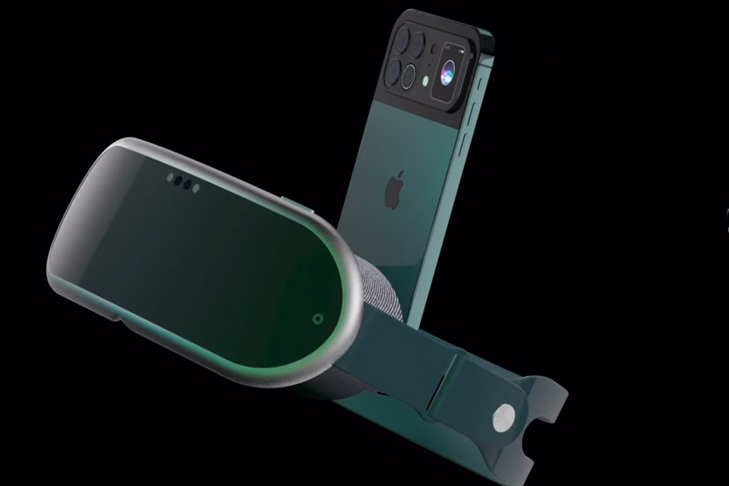
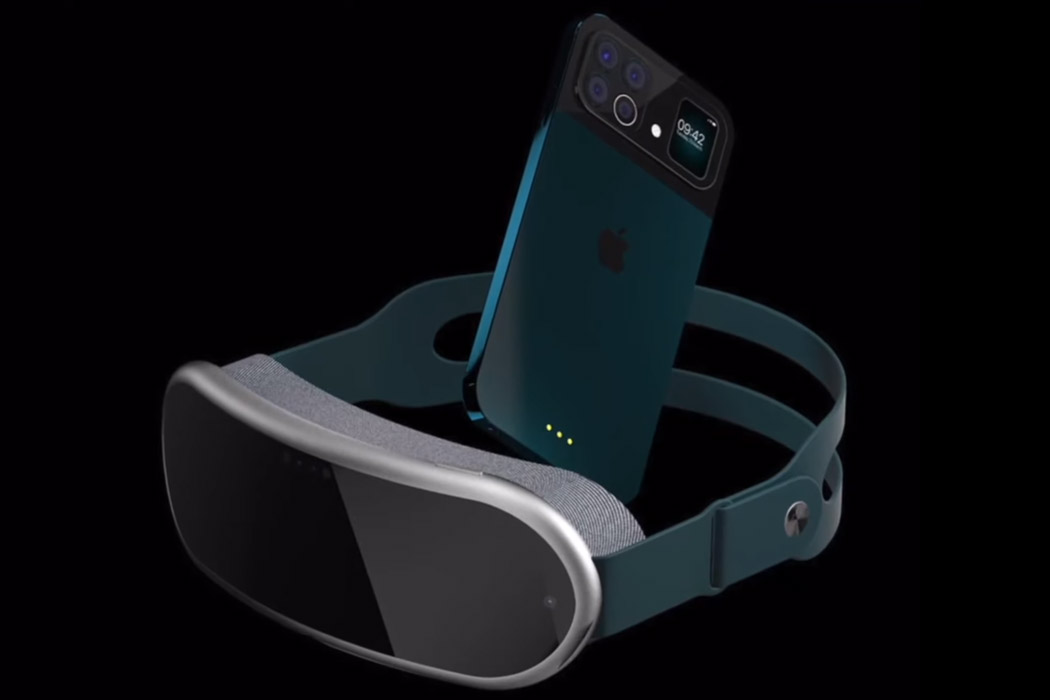
While iPhone 13 and the Apple VR headset cannot be launched in the same given timeframe – still it doesn’t deter imaginative designers from mustering up how the two products will look together. ConceptsiPhone has created a render of the two upcoming devices by Apple and mashed them together in a video dubbed iPhone 13 VR for creative writer’s delight. The VR headset is open to any imagination possible, and the folks over at ConceptsiPhone have taken that opportunity to show the world how the mixed reality headset will be like. It looks plush (after all it’s Apple) and is in sync with the design principles Apple has put in place for the headset – comfort and lightweight aesthetics. The strap looks reassuring as far as ergonomics go while the padding around the viewable area ensures utmost comfort.
via https://ift.tt/2nqSsIm
Post a Comment
Note: Only a member of this blog may post a comment.