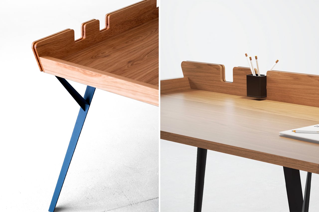
A beautiful piece of furniture can complete a room. It can be the final piece that makes a space come full circle, building a comfortable and cohesive haven, rather than a random area. Furniture pieces make or break a home, they add on to the essence or soul of a home, hence one needs to be extremely picky while choosing a furniture design. The design should be a reflection of you, and what you want your home to be. When you place a piece of furniture in a room, it should instantly integrate with the space, creating a wholesome and organic environment. We’ve curated a collection of minimal furniture designs that we believe will do this! Each of these pieces is unique, well-crafted, and made with a whole lot of love, and the love really shines through in the fine detailing and workmanship. We hope you feel the love too!
1. The Diag Desk
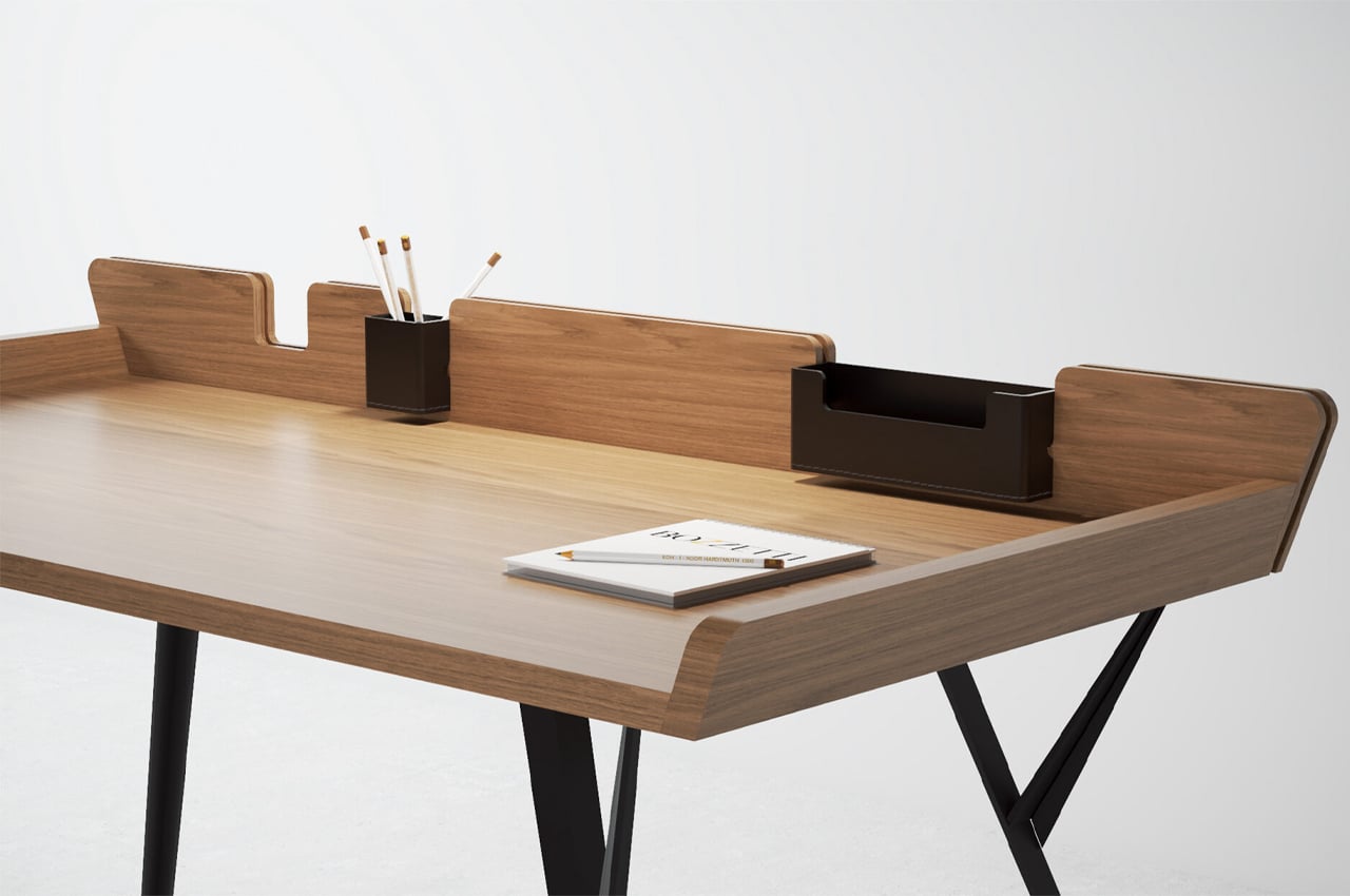
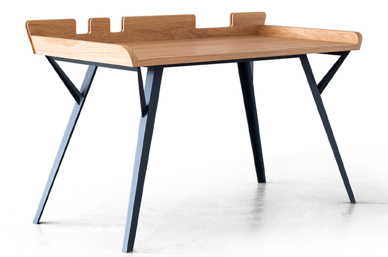
The Diag Desk is a minimalist, modern desk built to optimize desk space while incorporating storage elements like removable leather compartments. When it comes to desks, the simpler the better. Desks that are rooted in simplicity, either through a minimalist approach or by embracing Scandinavian aesthetics, typically offer a lot of practicality while maintaining a stripped-down design.
Why is it noteworthy?
Considering its minimalist build, more space can be devoted to the desk’s tabletop, where most of the desk’s purpose is reserved. The Diag Desk from Polish designer Marek Błażucki is one kind of minimalist design that integrates storage systems into its build, ensuring that users have ample desk space while still keeping their necessary stationery within arm’s reach.
What we like
- Integrates ample storage systems into its build
- Ensures stationery doesn’t fall off
What we dislike
- There are a lot of visually similar desks on the market
2. Acrobat
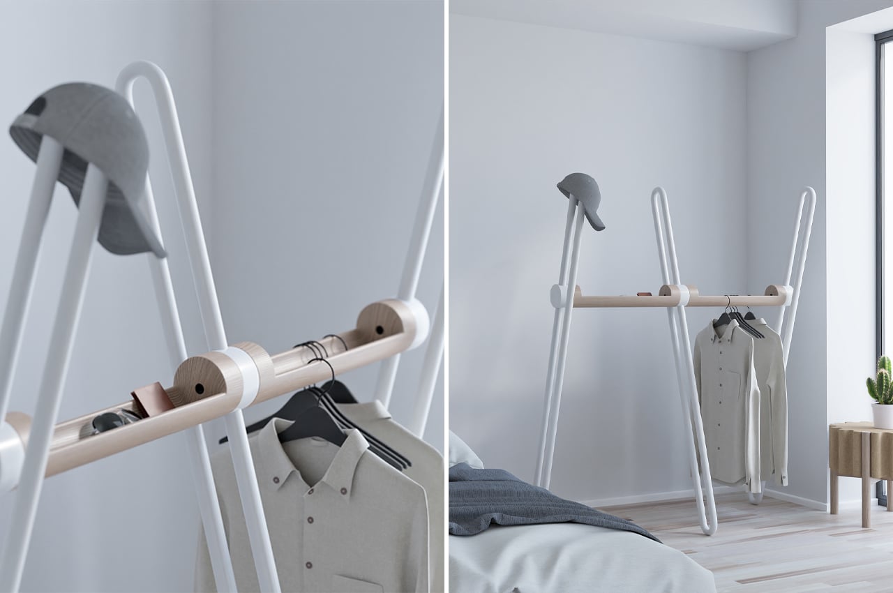
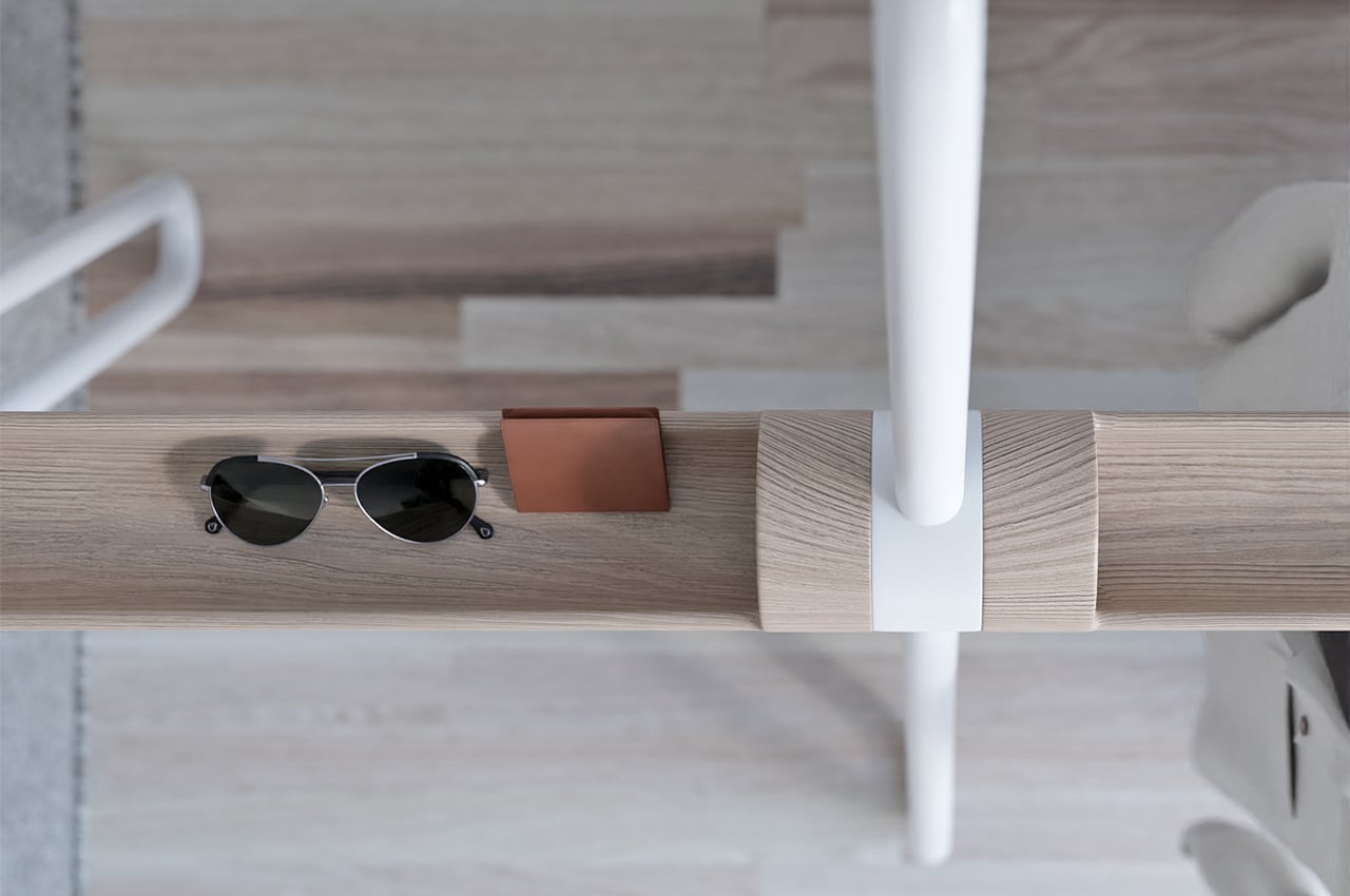
Acrobat is a multifunctional storage piece that combines the safekeeping components of an entryway table with the hanging function of a coatrack.
Why is it noteworthy?
As we continue to downsize our living spaces, the more multifunctional our furniture is, the better. Smaller spaces don’t necessarily have to mean less living space. Multifunctional furniture helps make more room for living while taking care of a lot of our household tasks. We usually have our own system of arranging EDC items like key rings, wallets, and phones. Entryway tables and coat racks usually take the brunt of those organizational needs, so finding multifunctionality in their design is key to keeping our homes decluttered. Acrobat, a multifunctional coat rack designed by João Teixeira, combines the storage components of an entryway table with those of a coat rack.
What we like
- The metal tube tops can also be used to hang clothes or hats without the need for a hanger
- The wooden hull that interlinks the beams offers a safe space to store EDC items like wallets, phones, and keyrings
What we dislike
- Can occupy a substantial amount of space
3. Midea’s Smart Bedside Table
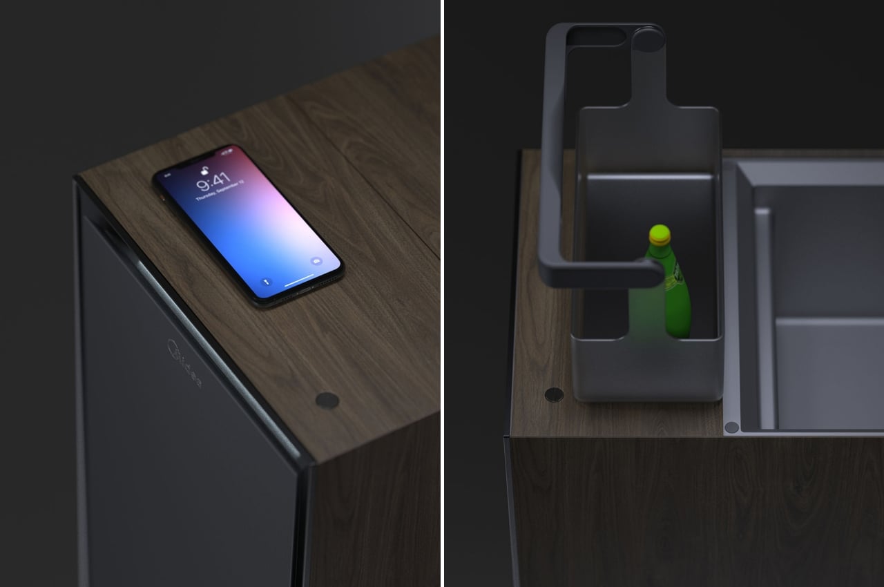
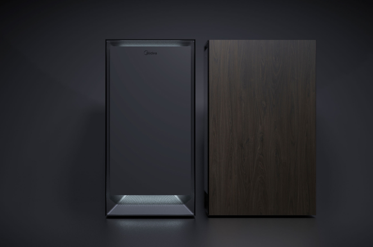
There is an attempt to put a mini-fridge in a position that doubles as a bedside table, but that’s mostly to conserve space, especially in hotels. Midea’s Smart Bedside Table admittedly doesn’t go that far, but it has thrown in everything else that it says is related to bedroom activities. Or at least the ones that will help you sleep more comfortably.
Why is it noteworthy?
The bedside table’s main functions are supposedly for air purification and humidification, something that’s not directly apparent when looking at the beautifully minimal piece of furniture. The “sub-functions,” however, are where things get a bit more out of hand. There’s a hidden wireless charging area on top of the table, but only near the front. The rear area of that surface actually flips open to reveal low-temperature storage with just enough room for a bottle or a few cans. The front area actually does open up to a UV sterilizing compartment for your gadgets or jewelry. There’s also a USB hub, aroma diffuser, and, thankfully, a bit of lighting.
What we like
- Quite an attractive design with its wooden body and clean design
- The front area op up to a UV sterilizing compartment for your gadgets or jewelry
What we dislike
No complaints!
4. Non Square
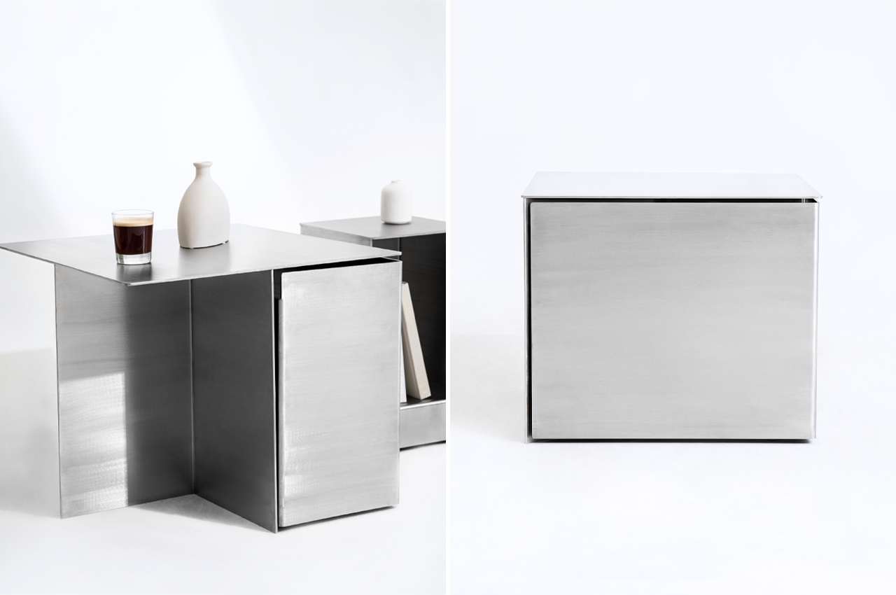
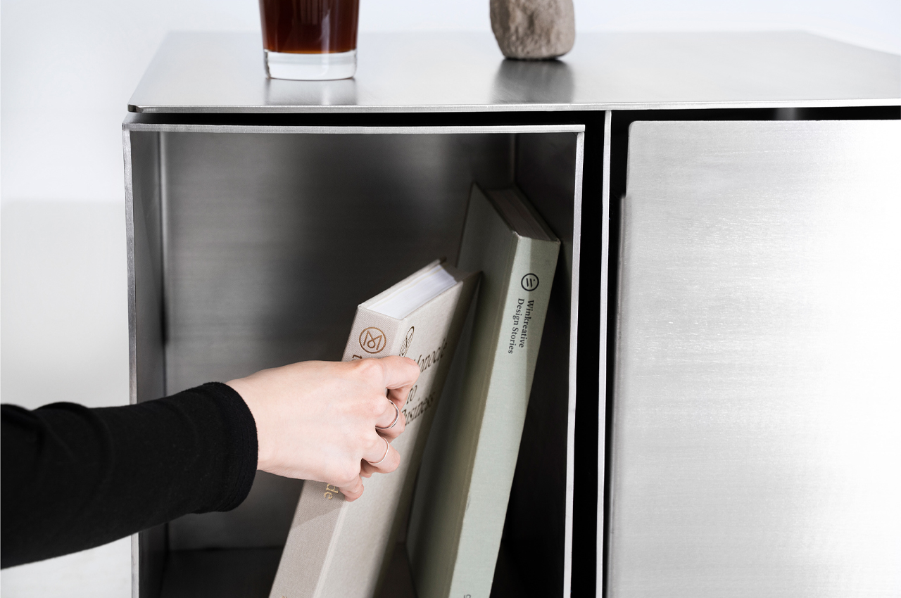
Introducing Non Square, the team of designers explains that, “It [pursues] the beauty of irregularity within, as opposed to regularity on the outside.” From the outside, Non Square sports a minimalist, stainless steel appearance that seems like a nondescript side table dressed as a cube. A closer look and Non Square’s larger purpose is revealed.
Why is it noteworthy?
Functionality typically stems from a product with a long shelf life and the ability to execute its primary purpose. Adding their design to the mix, Hyunjun Yu, Soojin Jung, Kyoungseo Park conceptualized Non Square, a furniture set that integrates side tables and stools within a stainless steel hexahedron structure.
What we like
- Hidden storage compartments
- Modular design
What we dislike
- The product’s bulky + metallic aesthetics may complement only certain living spaces
5. Faucet Light
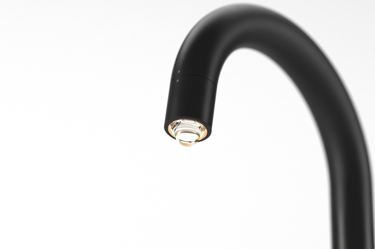
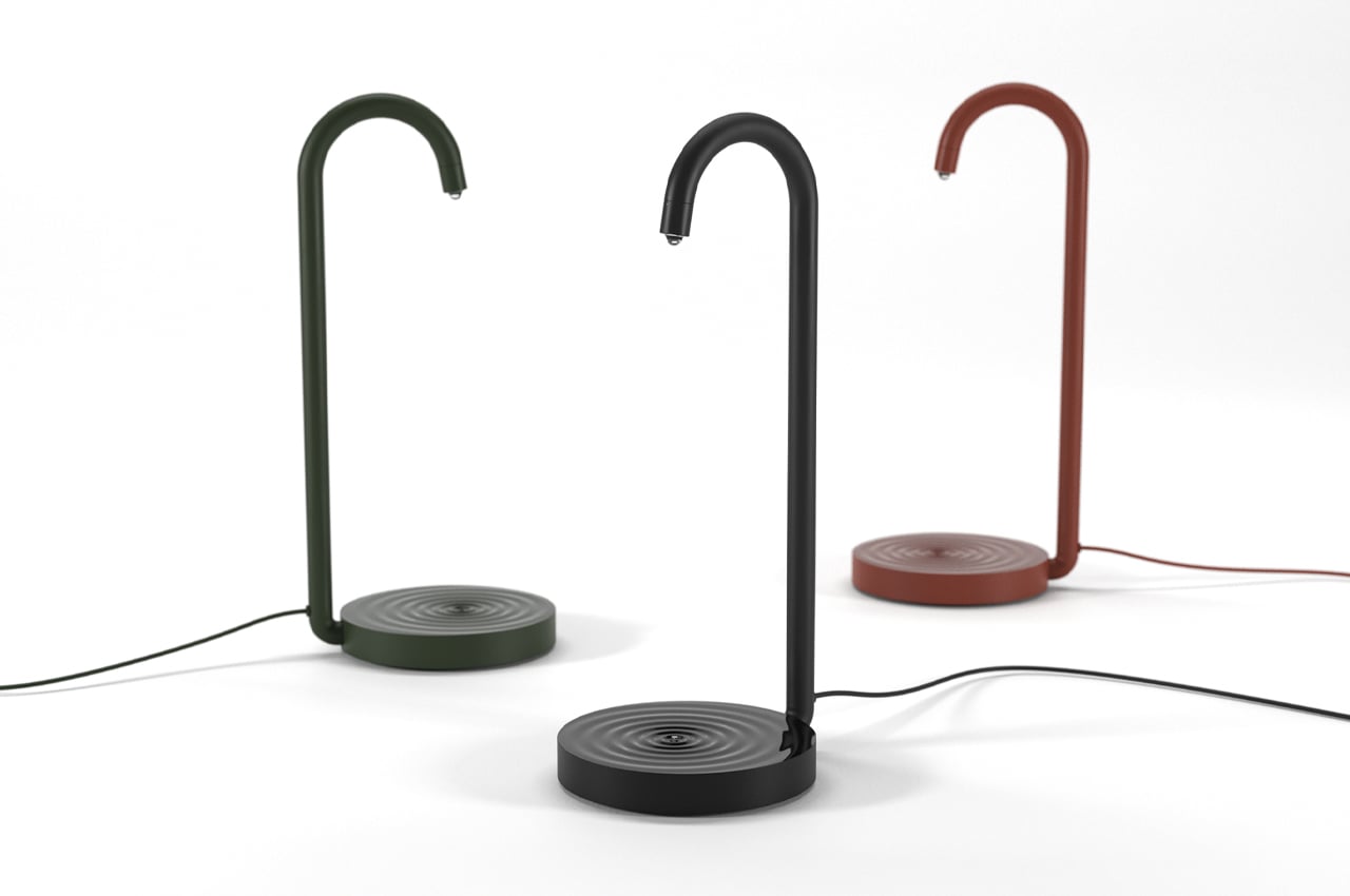
Faucet Light is a minimalist light fixture design that mimics the look of water droplets forming beneath a faucet’s spout.
Why is it noteworthy?
We’ve each suffered through the monotonous drip of a leaky faucet at some point. It’s like clockwork and we can’t do anything about it but stare and wait for the plumber. Industrial designer Jaewan Park must have found some inspiration during the waiting game as his new lamp design resembles a kitchen sink faucet and the bulbous water drop that forms beneath its spout. Aptly dubbed the Faucet Light, Park’s new light design finds practicality and an artful design through subtle details and joyful aesthetics.
What we like
- Features a glossy base to emulate the look of ripples on a still pool of water
- Faucet Light maintains a slim body to fit atop most tabletops, even crowded work desks
What we dislike
No complaints!
6. The Cloth Coffee Table
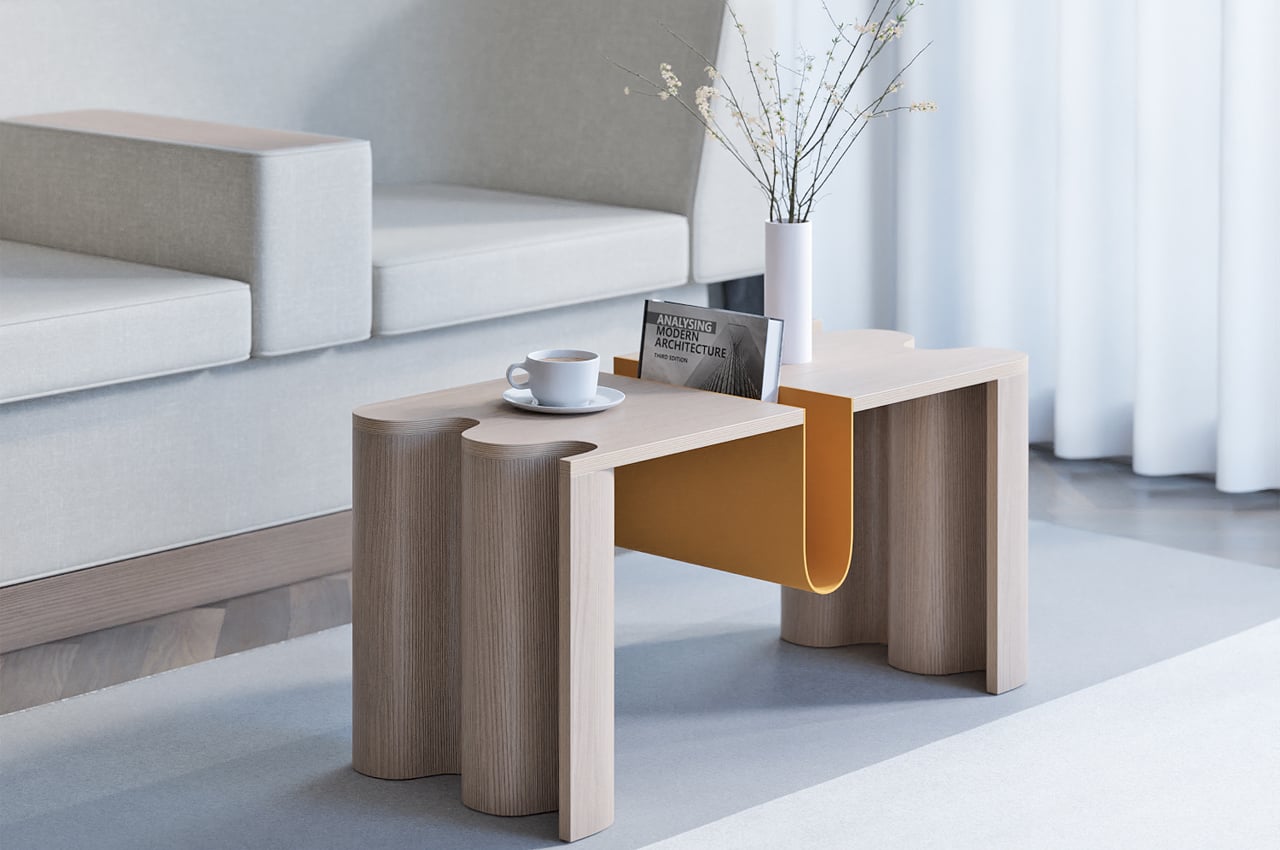
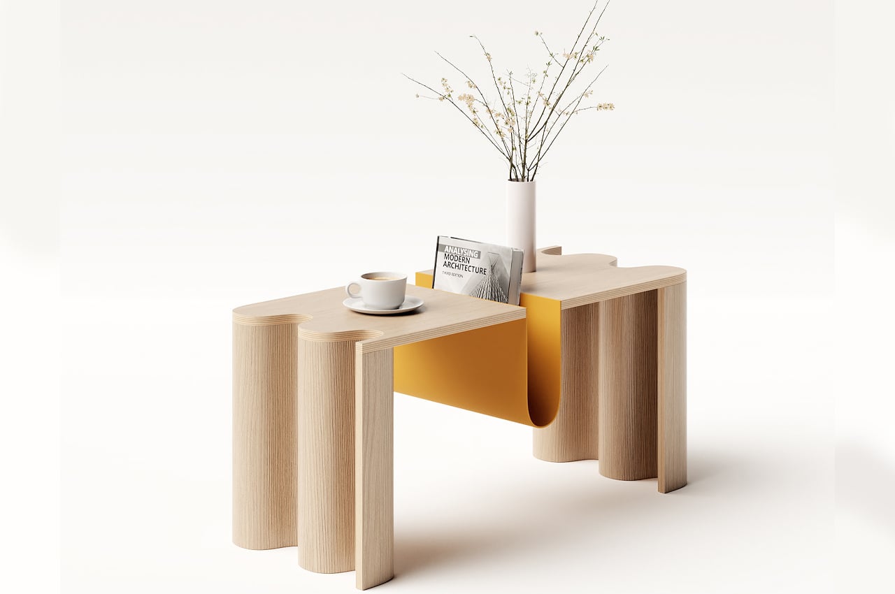
Characterized by its curved bookstand that works as the table’s centerpiece, the Cloth coffee table’s curvy personality is echoed throughout its build. The bookstand also finds a balance between boldness and elegance, offering a weighty centerpiece that helps ground the coffee table, without dominating the available tablespace. Featuring softly bold elements like an undulating table edge that mimics the look of a live edge, the Cloth coffee table keeps a dynamic profile without dominating the room.
Why is it noteworthy?
Doing minimalism before it was cool, Japanese and Scandinavian share a lot of common design principles, including a focus on warmth, groundedness, and a subdued color scheme for an overall calming effect. With aim of merging these principles together to design Cloth, Teixeira hoped to find a “balance between boldness and elegance, depending on the angle.”
What we like
- An artful blend of Japanese and Scandinavian design philosophies
- The curved bookstand is a distinguishing feature
What we dislike
- Weighty/bulky design
7. Hidden
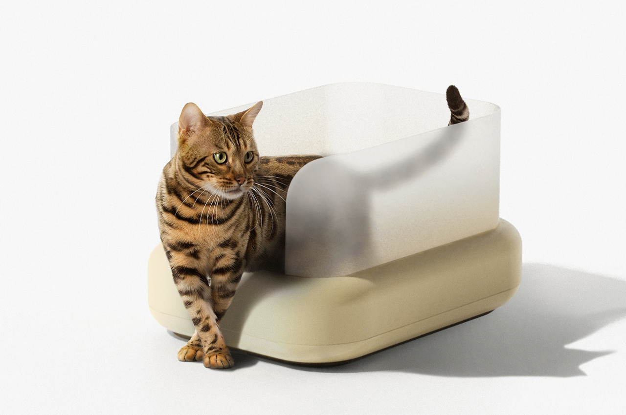
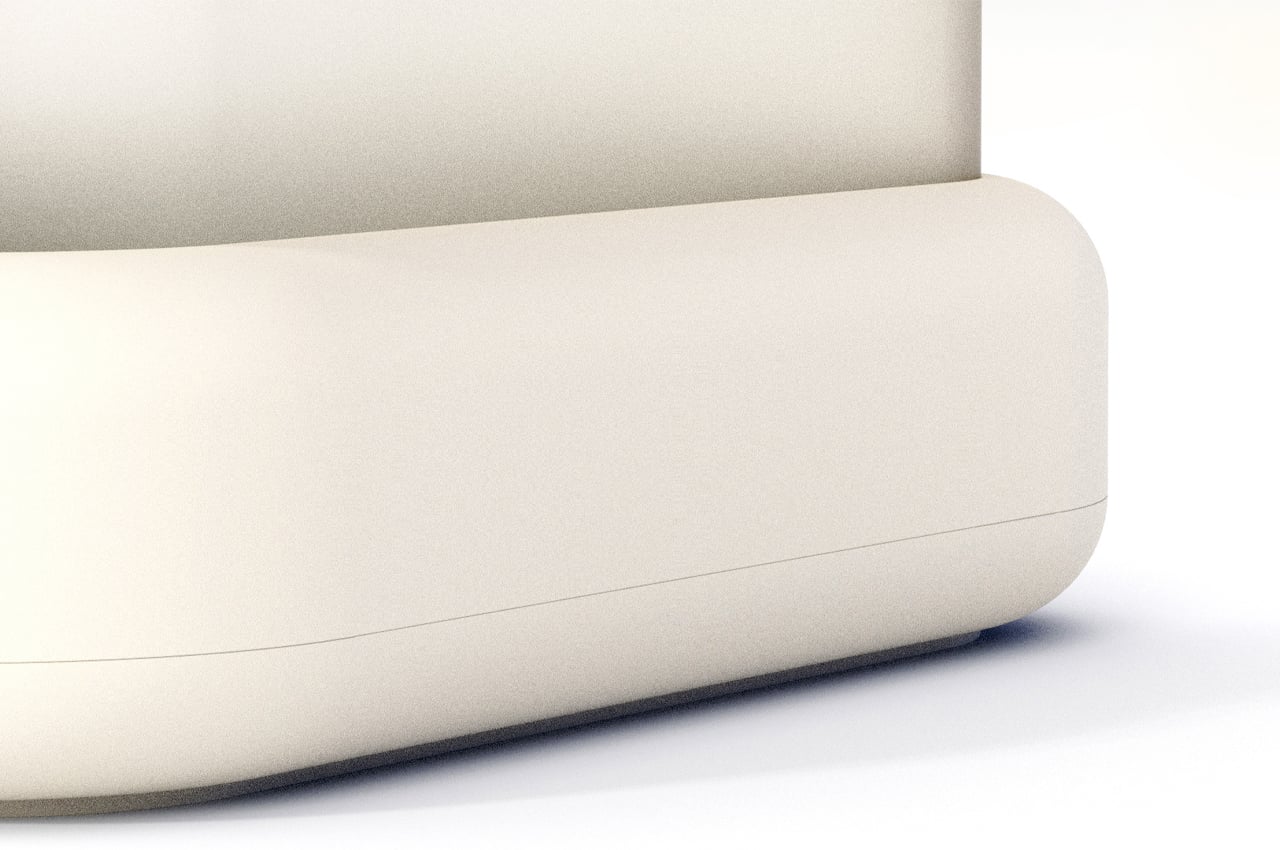
Hidden is an unconventional litter box conceptualized to be inconspicuous by design and fit into any modern home. The hardest part of owning a cat has to be taking care of the litter box. Cats mostly fend for and take care of themselves, but we’re in charge of the litter. Litter boxes aren’t designed for aesthetics, so cat owners usually have to find inconspicuous spots to keep the litter box out of sight and out of mind.
Why is it noteworthy?
It’s never a cute look to have a litter box in the bathroom or even the basement, but our cats gotta go when they gotta go. Designers with the studio YUPD took it upon themselves to conceptualize a litter box called Hidden that’s discreet by design, so it can be placed anywhere in the house.
What we like
- Discreet design
- Inspired by interior design elements
What we dislike
- It’s still a concept!
8. Storm Lamp
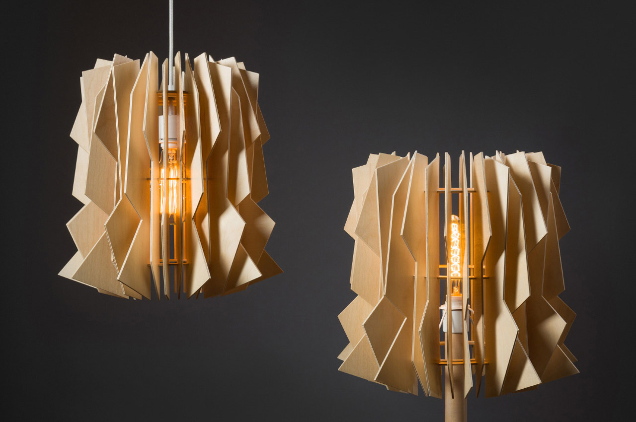
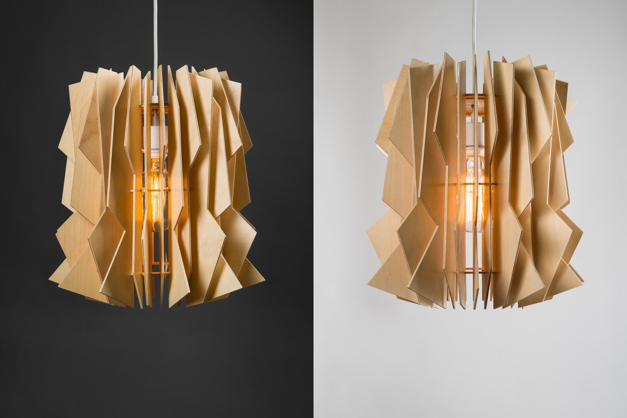
The beauty of the Storm Lamp by Julia Kononenko is that there isn’t any method to its mad design. The lamp comes with a variety of laser-cut wooden panels that can be arranged/oriented in any way you like because as its name suggests, the Storm Lamp is all about beauty in chaos. Looking almost like an abstract tornado, the lamp is entirely made from flat pieces of laser-cut plywood that are either left plain or painted black.
Why is it noteworthy?
When assembled together, they create a 3D form using the Gestalt visual law of continuity. Moreover, the jagged edges themselves illuminate to look like chaotic lightning strikes, reinforcing the product’s inspiration!
What we like
- The lamps are available in both hanging and floor formats
- The jagged edges themselves illuminate to look like chaotic lightning strikes
What we dislike
No complaints!
9. Solar
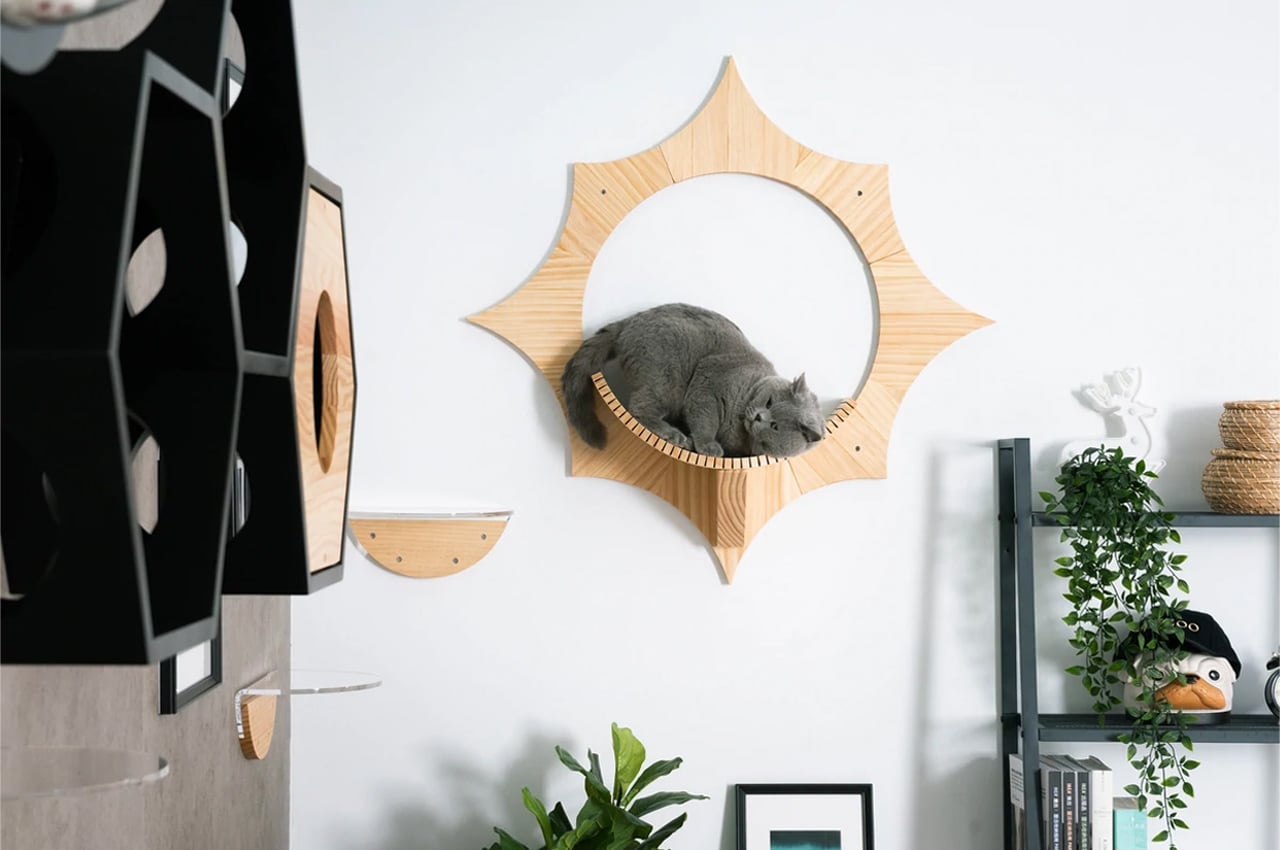
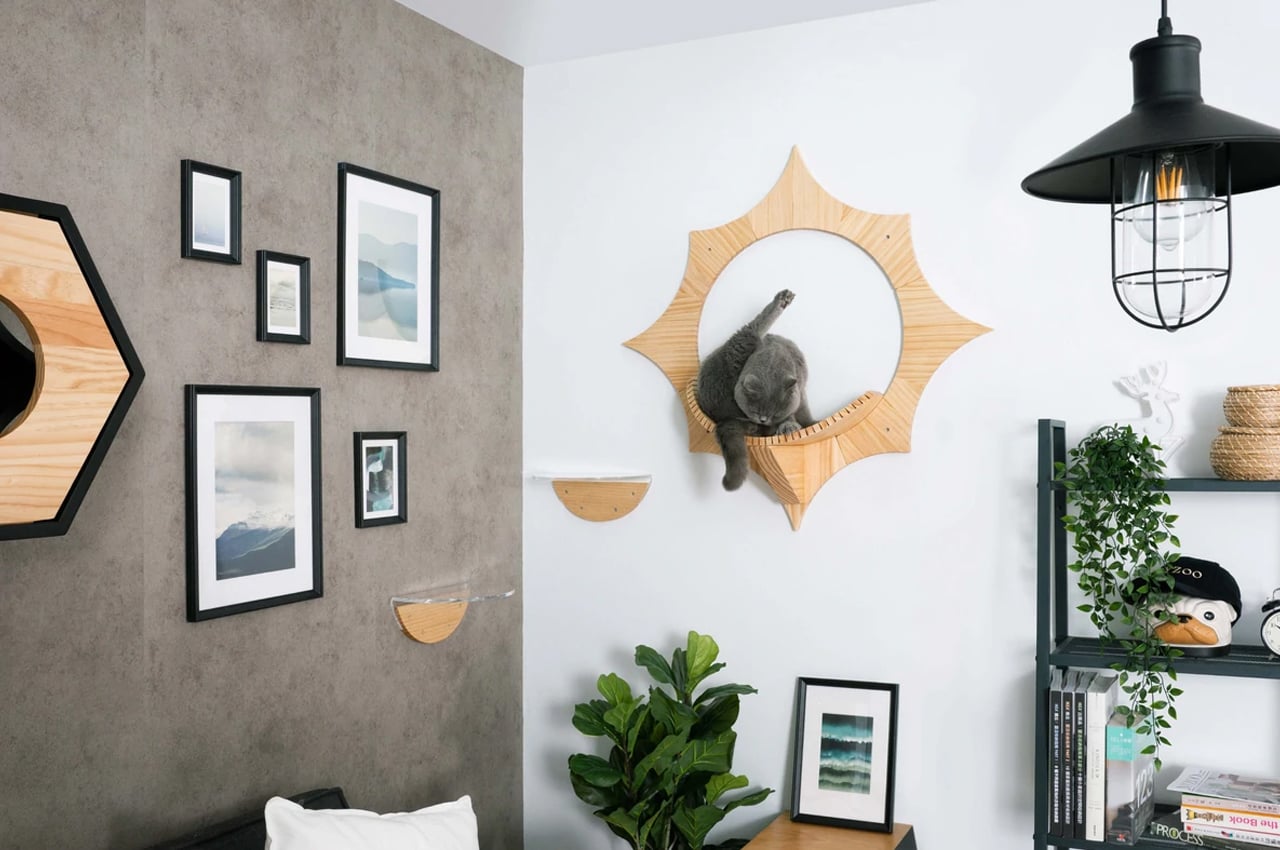
MyZoo, a cat goods company, designs modern cat furniture that caters to your cat’s every need, while not disrupting your interior design. Solar, one of their more recent designs, is a wall-mountable floating cat bed that mounts onto any vertical surface so cats rest midair in their own designated space.
Why is it noteworthy?
Shaped like the sun, Solar is a small, but sturdy floating cat bed that’s built from pinewood. In a similar fashion to their other pieces of cat furniture, MyZoo lined Solar with a slotted resting platform for safe jumping. Ideal for small spaces, Solar provides a resting spot and jumping platform for your cat and saves space in the meantime.
What we like
- Solar doesn’t take up any ground space and easily mounts to any wall where there’s room
- Easy to assemble
What we dislike
- There’s no cushioning on the bed, which would make it comfier
10. The Tie Stool
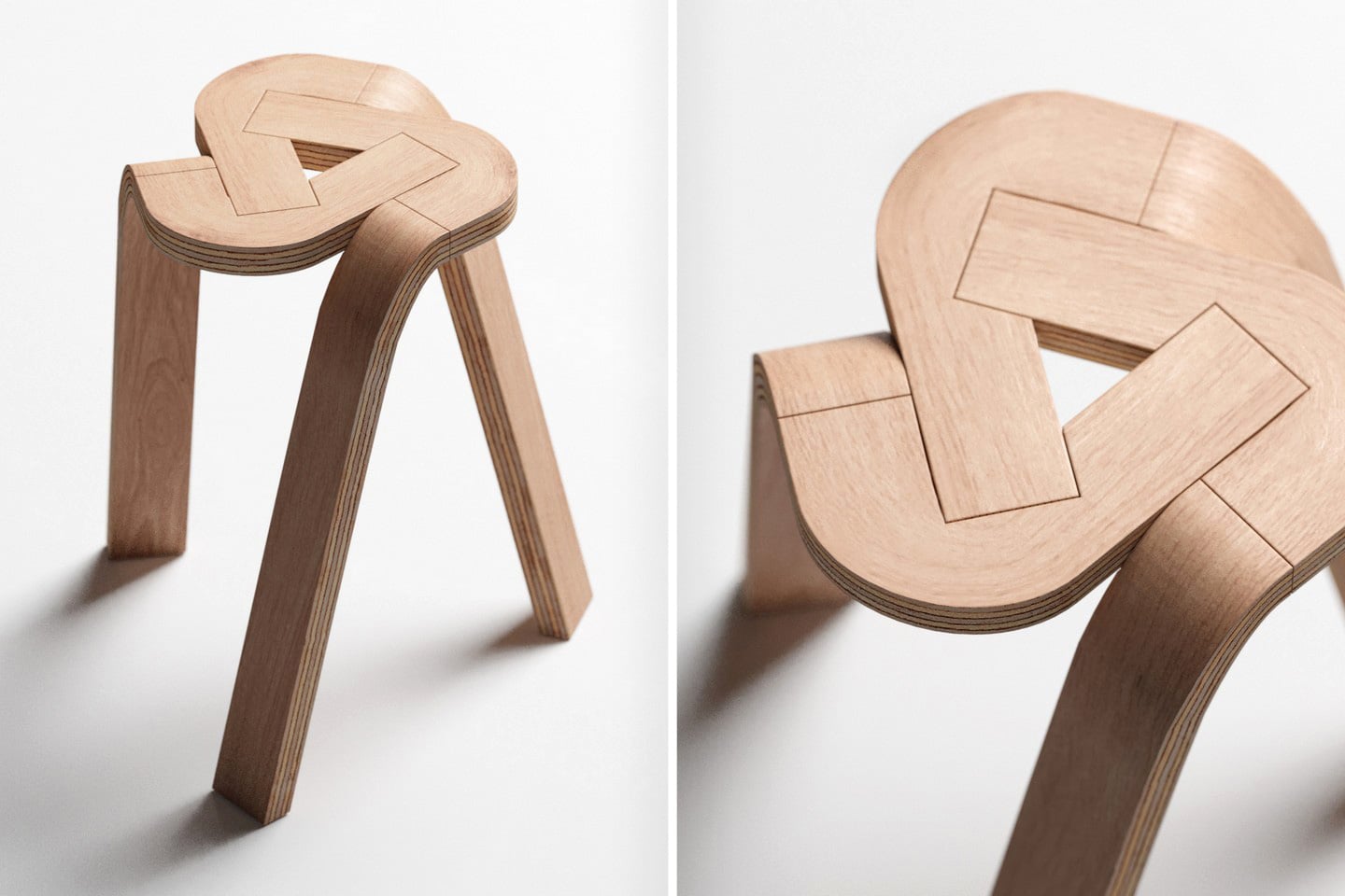
The Tie Stool’s beauty lies in its sheer simplicity – not just design but also materials. The stool comprises three bent plywood strips that conveniently lock into each other, creating a tripod form that you can easily sit on. The design could easily expand to accommodate more strips to create a 4-legged (or even 5-legged) stool, but the dynamic nature of having a tripod format really gives the Tie Stool its appeal. I don’t know about you, but I can’t unsee the Google Drive logo in the stool’s design!
Why is it noteworthy?
Fabricating the Tie Stool would require a few simple steps. The three plywood strips can, in fact, be split into 6 total parts (you can see the parting lines). The individual parts are formed using high pressure and temperatures that cause the plywood to bend and retain its shape, and cutting/finishing processes are performed on the parts to make them interlock into one another.
What we like
- The entire stool can potentially be flat-packed and shipped to customers
- It’s stackable
What we dislike
No complaints!
The post Minimal furniture designs to add a calming + zen aura to your living space first appeared on Yanko Design.
via https://ift.tt/eIGsAmw
Post a Comment
Note: Only a member of this blog may post a comment.