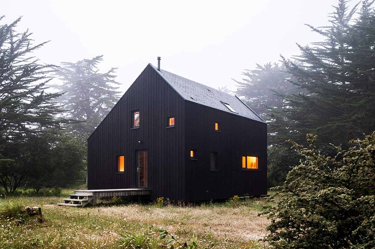
Black is a really strong and powerful color, that most of us often run away from! Especially when it comes to using it in our homes. However, when implemented correctly, black can radiate a very modern and minimal feel, creating an aesthetic that instantly leaves you feeling calm and balanced. From a black timber cabin that takes cues from traditional building methods to a tiny black cabin built from felled oak trees – this collection of all-black architectural structures is proof that when used boldly but smartly, black aesthetics can be a delight! I love these clean and minimal designs. What about you? Are you team all-black architecture too?!
1. Le Refuge KE01
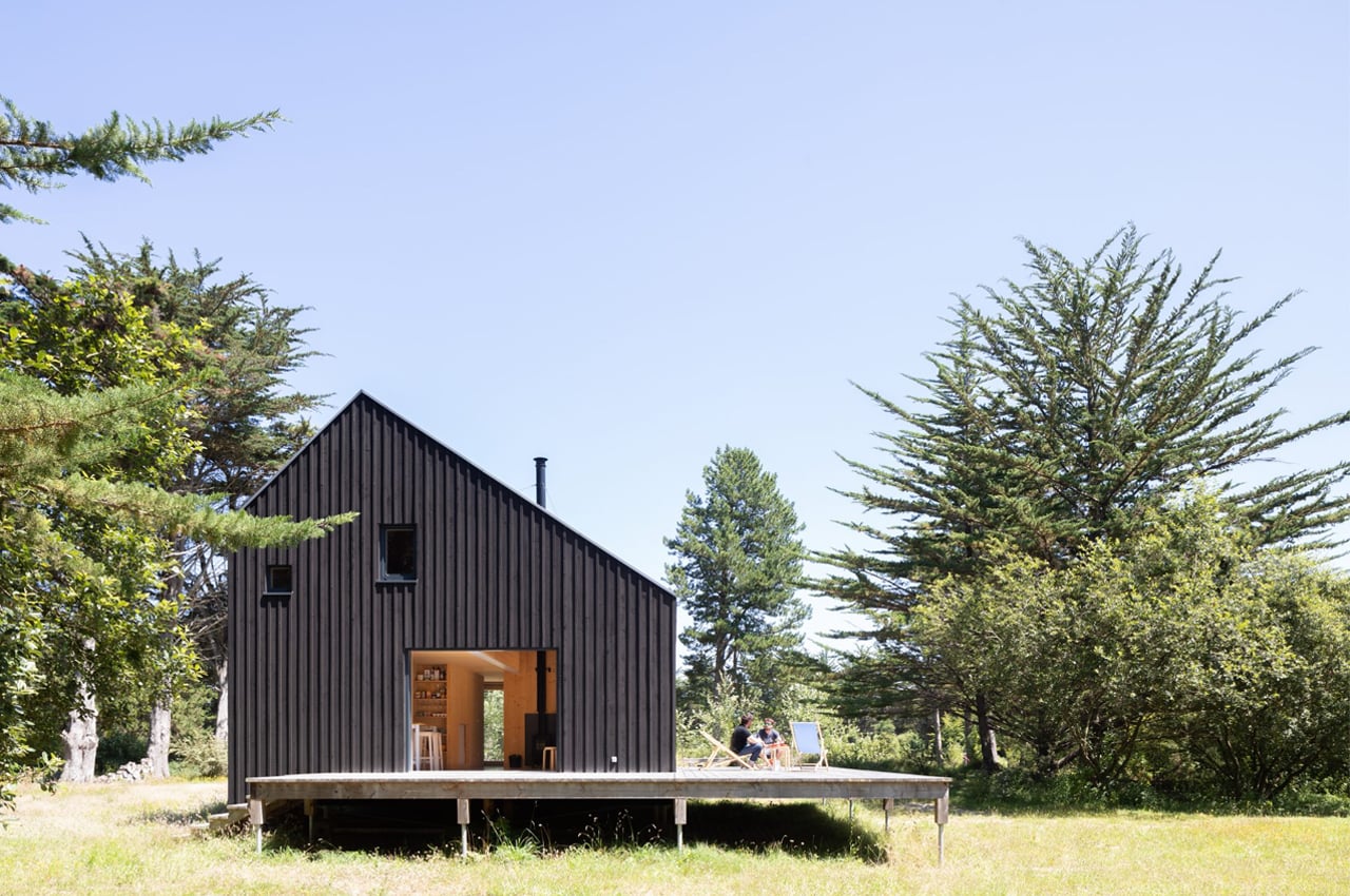
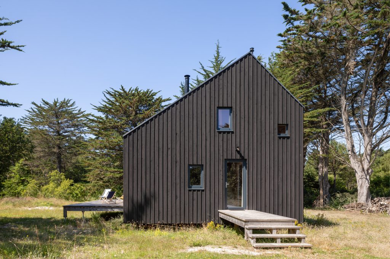
Le Refuge KE01 is a black timber cabin near the coastline of Keremma, France, built by Gayet Roger Architects to function as the firm’s co-founders’ family vacation home.
Why is it noteworthy?
Designed to be the ultimate retreat for relaxation and rest, Le Refuge KE01 is a small black timber cabin with warm interiors by Gayet Roger Architects. Spearheaded by the firm’s co-founders, Anne and Aldric Gayet, the project was initially conceived to be an idyllic vacation home for the architects’ family. Measuring 850-square-feet, the black timber cabin was built in harmony with the surrounding landscape to brace weather conditions of all kinds.
What we like
- A spacious, wraparound deck provides some lounge area on days when the weather permits
- The home’s interior exudes a nest-like quality with warm, unfinished spruce cladding
What we dislike
- No complaints!
2. Buster
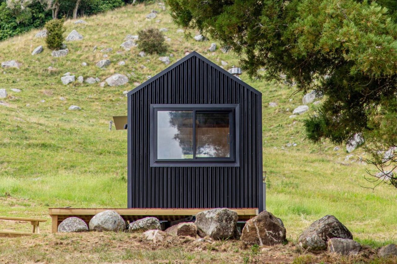
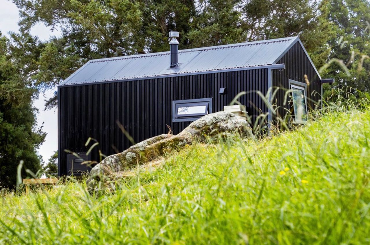
Buster is located in Matamata, just a couple of hours away from Auckland, New Zealand. You will be able to hear the sound of spring river water flowing around you as you’re surrounded by trees, stones, valleys, and basically the joys of nature. It’s located below the Kaimai Range “amongst ancient native bush and farmland”. It is a tiny home perfect for one person or a couple who wants to temporarily or even permanently live in such an area and to have something that is built sustainably and with the environment and your comfort in mind.
Why is it noteworthy?
Instead of being made from timber, it uses black corrugate as it will last longer and can survive all the different kinds of weather that the area experiences. They also used plywood to bring “a sense of warmth” to the house and is in fact what is also used in the traditional kiwi trampers huts, giving you even more of a local feel but with modern conveniences. It’s a pretty good combination, having a more natural lodging but using sustainable technology and devices to give you comfort and function.
What we like
- Buster is powered by GridFree solar panels
- The house is oriented to the north so that it will be able to maximize the light during the summer and even during the winter
What we dislike
- The solar energy is only enough to power a small fridge, lights, and to charge your smartphones
3. Casa ZGZ
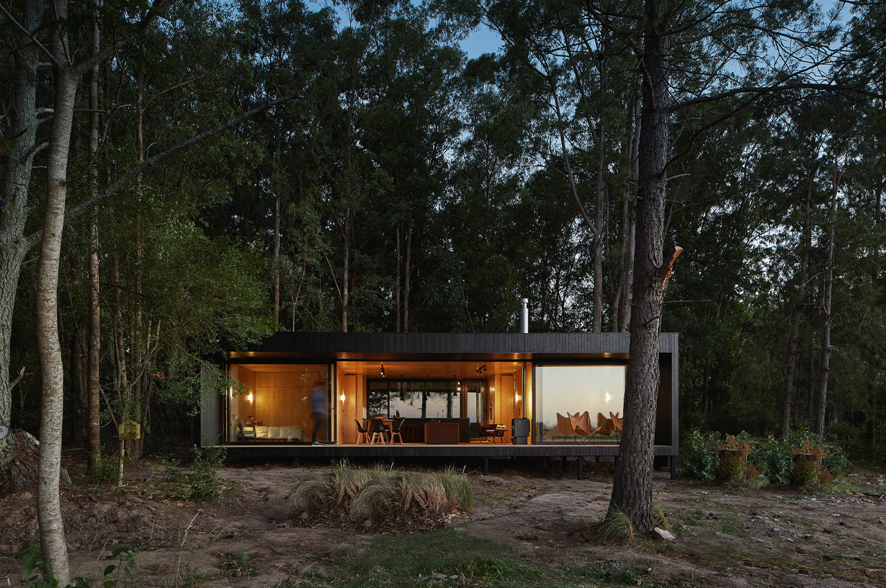
Montevideo-based architecture firm iHouse constructs prefabricated homes using the latest dry construction methods currently trending on the international stage. With only 70 days to build a home for Conrado, an Uruguayan living in London, on his family’s property in Colonia, iHouse was well-equipped to take on the project. Formed by the merging of two modules, Casa ZGZ was constructed offsite and then installed on the family’s property in just five days.
Why is it noteworthy?
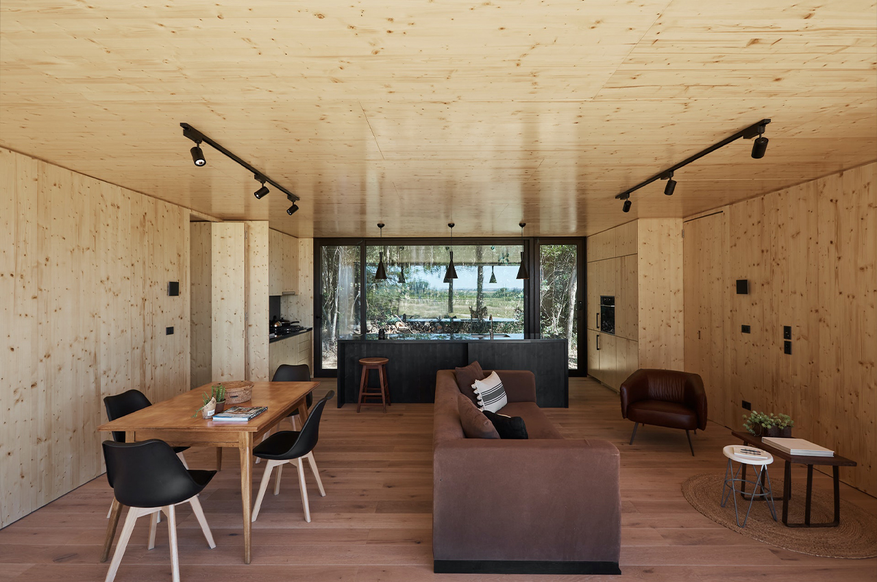
As Colonia is one of Uruguay’s oldest towns, the team behind Casa ZGZ hoped to maintain the spirit of the region’s historical architecture while contemporizing the cabin to accommodate modern needs. The single-level residence is clad in black in an effort to present hide the home in plain sight amongst the many elements of nature that surround it. The black exterior also warms up the home’s wooden interior, which is paneled with wood certified by the Forest Stewardship Council.
What we like
- Minimizing the home’s impact on the region’s environment and land, Casa ZGZ was constructed offsite in two modules
- Coexists in harmony with a space alien to its language
What we dislike
- It could have been equipped with another story
4. The Wood Pavilion #1
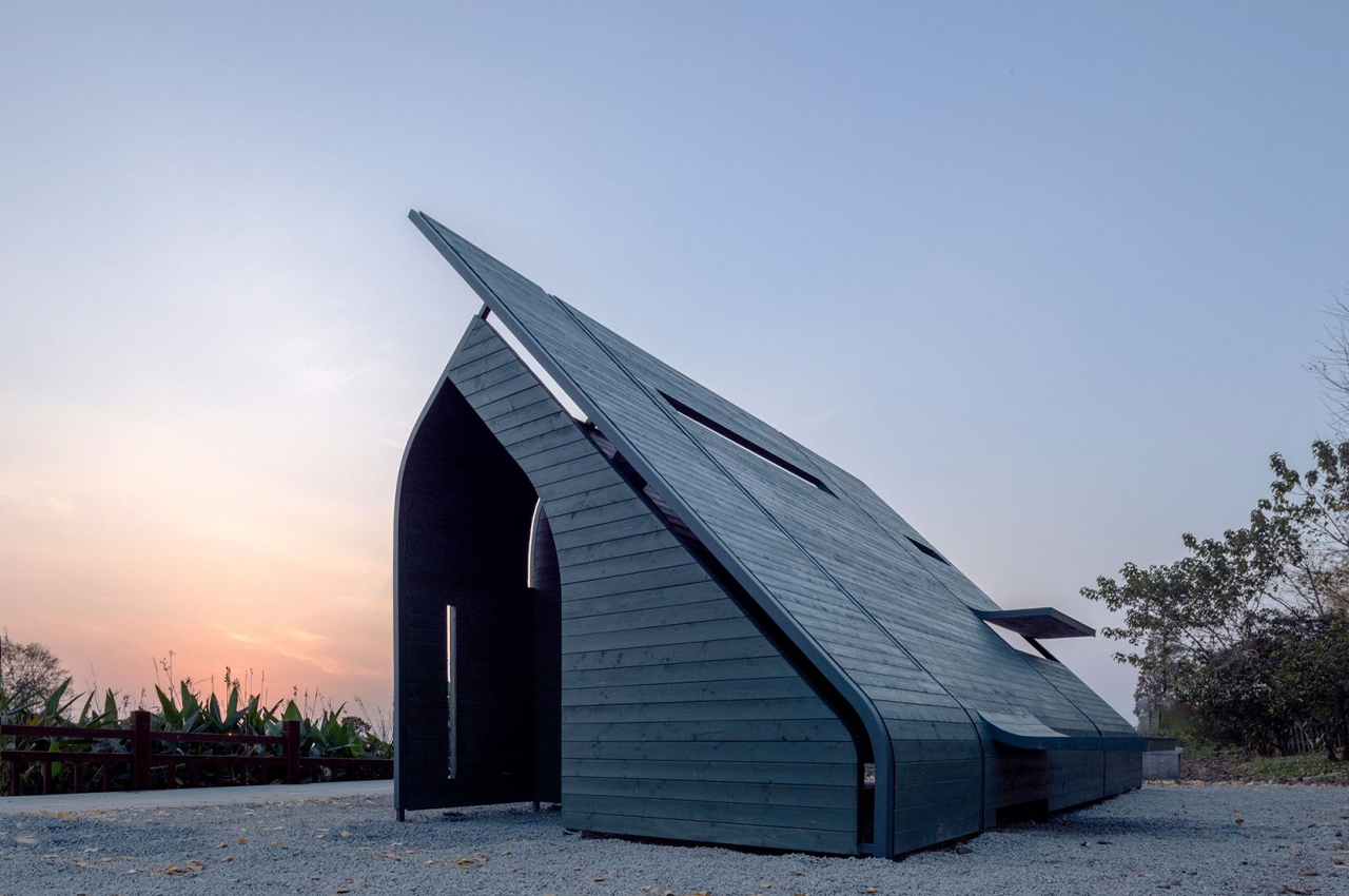
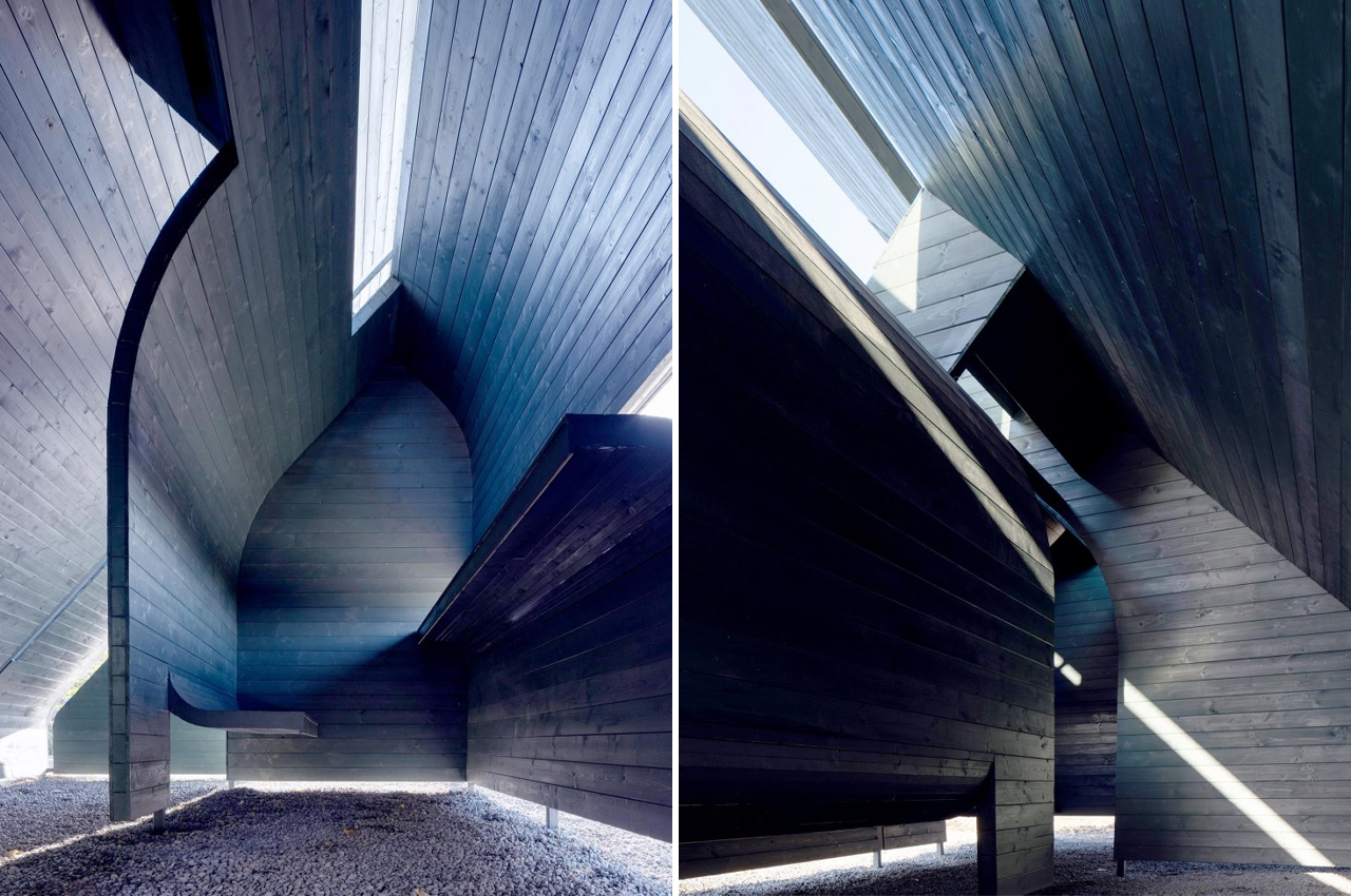
Lin Architecture constructed the Wood Pavilion #1 to create an ergonomic and meditative space where humans can indulge in their most instinctual and natural behavior.
Why is it noteworthy?
Human behavior is at the core of architecture and design. To build functional and meaningful structures and buildings, architects must first look towards the ways people naturally interact with interior spaces, the outdoors, and infrastructure. This marked the starting place for China-based architecture firm Lin Architecture when they developed plans for their Wood Pavilion #1, a prototypical experiment on space that redefines what living quarters could look like humans.
What we like
- Designed to cater to the bare essentials of human behavior
- Vista points are located in the most appropriate spots to capture the rising of the sun
What we dislike
- No complaints!
5. Matt and Lisa’s tiny home
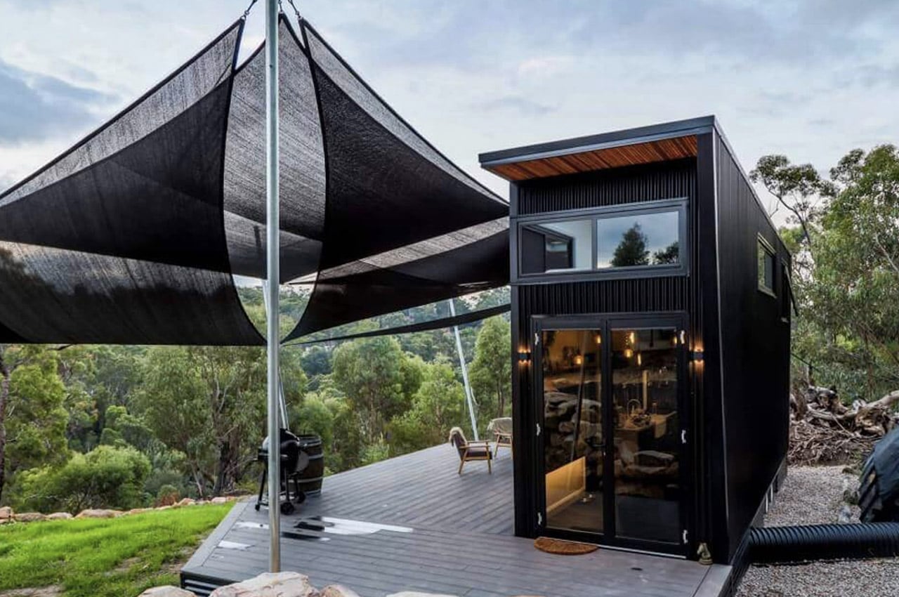
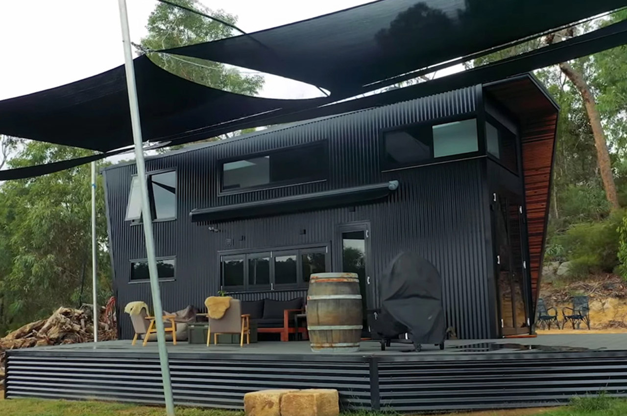
Nestled high above an Australian forest, Matt and Lisa’s jet-black, two-floor tiny home was constructed by the couple with help from a few friends.
Why is it noteworthy?
The tiny home’s black metal siding surely stands out, but amidst high eucalyptus treetops, it offers a more inconspicuous appeal, tying it up artfully with recycled hardwood trimming for the home’s protruding gables. Matt and Lisa’s home-on-wheels measures almost 30 feet in length and just about eight feet in width – the ceiling reaches sweeping heights of 14 feet, slightly above average for the conventional tiny home. But then tiny homes are anything but conventional. Coming from a builder’s background, the couple brought modern amenities to their tiny home such as cable, electricity, and running water, as well as a few playful outdoor features like an attached cat’s run.
What we like
- Impressive high ceilings
- Full-sized kitchen
What we dislike
- People may prefer a more compact tiny home
6. Lola
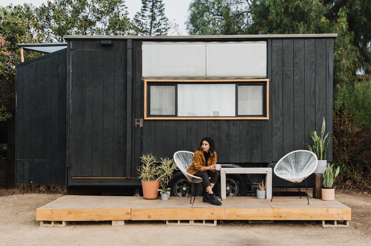
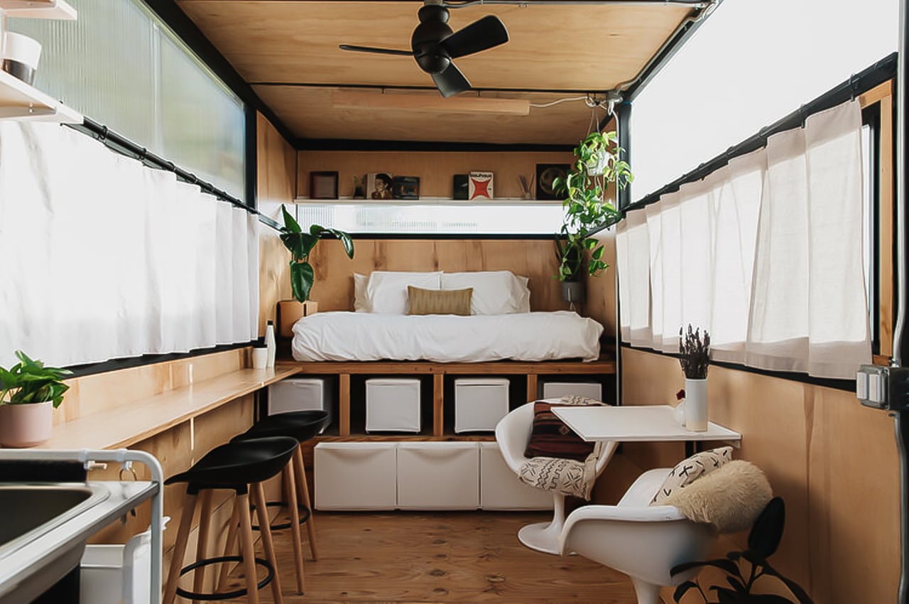
Lola is a tiny home on wheels that’s part of designer Mariah Hoffman’s larger multi-disciplinary design studio and brand Micro Modula, one that explores “home, place, and the self.”
Why is it noteworthy?
Joining the movement, self-taught spatial designer and overall creative, Mariah Hoffman planned and constructed her own tiny home on wheels called Lola. Over the span of five years, Hoffman gradually transformed an old utility trailer into a 156-square-foot mobile tiny home. Born out of a daydream to build her own home, Hoffman built Lola to “learn all the necessary skills for [her] personal and creative survival.”
What we like
- Built from construction materials that aesthetically met the bill and also provided some functional elements for the home to brace the seasons as well as the local critters
- The interior was planned in honor of the midcentury design
What we dislike
- The aesthetics may not appeal to everyone
7. Topol 27
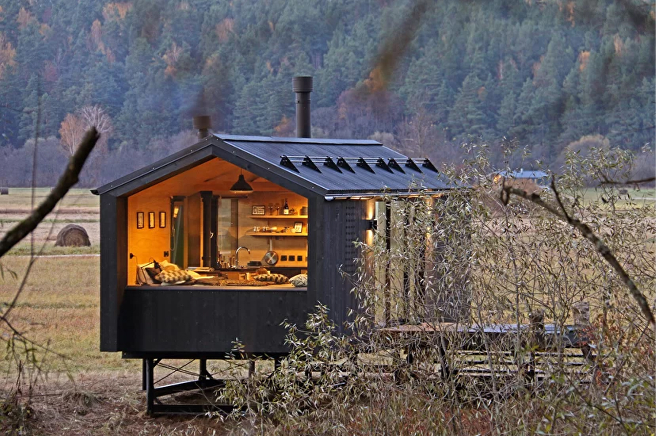
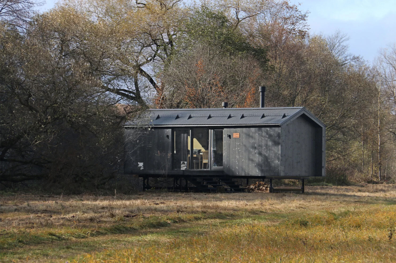
Built entirely offsite, Bio Architect’s prefabricated construction process cut down on the energy otherwise required for the shipping and handling of building material. Once transported to its final location, the home was positioned atop an aboveground metal frame that gives the home a lofty appeal. Walking through the front door, the home’s residents are greeted by the kitchen and dining area that merges seamlessly with the single sleeping space. Then, on the other end of the home, a bathroom and dressing room host all of the amenities needed for comfortable living.
Why is it noteworthy?
Joining the tiny house movement, Moscow-based Bio Architects has finished work on Topol-27, a prefabricated, modular tiny home designed to “be picked up from the warehouse by the client, installed the same day, and be ready to live.” Comprised of five functional areas, Topol-27 is named after the square meterage it covers. With the aim of maximizing the available living space, Bio Architects fills Topol-27 out with a bedroom, kitchen, living room, bathroom, and dressing room.
What we like
- Built entirely offsite
- Built from environmentally friendly and durable materials
What we dislike
- The black metal overcoat may give the tiny home a bit of an obscure profile from the outside
8. Riverside Cabin
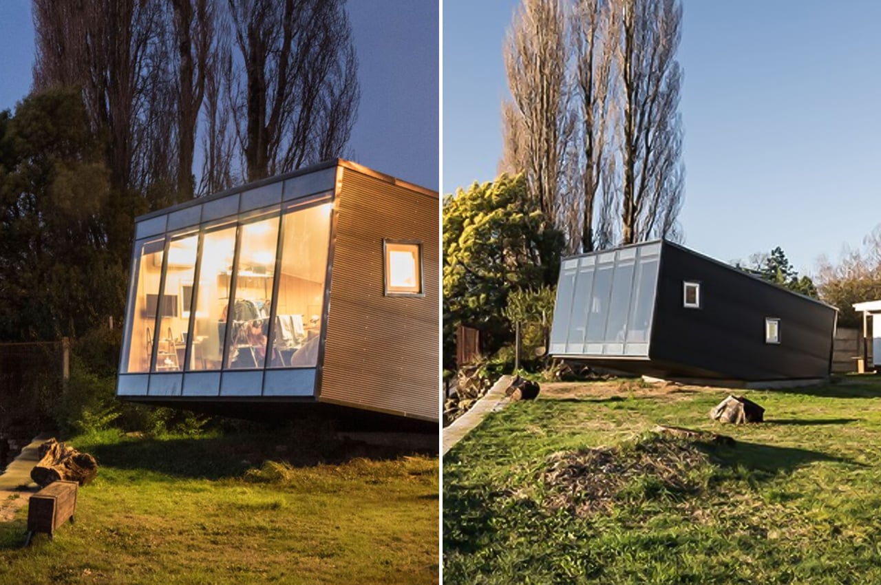
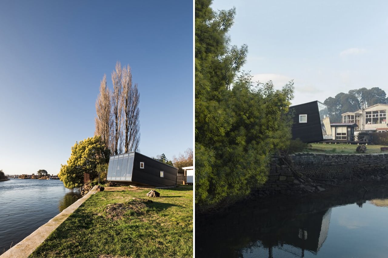
On the banks of the Calle-Calle River in Valdivia, Región de Los Ríos, architects with Arce & Westermeier were commissioned to design and construct a shelter to function as a local professor’s riverside retreat. Located close to the Universidad Austral de Chile, the tiny home is called Riverside Cabin after its harmonic relationship with the Calle-Calle River. Brimming from the natural treeline that extends along the river’s edge, Riverside Cabin takes on an unconventional shape that embraces the home’s surrounding landscape and ecosystems.
Why is it noteworthy?
In the initial stages of designing Riverside Cabin, the architects with Arce & Westermeier asked, “What kind of relationship with the river do we want: a traditional one, which seeks that each program enclosure manages to please itself with this unique geographical element? Or rather, one that selects where and how this visual pleasure is obtained?” Upon realizing they’d like to explore the latter, Arce & Westermeier found Riverside Cabin’s unique look. Tilting one end of the cabin towards the sky elongated the internal volume and gave the ceiling lofty heights to accommodate the bi-level interior.
What we like
- Blends in with the surrounding architecture, without taking away from the available views of the river
- Built using prefabricated metal plates that brace Chile’s rainy climate
What we dislike
- Not everyone may find the home’s unique shape and tilt appealing
9. Ohariu
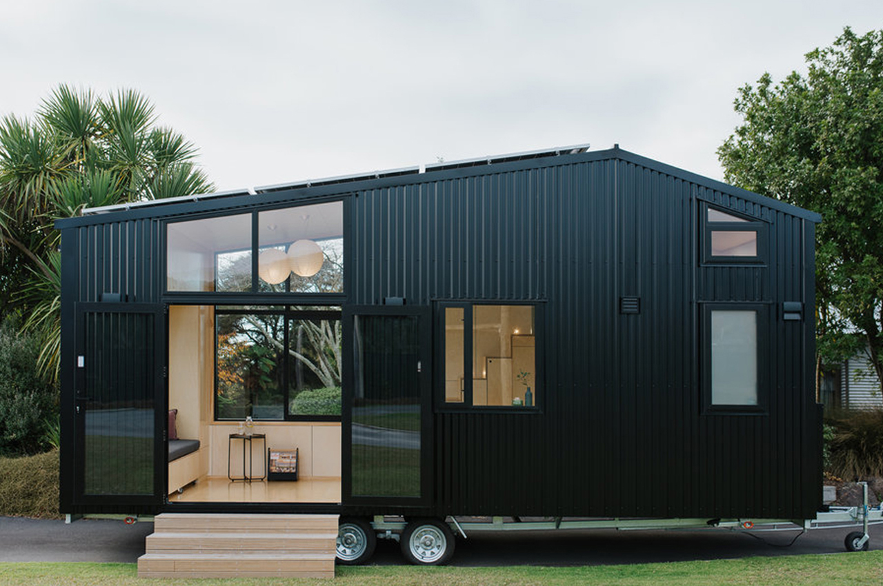
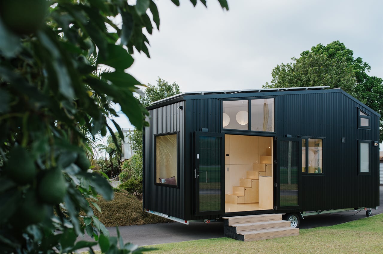
First Light Studio, a New Zealand-based architecture group built their own tiny home with help from a local company Build Tiny, Ohariu, checking all of the above boxes. Built to be net-zero through several sustainable features and compact enough to meet all NZTA regulations for mobile homes.
Why is it noteworthy?
Ohariu was built by First Light Studio and Build Tiny from a client’s brief calling for, “a refined tramping lodge on wheels.” That’s code for hiking, for all us Americans. Since the tiny home would primarily be used for hiking trips and traveling throughout the outdoors, Ohariu was built to be adaptable and versatile above all else. Inside, the living spaces are described by the architects at First Light Studio as being, “more a large and very detailed piece of furniture than a traditional house build, the fit-out [focusing] on the things that are important and necessary.”
What we like
- Each furniture piece inside Ohariu doubles as storage to maintain an open, clutter-free interior
- Entirely powered by the solar panels that make a grid on the roof, Ohariu is net-zero
What we dislike
- No complaints!
10. Hemmelig Room
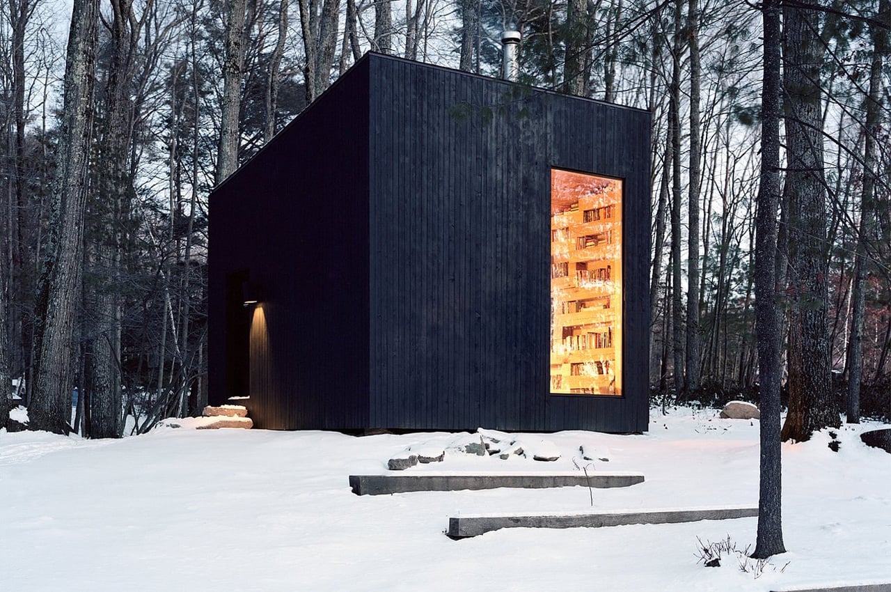
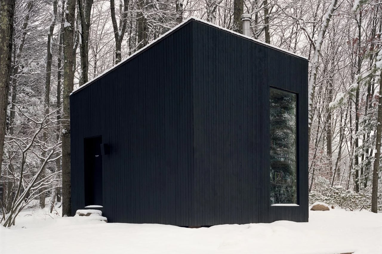
Calling the bookworm’s oasis Hemmelig Room, or ‘secret room’ in Norwegian, Studio Padron built the entire tiny cabin from disused mature oak trees that were felled during the main home’s construction. From the outside, Hemmelig Room finds a geometric structure clad in blackened timber. Following the main home’s construction process, the felled oak trees were cut into large, rectangular log sections that were left to dry over several years before building Hemmelig Room.
Why is it noteworthy?
Studio Padron designed and built a tiny cabin entirely from mature felled oak trees acquired from another home’s construction waste. As the old saying goes, “one man’s trash is another man’s treasure.” When it comes to home construction, waste produced during the building process opens the door for more opportunities. While many home builders and architects plan homes around the site’s preexisting trees and landscape, sometimes felling trees can’t be avoided. After finishing work on a new home, Studio Padron, a US-based architecture firm, utilized the felled trees collected during the home’s construction and built a tiny black cabin to function as the home’s standalone library.
What we like
- Built from felled oak trees
- Nonuniform timber panels merge with cavities to create bookshelves
What we dislike
- No complaints!
The post All-black architectural structures designed for lovers of minimal + bold architecture first appeared on Yanko Design.
via https://ift.tt/SKzCEtU
Post a Comment
Note: Only a member of this blog may post a comment.