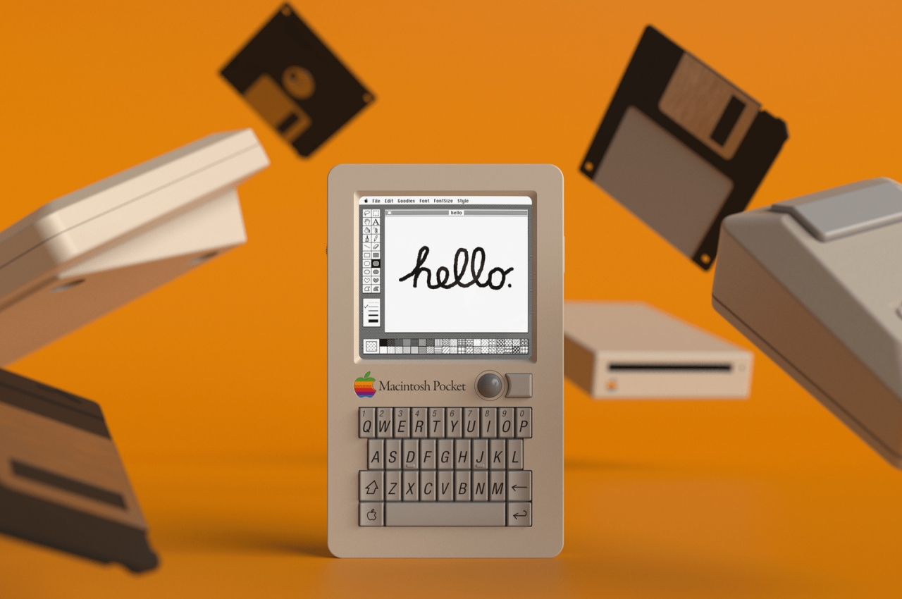
They always say that hindsight is 20/20, but that really doesn’t mean much when you can’t change what has already happened. Many of us would probably try to undo things or make different decisions based on what we already know happened, but that just isn’t possible. To be fair, our predecessors did the best they could, based on information they had at that time, and even the greatest visionaries couldn’t have predicted the ups and downs that would change the world for better or worse. The young Steve Jobs of the 80s, for example, probably never saw the iPhone or even the BlackBerry coming, so we can only imagine how things could have turned out if Apple had the knowledge and resources to make a pocket computer back in the days. Fortunately for us, somebody asked that same question and came up with a rather intriguing answer.
Designer: Rex Sowards
Apple did try to briefly venture into the pocket computer market, but the Newton was more aimed at Palm, which was a Titan in that niche market during that era. It wasn’t exactly pocketable by any standard, but it did try to introduce innovative ideas and features in the personal digital assistant (PDA) market that was thriving at that time. The Newton, however, barely lasted a decade, especially after it failed to meet the returning Steve Jobs’ infamously high standards.
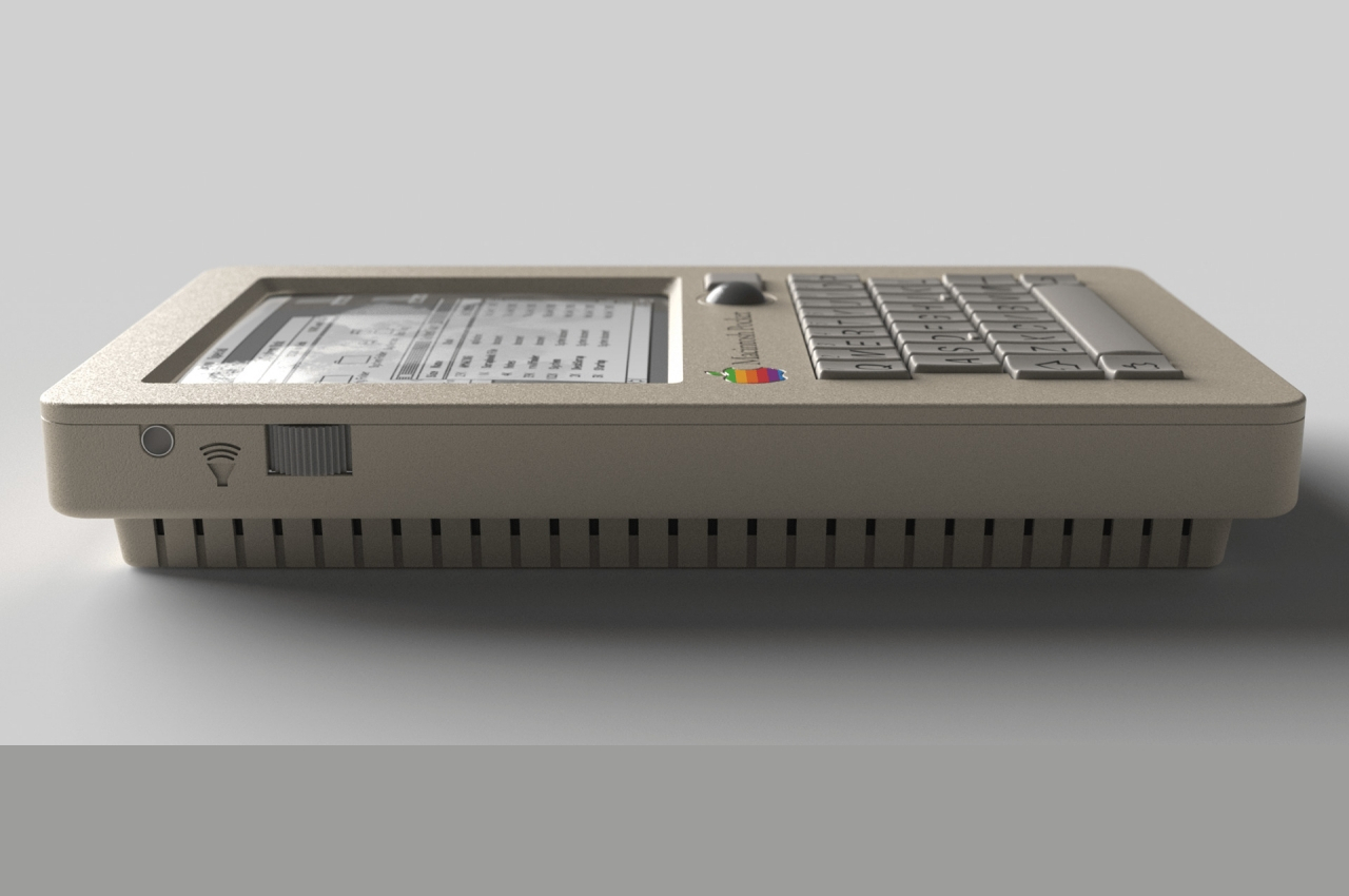
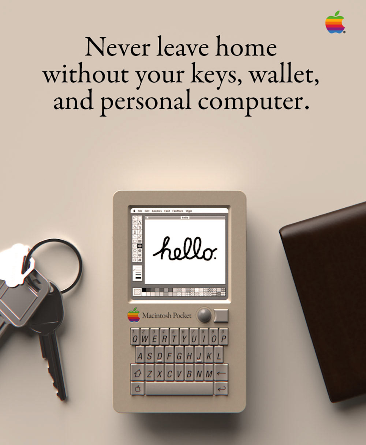
This Macintosh Pocket isn’t a simple rehash of that failed concept, though. Instead, it takes its DNA from two unlikely sources. On one side, you have a QWERTY keyboard in a cramped space that has become synonymous with BlackBerry. On another side, you have the two-step chassis of a Game Boy Pocket of that generation, hence the “Pocket” in the concept’s name. At the same time, you still have the telltale design language of Apple from the late 80s to early 90s, like that off-white color scheme and Macintosh keycaps.
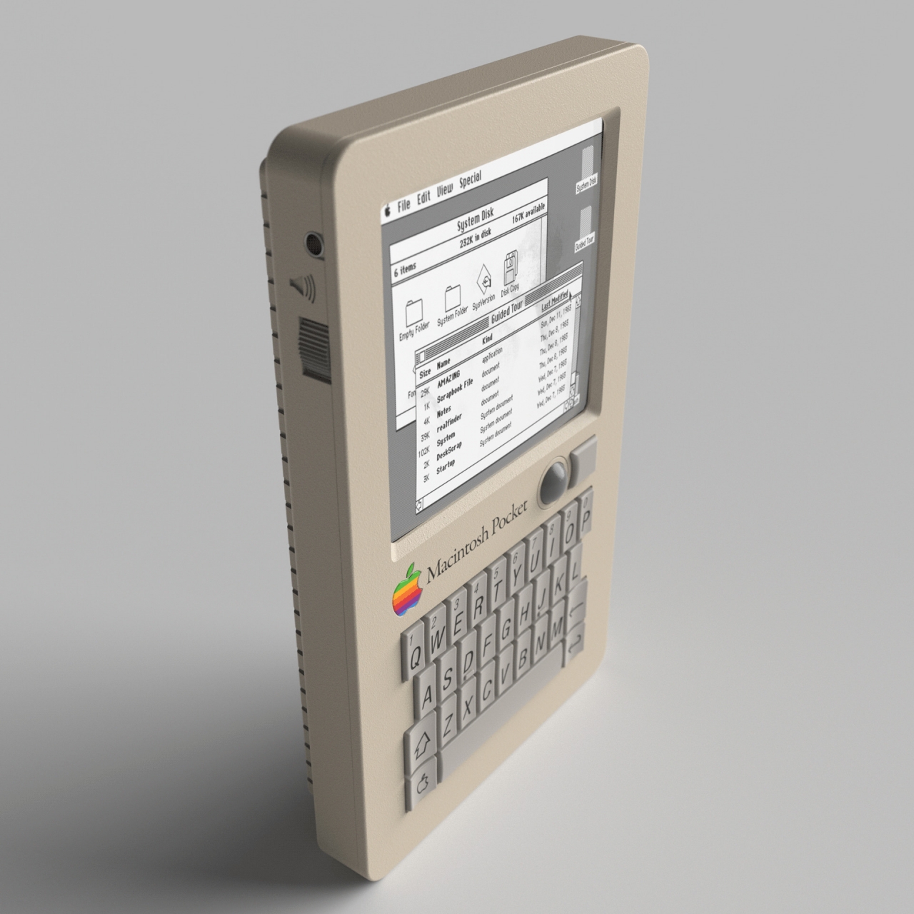
The concept doesn’t simply slap on a display and a keyboard on a Game Boy body and call it a day, though. There was a great deal of thought given to how the mouse pointer would be controlled for a device of this size. A touch screen and a BlackBerry-esque touchpad were both out of the question, and a Lenovo nib is probably just as unlikely. Instead, Sowards took his inspiration from the PowerBook’s iconic trackball, reduced in size, of course. He even took the extra step to pattern the button after the PowerBook’s design, making it curve around the trackball on one edge rather than being perfectly square.
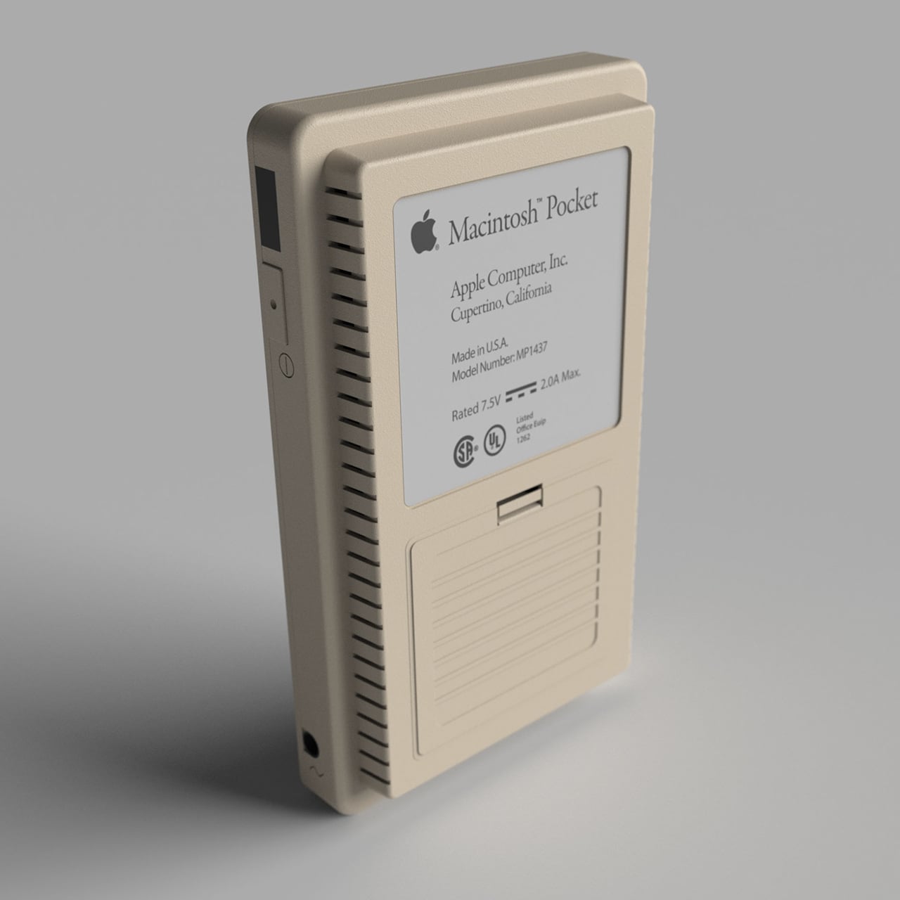
The back of this device is equally interesting in how it hides the ports that were standard on the Macintosh Classic. The most logical positions for these would be on the sides, but that would have cluttered the gadget’s design, a big no-no for Apple. Hiding it behind a panel where the Game Boy’s batteries would have been is a rather sneaky way to keep the design clean without losing functionality. Unsurprisingly, there is absolutely no room for a floppy drive of any size.
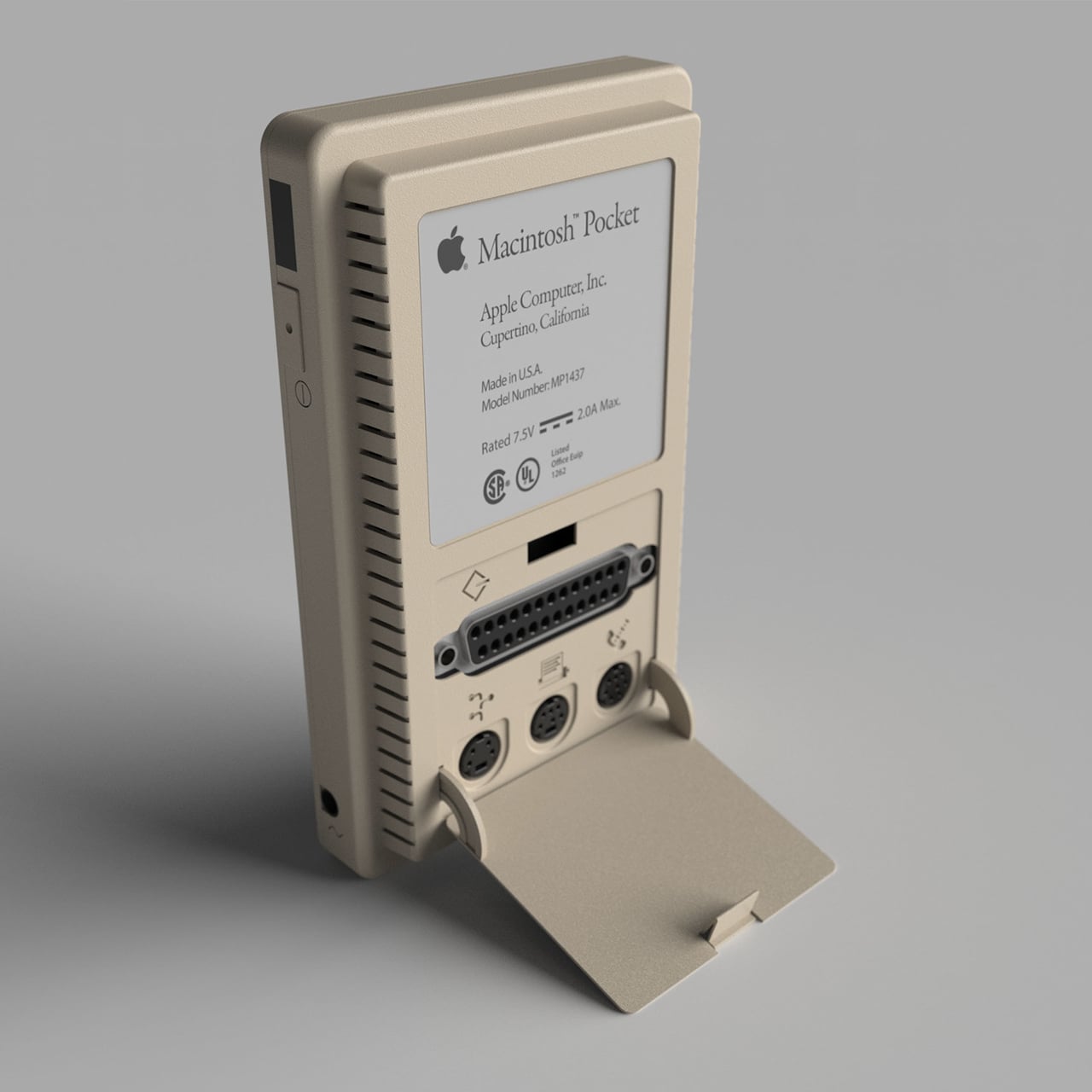
It’s probably questionable whether the Apple of the 80s would have adopted such a design, even if they magically foresaw BlackBerry’s becoming the de facto standard mobile device in the business world. It’s still an interesting thought experiment, though, combining designs and lessons learned by various companies across various industries. The craziest thing about this concept, however, is that it is probably completely doable today, thanks to 3D printing and small PCBs. It won’t be able to run the old Mac OS, though, at least not legally, but it could still be an interesting foray into what could have been if the stars were just aligned differently.
The post This Macintosh Pocket computer concept makes us wish we had a time machine first appeared on Yanko Design.
via https://ift.tt/mz2lNBD
Post a Comment
Note: Only a member of this blog may post a comment.