Now I feel nothing.
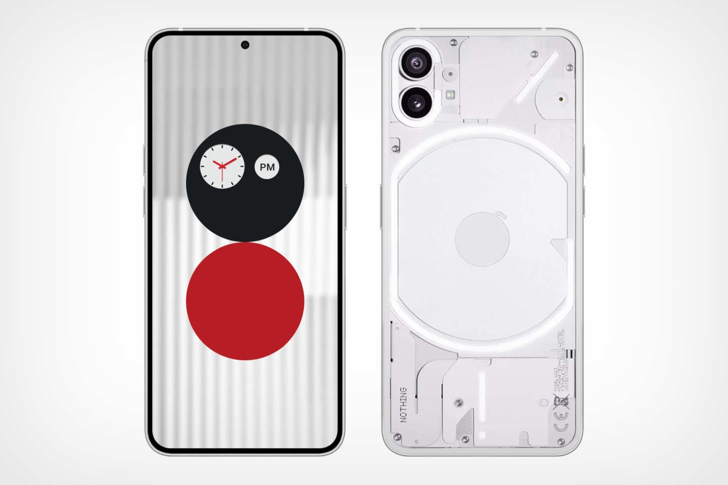
It isn’t common for a company to just leak their own designs before officially launching, but nothing about what Nothing does is common. It’s positioned itself as the underdog, the outliar, and when I woke up today to see that the company’s official Twitter handle just randomly outed their own phone’s design, I was confused. However, after quite a few hours of mulling over it, I’ve come across a few realizations – some obvious, some not so much. The most obvious one? This phone looks nothing special… and I now have EVEN higher expectations for the actual launch, otherwise this seems like yet another smartphone, albeit with a transparent design.

The Design
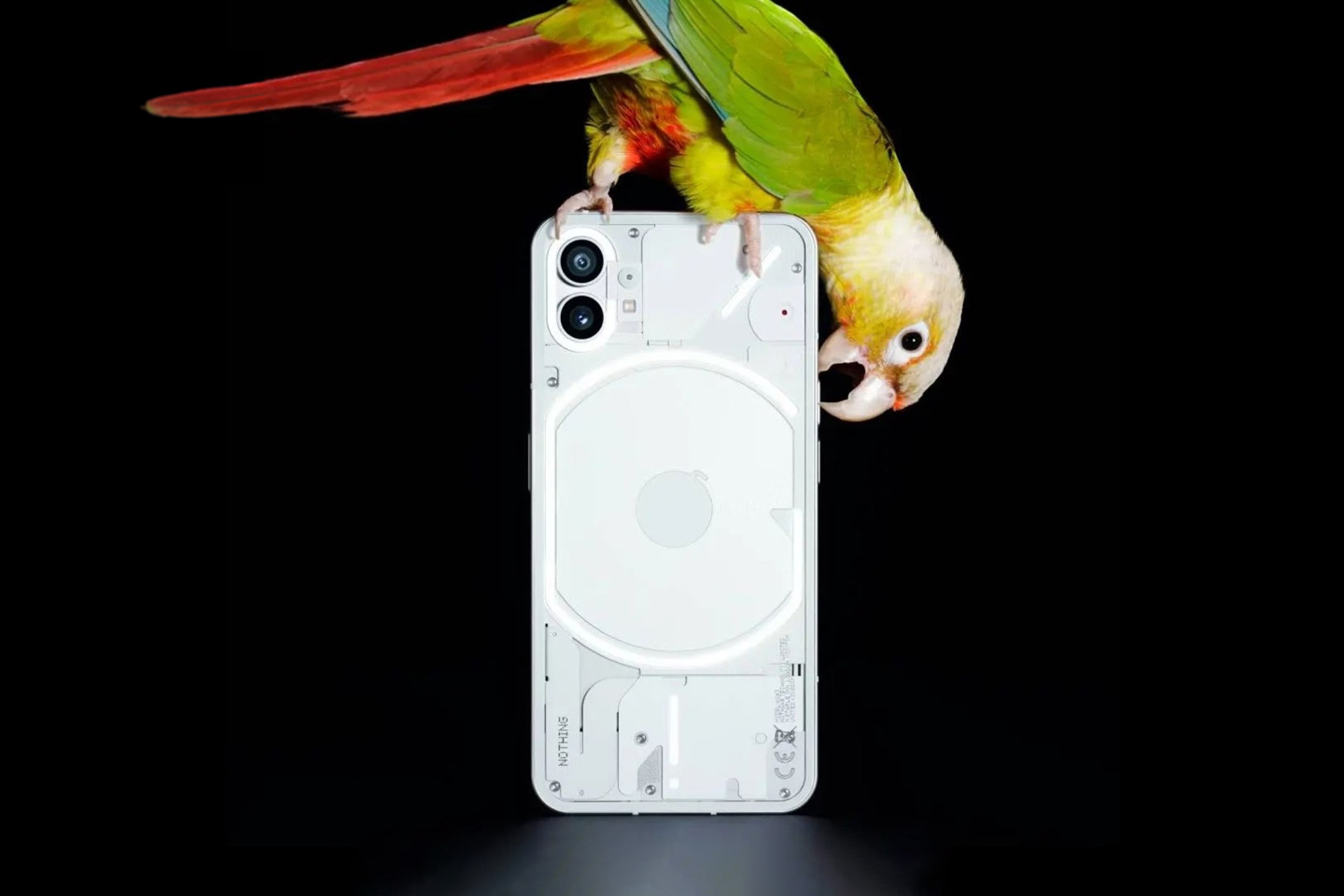
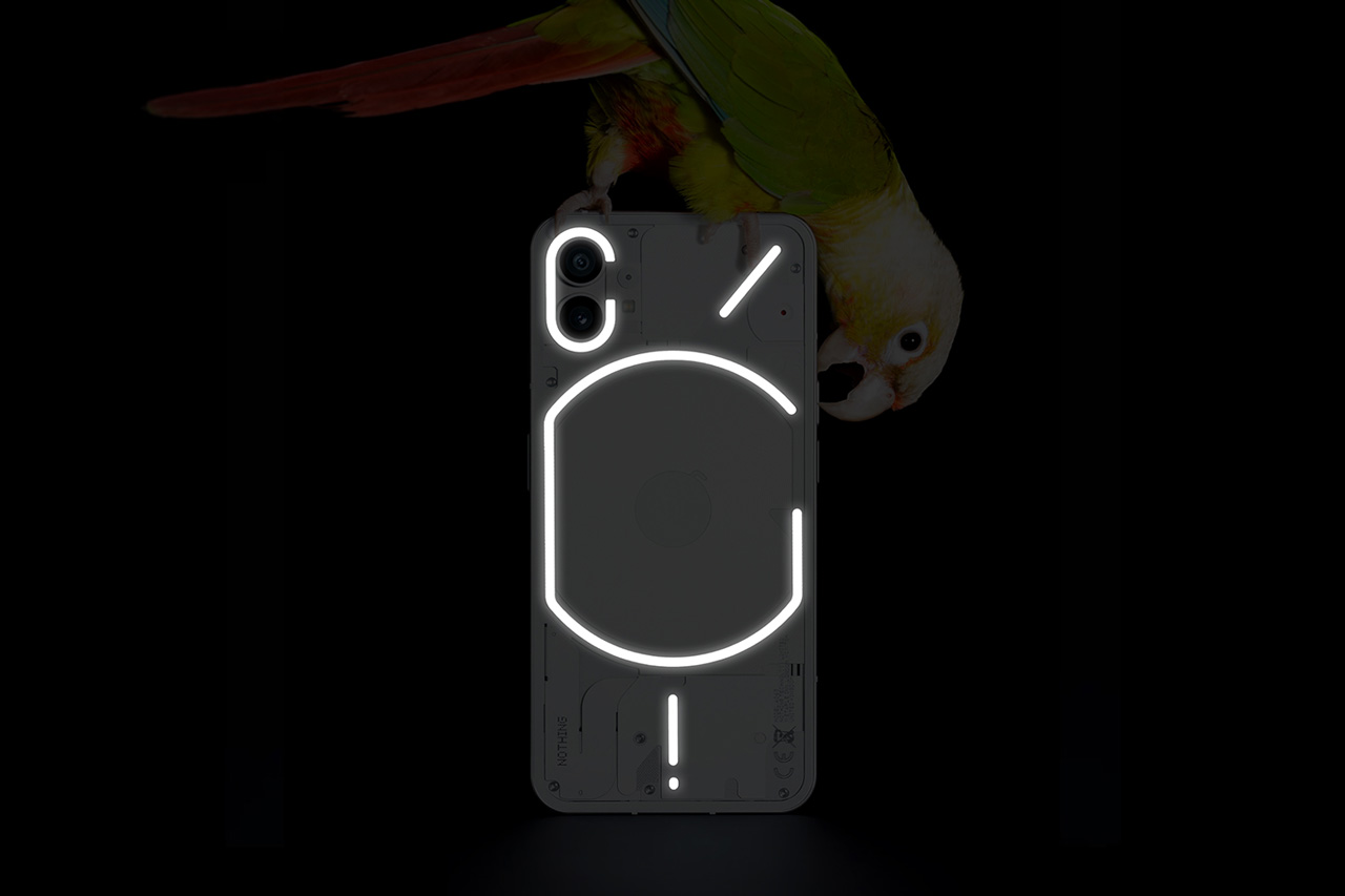
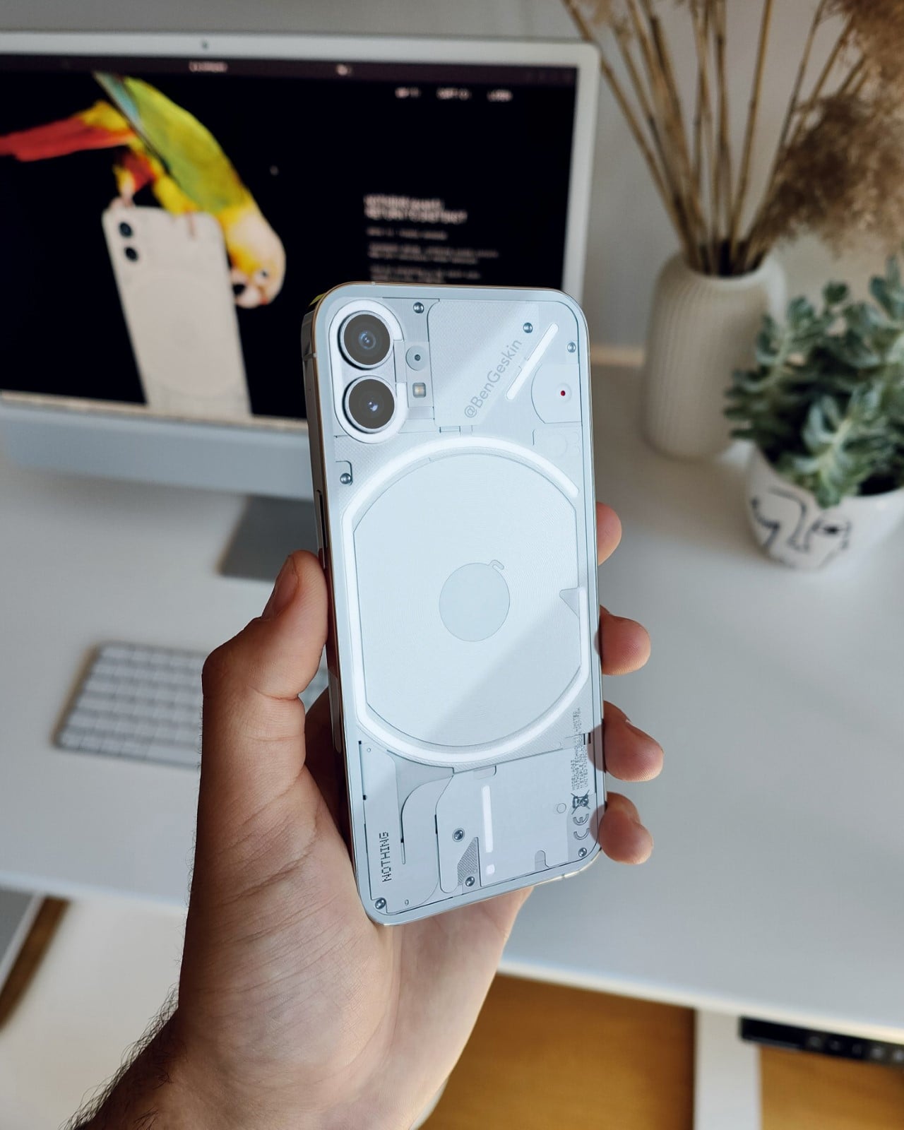
Nothing officially revealed the rear of the phone (one could say that this is pretty much the entire phone’s design) online after months of teasing and cryptic imagery, and now I feel underwhelmed… but more on that later. The phone looks fairly regular, with a transparent fascia that lets you see the inner components. In fact, slap a case on it and it won’t look any different from the iPhone 12. Those weird patterns on the back, which Pei teased in March, are in fact lights that glow based on what you’re doing with the phone. I assume the camera light glows when the camera is on, the lower exclamation glows when there’s a notification, and the arc around the wireless charging coil glows when your phone’s on low battery (there’s a mockup image below). That being said, there isn’t much more to the design as of this leak. We already know what the front will look like, given that Pei gave us a brief on the Nothing launcher back in March.

The ‘Leak’
With the leak, Nothing confirmed a few thoughts of mine. Firstly, everything this company does is backed by a LOT of hype (something that our patience will run out for eventually), and secondly, there’s a fair chance that the core team at Nothing knew that people will find this underwhelming. Let me explain. The first part, the hype, is fairly obvious. Having a small tech company succeed in today’s day and age is near impossible. Unless you hype up your products and sell them at an incredibly compelling price, there’s little you can do to create that fan community. It’s something OnePlus did before finally getting absorbed by Oppo and pretty much following the ‘either you die a hero or live long enough to see yourself become the villain’ character arc. With Pei’s second act, hype and price formed the marketing backbone yet again. The philosophy was strong – we’re going back to zero, to the chalkboard. We’re reinventing tech. The hype was stronger, hiring Teenage Engineering, the former design head of Dyson, strategic leaks, cryptic announcements, delayed gratification. However, if the story about the boy who called wolf is any indication, that strategy has an incredibly low shelf life when you overhype and underdeliver. Now to the second part. Exactly 3 years ago, 15th June 2019 to be precise, Google randomly leaked their Pixel 4 design on Twitter pretty much exactly the way Nothing leaked their phone. The design was a stark deviation from the Pixel 1, 2, and 3 designs from before, and it was widely speculated that instead of a negative response on the day of the launch, pre-emptively leaking your design online was a great way of ‘softening the blow’. If people know what to expect, they won’t expect something more or something else. The phone (1) is mirroring a lot of those ‘vibes’, because the response has been fairly tepid. Customers can’t see how the phone (1) is as different as Nothing claims it is, with a lot of people rightfully pointing out that it looks exactly like a transparent version of the white iPhone 12.
Personal Thoughts
It’s natural for designs to polarize us and it’s natural for me, as a design observer and human, to get polarized, but here’s what I genuinely believe. The reveal didn’t match the build-up. That’s all. Pei promised something ground-breakingly different, and the Nothing phone (1) looks EXACTLY like an iPhone 12 with a transparent back. Sure, it’s neatly designed, and looks rather nice with all-white inner components, but if Pei was hoping for something as vastly different as the Cybertruck, this clearly isn’t it. It’s still a candybar phone, still has cameras the way you’d expect, wireless charging, etc. Aside from being transparent and having glowing lights on the back, this feels like just another Android phone. In fact, I was bantering with a colleague and he ended up saying something rather revealing. The phone (1) embodies the ‘sex sells’ idea but in tech. Instead of an opaque Android phone, here’s an Android phone with its clothes off, in sexy lingerie.
This now puts pressure on the July event, when Pei will take the stage to fully announce the phone and its features. The Nothing launcher is currently available in beta on the Google Play Store, so if Pei has to compel people to buy the hardware instead of just using the free launcher, the phone will potentially have to move mountains and do much more than being transparent and affordable…

The post I was genuinely excited about the Nothing phone (1)… and then they leaked the design online first appeared on Yanko Design.
via https://ift.tt/4ZzvHjG
Post a Comment
Note: Only a member of this blog may post a comment.