Designers were invited to imagine new “Masterpieces for the Table”
Organized by Parmigiano Reggiano® in collaboration with Alessi, and with the participation of Kartell as the hosting partner for the Awards Party, The Parmigiano Reggiano Design Challenge 2022 closed on May 6, 2022, after attracting hundreds of entries from across the globe.
The competition invited the design community to imagine products at the intersection of food and design, across two categories: ‘In the Kitchen’ and ‘At the Table’. The brief required that the entries consider one or more of the following themes: biodiversity, aging, and zero waste.
The jury evaluating the entries included some of the most influential thought-leaders in the design industry, including: Mauro Porcini, the highly respected Chief Design Officer for PepsiCo; Karim Rashid, described by Time Magazine as “The Most Famous Industrial Designer in All the Americas”; Debbie Millman, curator, and host of the podcast Design Matters; Donald Strum, president of Michael Graves Design; celebrated Italian architect and designer, Fabio Novembre; Alessia Genova, managing partner at Tihany Design; Kevin Bethune, founder of Dreams, Design and Life; and Qing Yan, the 2021 Parmigiano Reggiano Design Challenge Best of Show winner. Additional two renowned chefs joined the jury to proved a culinary perspective: Chef Michele Casadei Massari, the U.S. brand ambassador for Parmigiano Reggiano, and four-time James Beard Award-winning Chef Michael Nischan.
Ultimately, the jury selected a total of 12 Award Winners with separate Gold, Silver and Bronze Awards for Professional Designers and Design Students in each of the two categories. From these, the judges selected one project as the recipient of the Best of Show Award, and that honor went to John Jack Elliott, the Director of Graduate Studies and Associate Professor of Human Centered Design at the College of Human Ecology, Cornell University in New York.
Click here to learn more about the Parmigiano Reggiano® Design Challenge.
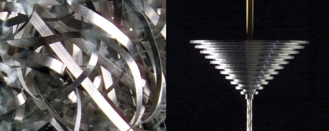
The scraps from machining the aluminum ceiling holder are re-used to make the diffuser of the lamp, resulting in zero waste
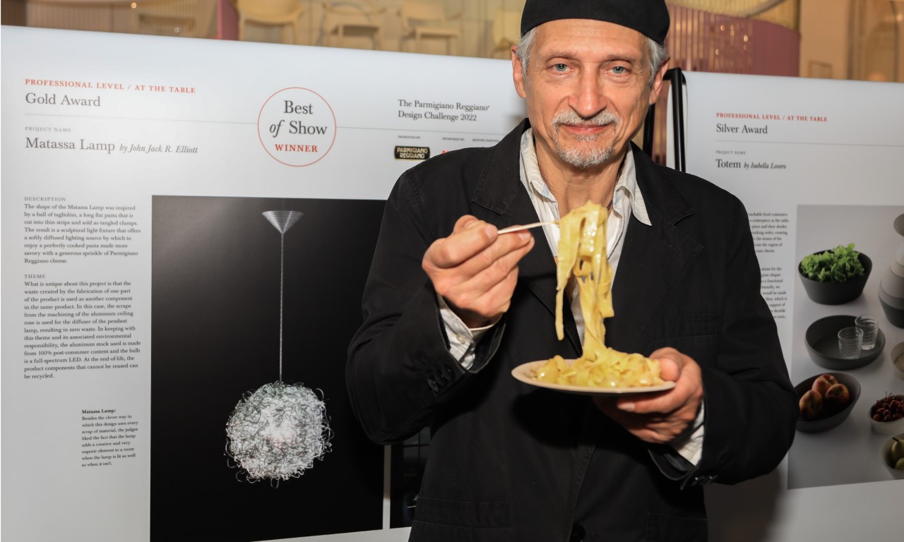
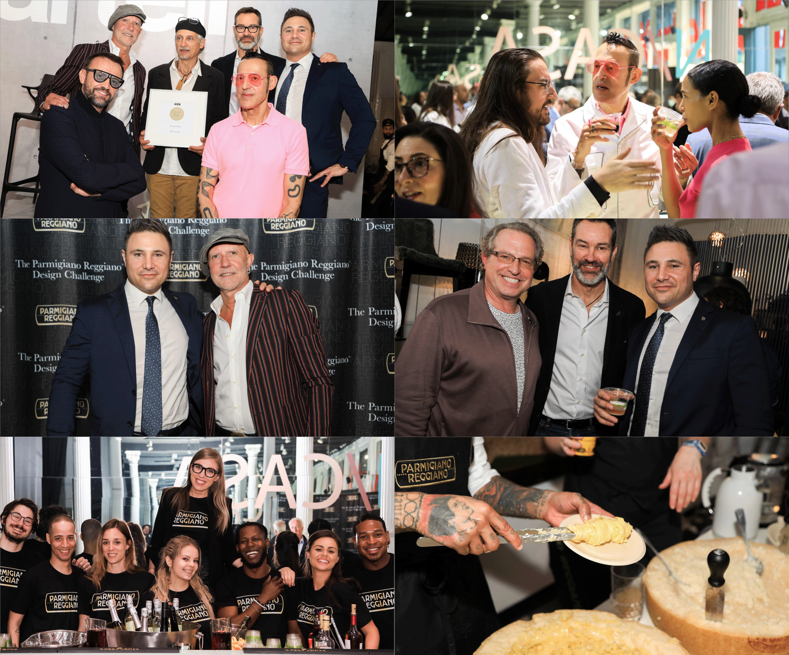
John Jack Elliott enjoying a plate of Fettuccine with Parmigiano Reggiano at the Awards Party on May 19, 2022 at the Kartell Showroom in New York
BEST OF SHOW + GOLD AWARD
Matassa Lamp by John Jack Elliot
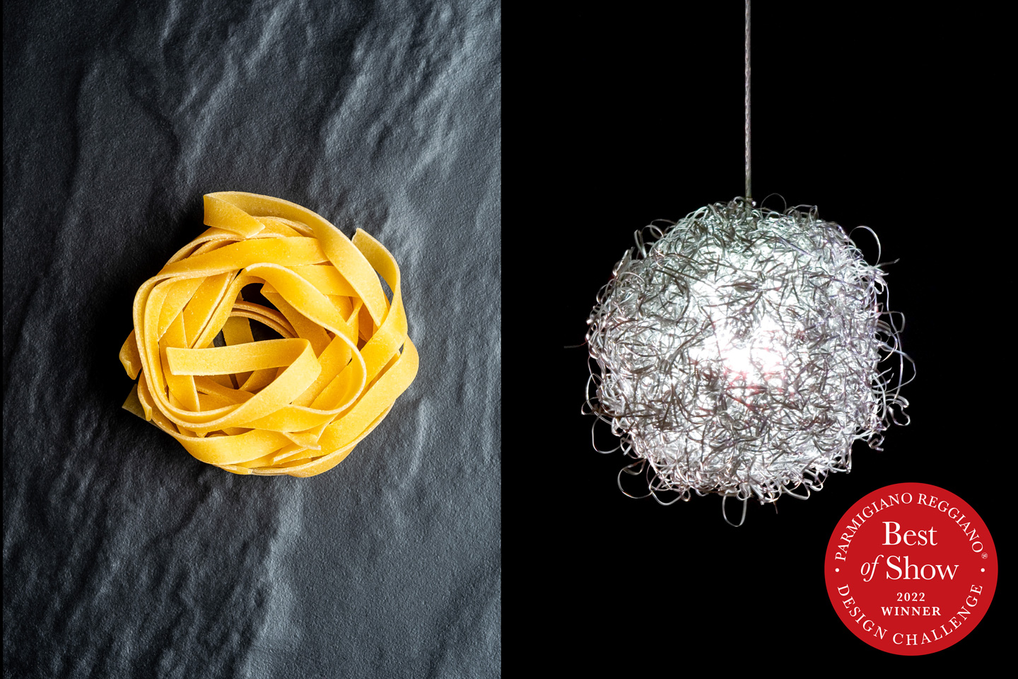
The Best-of-show-winning Matassa lamp’s bundled-up shape takes inspiration from a ball of tagliolini, a long, flat pasta that is cut into thin strips and sold as tangled clumps. However, its inspiration isn’t just the only interesting thing about the lamp. Its unique design is effectively created by the waste the lamp itself generates! Each Matassa comes with a machined aluminum ceiling rose, and the strands that are generated as waste during the machining process are then used to create the pasta-inspired aluminum wool mass, which does a marvelous job of reflecting and bouncing off light in all directions to create a ceiling lamp that’s eye-catching, but also appetizing!
‘At The Table’ Winners
Totem by Isabella Lovero & Enrico Bosa (Silver – Professional)
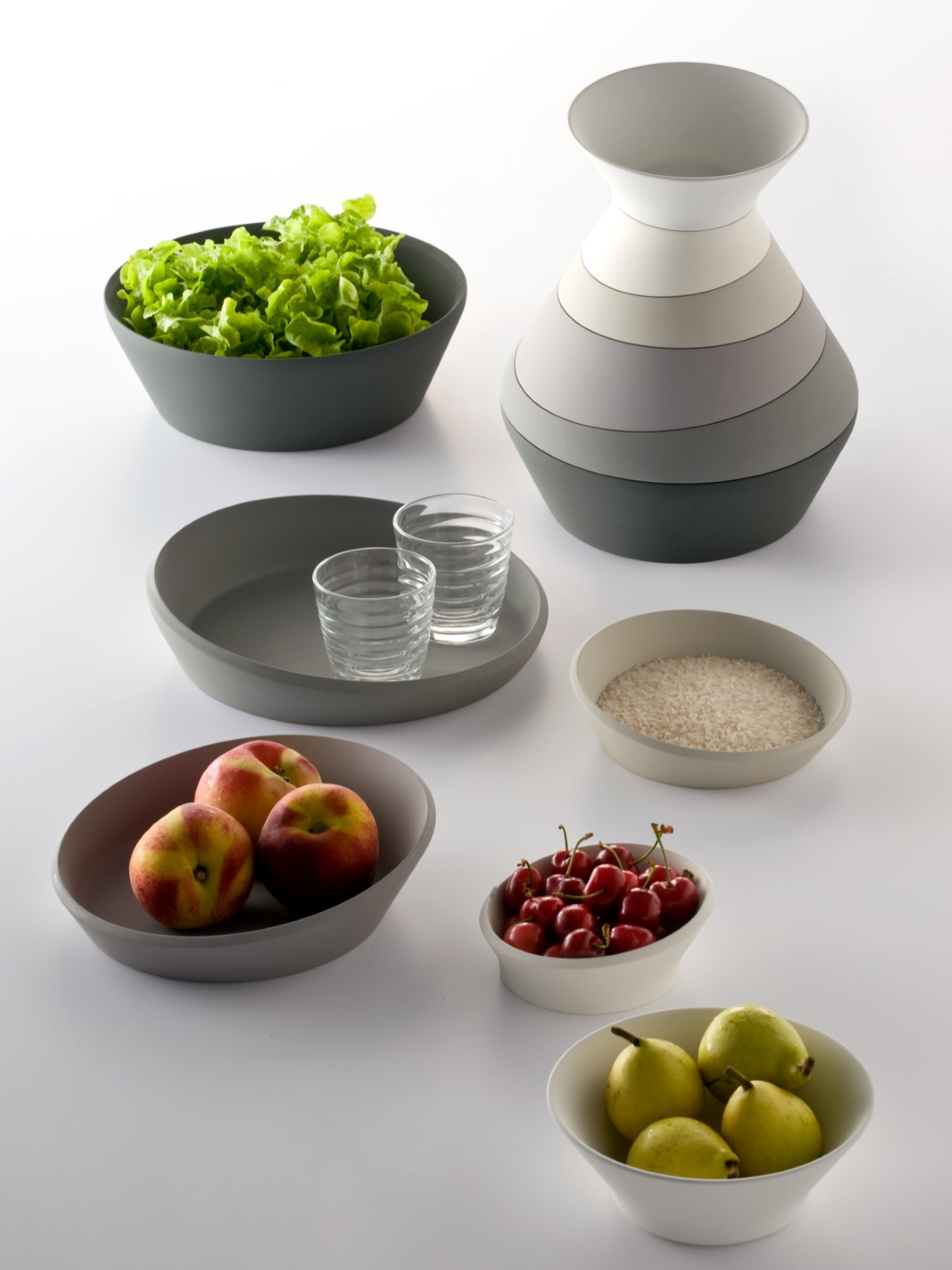
Totem is a system of stackable food containers designed to double as a centerpiece at the table. The slanted cut of each piece and their shades of grey help define the stacking order, creating a play of veins inspired by the stones of the Reno river – which cuts across the region of origin of Parmigiano Reggiano cheese. According to the two Italian designers, “Diversity was one of the inspirations for the design, both in terms of the organic shapes of the bowls, and its use as both a functional and a decorative object. Additionally, we envisioned that the containers would be made from natural organic wheat straw fiber, which is a byproduct of wheat production, – therefore aligned with zero-waste principles. Lastly, this durable bioplastic material is 100% BPA free, non-toxic, odorless, and biodegradable”.
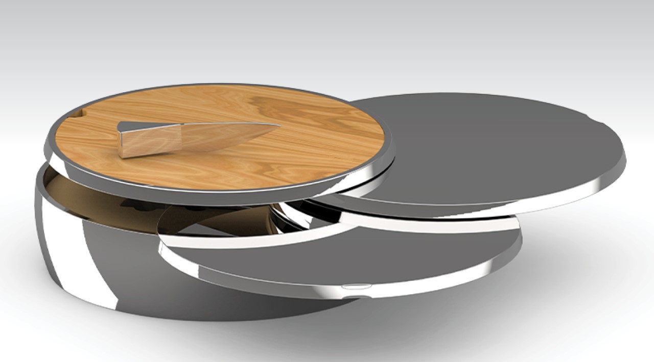
Apertivo by Ryan Twardzik (Bronze – Professional)
The design of the “Apertivo” was inspired by the iconic shape of a Parmigiano Reggiano cheese wheel. Divided into four sections, Apertivo offers an attractive solution for a happy hour spread featuring our favorite cheese. The Apertivo design incorporates the diversity theme through a variety of materials, like wood, steel, and soft cloth, each offering a different kind of touch, adding a rich tactile experience. Also, the Apertivo is made of materials that will acquire a patina and look better over time – which addresses the aging theme.
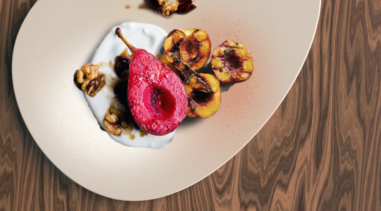
Sensei by Kim Bujak (Gold – Student)
Sensei radically reimagines how we look at our food on the plate. Made of beige earthenware with a thermochromic coating, Sensei glows to show you what food on your plate is warm versus which elements aren’t. From 30C°, the plate turns in light orange in a radius of two centimeters and shows which part of the food is warm by the framing effect. From 5-15C°, the area around the colder food turns whitish. Millimeter-sized thermo-sensitive speckles become visible through a change in temperature and offer a new level to put the work of art on the plate in the right light. This isn’t just a usability feature, it also becomes an artistic one, creating new avenues for plating and food presentation!
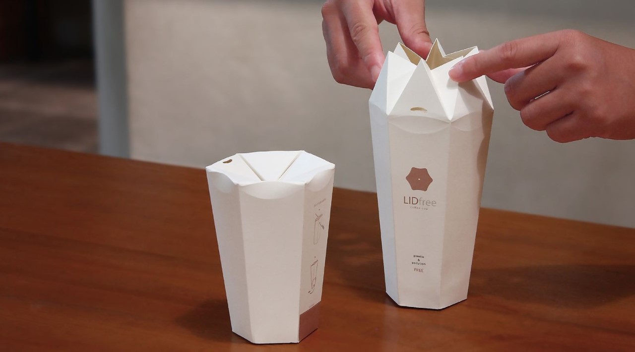
LIDfree by Chia-Chun Chuang & Pei-Chun Hsueh (Silver – Student)
Meet the LIDfree, a to-go paper cup that comes with its own fold-in lid. While the lid isn’t 100% spill-proof (not even the plastic ones are), it does a few key things really well. A. Preventing spillage. B. Merging of two products (cup and lid) into one. C. Giving you a central channel to put your straw (and even giving you the option to not use one) and finally, D. replacing a wasteful plastic part with a recyclable paper one. The LIDfree cup features a nifty folding rim that collapses inwards to shut the cup. While it leaves a central hole open, the design still, for the most part, remains spill-proof as the hole remains at an elevated position when the cup is lying on its side. Moreover, the central hole is perfect for inserting straws of any width (hopefully eco-friendly ones!) as the origami elements expand and contract to the diameter of the straw.
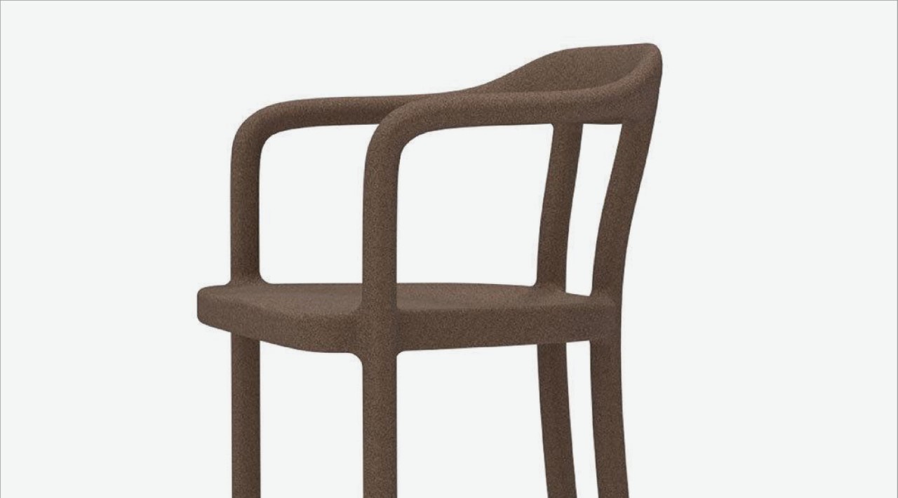
Bean Chair by Lulu Pennell (Bronze – Student)
Championing the idea of recycling waste, the Bean Chair, as its name alludes, is made entirely from used coffee grounds. An estimated 18 to 20 million tonnes of wet, waste coffee grounds are discarded each year, creating a perfect opportunity for it to be recycled. By incorporating spent grounds, the chair maintains a slight coffee aroma, enhancing your eating experience through your sense of smell. The material used also gives the chair a natural brown color without having to use any dyes or pigments. Ultimately, Bean isn’t designed to be just another recycled chair – it also hopes to make seating uniquely multisensorial. By incorporating the mild fragrance of coffee into the chair, the Bean Chair makes for a rather multi-dimensional product. I think every café should have these chairs!
‘In The Kitchen’ Winners
Haptics of Cooking by Boey Wang (Gold – Professional)
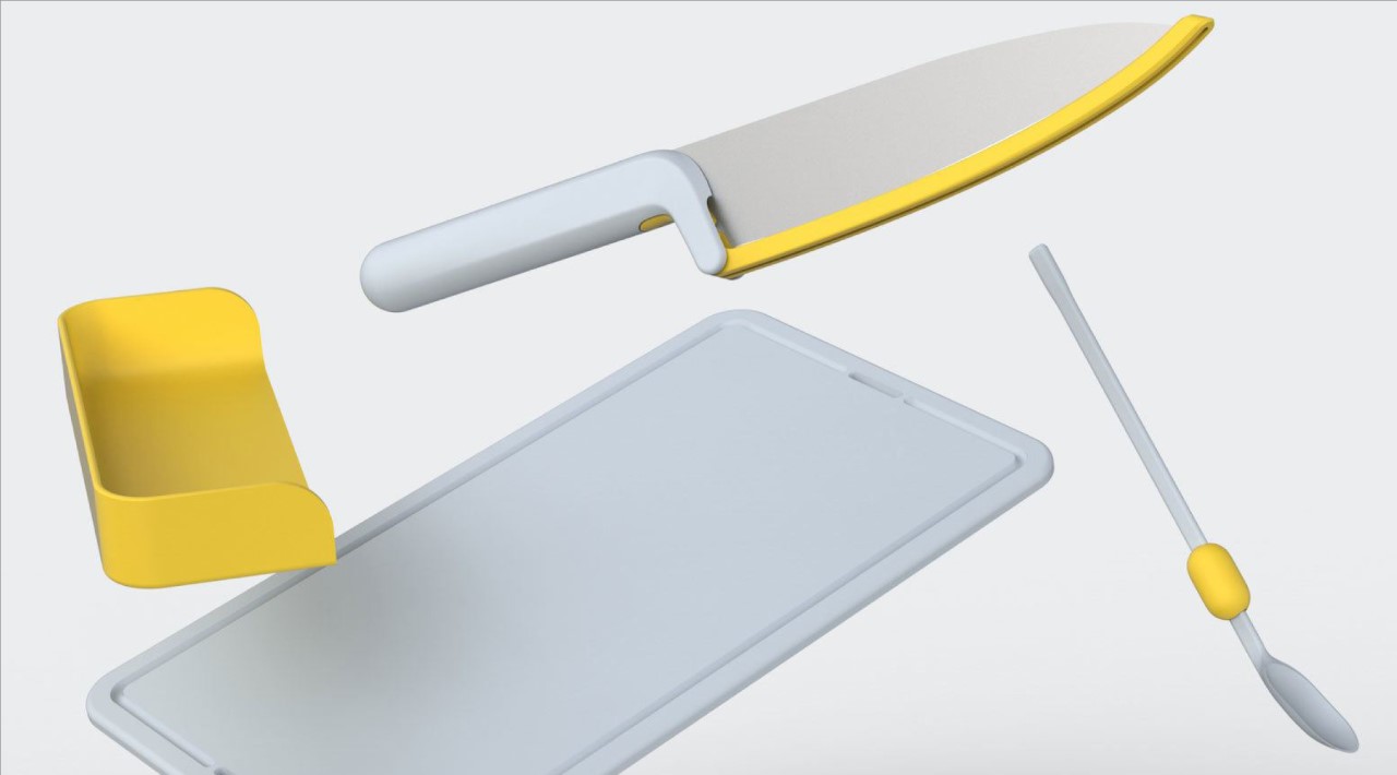
Building on a theme similar to the previous Folks Project, this design from Boey Wang further helps the visually impaired with food preparation. Called the Haptics of Cooking, it relies on the science and technology of transmitting and understanding information through touch. Ranging from your chopping board and knife to even measuring cups that have intuitive bumps to let the user know how much water they’re filling, the Haptics of Cooking allows food-prep to be as intuitive to the visually impaired as it is to other people. “This project embraces the concept of diversity by the simple fact that it is about a product for the segment of our population whose vision is impaired”, says designer Boey Wang.
HUB by Rotimi Solola (Silver – Professional)
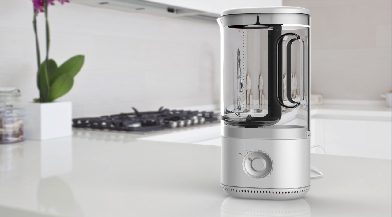
HUB approaches the problem of planned obsolescence and product repairing from a different perspective. Designed as a modular appliance, HUB serves as a blender, processor, and stand mixer while relying on one singular motor element that connects to all three modules. Called the HUB, this motor element becomes the primary appliance that shapeshifts based on the module you use. “Through research I found that people aren’t willing to service or fix damaged products themselves if they don’t understand how to do so—they’d simply rather simply buy a new thing,” said designer Rotimi Solola. “If complex products were simple to understand, diagnose, and disassemble, would this change consumers’ willingness to fix them?” The HUB expands on that idea by uniting different appliances in a way that pushes consumers toward wanting to repair broken gadgets. The HUB is designed to be repaired, and since it’s essentially a 3-in-1 appliance, you’re less likely to throw out all three appliances if your HUB stopped working.
Cooking Totem by Adrian Perez (Bronze – Professional)
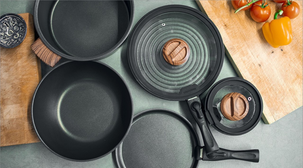
The Cooking Totem might look like a massive cauldron, but it’s actually every cooking utensil you’ll ever need. Packed with seven different utensils cleverly stacked one into another, the Cooking Totem’s uniquely integrated design helps save space as well as money. Made primarily out of cast iron, the Cooking Totem has a crepe pan, soup pot, saucepan, skillet, wok, two lids, and a detachable handle all built into one design. When packed, the Cooking Totem comes together like a Matryoshka Doll, with elements nesting one into another. However, when you need to cook, virtually everything you need rests right within the Cooking Totem’s space-saving design!
Unità by Nicole Tan (Gold – Student)
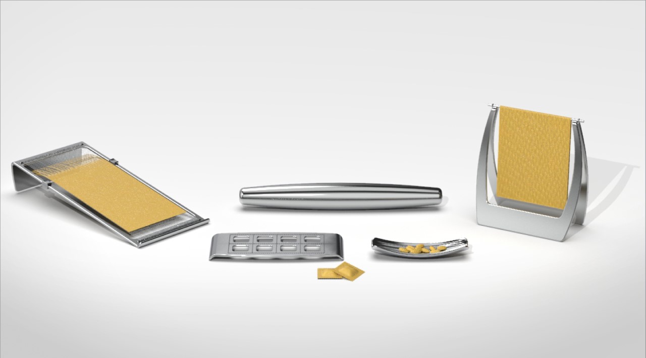
Unità wonderfully brings pasta into the modern age by fusing contemporary design with the age-old tradition of hand-making pasta. It comprises a rolling pin, a pasta cutter with 2 different wire cutting sizes, a gnocchi board, a ravioli cutter, and a drying rack, all designed to elevate the art of pasta-making by being objects of art in themselves. “In today’s context, our hectic lifestyles often hinder us from the joys of creativity”, says Nicole. “Unità was created to put a modern twist on the various pasta-making techniques. This makes the process fun and convenient, yet traditional in methodology.”
Folks by Kevin Chiam (Silver – Student)
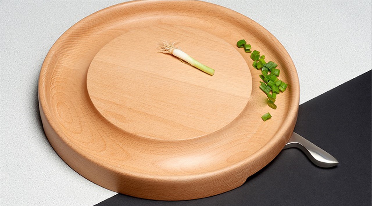
Designed as kitchenware for the blind, Folks consists of a knife, chopping board, and teaspoon that helps guide the visually impaired into intuitive cooking and prep without mistakes or accidents. The knife has a pivoting guard which protects and guides the fingers like a physical anchor during the cutting process while reducing the likelihood of getting cut. Food that is stuck on the blade can also be cleared with a simple trigger. The chopping board is paired with a side tray, which pegs freely on all sides of the board, acting as an extension of the hand and reducing spillage. The teaspoon, a personal favorite, comes with its own integrated buoy, which allows the spoon to float when you add a liquid. It thus becomes a reference point that informs the blind of impending liquid contact and lowers risks of scalds or burns.
Grow-N-Glow by Jez Sun (Bronze – Student)
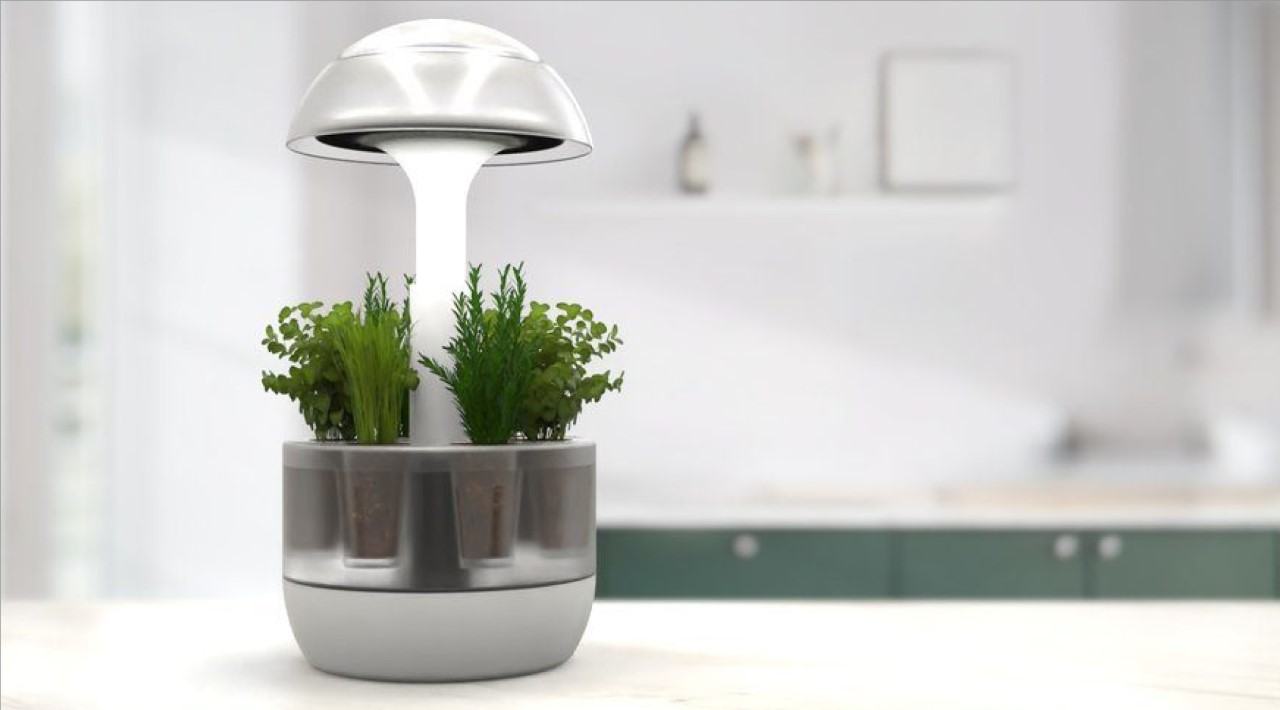
Grow-N-Glow is an intelligent countertop garden designed to bring a breath of nature and sunshine to urban homes. Styled as a modern lamp, Grow-N-Glow comes with sun-mimicking LEDs that help you cultivate your own kitchen garden from seed to harvest. Designed to be a smart-planter, the glow light also serves as the assistant to tell you when to change the water and add nutrients. Equipped with both ‘grow’ lights and ‘glow’ lights, the tabletop planter helps create the perfect environment for your plants to flourish, while also doubling as a wonderful ambient light that’s ideal for your home.
THE AWARDS PARTY
A celebration at the intersection of food and design
The winners were celebrated in New York City on Thursday, May 19 2022 at the Kartell showroom. The event was timed to coincide with the last day of NYCxDesign and it attracted many prominent members of the design community. The majority of the judges attended the event and presented the Best of Show Award to the winner during a short ceremony. The Best of Show winner will receive a one-week trip for two to Italy, including VIP tours of the Alessi and Kartell Museums, as well as a special visit to an artisanal Parmigiano Reggiano cheese dairy.
Learn more about the Parmigiano Reggiano Design Challenge Awards Winners and the Awards Party
Visit the site for additional information, photos and videos.
The post Parmigiano Reggiano Design Challenge 2022 comes to a close. Here are the winning designs! first appeared on Yanko Design.
via https://ift.tt/zOt879b
Post a Comment
Note: Only a member of this blog may post a comment.