A beautiful piece of furniture can complete a room. It can be the final piece that makes a space come full circle, building a comfortable and cohesive haven, rather than a random area. Furniture pieces make or break a home, they add on to the essence or soul of a home, hence one needs to be extremely picky while choosing a furniture design. The design should be a reflection of you, and what you want your home to be. When you place a piece of furniture in a room, it should instantly integrate with the space, creating a wholesome and organic environment. We’ve curated a collection of IKEA-worthy furniture designs that we believe will do this! From a bookshelf with a plot twist to a chair that’s meant to tip – each of these pieces is unique, well-crafted, and made with a whole lot of love, and the love really shines through in the fine detailing and workmanship. We hope you feel the love too!
1. The Plot Twist Bookshelf
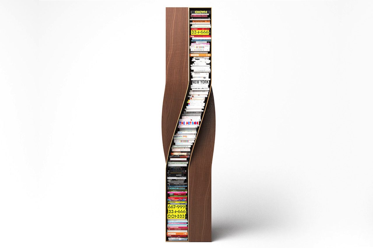
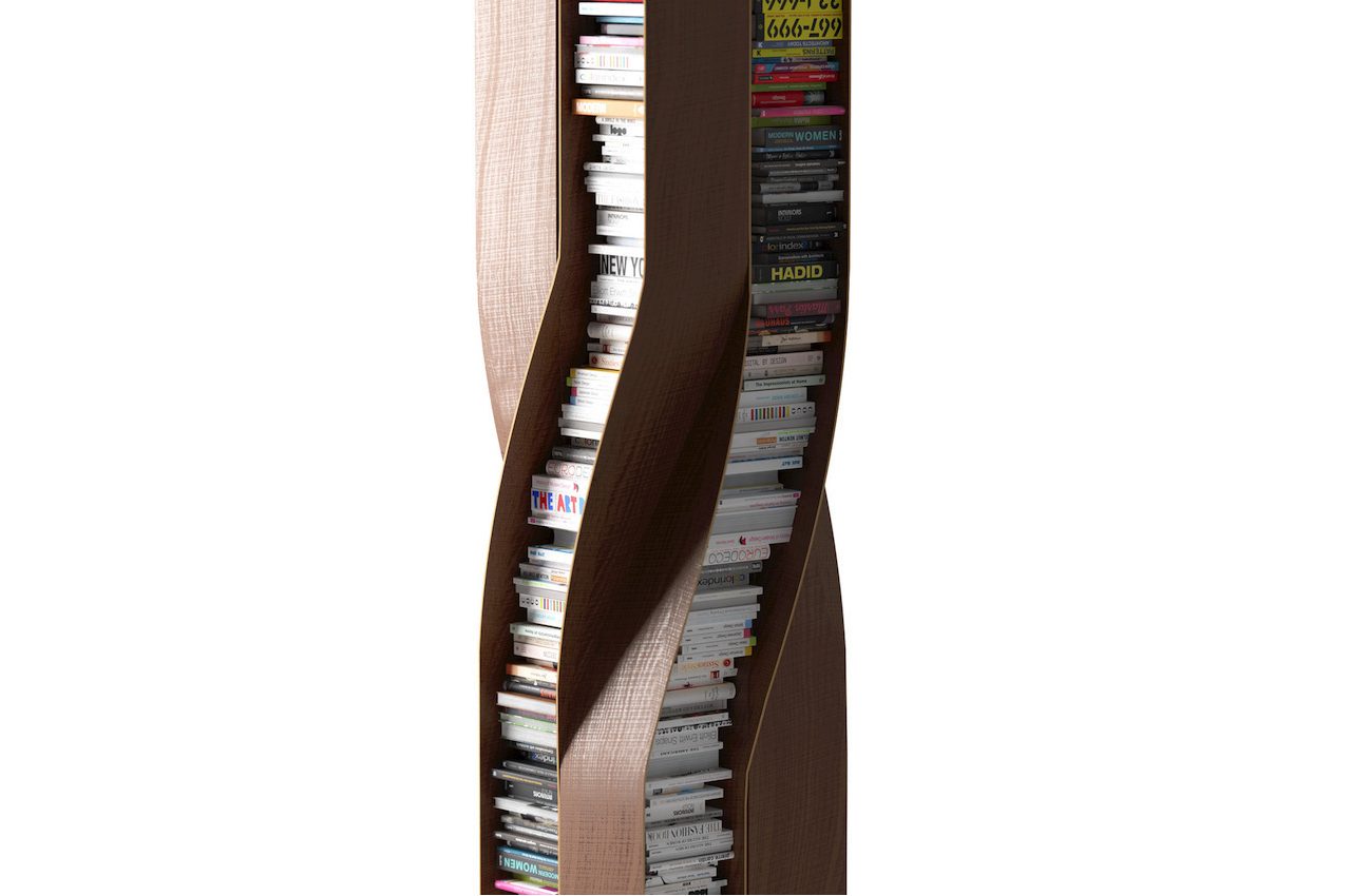
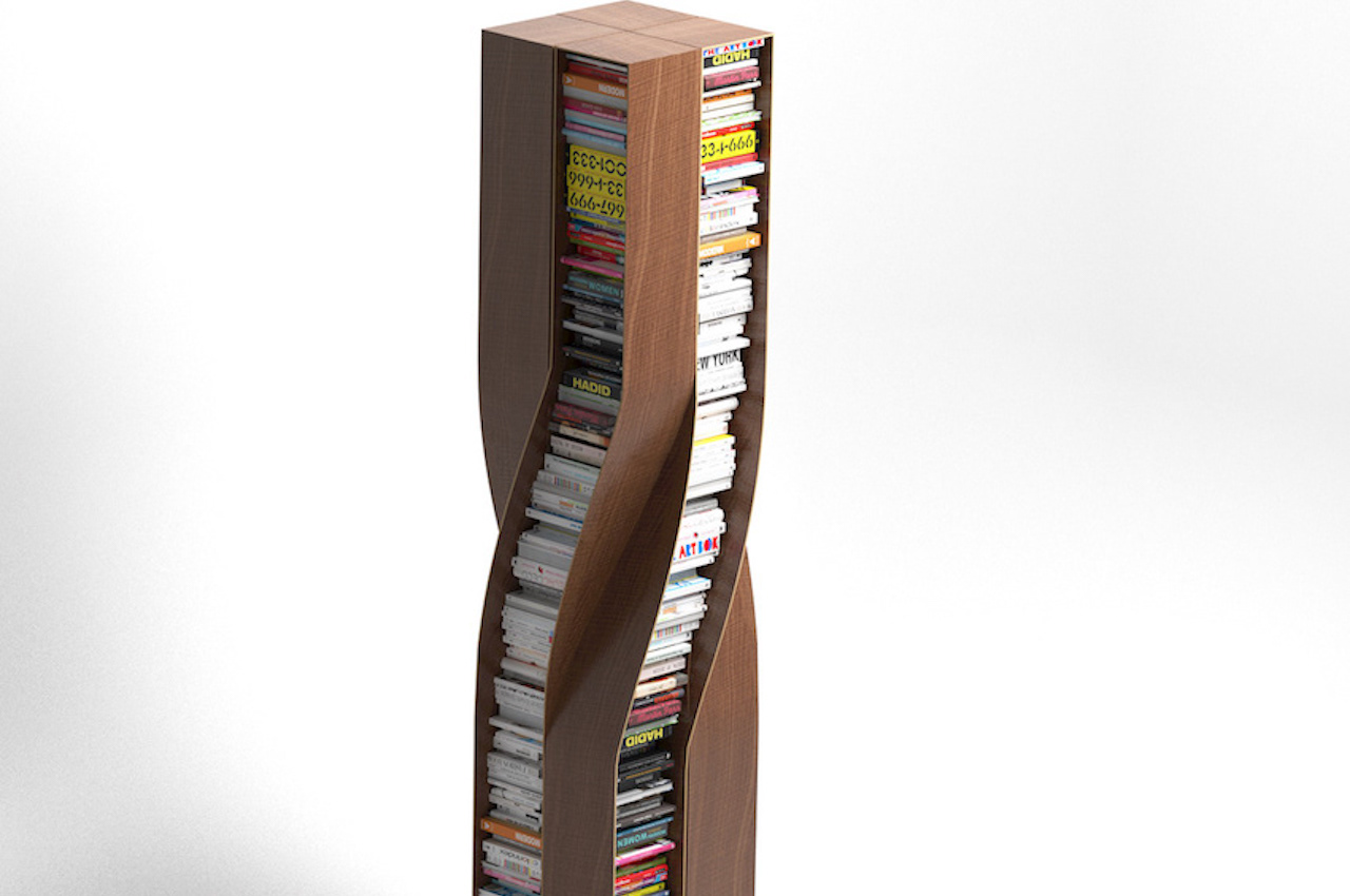
Prolific German furniture designer Deniz Aktay has recently introduced the Plot Twist Bookshelf. It’s a piece of furniture that features four separate twisted wooden elements. They are connected to each other, shaping and creating a stable form.
Why is it noteworthy?
The bookshelf’s design allows it to be accessed from every side. As with most of Deniz Aktay’s product designs, this bookshelf is oddly satisfying. The curves are present as with the designer’s other projects. In addition, most of Aktay’s works have undergone some bending or twisting, as with the Wavelet, the Tie Stool, and The Pet Table.
What we like
- The shelves can accommodate similarly sized books for a clutter-free look
- The bookshelf is stable and stands on its own
What we dislike
- Space consuming design
2. The Pessoa Table
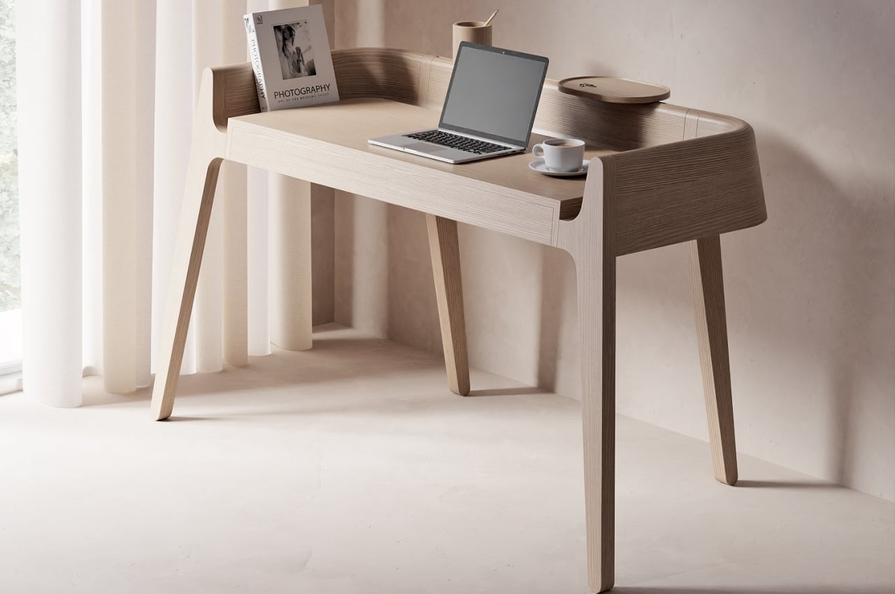
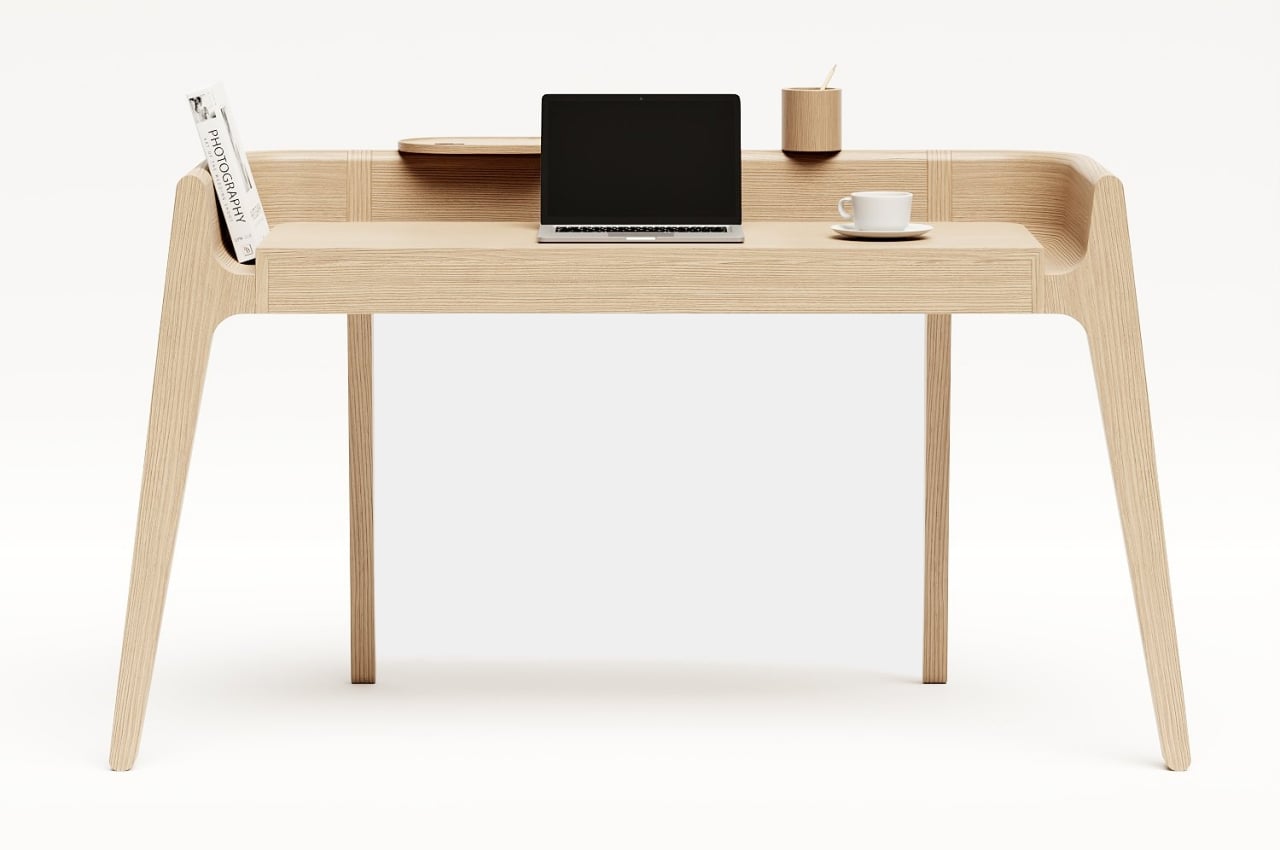
Minimalist desks are great at sneaking organizational features into hidden nooks and crannies, but this striking work table has those compartments and spaces hiding in plain sight.
Why is it noteworthy?
Given the desk’s simple yet beautiful appearance, it might come as a surprise to learn that its form is actually inspired by three very different people with very different personalities. Or, to be more precise, the desk is named after the famed Portuguese writer Fernando Pessoa, whose different “heteronyms” (he doesn’t want to call them pseudonyms) have different and sometimes extremely conflicting ideologies. But almost like a metaphor for that situation, the Pessoa table still retains a unified appearance and beauty, just as all of Pessoa’s seventy-five heteronyms spring from the same man.
What we like
- Minimal + vintage looks
- Features two containers that float in the back panel
What we dislike
- No complaints!
3. The Swing Ao Stool
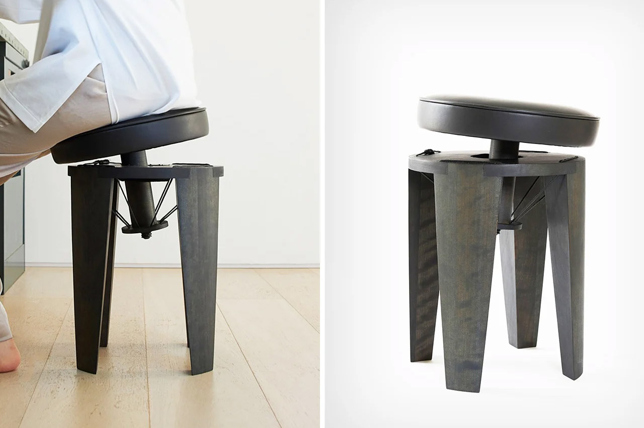
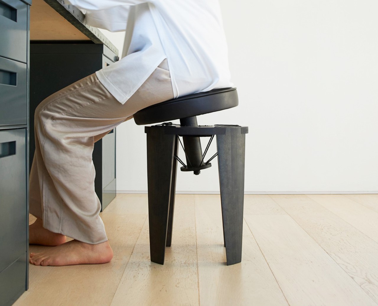
Dubbed the Swing Ao Stool, this little number by Takusei Kajitani explores a fun concept of using tension to emulate ‘softness’. Sort of how a hammock feels soft like a beanbag, although there’s no ‘cushioning material’ inside a hammock, the Swing Ao chair provides a level of flexibility thanks to the fact that the seat is, in fact, suspended from the chair’s four legs.
Why is it noteworthy?
The idea, says the designer, was born from a need to eliminate the sedentary lifestyle. “Most chairs have been designed on the idea that sitting is a static movement despite the human body is designed to move,” says Kajitani. “It forces our body to stay rigid for a long time.” To that end, the Swing Ao Stool promotes constant movement. Sort of like sitting on one of those yoga ball chairs, the Swing Ao Stool keeps you constantly moving, feeling like a cross between a stool and a pogo stick!
What we like
- The chair’s unique design explores a special arrangement where the seat and the legs don’t really touch each other
- This tension structure allows the seat to move freely in conjunction with the movement of the sitter’s pelvis like a small swing
What we dislike
- No complaints!
4. The Landr
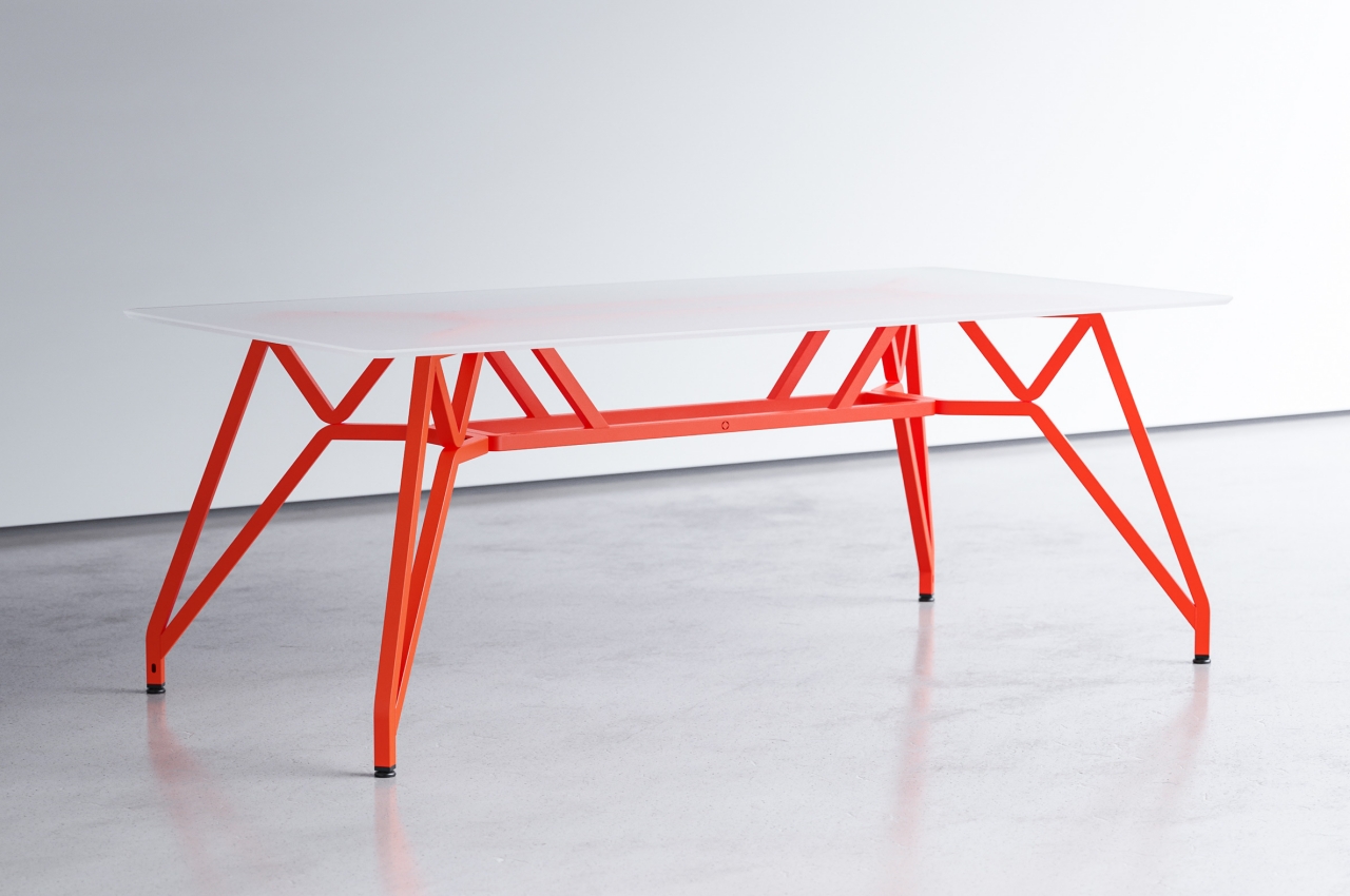
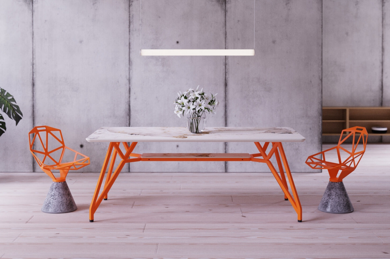
The Landr dining and conference table tries to correct the design mistakes of common tables, promising enough stability that you can even place a lander on top of it to screw a light bulb.
Why is it noteworthy?
Of course, we’d rather you didn’t, but Landr’s designer is so confident in its stability to make such a bold and unqualified claim. Whether you’re cutting bread or standing on top of it, the table shouldn’t budge a single inch. At the very least, it wouldn’t collapse from under your weight, and it definitely looks like it could handle a rough lunar mission. That’s despite having a modular design that is also promised to be trouble-free to assemble.
What we like
- Extremely easy to assemble
- It is mostly made of renewable or recyclable materials
What we dislike
- No complaints!
5. The Circus Coffee Table concept
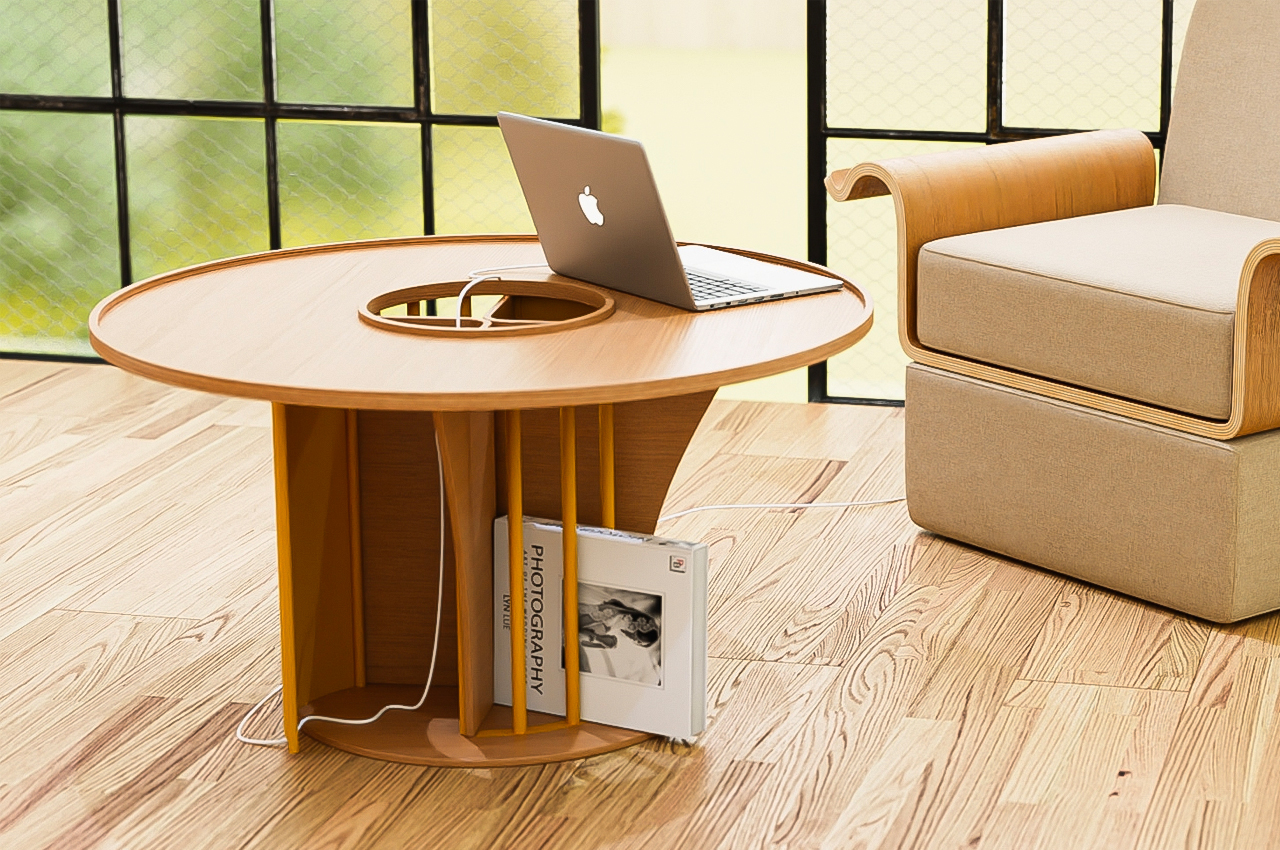
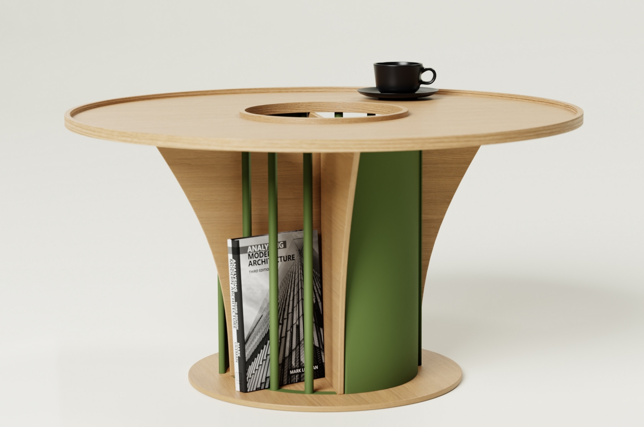
The “Circus” coffee table concept is designed to bring people together in a more active and almost chaotic way. It’s taller than most coffee tables, tall enough to be a regular desk. In fact, it can even be used as one and has features designed to accommodate working on it.
Why is it noteworthy?
The table’s jumble of shapes and materials is almost chaotic, just like a circus. You have a predominantly wooden table with metal components that add functionality to the table. The large circular hole in the middle turns the disc into a donut and reveals two triangular shapes that form the legs of the table. Instead of a solid cylindrical base, the table has metal bars and doors on opposite sides, creating further contrasts in terms of design.
What we like
- The bars serve as slots for books
- The solid panels, on the other hand, are doors for storage, as well as a way for charging cables to go through without dangling from the edges of the table
What we dislike
- It’s still a concept!
- Probably impractical in setups where a wide cough is involved
6. Brustolin’s furniture collection
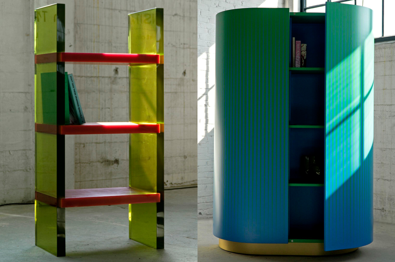
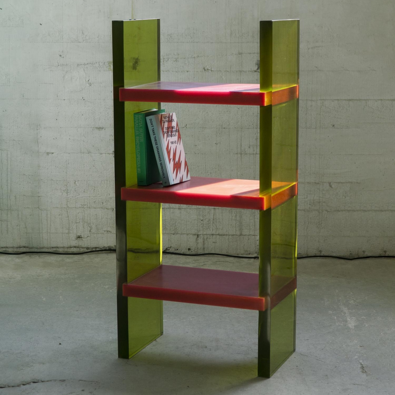
On their own and with their peculiar designs, these pieces of furniture would have pretty much fit the description of minimalist products. Their basic shapes and base color schemes are not that uncommon, but as with anything in life, it’s the different ways you mix these elements up that really make a difference. And in this collection, it’s exactly that interaction of elements that makes them stand out without removing their primary function as usable pieces of furniture.
Why is it noteworthy?
The translucent epoxy resin legs and opaque shelves already give the Differ Shelf a sharply contrasting motif. It is, however, the way the light bends, reflects, and refracts through those yellowish panels that turn the shelf into an almost dazzling light show, depending on where you stand. Given its unique visual properties, this shelf is designed to stand in the center rather than against a wall so that people can walk around it and view it from different angles. It truly differs from other shelves.
What we like
- Made by Venetian craftsmen
- Brustolin’s furniture collection displays an interesting way of giving shape to color
What we dislike
- No complaints!
7. The Diag Desk
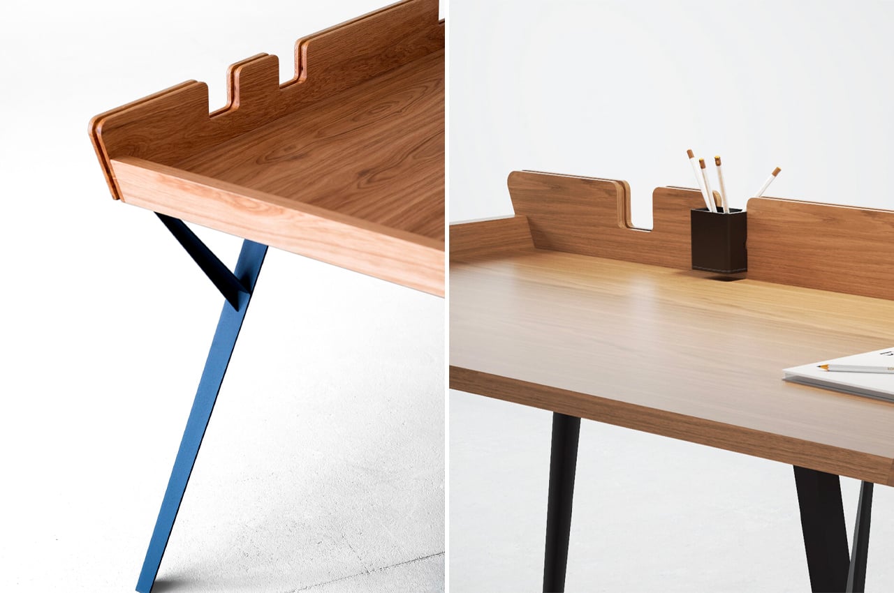
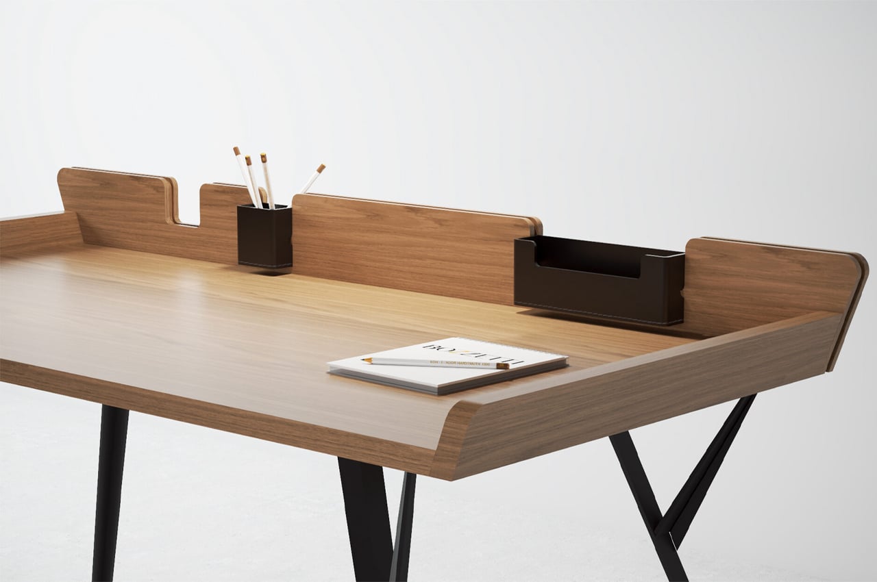
The Diag Desk is a minimalist, modern desk built to optimize desk space while incorporating storage elements like removable leather compartments. When it comes to desks, the simpler the better. Desks that are rooted in simplicity, either through a minimalist approach or by embracing Scandinavian aesthetics, typically offer a lot of practicality while maintaining a stripped-down design.
Why is it noteworthy?
Considering its minimalist build, more space can be devoted to the desk’s tabletop, where most of the desk’s purpose is reserved. The Diag Desk from Polish designer Marek Błażucki is one kind of minimalist design that integrates storage systems into its build, ensuring that users have ample desk space while still keeping their necessary stationery within arm’s reach.
What we like
- Integrates ample storage systems into its build
- Ensures stationery doesn’t fall off
What we dislike
- There are a lot of visually similar desks on the market
8. The O6
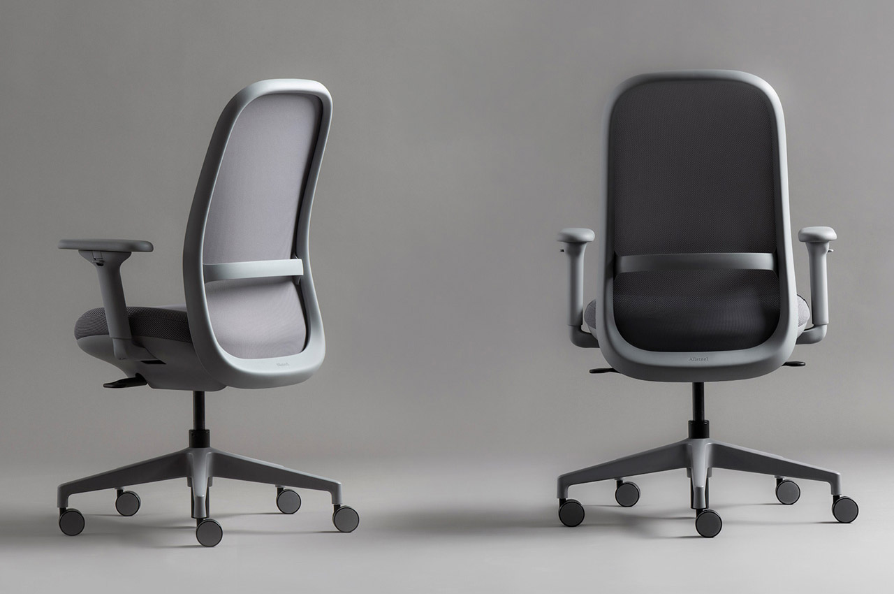
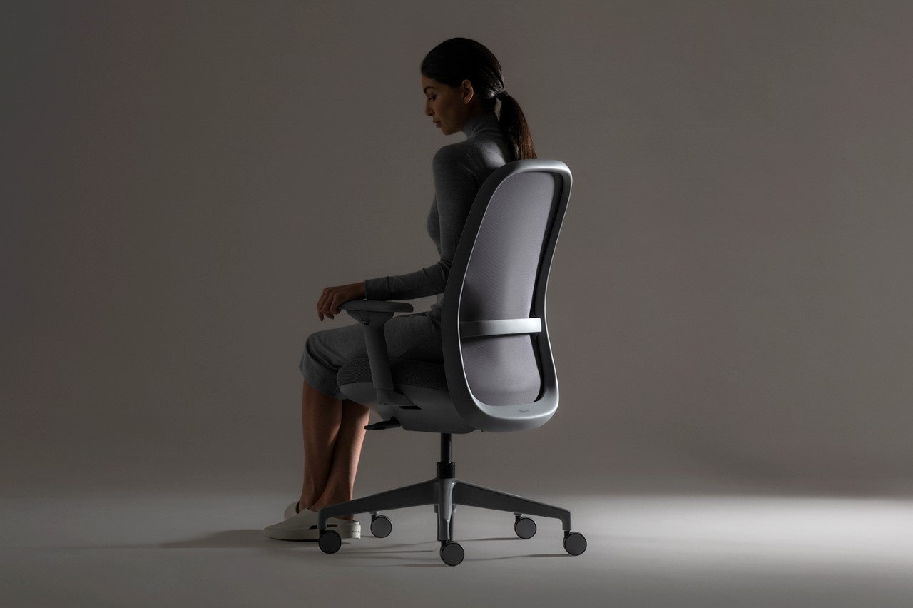
Named after the O-shaped backrest that gives the chair its distinct lightweight design, the O6 is the result of a 2-year collaboration between Benjamin Hubert’s LAYER Design and Allsteel.
Why is it noteworthy?
The O6, like a lot of LAYER’s past work, relies on balanced forms, curved edges, and soft forms that create a visually comforting experience that in the case of the O6 also extends to the actual experience of sitting on the chair too. Designed to blend into your muted office setup (rather than act as a vibrant statement piece), the chair sports a greyscale color palette and comes in 4 color options for the frame going from a light neutral grey all the way to black. Users can further customize the chair’s design by choosing from as many as 22 different colors of Spectrum mesh for the back and seat and six 4-Way Stretch mesh back colors.
What we like
- The idea for the O6 was to create a design that embodies the aspect of easy and comfortable productivity
- The chair’s name also pays a hat-tip to the six key interactions that enable the user to configure the O6 for ultimate comfort
What we dislike
- No complaints!
9. The O TRL
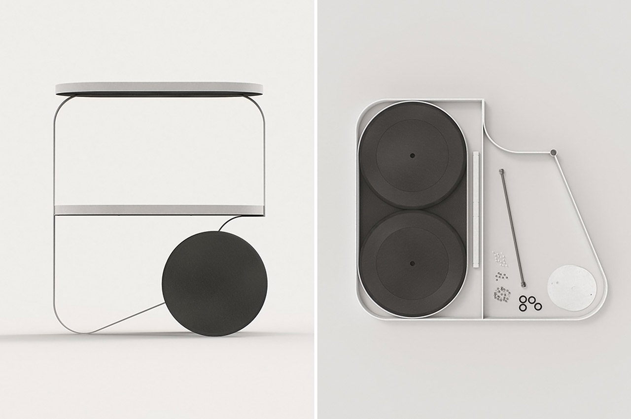
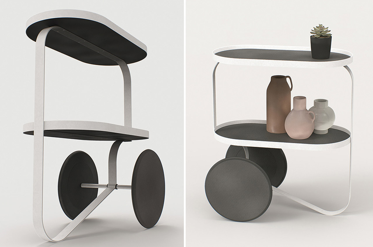
What the world needs more of is minimal and elegant furniture like the O TRL by Annabella Hevesi. Annabella created this tray table as a versatile piece of furniture – use it to store your stationery, kitchen knick-knacks, or as a makeshift desk in work from the home emergency scene – the pure and minimal aesthetics of this design make it a perfect match everywhere.
Why is it noteworthy?
The trolley has a slim and sleek silhouette and is constructed using a black MDF board, powder-coated steel, and rubber. Do not be fooled by its humble looks; this tray can bear its fair share of weight and move around smoothly, given its large weight-bearing wheels.
What we like
- Can bear weights
- Moves around smoothly
What we dislike
- The design looks a little frail
10. The Tippi Chair
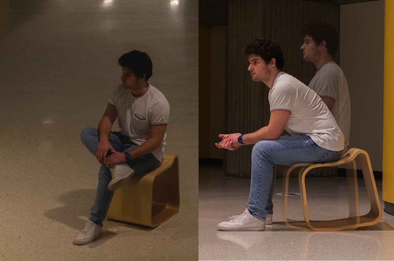
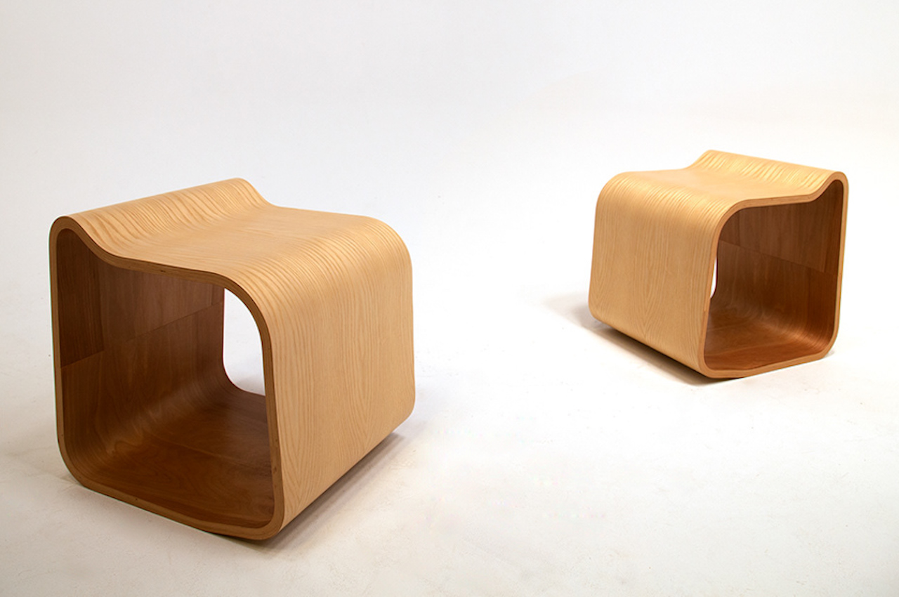
For Joshua Corder, the Tippi Chair tells us a person’s tendency to play with a chair, so it tips over. Instead of coming up with an asymmetrical chair, he comes with something that has a sloped back and angled front. The Tippi Chair’s name is derived from the “tip” movement.
Why is it noteworthy?
The chair with the height of a stool offers a tip function which is made easier with a 5-degree tip angle. The Tippi Chair doesn’t really have separate legs but the front and back support serve the same purpose. There is a small curved backrest that makes it easy for anyone to grab and carry the chair. The space underneath serves as storage for your bag or shoes.
What we like
- Ideal on an entryway, allowing you to sit down and wear or take off shoes with more convenience
- Offers a tip function
What we dislike
- It’s not something you can use as a dining chair or as an office chair
The post IKEA-worthy furniture designs that perfectly represent contemporary aesthetics + functionality first appeared on Yanko Design.
via https://ift.tt/bkZguwc
Post a Comment
Note: Only a member of this blog may post a comment.