Although it was largely anticipated, Apple still managed to give us a surprise with the somewhat sudden drop of its new iPad lineup. As expected, the new M2 iPad Pros turned out to be powerhouses to rival the MacBooks in strength, especially when it comes to productivity features enabled by better Apple Pencil support. It might look a little boring, though, since the design remains mostly unchanged from the previous generation. In that regard, it is the new 10th-generation entry-level iPad that’s more exciting and a little bit more confusing. While Apple did finally consolidate its tablet design across tiers, it also introduced a few design quirks that resulted in a bit of bewilderment when it comes to accessories for the 10.9-inch iPad.
Designer: Apple

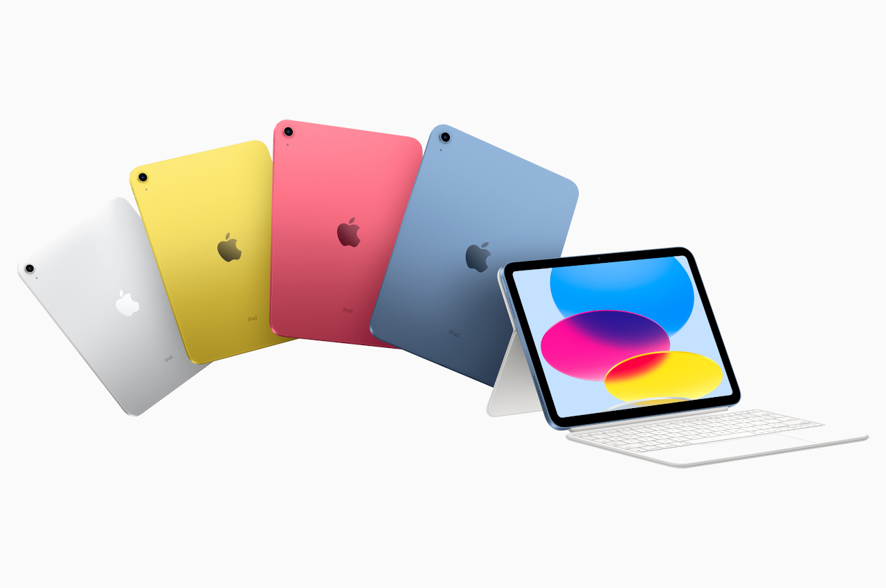
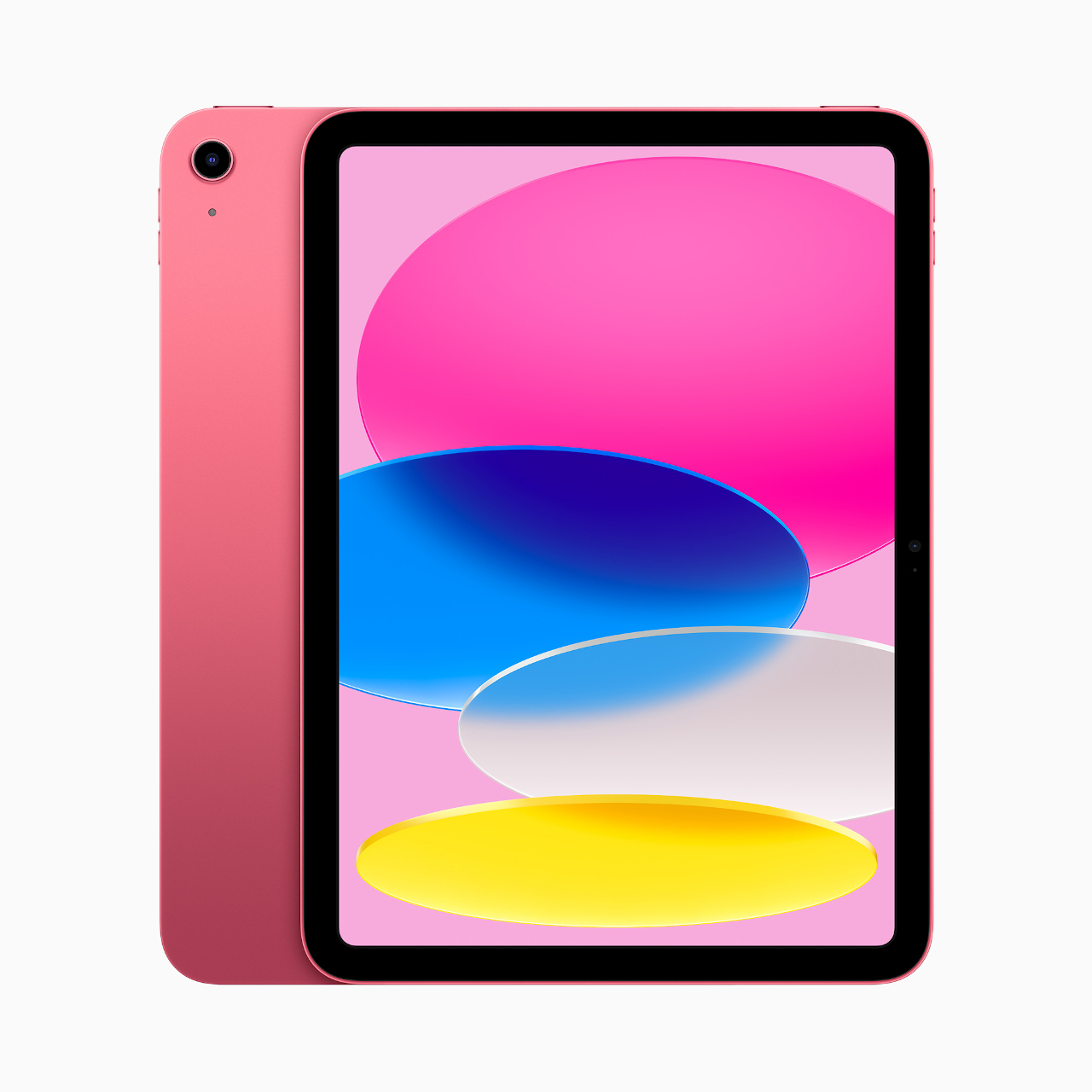
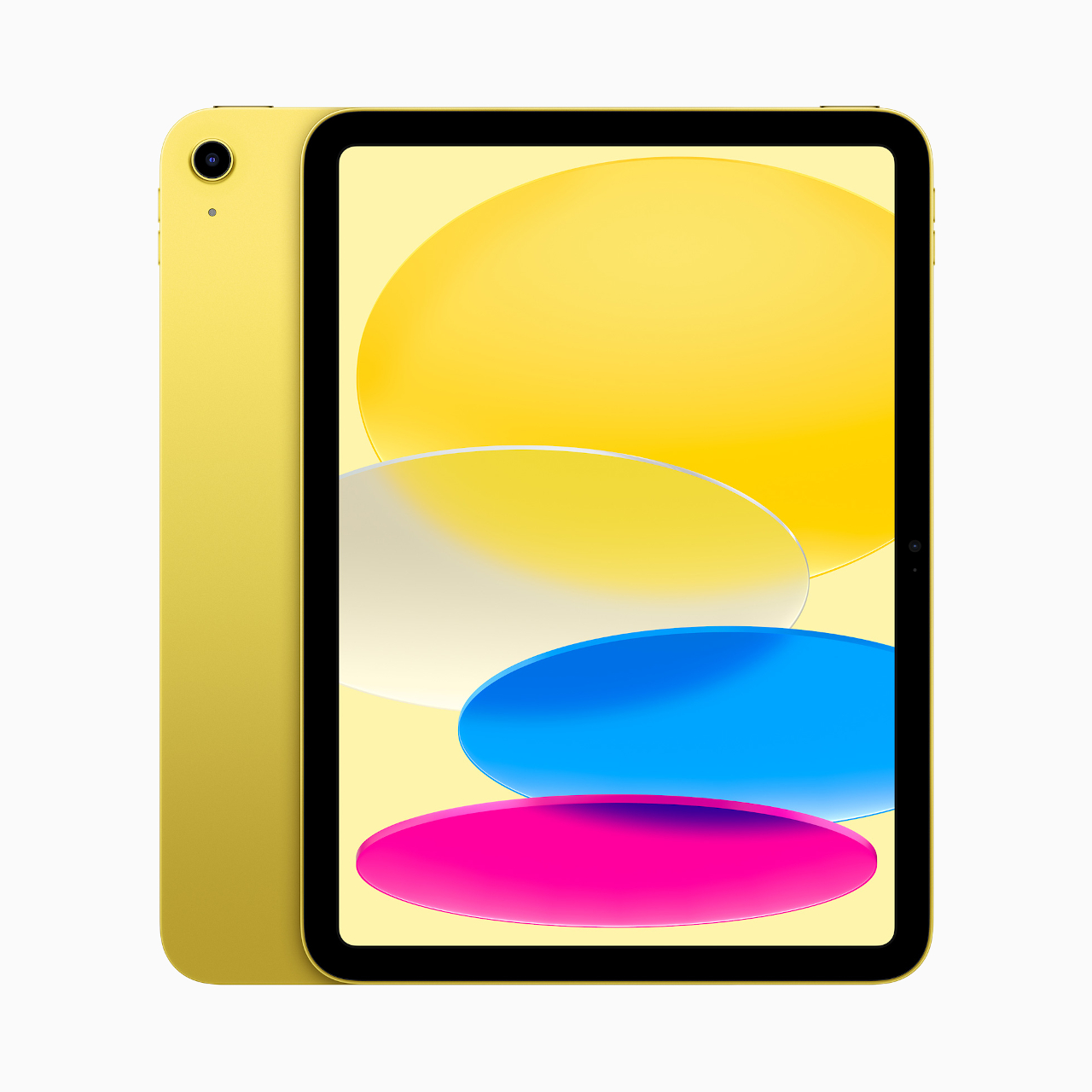
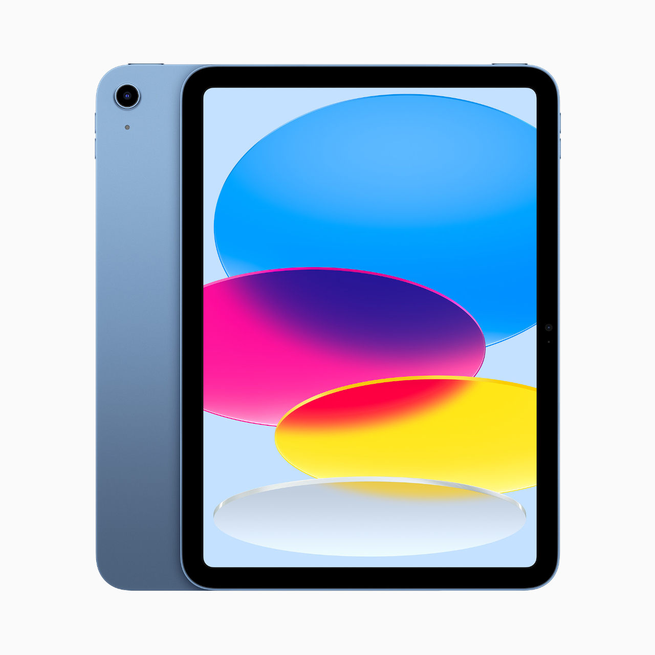
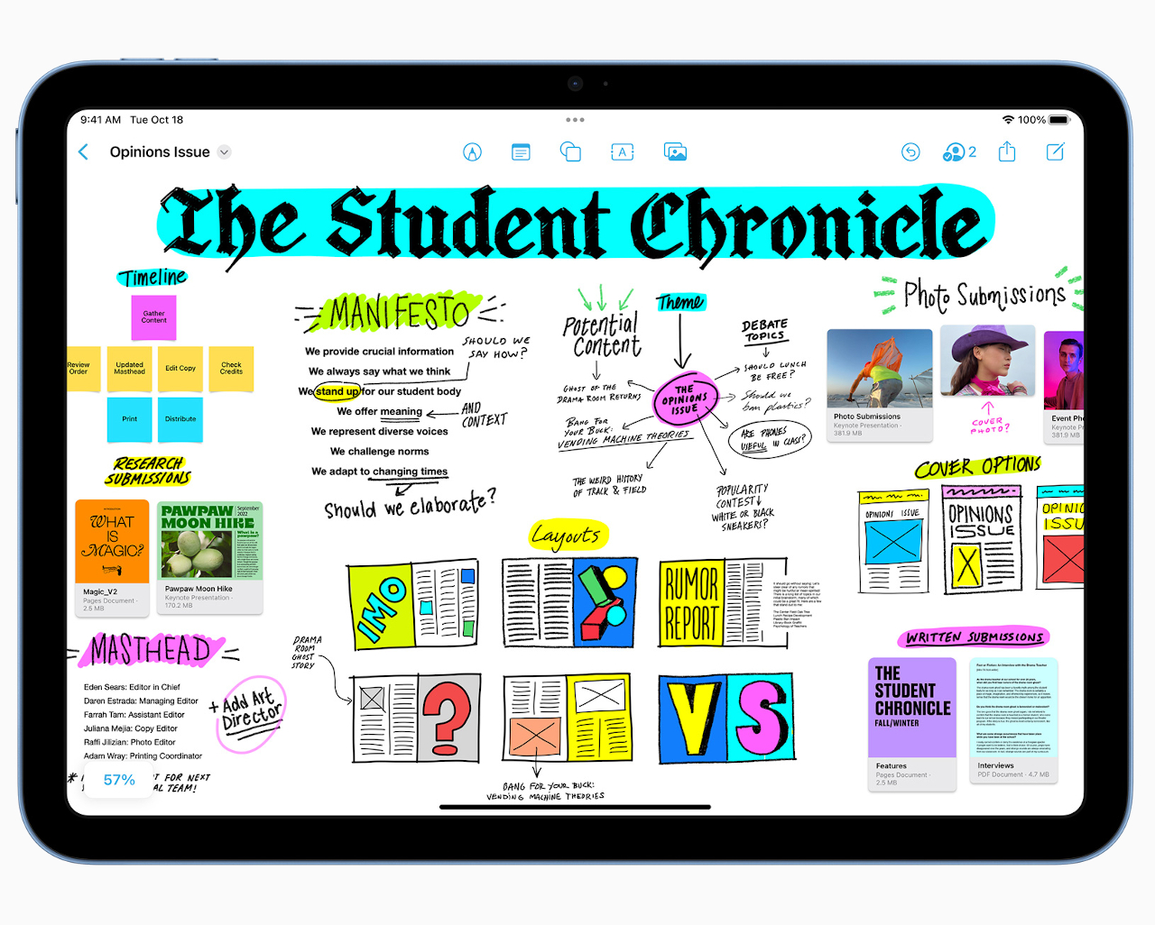
On the outside, the iPad 10 breathes new life into the lineup with vibrant color options that mirror the choices for the latest iMac all-in-one computers. With the switch to flatter edges, Apple has finally unified the look of all of its iPads. It’s a long overdue change that easily identifies an iPad as belonging to the company’s “modern” generation. It’s hard to deny that these new iPads look delightful on their own, and you might be hesitant to put a protective case on them because of that.
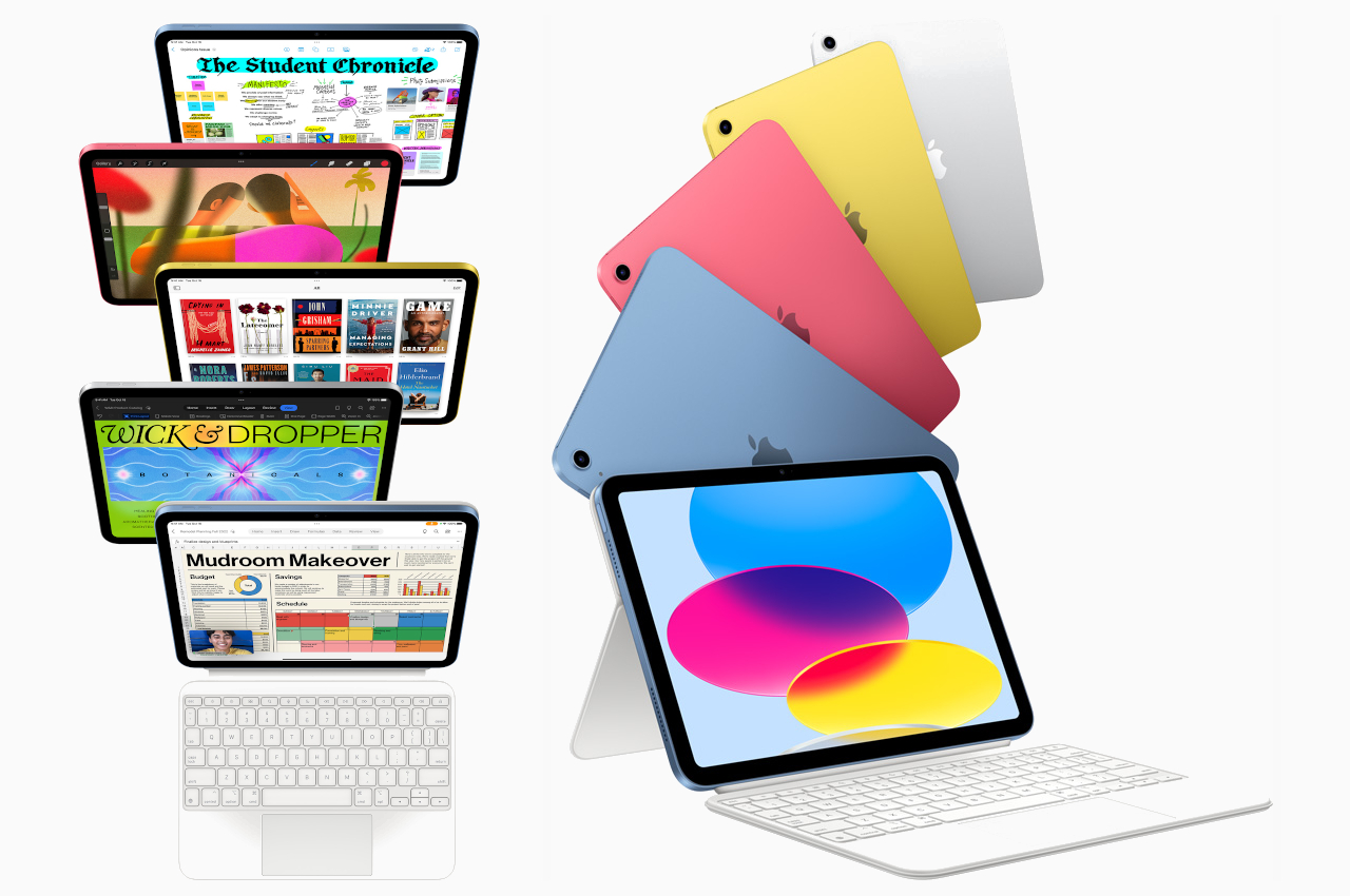
There are also quite a few notable changes inside brought about by the overall design upgrade. The most evident will be the switch from a Lightning port to a more standard USB-C port, which is now also uniform across all current iPad models. An even more significant change, however, is the relocation of the front-facing camera from the portrait edge to the landscape edge. This is admittedly a more natural position for a camera design to be used in video calls while the tablet is standing horizontally on a desk, perhaps with a keyboard cover. Despite that logical placement, none of the other iPads, even the new iPad Pros, have adopted this design, and Apple may have a rather unfortunate reason for doing so.
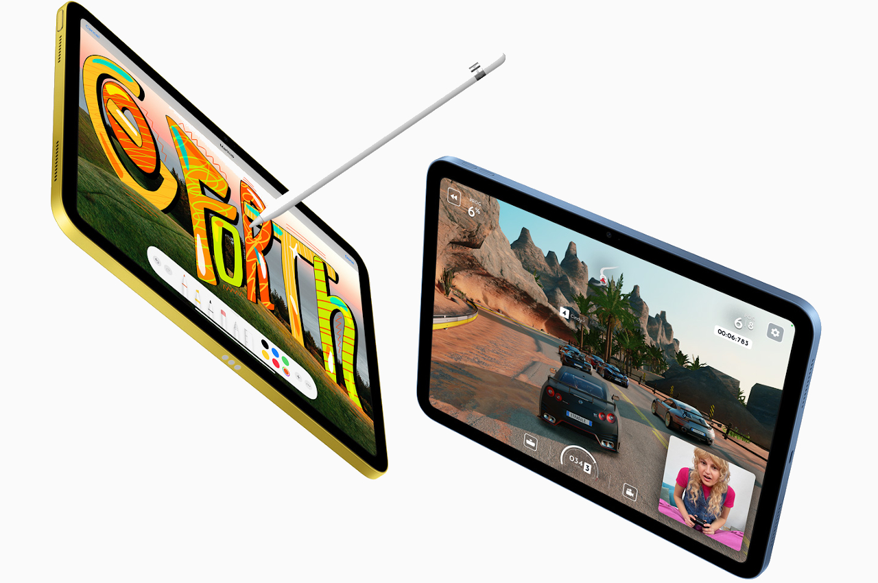
The two major changes above have an adverse effect on the iPad’s most important accessory. Surprisingly, the iPad 10 is compatible only with the first-gen Apple Pencil, making it the remaining iPad to do so. The reason is that the 2nd-gen Apple Pencil can only charge magnetically on the landscape edge of an iPad, a place that is now occupied by the front camera on the iPad 10. Unfortunately, the old Apple Pencil charges only via a Lightning connector, which the iPad 10 no longer has. Apple’s solution, as you might have guessed, is to sell a USB-C to Apple pencil adapter that does solve the awkwardness of the older-gen charging method but introduces a new kind of convenience in the process.

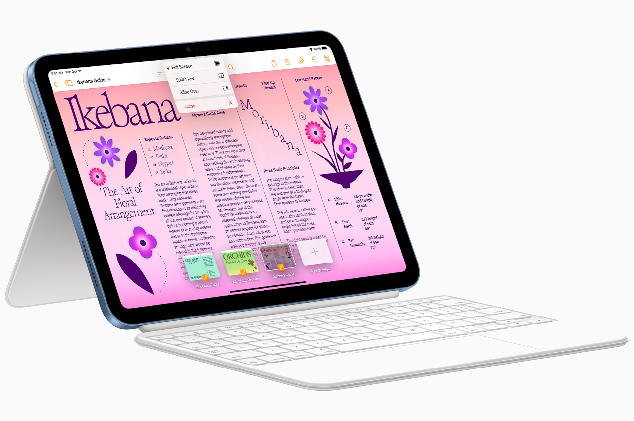
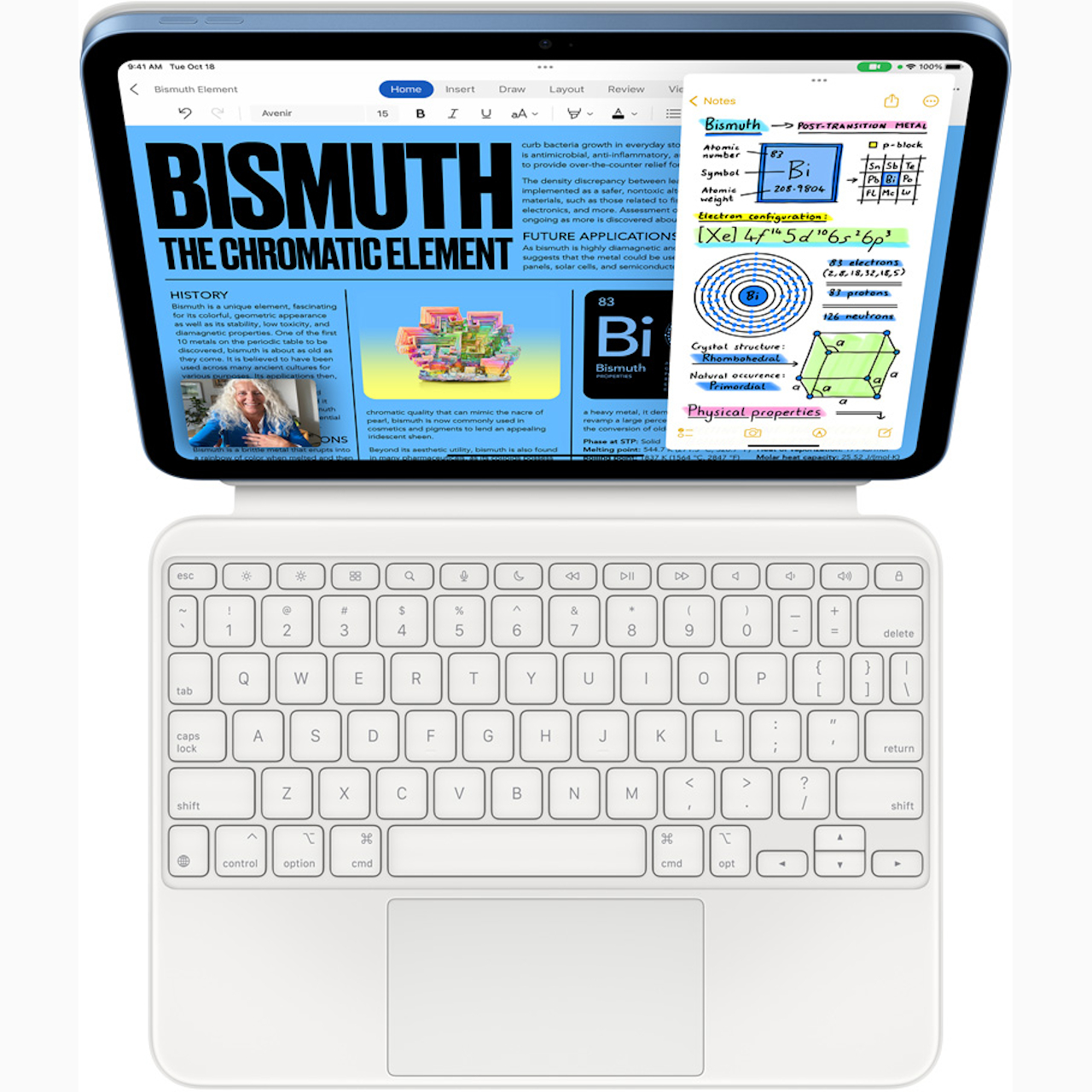
Apple is also launching a new Magic Keyboard Folio for the iPad 10 that comes in two pieces, one for the keyboard and another for the back cover that can fold outward to act as an adjustable stand. Curiously, you’ll have to sacrifice the iPad’s eye-catching color because the folio is available only in white for now. It is also strangely compatible only with the iPad 10, which complicates Apple’s iPad accessory lineup a bit. The 10th-gen iPad starts at $449 as the new entry point to this line of portable computers, while the Magic Keyboard Folio sells for $249.
The post The new iPad 10 is a beautiful upgrade with a few oddities first appeared on Yanko Design.
via https://ift.tt/u1Vib0F
Post a Comment
Note: Only a member of this blog may post a comment.