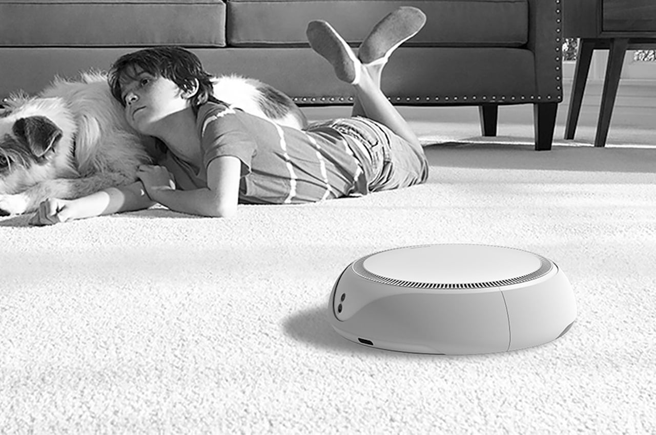
Long before “smart home” was even a thing, the first intelligent machine that invaded our homes were the rolling cans that some people still mistakenly call “Roombas” today. Robotic vacuums today are a dime a dozen, and some have even outgrown their singular purpose of sucking up dirt, including some mopping functionality. Some have even started to clean up after themselves, either by depositing their dirt into their charging docks or even washing their mops so you won’t have to get your hands dirty. Despite all these upgrades, the appearance of robotic vacuums has remained mostly the same, which can perhaps be summarized as functional yet uninspired. Thankfully, you don’t need to overhaul the vacuum cleaner’s design, and all it needs is a few tweaks to make the robot look more at home among the rest of your well-designed furniture and appliances.
Designer: WAIA
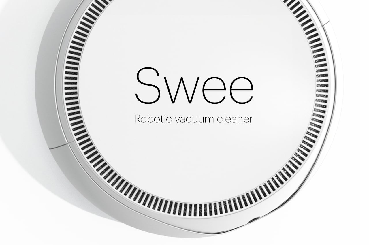
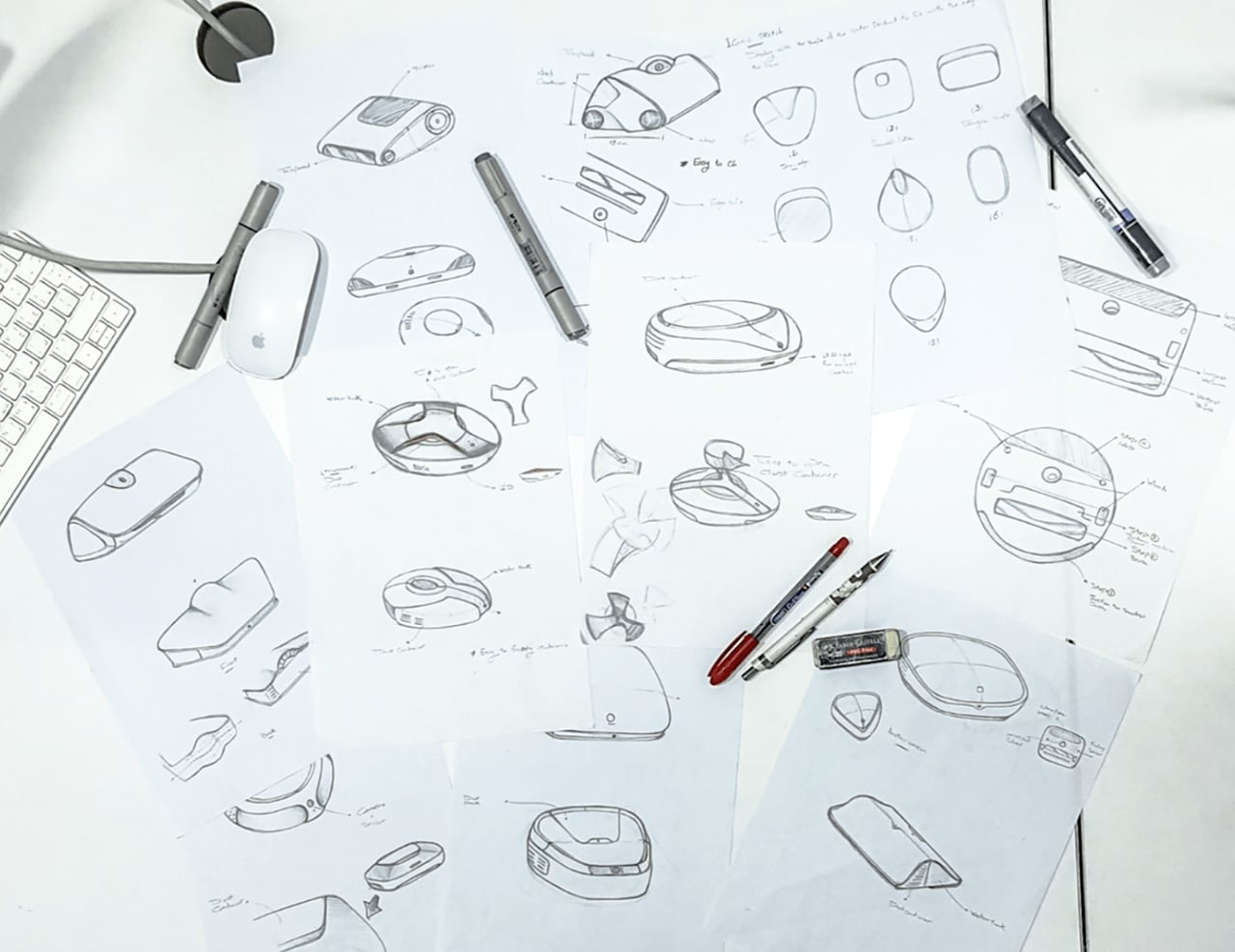
Although there are some that are more square in shape, most robotic vacuums are like large circular pucks or extremely short cans. The shape wasn’t chosen on a whim and is the most efficient way for the robot to move around and navigate turns and corners without bumping into other things. Unfortunately, almost all these machines follow the same cookie-cutter design, so it’s almost impossible to identify different brands or even different models from the same brand at a glance. It’s almost as if the industry has run out of ideas, which is hopefully not the case.
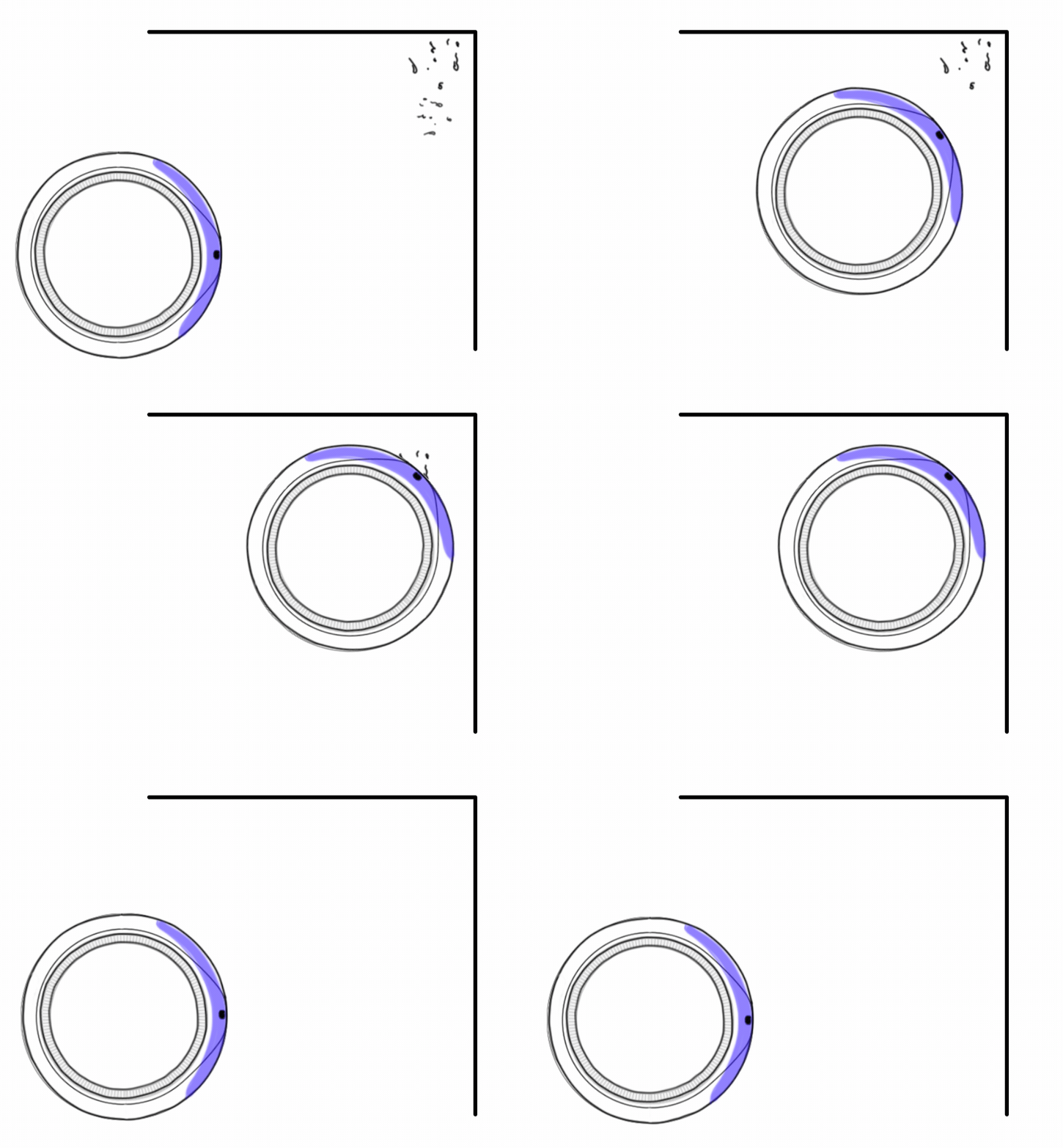
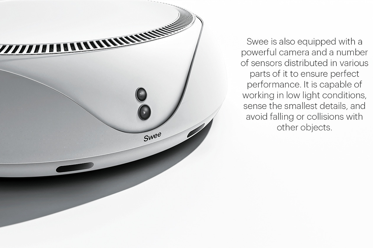
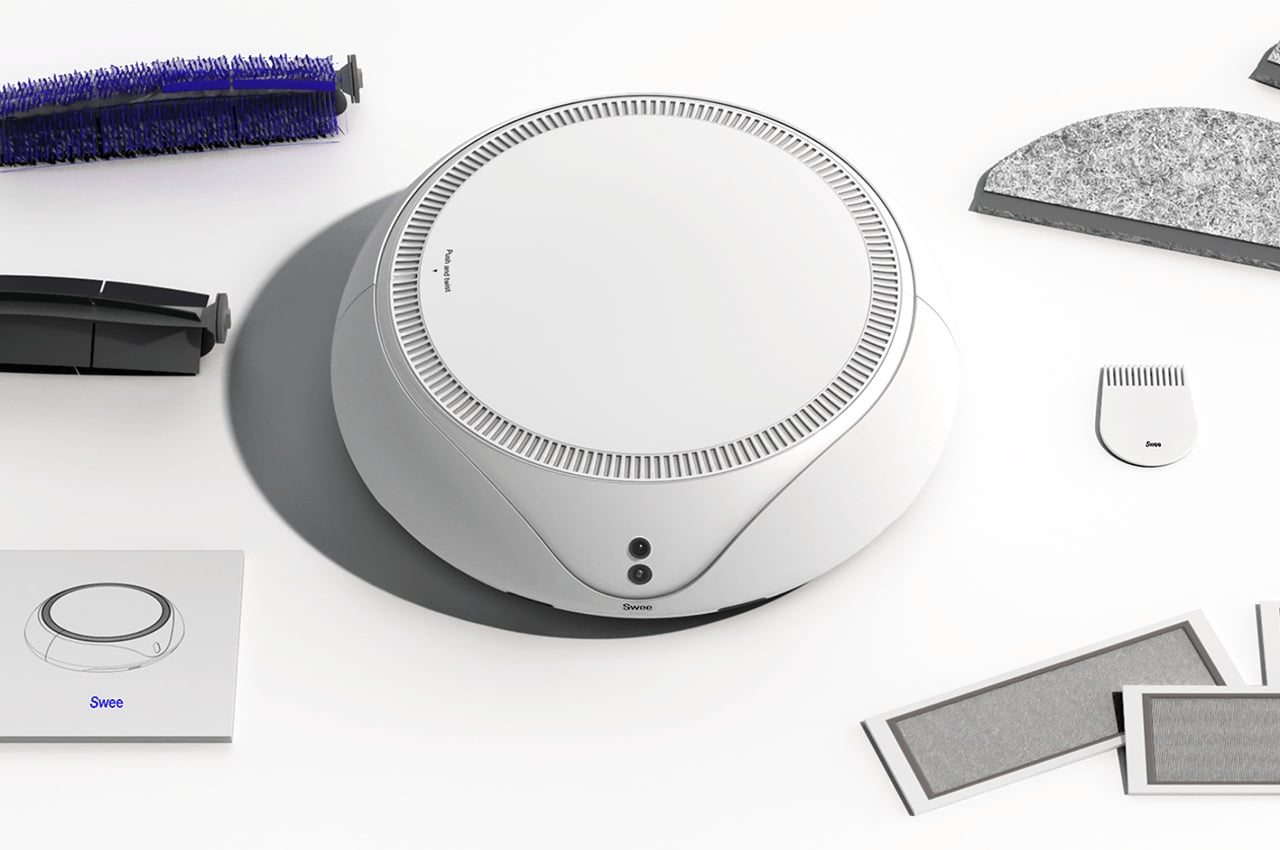
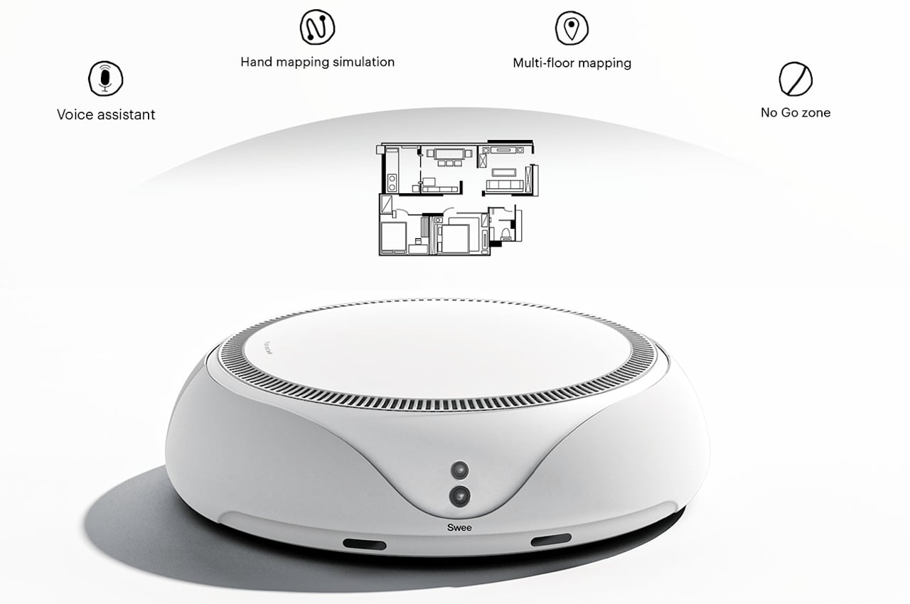
Swee is an attempt to give the robotic vacuum a bit of an upgrade both in terms of design as well as functionality. It retains the round shape of most of its kind, but its sides taper just a little bit towards the top to give it a more interesting profile. There are also grilles around the top edge which may or may not serve any purpose but do make that area look more active. The robot’s eyes are moved to the front, where they make more sense, removing the need for the typical disc jutting out from the vacuum’s top.
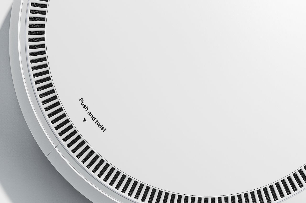
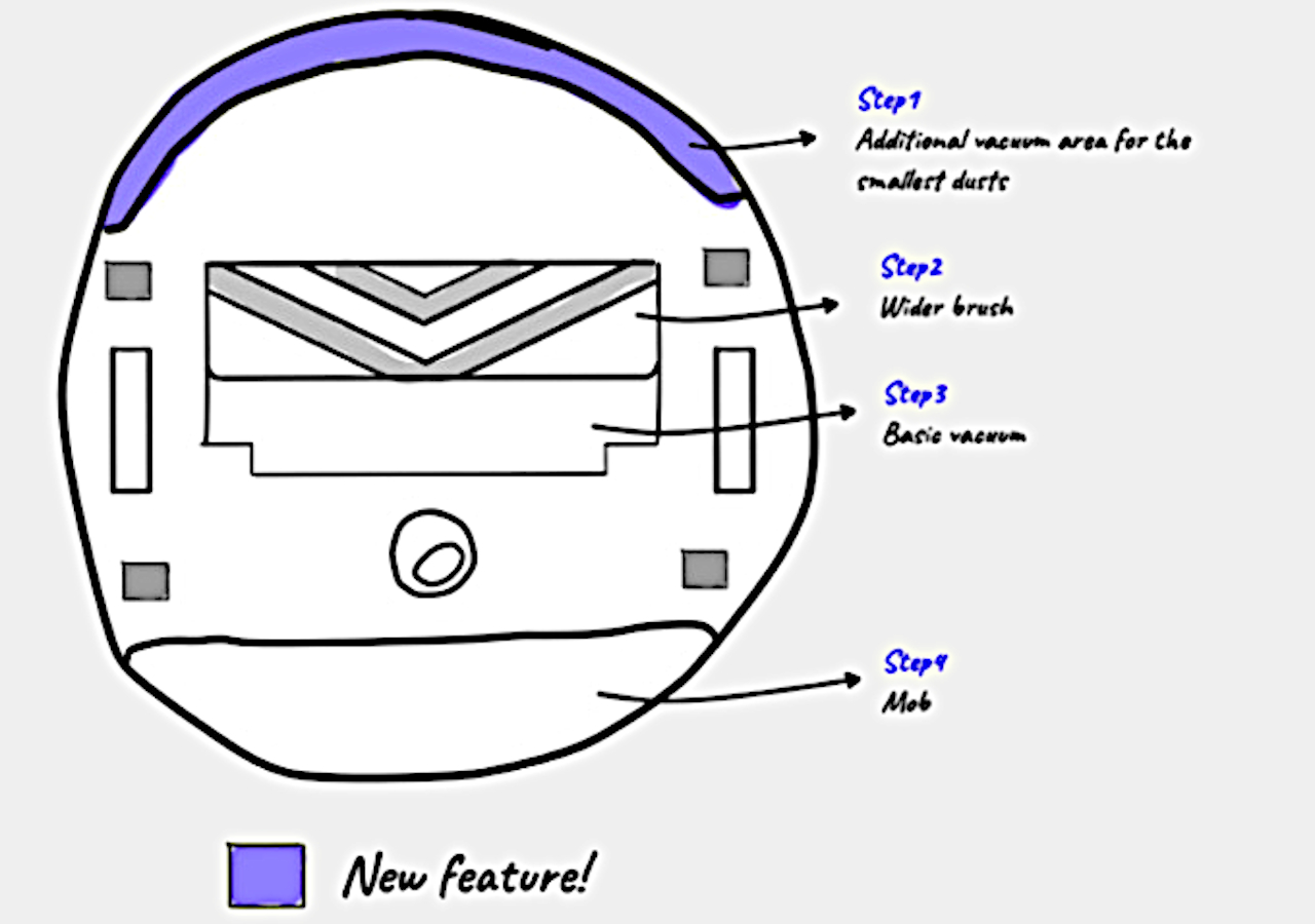
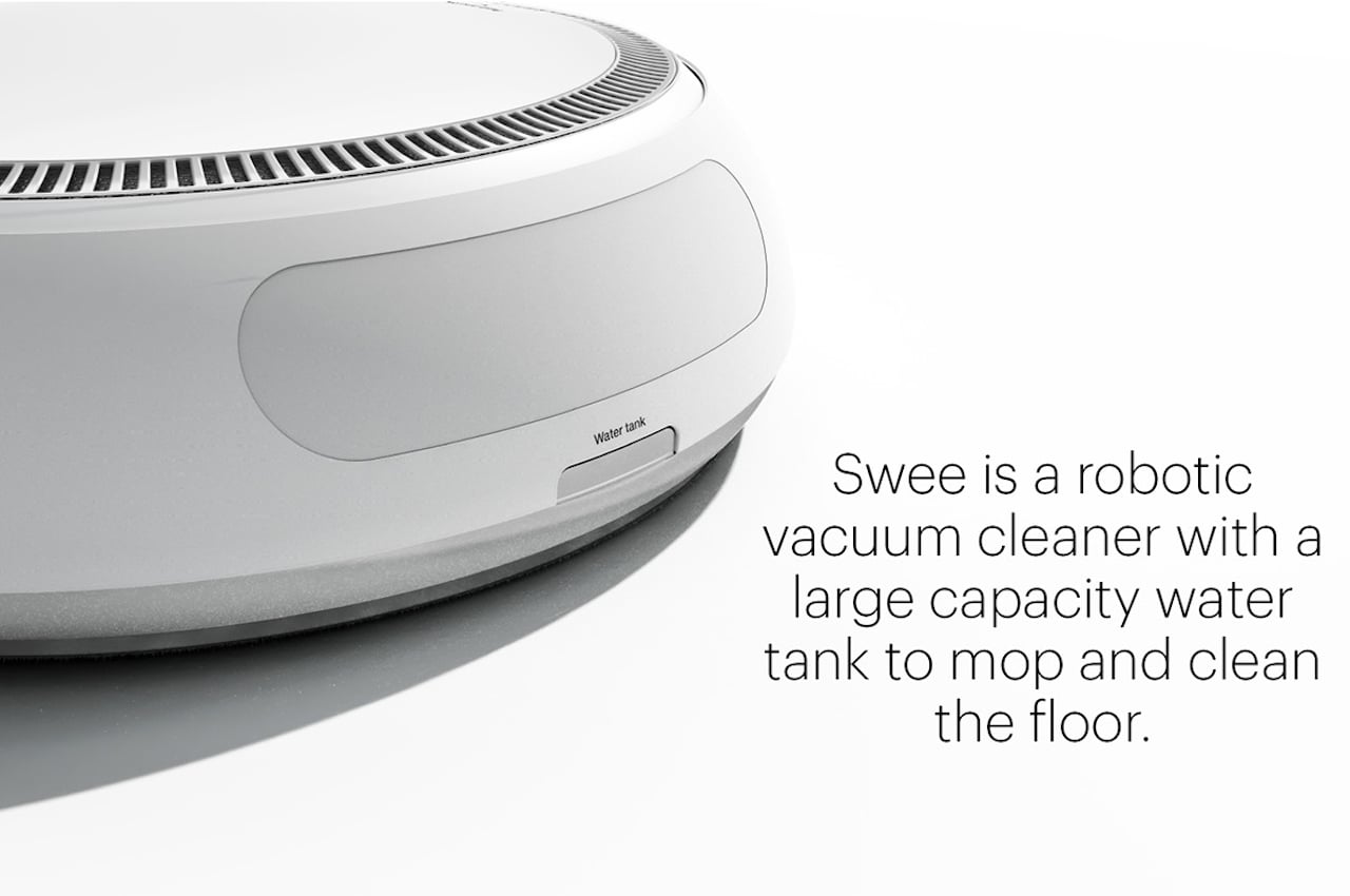
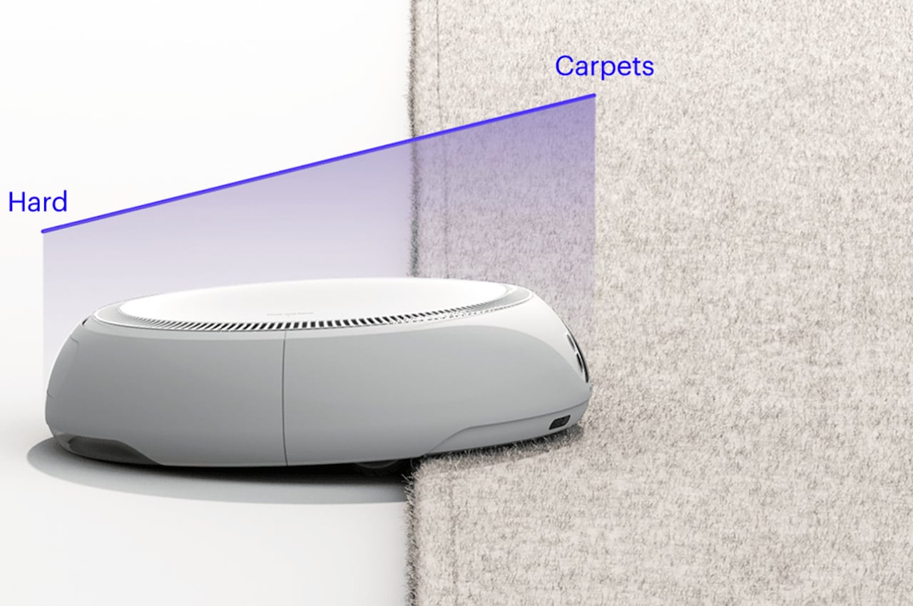
In terms of features, Swee adds another suction piece right at the front to suck up dirt in corners that it would normally be unable to reach. Removing the robot’s dust bin has also been simplified. Instead of having to turn the machine over to get access to that container, one can simply push and twist the vacuum’s top to release the container. Swee also has mopping functions, and its revised design supposedly allows it to have a larger water tank as well.
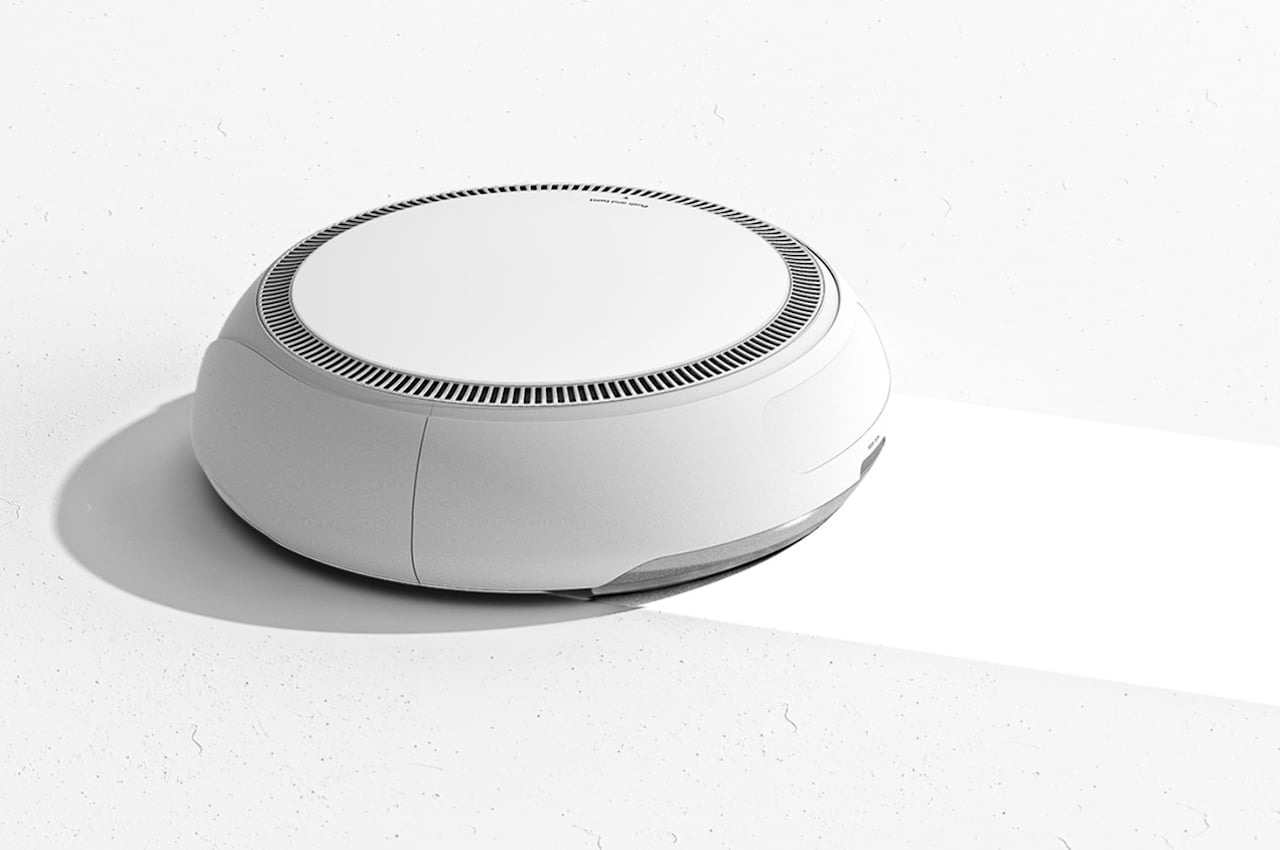
The concept doesn’t really make radical changes to the conventional design of robotic vacuums, but it still has enough modifications that make the device look more pleasing and, at least in theory, work better as well. For now, though, it seems that we’re really stuck with circular forms for these rolling and sucking machines, at least until we get smarter and more agile robots that can get to nooks and crannies that even humans find difficult to reach.

The post This robot vacuum concept finally gives the cleaning machine a much-needed facelift first appeared on Yanko Design.
via https://ift.tt/u1Vib0F
Post a Comment
Note: Only a member of this blog may post a comment.