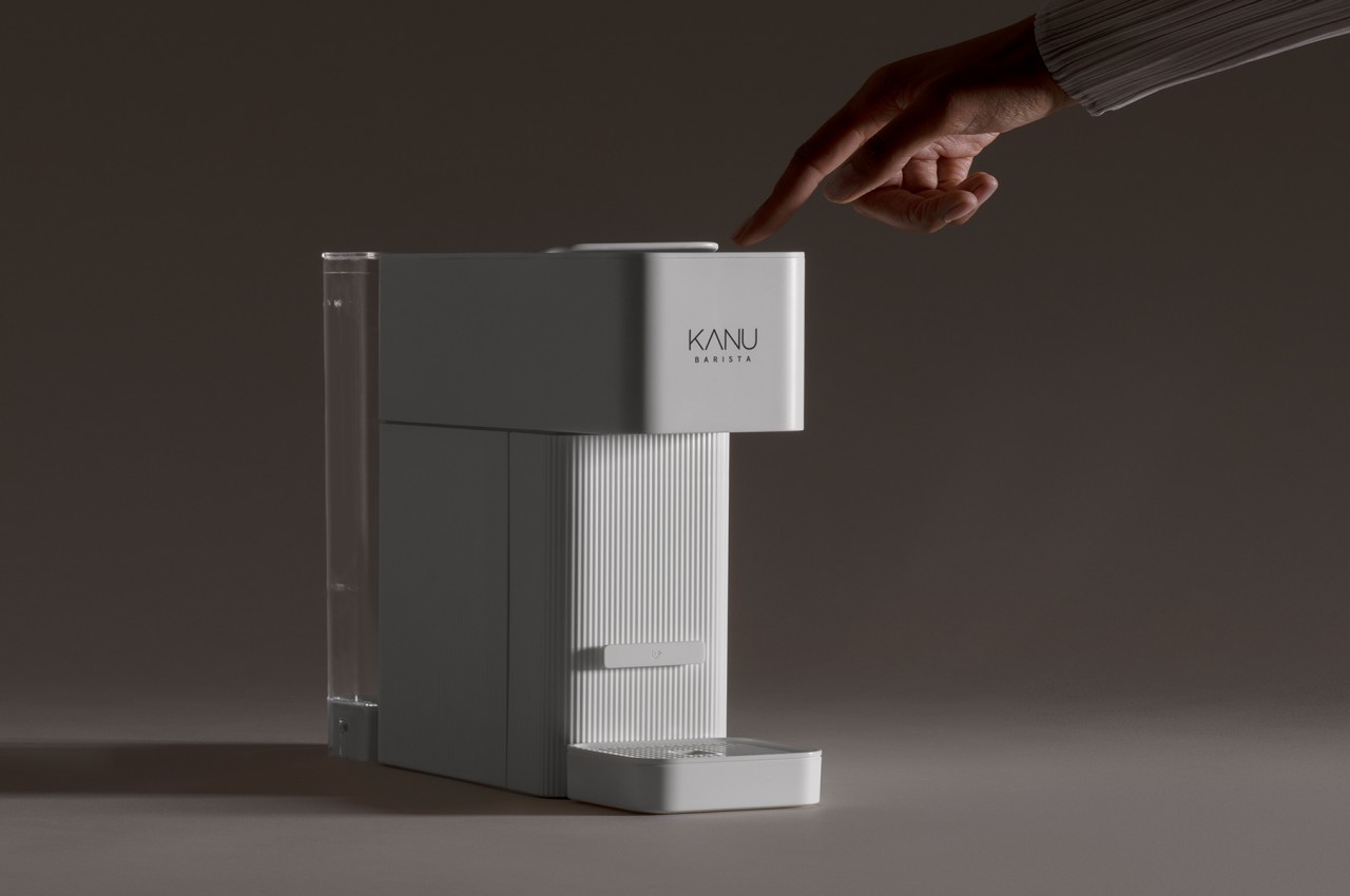
Kitchen appliances have gotten more sophisticated and more advanced these days, yet their design language has remained mostly the same. Although they definitely look elegant and refined, most kitchen equipment, from refrigerators to ovens, often have sharp edges, shiny metallic surfaces, and an almost cold demeanor. There are exceptions, of course, but this design DNA seems to be the most prevalent, even for smaller appliances like toasters and coffee machines. That, in turn, dictates the overall aesthetic of the kitchen, at least if the appliances’ style doesn’t clash with the theme you already have going. That doesn’t always have to be the case, and this capsule-based coffee machine challenges those established traditions to bring a device that greets you with a calming and somber ambiance that helps ease you into the day.
Designer: Benjamin Hubert (LAYER Design)
A lot of people depend on coffee to get their day started or even get through the rest of the day. While businesses like Starbucks can be found almost everywhere, many households today would have their own coffee machine, whether using beans or capsules. Despite the popularity of these appliances, few owners probably notice how their designs affect how people see and approach them, which is to say they see coffee machines are veritable machines that are elegant yet clinical rather than something approachable and personal.
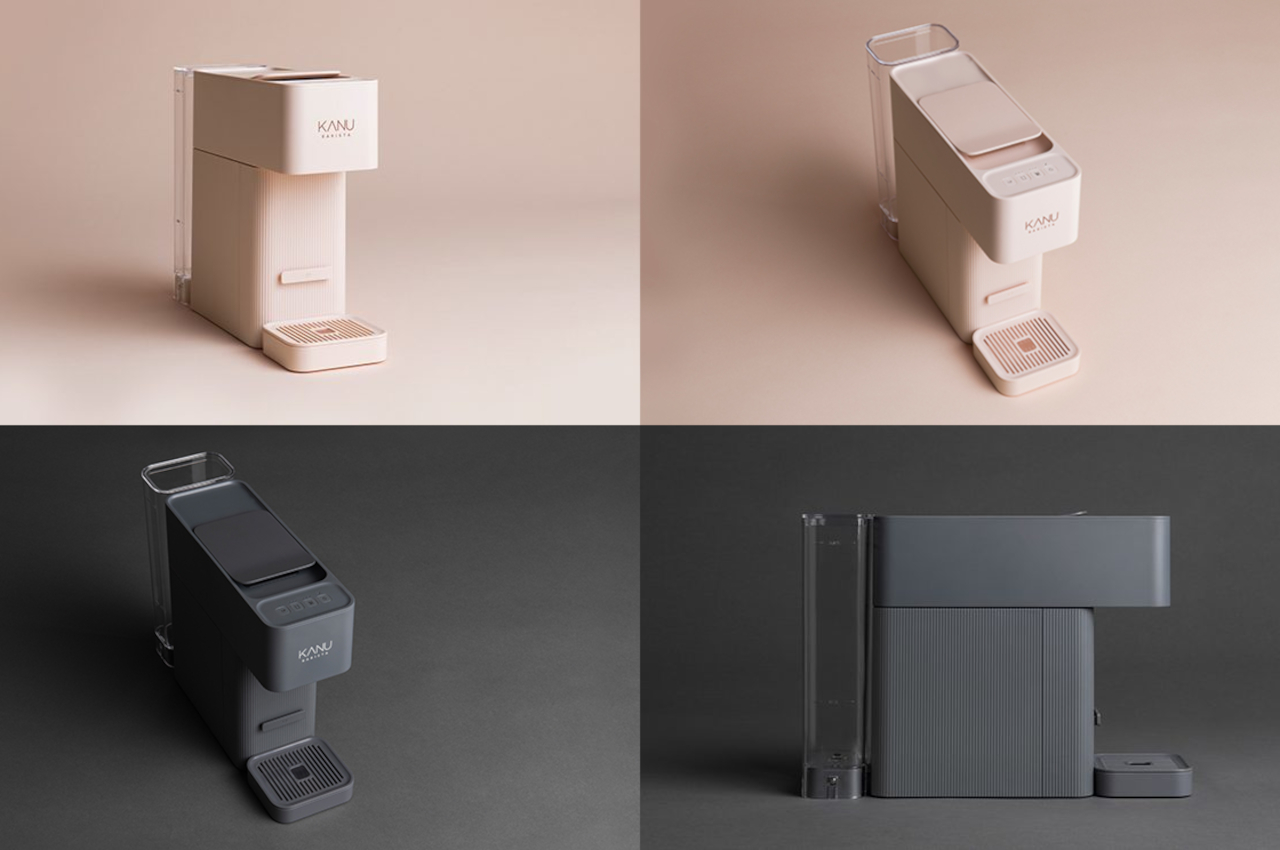
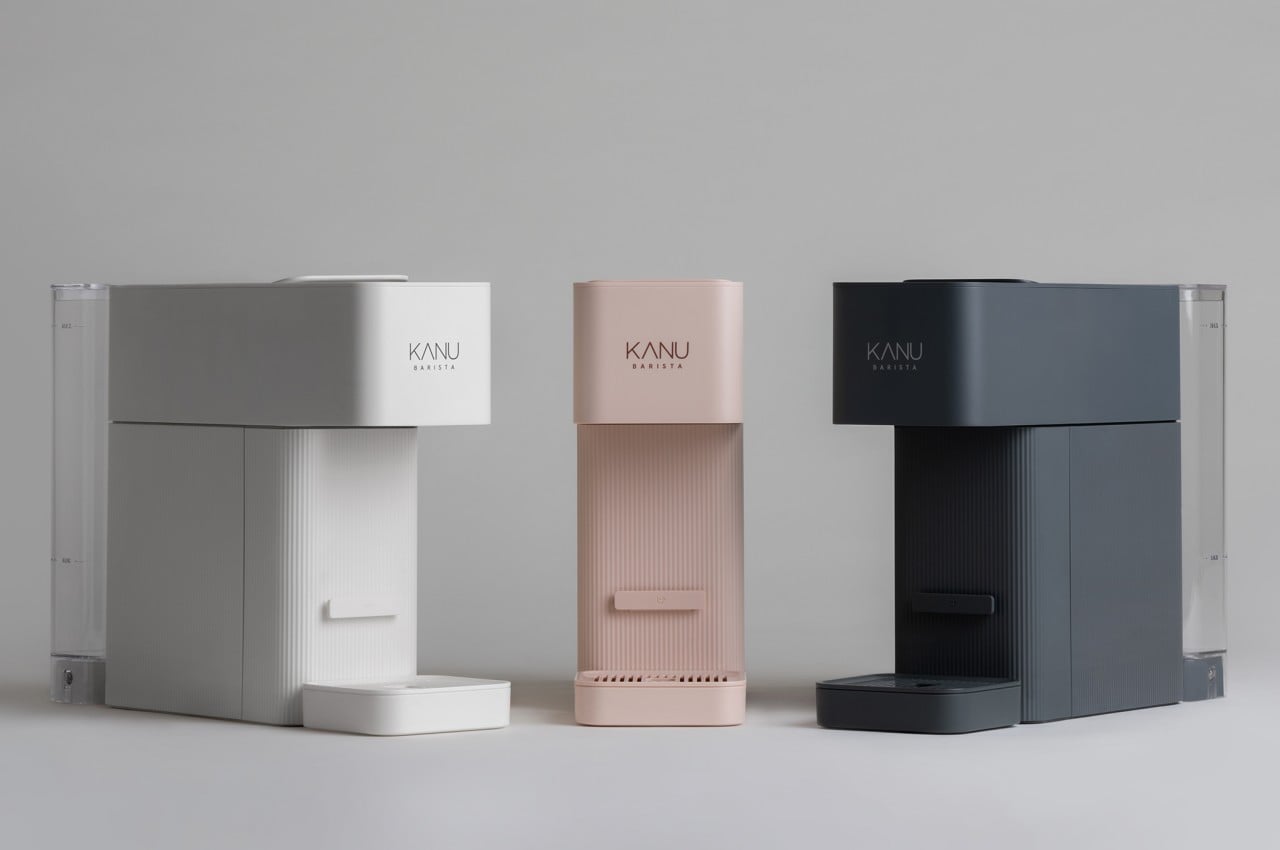
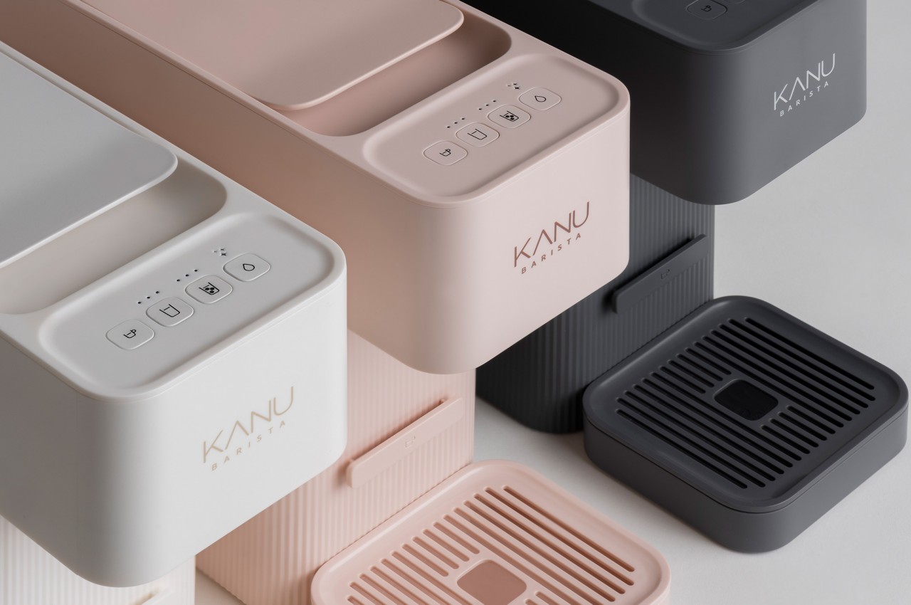
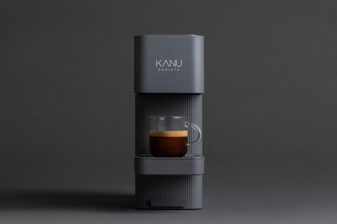
Breeze, designed for the South Korean coffee brand Dongsuh, tries to change that attitude by drastically changing the appearance of a capsule coffee machine. This comparatively newer breed of coffee makers often have more stylish and less industrial designs, but they still can’t get rid of that shiny metallic luster common to kitchen appliances and tools. In contrast, Breeze applies a refreshing and softer color palette, favoring pastel variants of white, charcoal, and pink to convey a gentler personality.
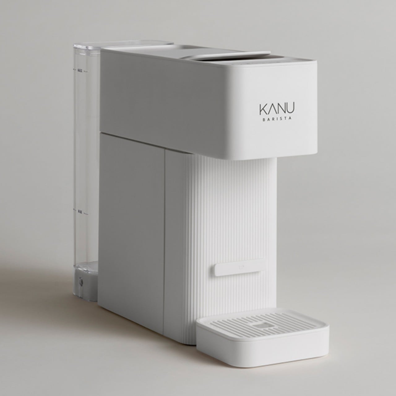
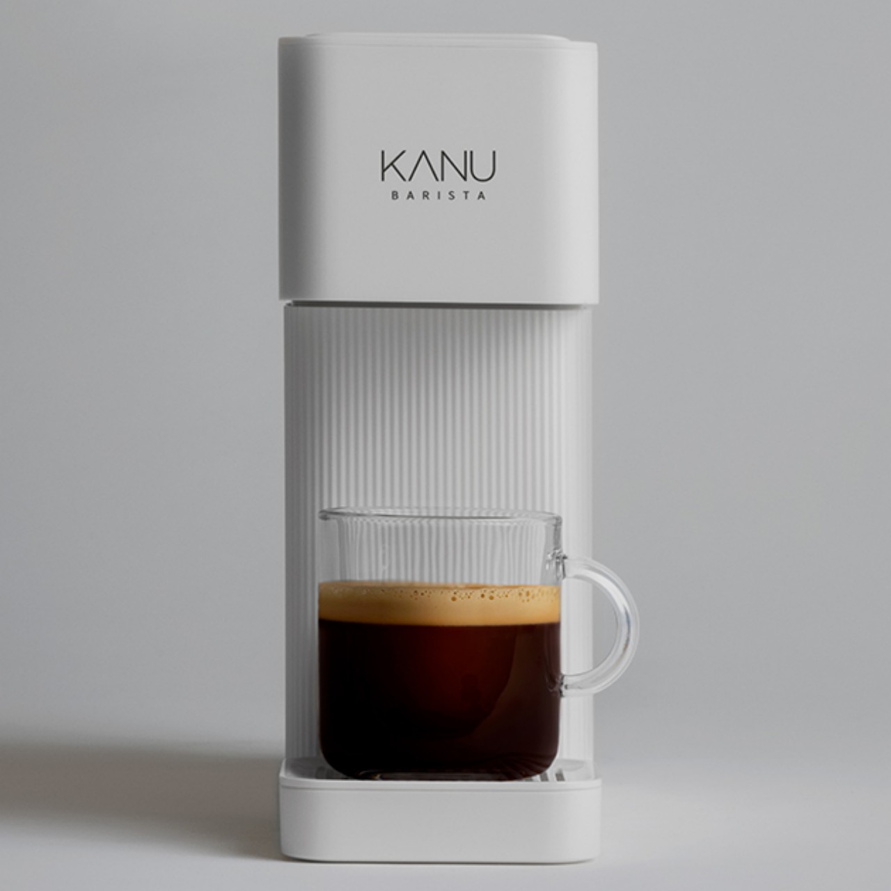
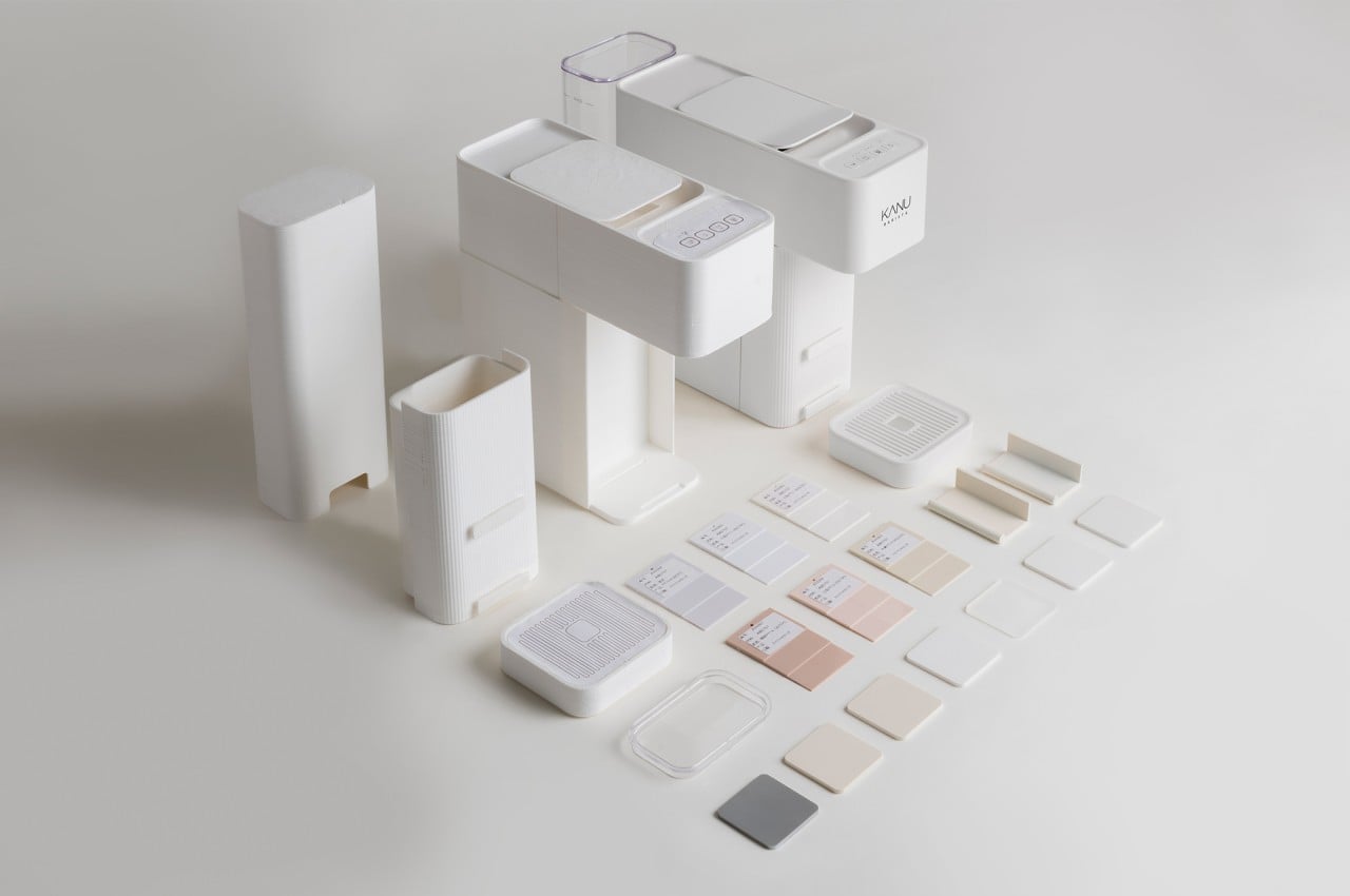
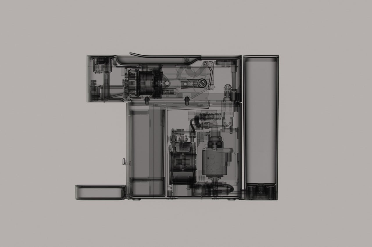
The shapes are also distinctly different. While the modular blocks are admittedly more geometric, their rounded corners add to the overall softer aesthetic of the machine. A ridged surface wraps around the base, contrasting with the smoother texture of the head. Another point of contrast is the tall water tank at the back, a transparent container that projects an image of clarity that, when taken together with the more subdued hues of the machine, seems to send a message of calm.
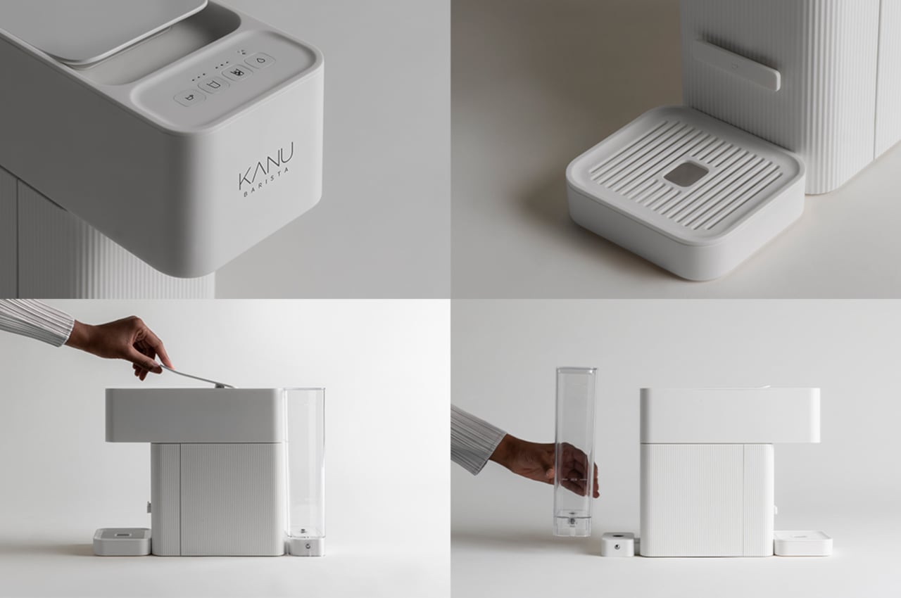
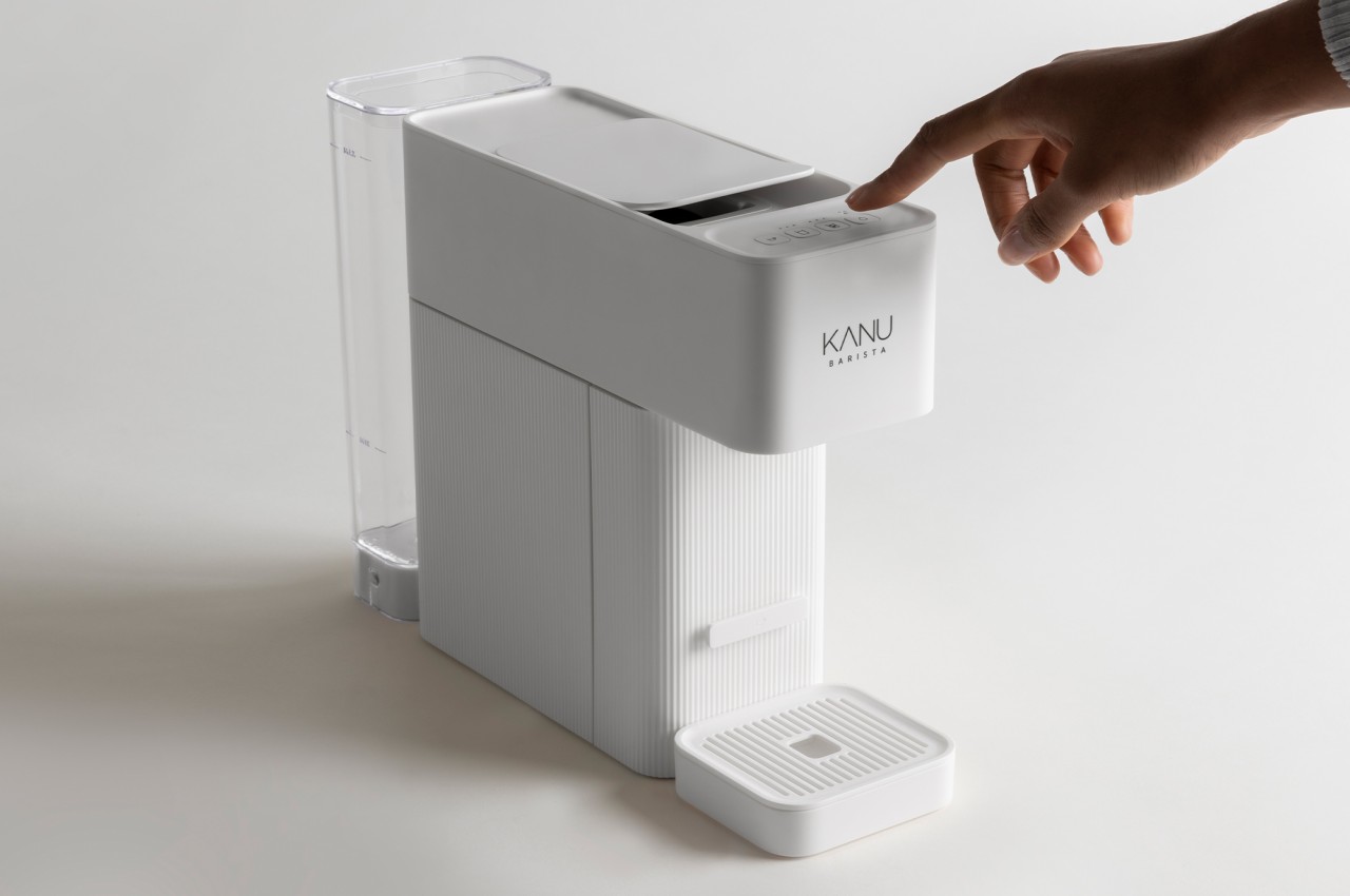
Beyond just the visuals, the design also includes a more tactile interface to operate the machine, using clearly marked LED-backlit buttons at the top of the head. Made from simple shapes and with a simple way of operating, Breeze gives the coffee machine a gentle and almost comforting identity, which is probably the kind of character you’d want to meet when you get your coffee first thing in the morning or in the middle of a tiring day.

The post LAYER Breeze coffee machine presents a softer way to start your day first appeared on Yanko Design.
via https://ift.tt/37Ltv9f
Post a Comment
Note: Only a member of this blog may post a comment.