There’s something about wood as a material that instantly puts you at ease. Wood radiates a certain warmth, and sense of zen, that no other material can exude. And, sometimes a wooden piece of furniture is what your living space truly needs. I feel a well-crafted piece of wooden furniture can add a magical touch to even the simplest of living spaces! Minimal, clean, and almost always soothing, beautifully designed wooden furniture helps a space radiate an aura of warmth and calmness. They instantly make you feel at home. From a wooden arcade cabinet that puts a beautiful twist to a gaming classic to a minimal wooden sideboard with legs that can store your favorite books – these quintessential yet stunning wooden furniture designs are all you need in your home.
1. Wormhole Coffee Table
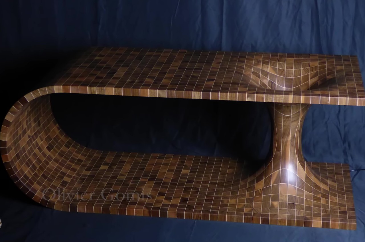
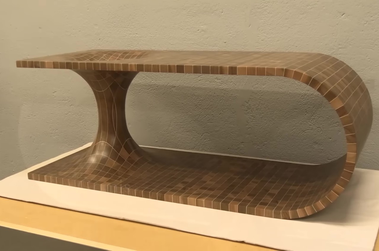
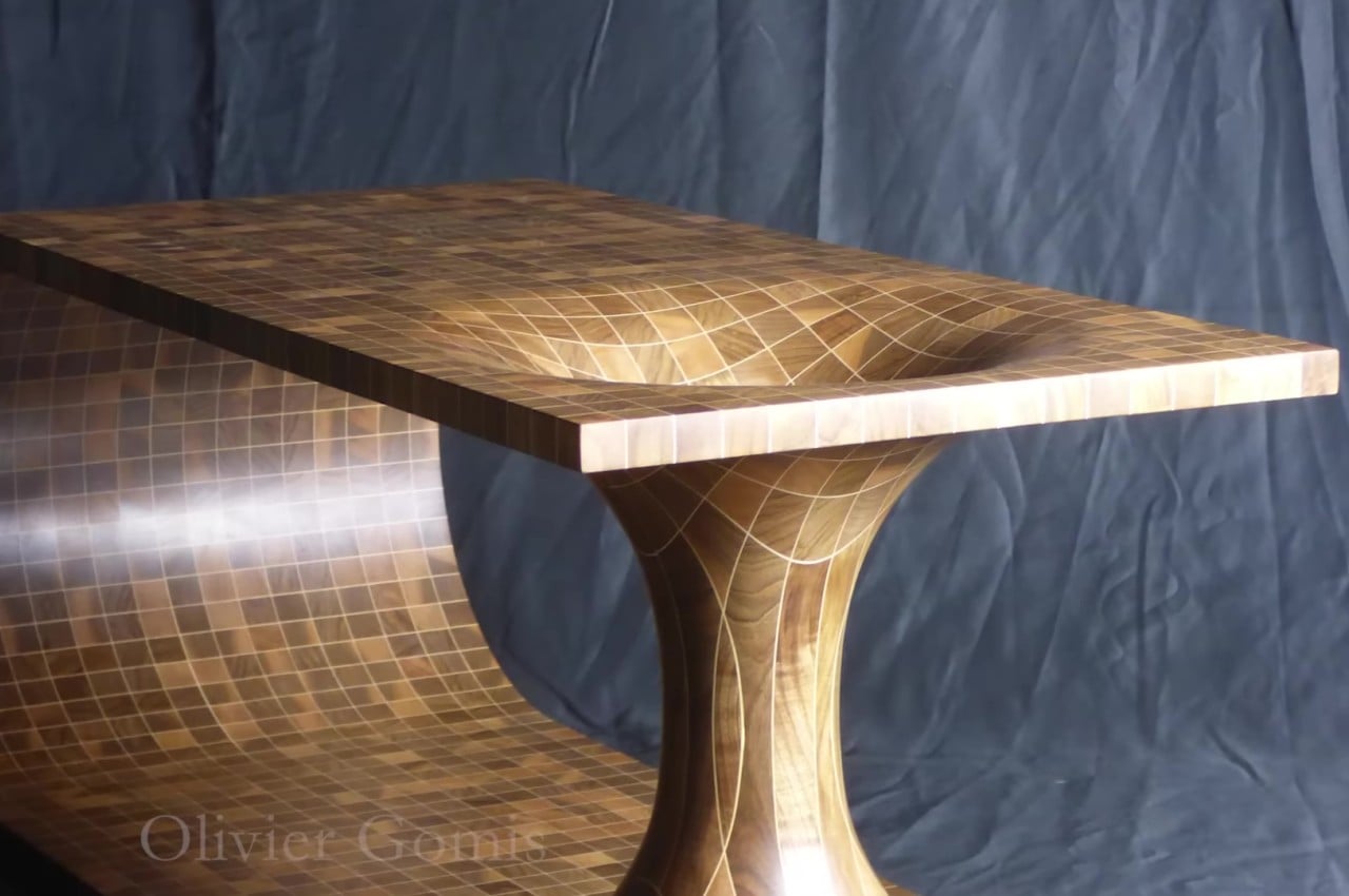
Wormholes can hypothetically connect two disparate points in spacetime via a tunnel. And they’re quite commonly found in science fiction! And this mind-blowing coffee table by Olivier Gomis attempts to convert the hypothetical wormhole into a physical manifestation.
Why is it noteworthy?
The shape of a table is already quite eye-catching on its own. It’s almost like a wooden plank that has been bent so that the two ends are on top of each other and then joined together by a double cone. These are then glued together with sheets of maple veneer in between, which give the appearance of those faint light lines that form the grid.
What we like
- A lamp was installed in the center of the hole, giving the table an eerie appearance in the dark
What we dislike
- You’ll probably want to keep things away from the part of the table that curves downward
2. Wooden Arcade Cabinet
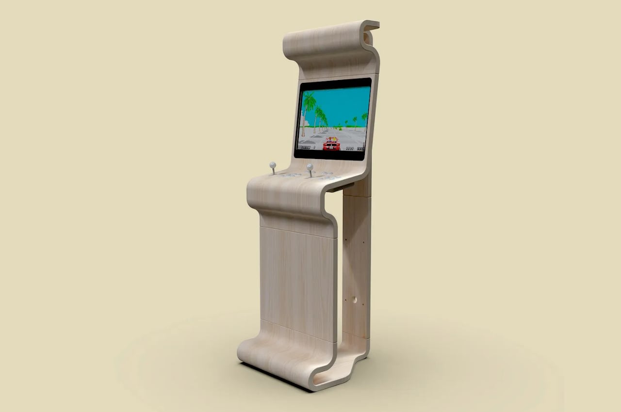
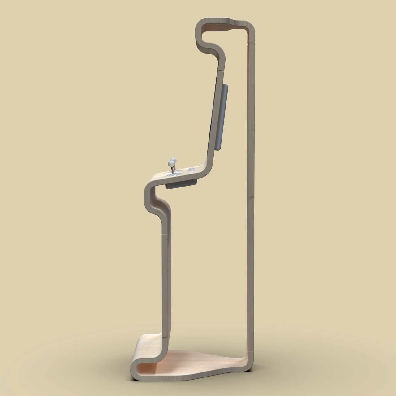
We’ve seen many of these “old school” designs surface in the past few years, thanks to successful “retro mini” revivals of popular consoles from a few decades ago. Of course, not all revivals have to stick to those same old designs, especially when there’s plenty of room to see these old giants in a new light. This arcade cabinet, for example, offers the same functionality as its predecessors but puts it inside a bare, minimalist wooden structure that looks stylish and perfect for a luxurious room.
Why is it noteworthy?
Unlike conventional arcade cabinets, this design can hardly be called a “cabinet” because of its shape. Instead of a large box, this arcade cabinet only has the outer “skin,” showing only the silhouette of the gaming contraption. In fact, it also has its sides left out so that you’ll only see the outline of its profile when seen from the sides. Unlike a typical cabinet as well, this interpretation has its back tapered a bit, streamlining the design and minimizing space.
What we like
- It has plenty of curves that give it a softer personality
- This arcade cabinet almost looks more like an art piece paying homage to the golden age of arcades
What we dislike
- It’s still a concept!
3. Allieva
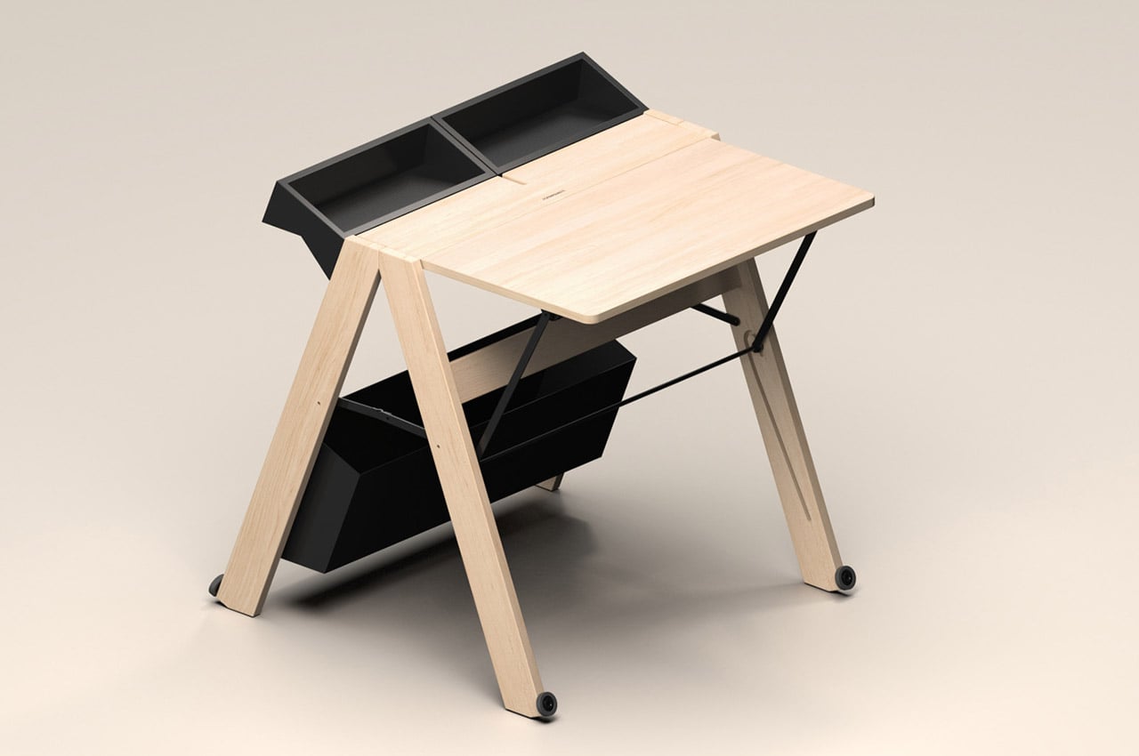
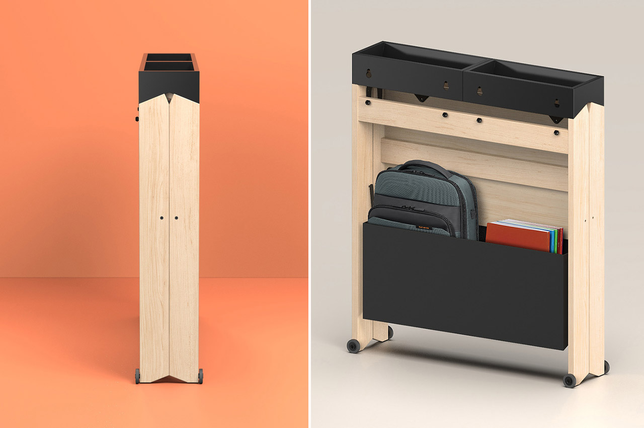
There’s always been a need for compact and functional workstations. But this necessity is further compounded by the growing trend of distance learning and working from home, especially after the pandemic. To address this problem, Whynot Design has introduced a unique and innovative solution called the Allieva. This foldable wooden workstation is designed for Foppapedretti, one of the most well-known Italian brands for baby products and wooden furniture since 1945.
Why is it noteworthy?
This sleek, foldable work desk is meant to fit in any space, making it perfect for small houses and dorm rooms. Despite compromising on size, Allieva is aesthetically pleasing. It takes up as little space as possible and measures only 7 inches deep when folded.
What we like
- The workstation can be set up easily with a simple gesture
- Comes with a large compartment at the base of the table that allows you to keep everything
What we dislike
- The folding and unfolding mechanism could be considered tedious by some
4. The Altura
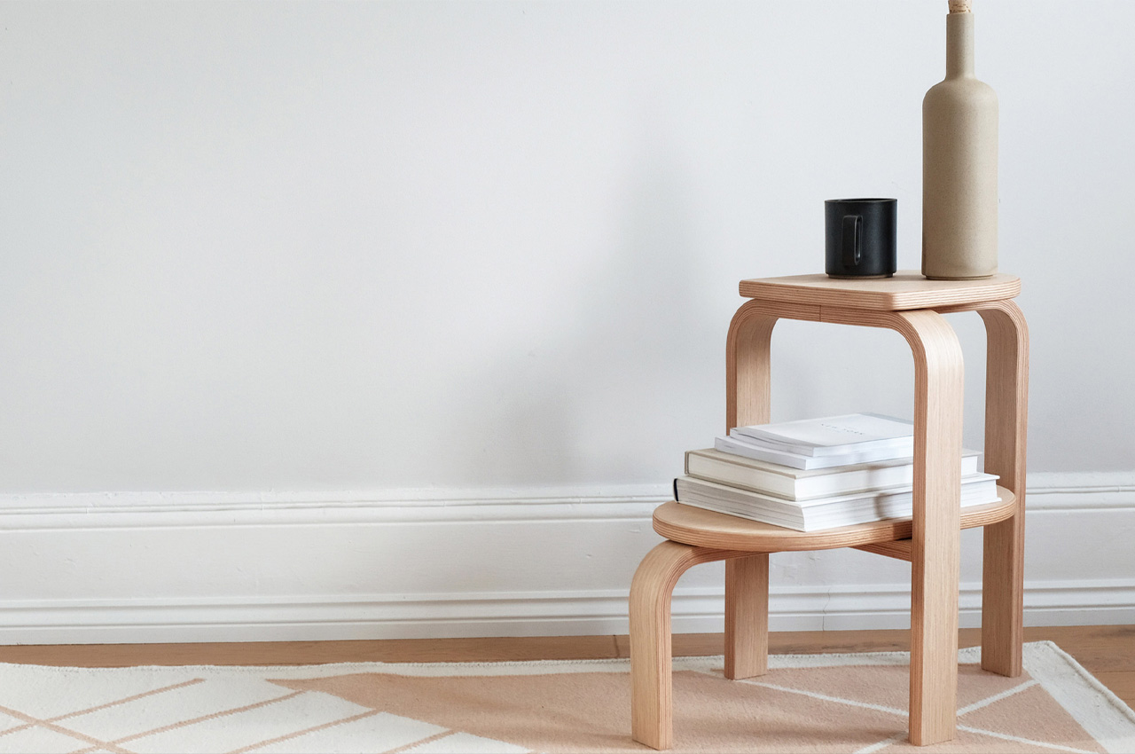
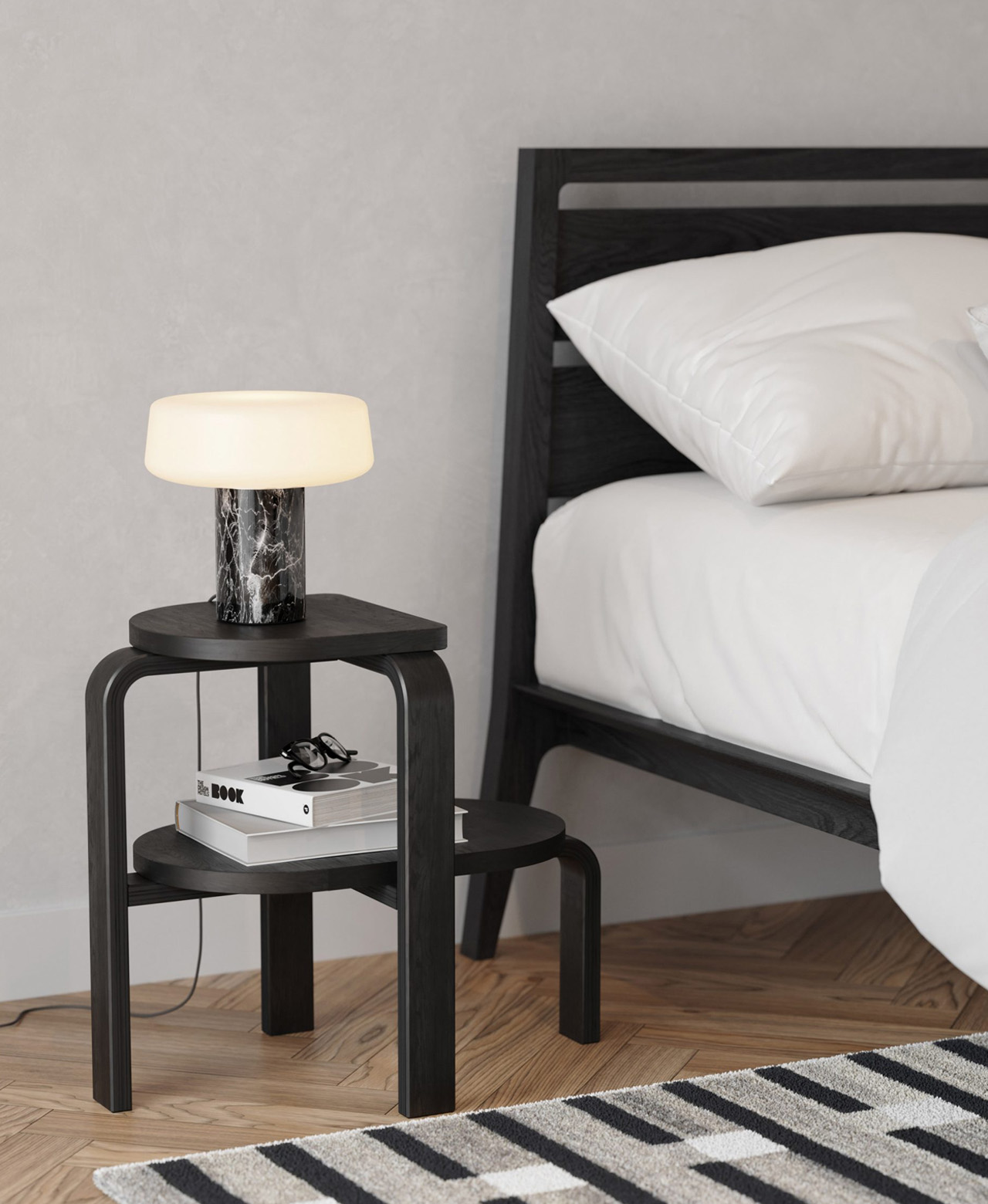
Patricia Perez designed the Altura, a minimal and sturdy step stool, for Case Furniture. An interesting fact about the stool is that it doubles as up as a side table and a plant stand.
Why is it noteworthy?
Described as a “sleek yet sturdy design”, the stool has been equipped with two stepped tiers that serve extremely handy in holding and storing all kinds of items – from lamps, and books, to an entire person!
What we like
- It enables users to reach those high-up places in their homes that they usually aren’t able to reach
- Altura’s minimal and neutral aesthetics make it a great addition to any modern living space
What we dislike
- There are similar designs on the market, nothing to really help it stand apart
5. The Spacing Sideboard
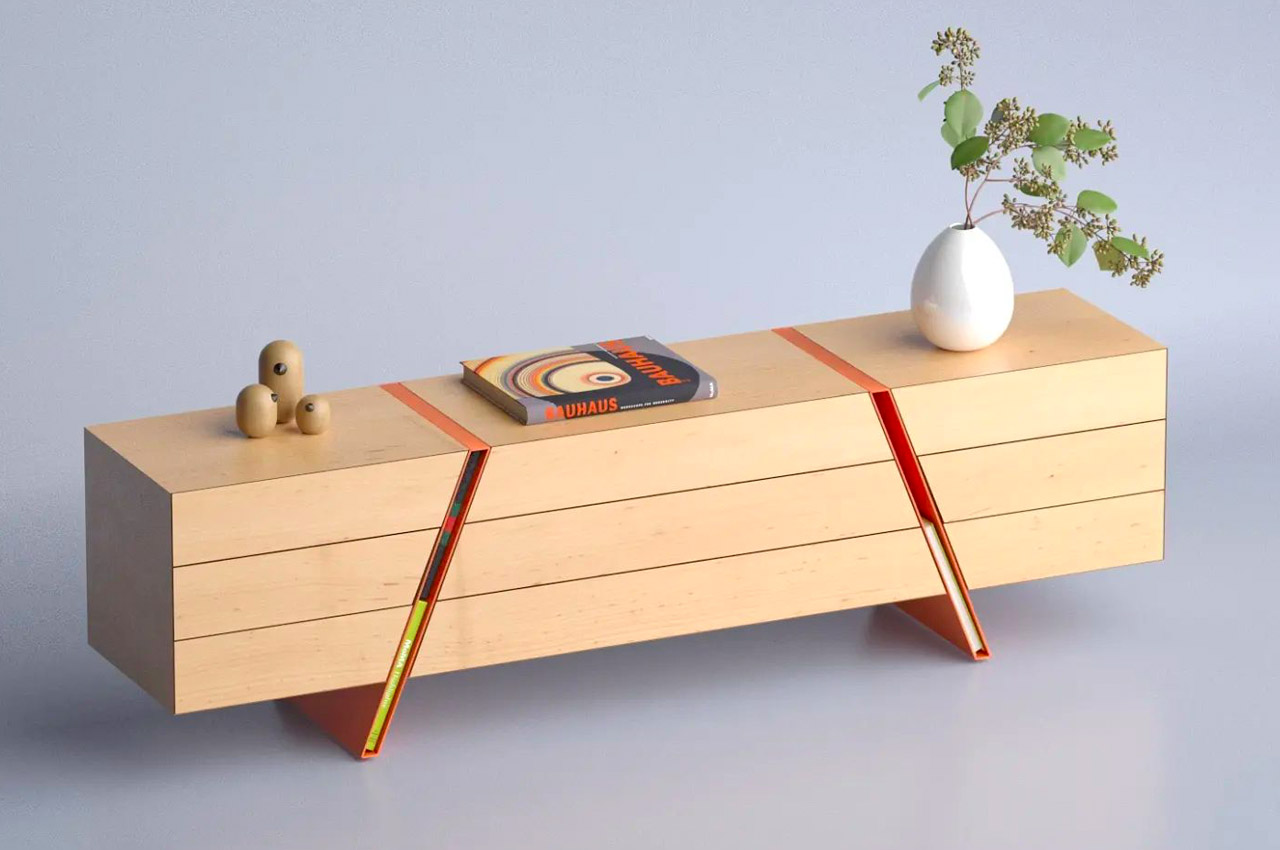
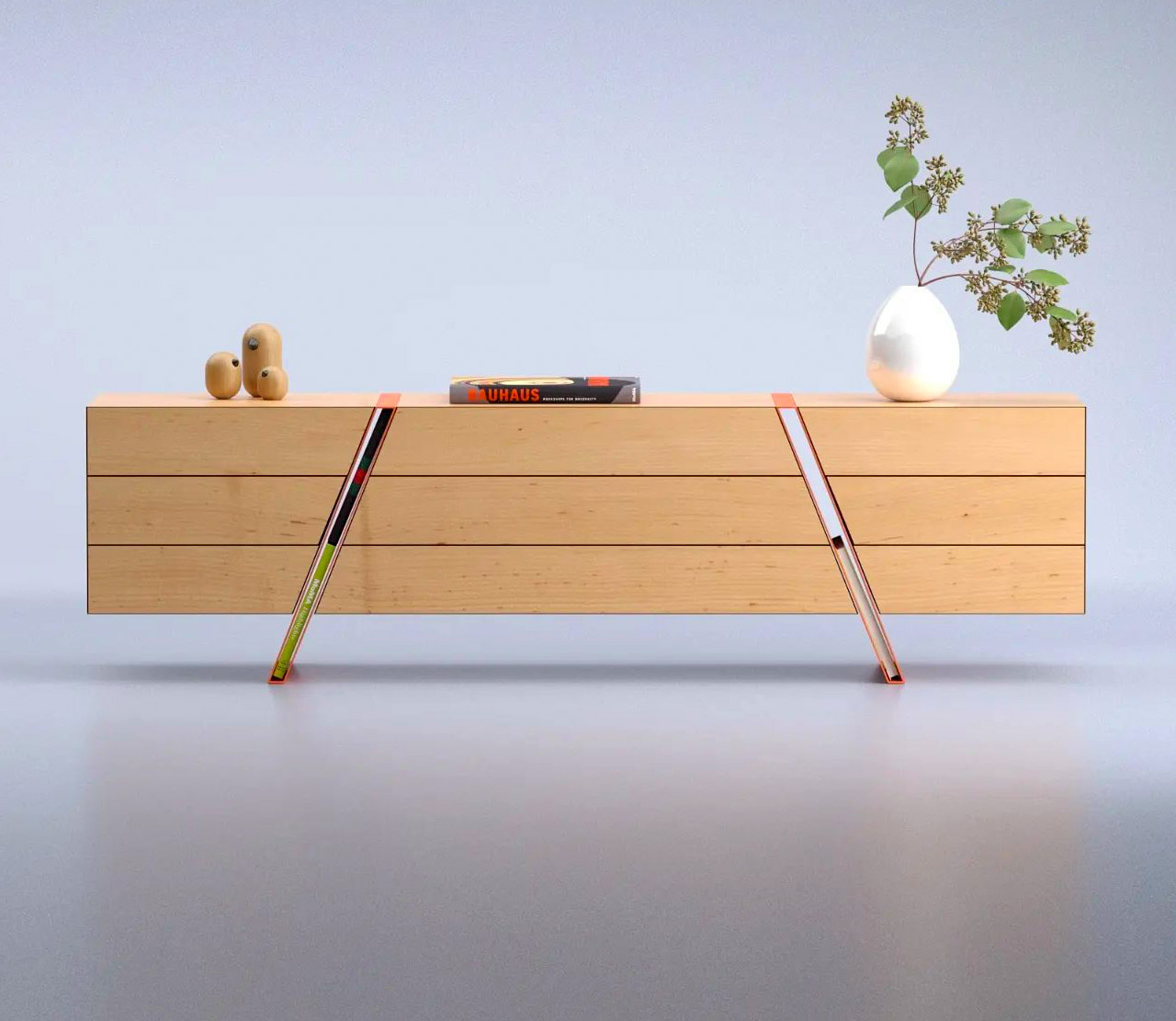
The Spacing Sideboard is a simple wooden piece of furniture that is marked by two bright orange legs. These colorful legs are the star attraction of the sideboard! Because here’s the interesting part, Deniz has integrated the legs into the center of the sideboard, and also carefully left them hollow.
Why is it noteworthy?
The hollowness of the diagonal legs allows them to function as storage spaces! The amount of space is ideal to fit a book or two into it. Yes, you can’t place bigger items, such as say your laptop or even a really fat book in it, but it’s a genius storage solution to display a few of your favorite (normal-sized) books!
What we like
- The sideboard also features push-to-open drawers that emphasize the length of the sideboard
What we dislike
- Not the best storage option for smaller compact homes
6. The Seed Chair
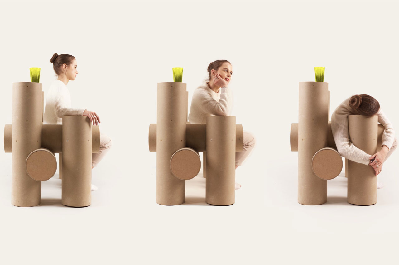
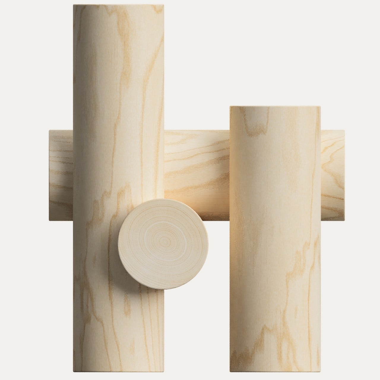
Google has always had a penchant for minimalism, though the exact application of that design philosophy changes over time. And what could be more minimalist than pieces of furniture that are not only natural but are also inspired by nature’s more basic designs. The Seed Chair, for example, looks like nothing more than a few short logs joined together to form a seat, representing the most basic interaction between nature and man.
Why is it noteworthy?
Though it does embrace Google’s spartan aesthetics and preference for geometric shapes. At the same time, however, it is almost the complete opposite of Google’s spirit. The chair is large, heavy, and has plenty of friction, while Google’s culture is always associated with agility and fast-paced change, almost to a fault.
What we like
- Nature-centric design
- Embrace’s Google spartan aesthetics
What we dislike
- Doesn’t seem like the most comfortable seat
7. Serpentin
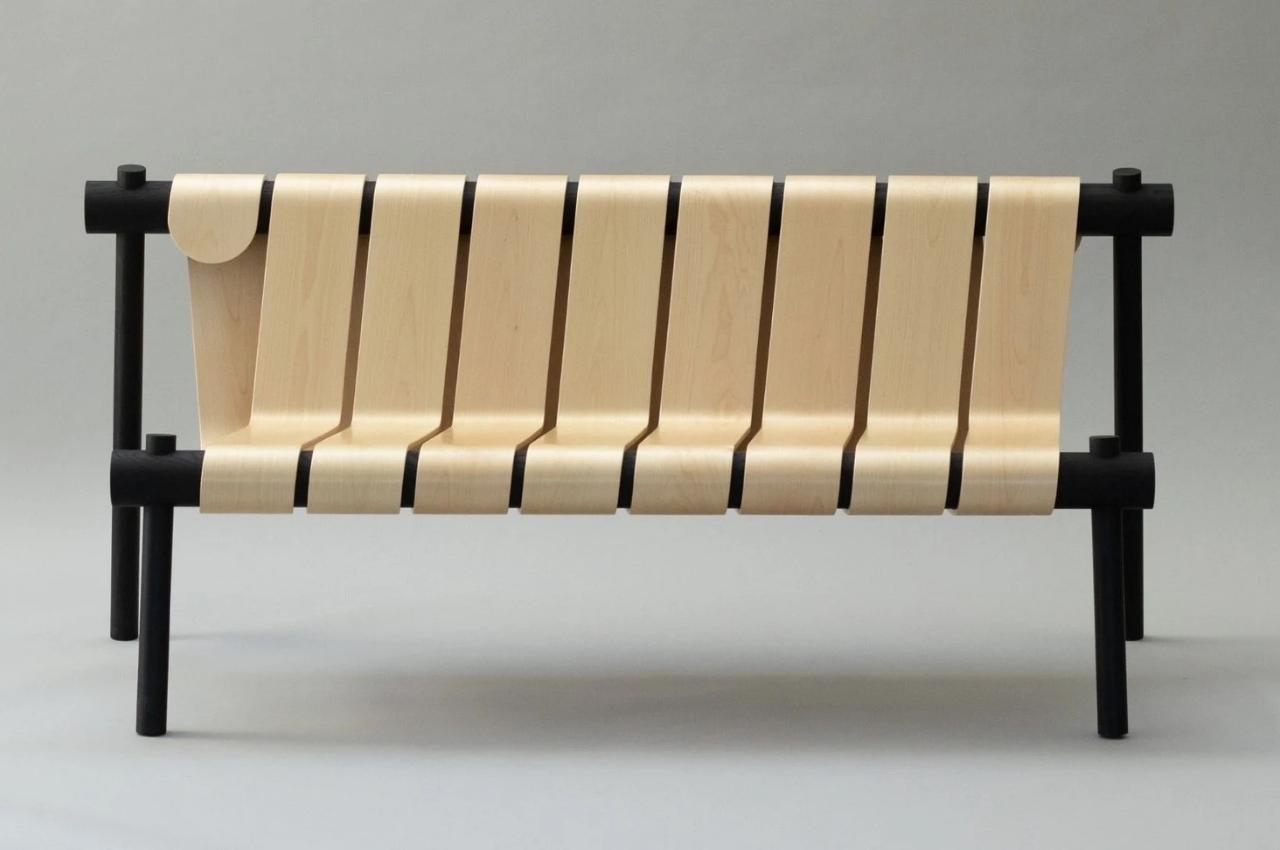
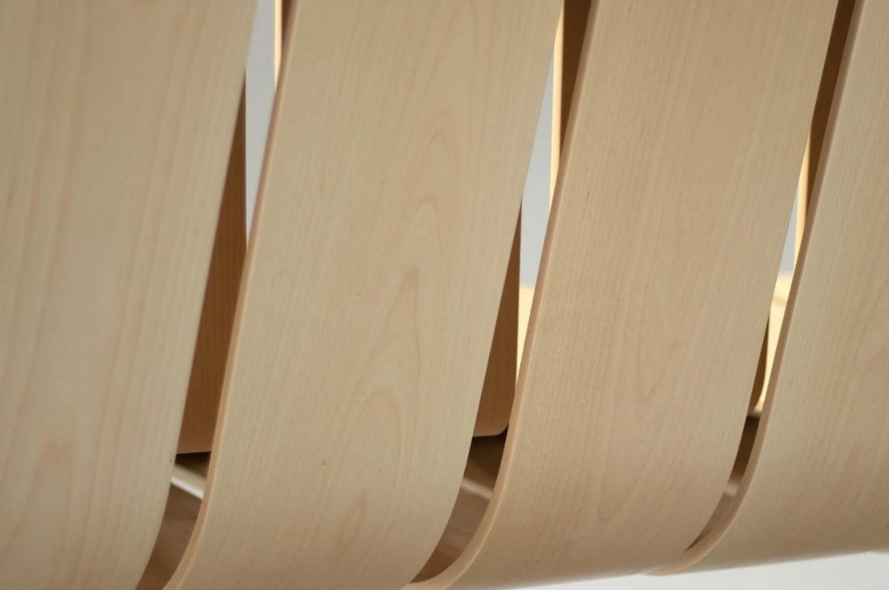
The Swedish-based furniture designer Marc Hoogendijk wanted to create something that blends together technology and design. He created an indoor bench called Serpentin which gives us the illusion that it’s one continuous piece of wood.
Why is it noteworthy?
He says he likes using a methodology that “mimics the function of human-made objects” and then uses this on the furniture he designs. He calls this “technomimicry” and he applied it to this bench as well.
What we like
- Inspired by tubes that are made from a continuous strip of paper wrapped around continuously, like what you see in toilet paper or liquor containers
What we dislike
- The bench may not merge with the aesthetics of different kinds of home
8. The Leaning Chair
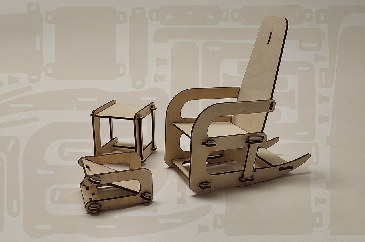
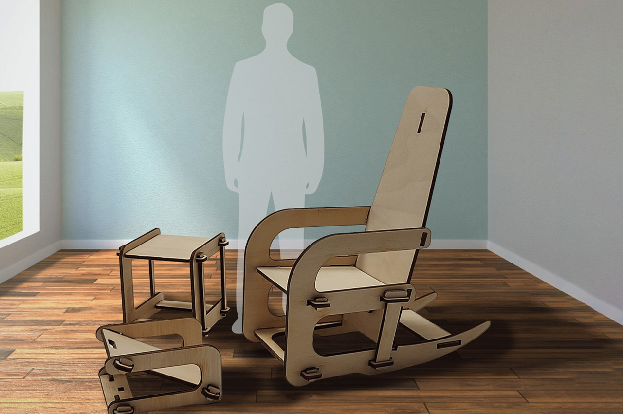
Many flat-pack furniture also comes with an implicit benefit. In most cases, the separate pieces can be cut out from a single sheet of material, often wood or fiberboard, which minimizes the wasted material. At first brush, that almost seems like the key feature of the Leaning Chair set, and it’s definitely an important one. All three members of the set are CNC cut from the same 4×8 piece of plywood, and while there are still areas of the sheet that are unused and probably discarded, it’s still a lot less wasteful than conventionally assembled furniture.
Why is it noteworthy?
The set features a chair, an ottoman for your feet, and a side table to complete the setting. Like any flat-pack furniture, they can all be assembled without screws or tools. You don’t even need fasteners or glue to keep them together.
What we like
- Sustainable + efficient design
- Ready-to-assemble
- Sturdier than it looks
What we dislike
- Some people might actually be wary of this kind of assembled furniture, especially chairs that look a bit unstable on their feet
9. The Nodding Chair
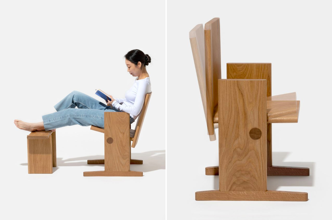
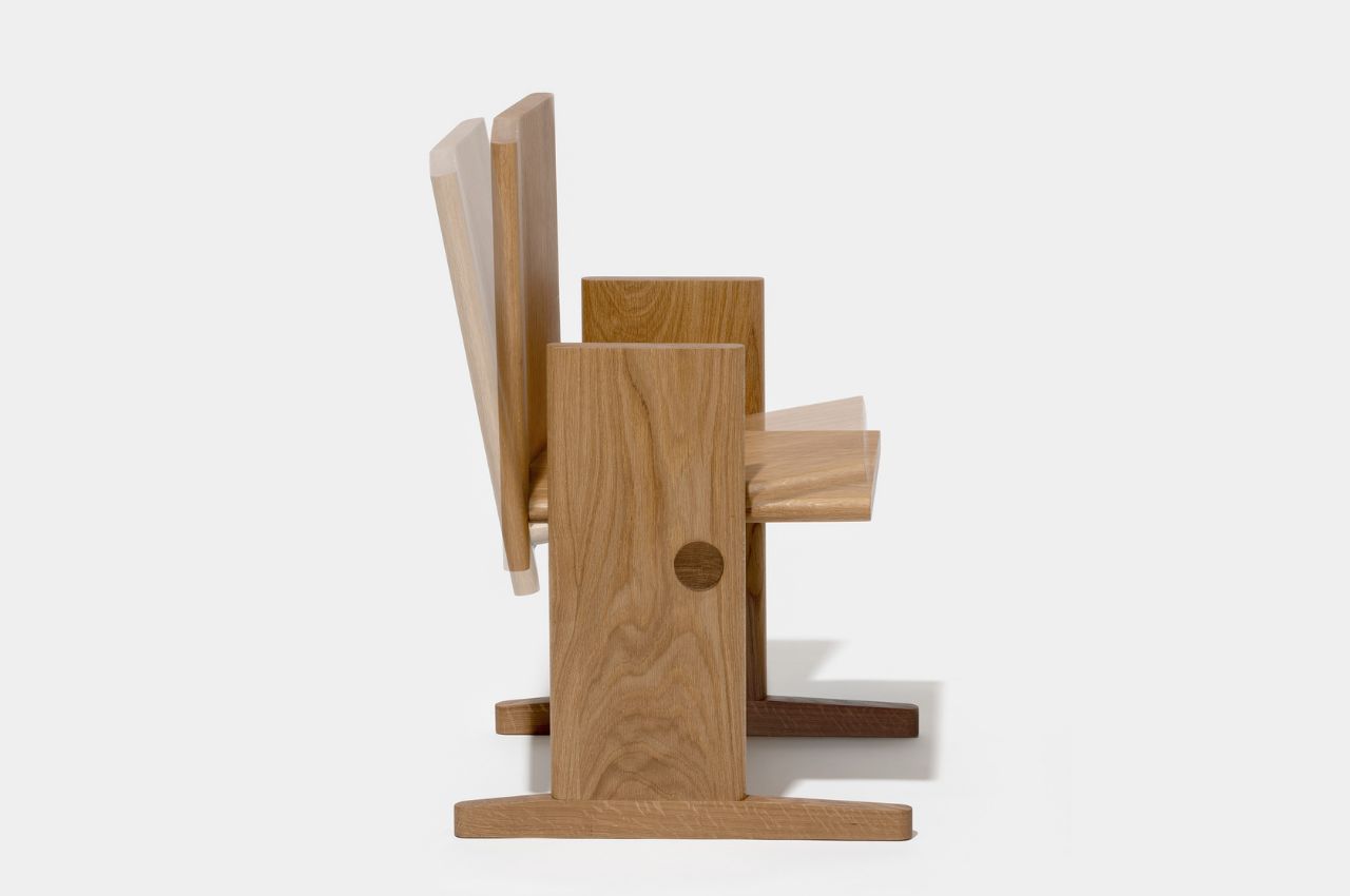
As someone who loves to read, and read for long periods of time, I know that wooden chairs are the least comfortable ones to sit on while finishing a good book. And I’ve also tried to read while on a regular rocking chair and that made me dizzy since the constant big movements are a bit too much for my poor eyes. But staying put in a chair can still be uncomfortable and you need some type of motion while you’re reading. This product concept seems to be the perfect one for bookworms like me.
Why is it noteworthy?
While rocking chairs are good for relaxation, they’re not always good for floors and if you’re like me, for our eyes and peace of mind. The designer thought of a new way to have a chair that can be comfortable and still let your body have its range of natural motion while reading, resting, or even writing (if you’re used to that). The Nodding Chair can be tilted forward and backward, letting you make smaller movements that won’t make you too nauseous.
What we like
- Creates less pressure on the floor so you won’t get marks and scratches
- Allows the chair to move with you as you occasionally change positions while reading
What we dislike
- The seat itself doesn’t seem to be that comfortable as it’s just plain wood and there’s no cushion
10. The Circus Coffee Table
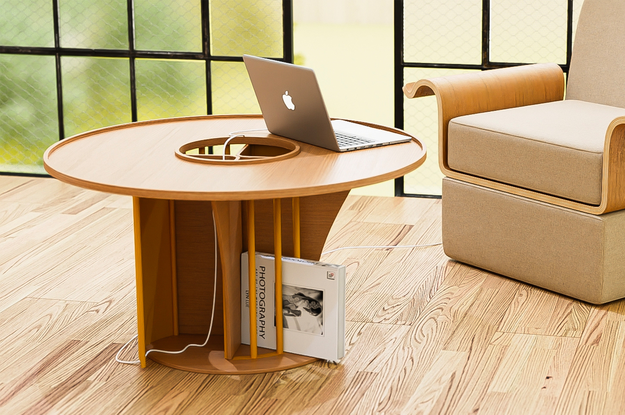
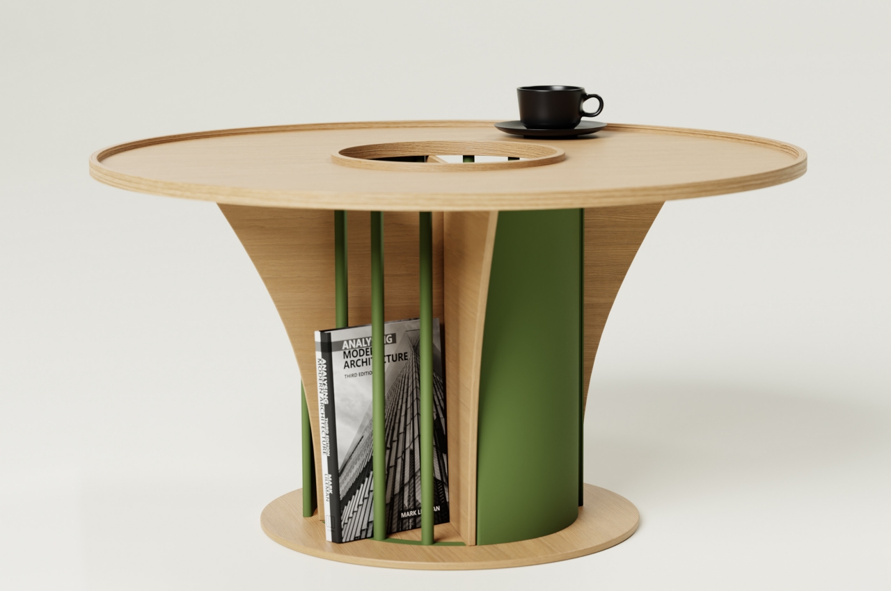
Much like its name, the Circus coffee table is an intriguing concept designed to bring people together in an active, interactive, and chaotic manner. Unlike conventional coffee tables, the circus coffee table is quite tall, and it can be used as a regular desk if need be.
Why is it noteworthy?
The table’s jumble of shapes and materials is almost chaotic, just like a circus. You have a predominantly wooden table with metal components that add functionality to the table. The large circular hole in the middle turns the disc into a donut and reveals two triangular shapes that form the legs of the table. Instead of a solid cylindrical base, the table has metal bars and doors on opposite sides, creating further contrasts in terms of design.
What we like
- Designed to be the center of attraction
- Can function as a regular desk too
What we dislike
- Some people may not like the unconventionality of the design
The post Top 10 wooden furniture designs to incorporate this warm material into your home first appeared on Yanko Design.
via https://ift.tt/ZQwgujz
Post a Comment
Note: Only a member of this blog may post a comment.