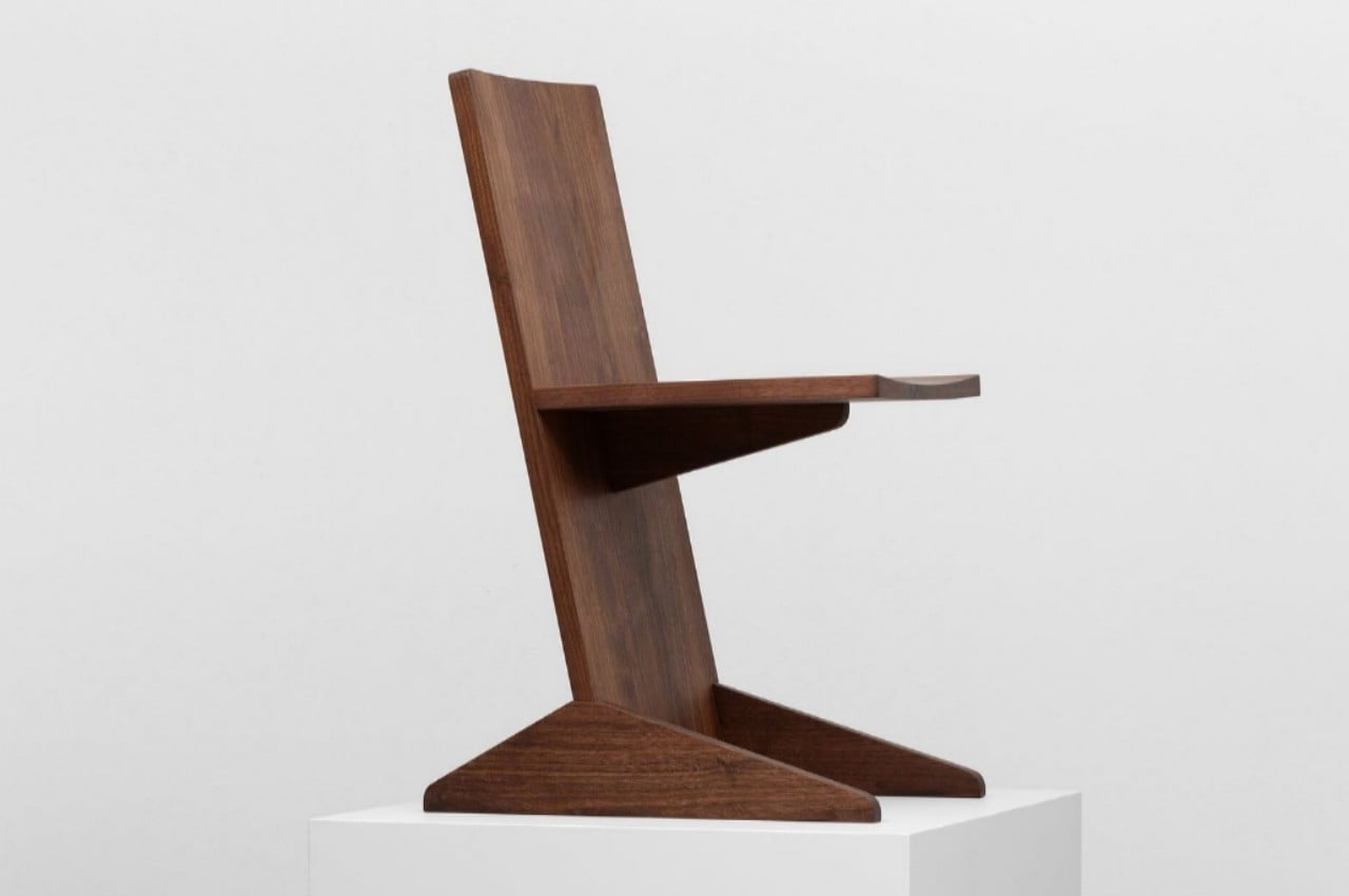
The primary purpose of a chair is, of course, to provide something to sit on. The basic shape of a chair, from its legs to its back to its actual seat, has evolved over the centuries, resulting in a design that provides stability and comfort. That’s not to say that there’s only one way to design a chair, though, and there is plenty of wiggle room for tweaking forms and materials, depending on what the focus of the design is. This design experiment, for example, makes use of a rather unconventional design structure that gives it a unique silhouette and construction, though it may have admittedly reduced the comfort and stability of the overall design in the process.
Designers: Mirko Ihrig, Casey Lewis (LOTTO)
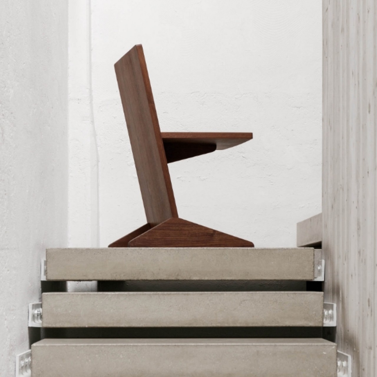
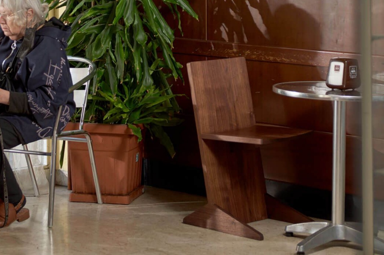
A good chair design would need to have stable legs to stand on, ample room to sit on, and a reliable back to lean on, though that last bit sometimes becomes optional when talking about stools and similar seating furniture. The combination of these three elements leads to a usable piece of furniture, but many designers try to change the formula a bit by using different forms, materials, or structures. Canti, for example, is an experiment that uses a common architectural structure to create a chair that highlights the use of wood as an industrialized material.
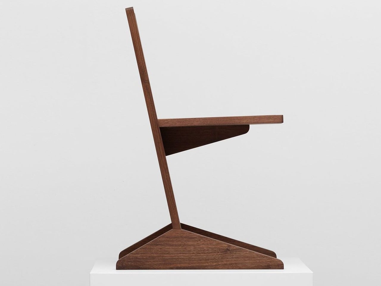
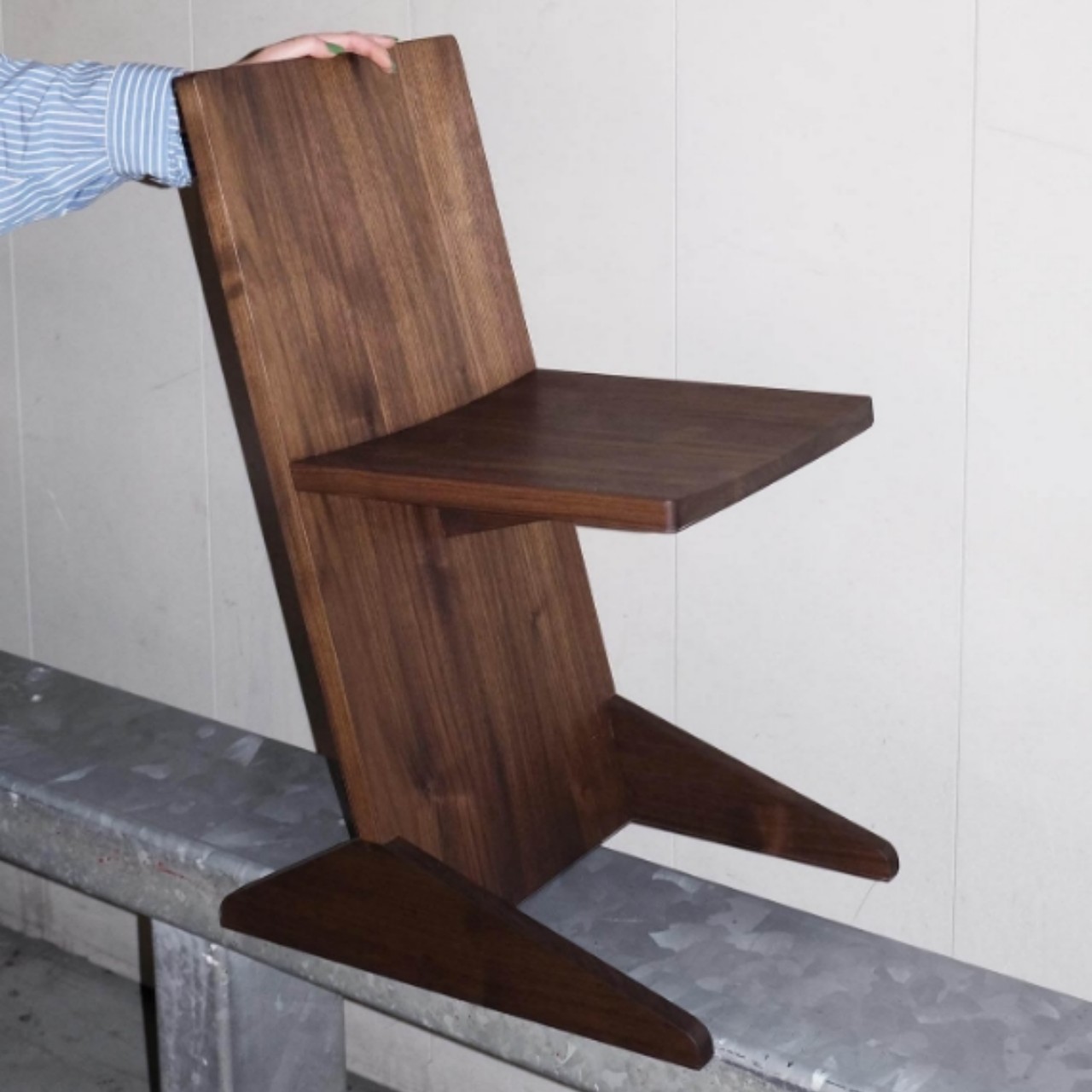
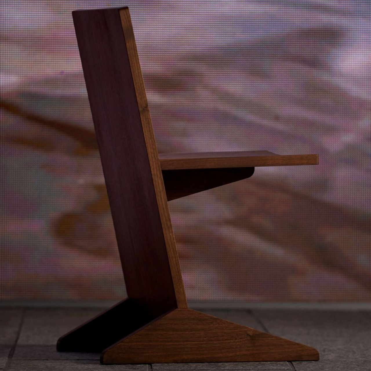
When used for construction, timber is often cut into planks because they are the most space-efficient form for production and transportation. The final product will, of course, look very different from this initial shape, but the Canti chair skips a few steps to reflect the original form of the plank. In short, it uses a simple plank of wood as the “spine” of the chair and uses another cantilevered plank as the seat.
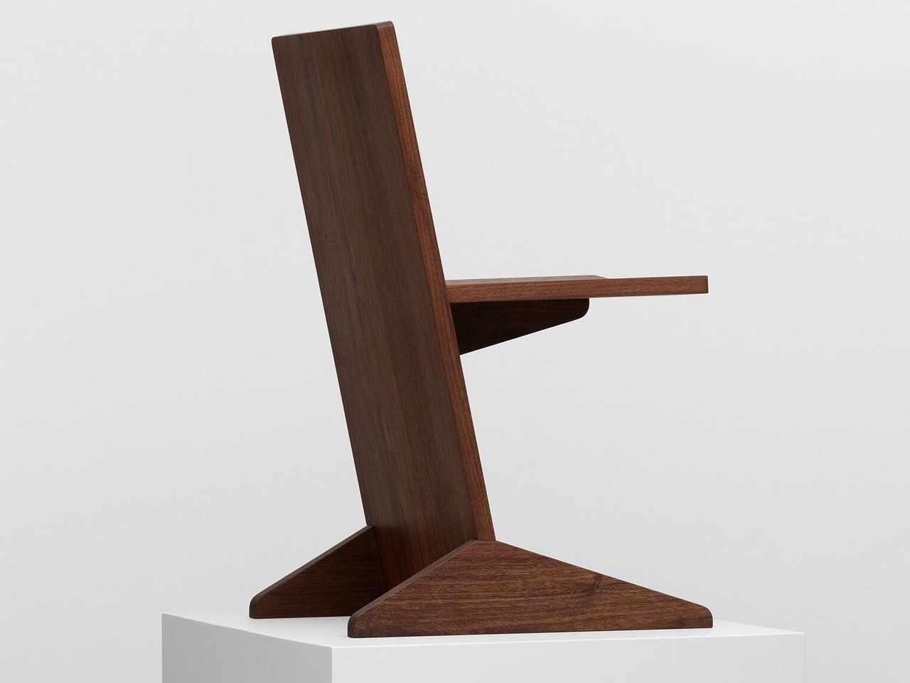
This results in an interesting design that is almost brutalist in both its raw shape and material, though the wood is definitely finished to look and feel more approachable. It pays tribute to bare wooded planks used in construction and production. It also gives off a sense of imbalance and discomfort, which is ironic for something that is supposed to be designed for stability and comfort. The way the plank that serves as the main structure tilts backward might make you feel it will tip over, and the somewhat short protrusion that is the seat doesn’t inspire much confidence either.
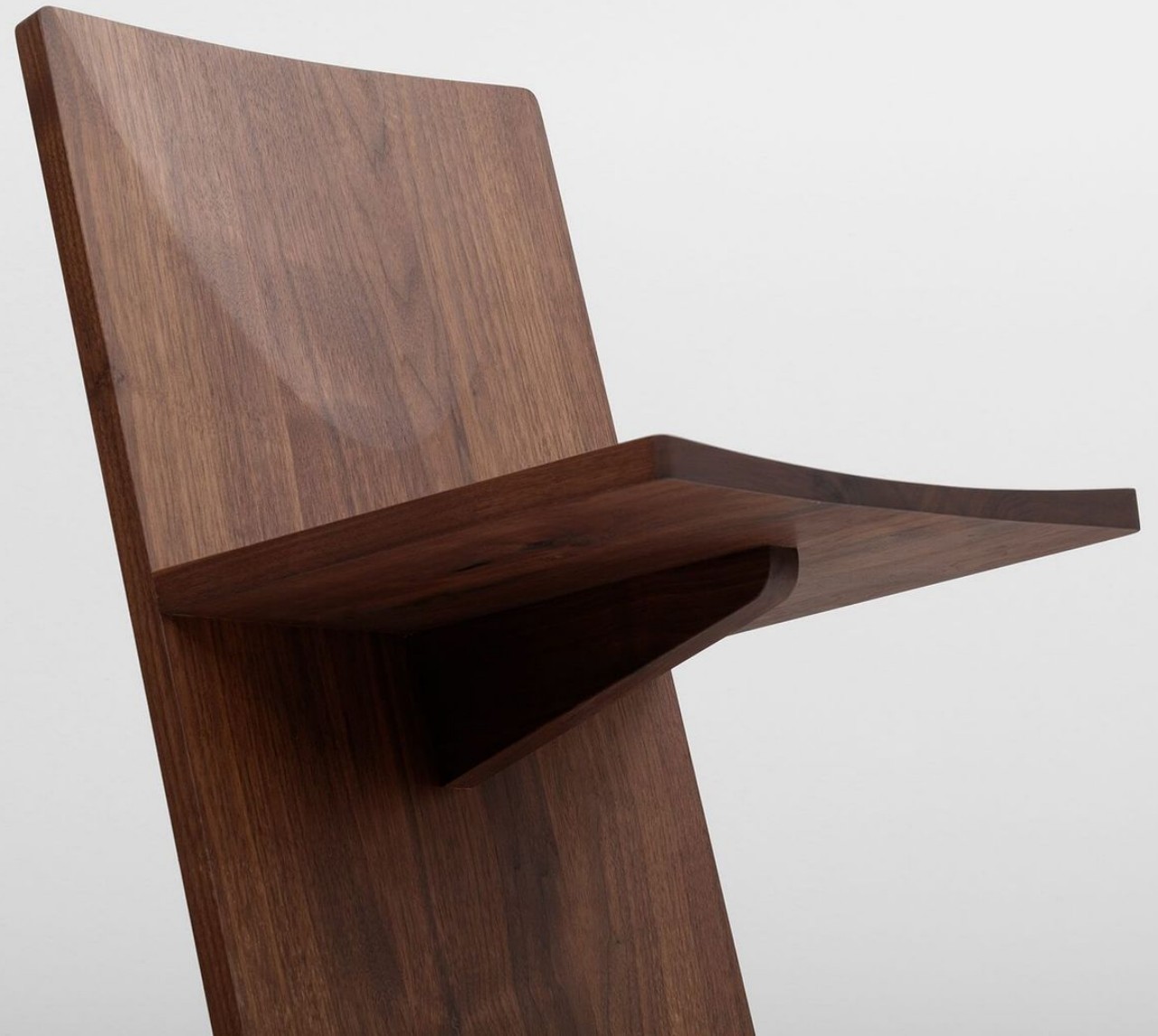
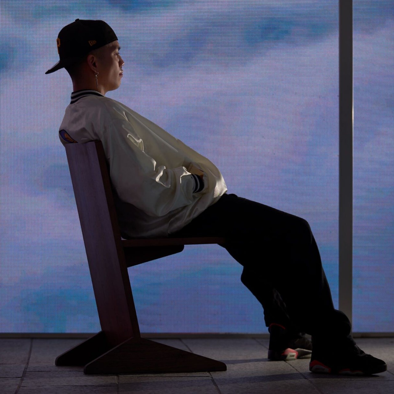
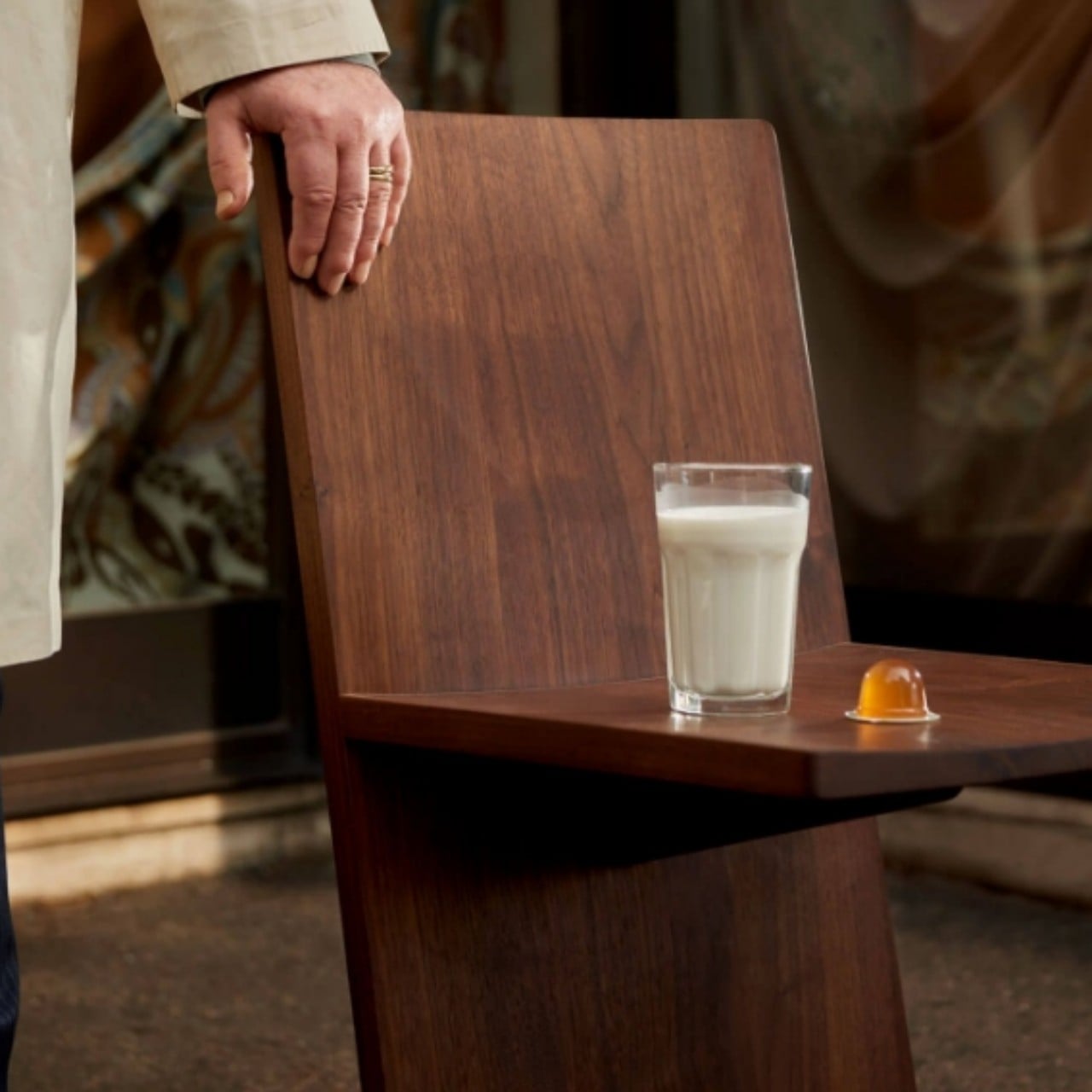
Of course, the Canti chair does attempt to provide a bit of comfort by carving out an extremely subtle curve for the person’s body. That curve is indeed so minimal that you can even put things on the seat, turning the chair into a makeshift side table. It might not be the most comfortable chair to look at or even use, but Canti definitely sparks the imagination as a design experiment that could be close to being ready for production.
The post Cantilevered wooden chair experiment puts simplicity and efficiency on a pedestal first appeared on Yanko Design.
via https://ift.tt/Uwg6p0A
Post a Comment
Note: Only a member of this blog may post a comment.