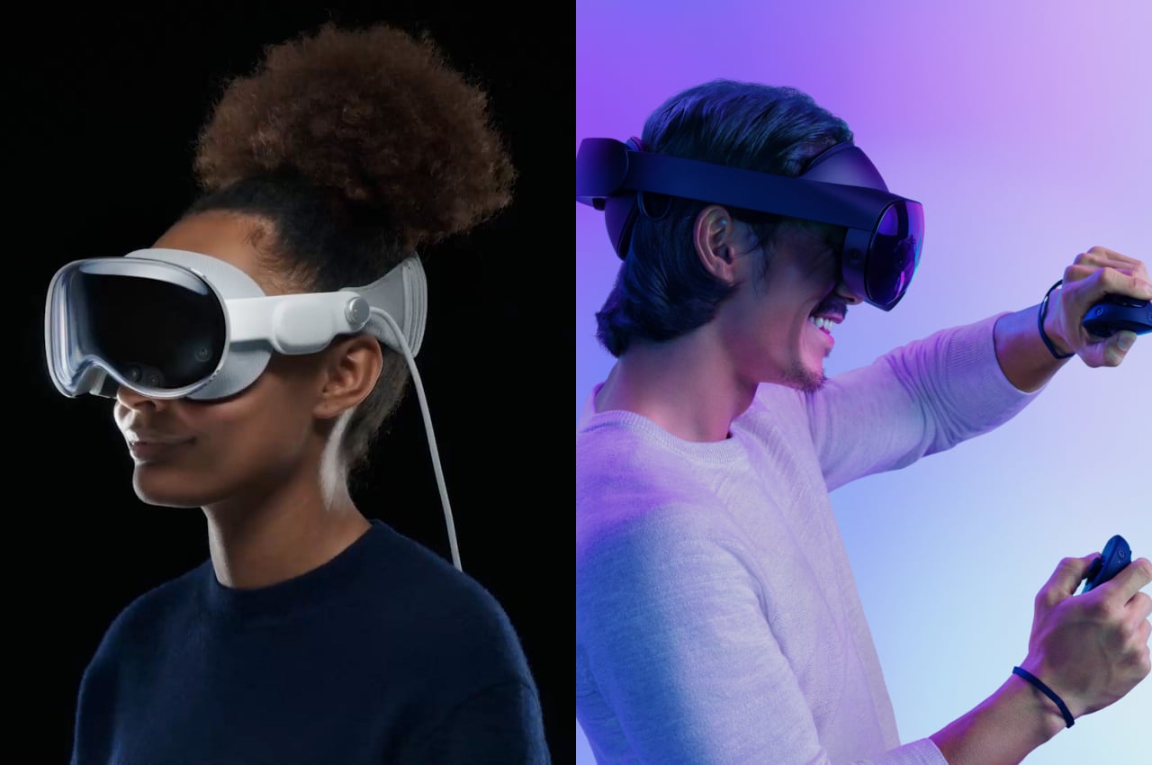
Apple finally took off the veils from its much-anticipated entry into the mixed reality race, and the Internet was unsurprisingly abuzz with comments on both sides. Naturally, comparisons were made between this shiny newcomer and the long-time market leader, which is now Meta, whether you like it or not. Given their already tenuous relationship, the launch of the Apple Vision Pro only served to increase the rivalry between these frenemies. It’s definitely not hard to paint some drama between the two tech giants vying for the same mixed reality or spatial computing market, whichever buzzword you prefer to use. But is there really a direct competition between these two products, or do they have very different visions with almost nothing in common except for having to put a screen over our eyes? We take a deeper look into the Apple Vision Pro and the Meta Quest Pro to see where they differ not only in their design but also in their vision.
What is the Meta Quest Pro
Let’s start with the older of the two, one that dates back to the time when Facebook was also the name of the company. Originally created by Oculus, the Quest line of VR headsets soon bore the Meta name, though not much else has changed in its core focus and the way it works. In a nutshell, the Meta Quest Pro, along with its siblings and predecessors, falls under the category of virtual reality systems, which means it gives you a fully enclosed experience confined within virtual walls. It practically blocks off the rest of the real world while you’re wearing it, but the Quest Pro now has a “passthrough” feature that lets you see the world around you through the headset’s cameras, but the quality is definitely lower than what your eyes could naturally see.

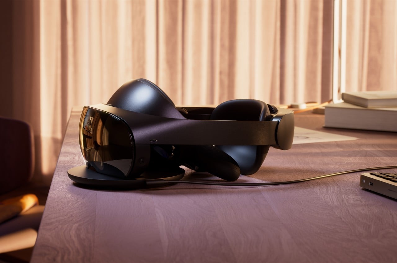
In terms of product design, the Quest Pro doesn’t stray too far from the typical formula of consumer electronics, which is to say that there’s plenty of plastic material all around. To be fair, Meta aimed to make the Quest hardware more accessible to more people to help spread its adoption, so it naturally had to cut a few corners along the way. The choice of materials was also made to lighten the gear that might be sitting on your head for hours, but it also doesn’t remove the less-than-premium feel, nor does it completely alleviate that heft.

To its credit, the design of the Quest Pro does help make the headset feel a little less burdensome by balancing the weight between the front and back parts. While the front has most of the hardware and optics that make the Quest Pro work, the back has the battery that powers the device. Having that battery present still adds to the overall weight of the machine, but Meta opted to prioritize mobility and convenience over lightening the load.
What is the Apple Vision Pro
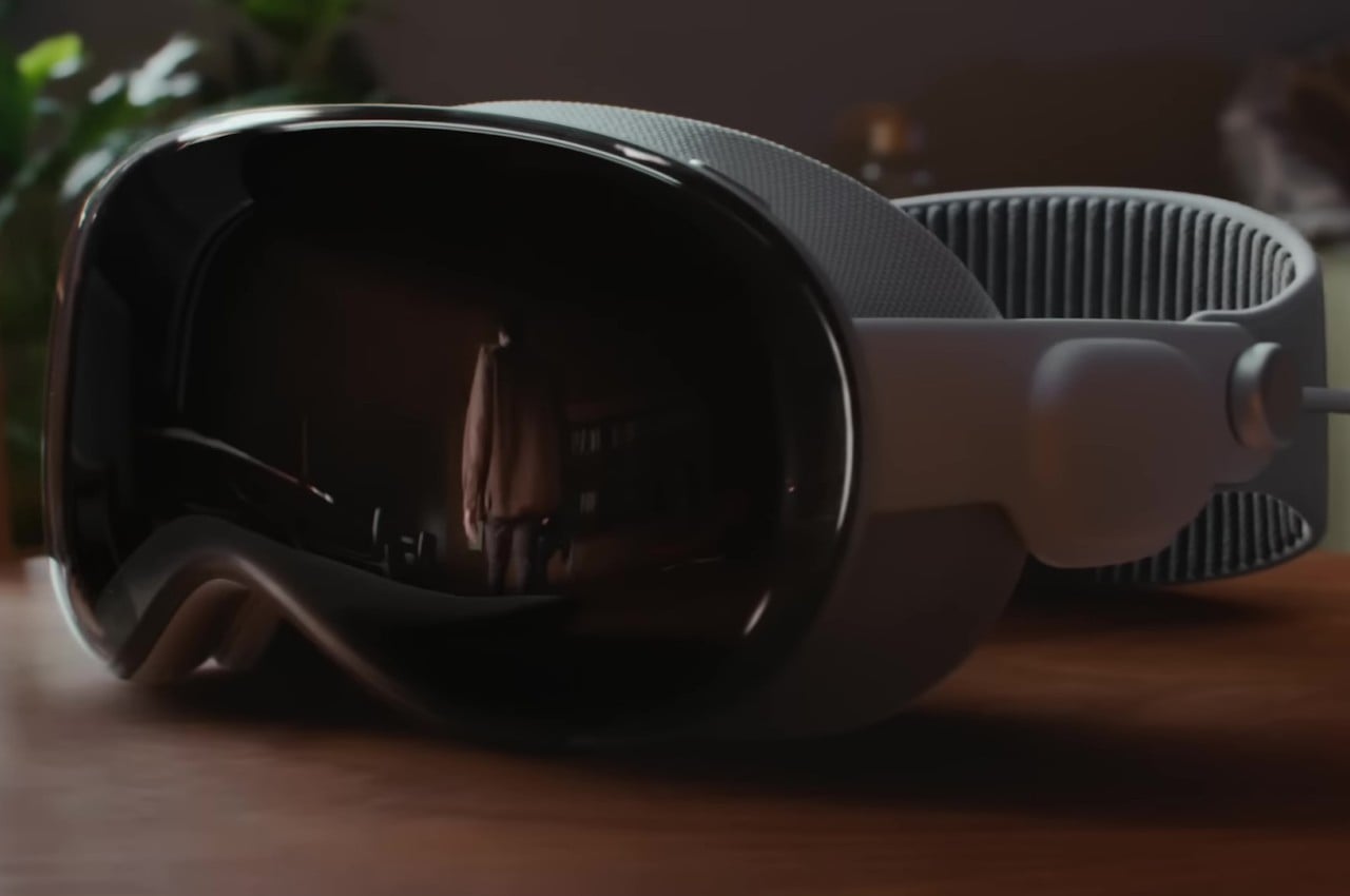
The Apple Vision Pro, in comparison, takes an almost completely opposite approach from the Meta Quest Pro or all other headsets in general. In typical Apple fashion, the company paid special attention to design details that make the hardware both elegant and comfortable. The Vision Pro makes use of premium materials like laminated glass and woven fabrics, as well as heavier components like aluminum alloy. It’s a device that looks elegant and fashionable; an undeniable part of Apple’s hardware family.


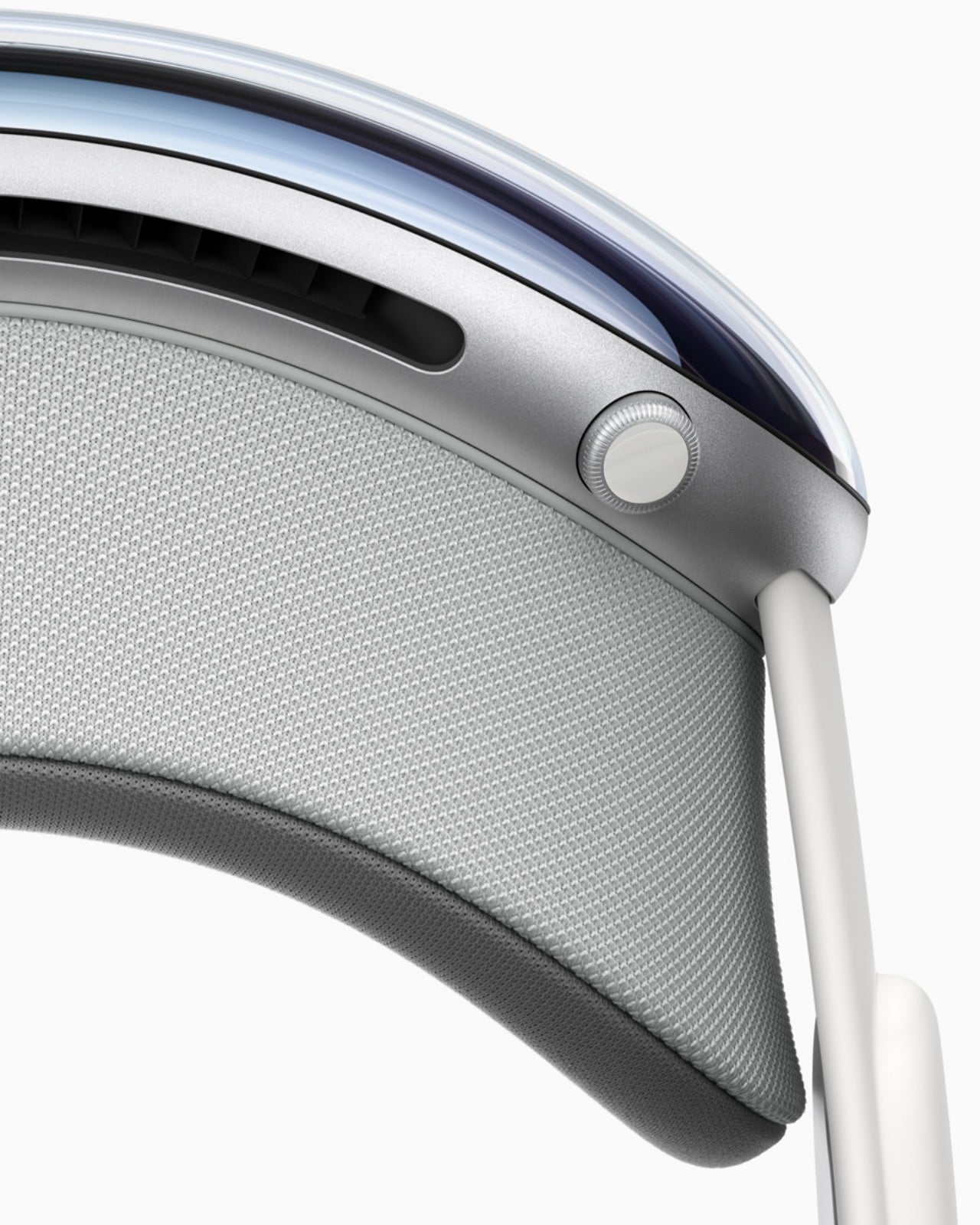
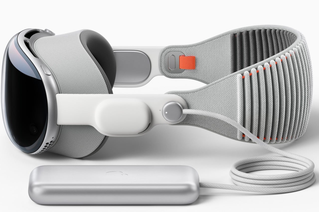
Apple’s answer to the battery problem is both simple and divisive. The Vision Pro simply doesn’t have a battery, at least not on the headset itself. You’d have to connect an external power source via a cable, though that battery can be shoved inside your pocket to get it out of the way. It doesn’t completely hinder mobility and even opens the doors for third-party designs to come up with other ideas on how to solve this puzzle.
The biggest difference between Apple’s and Meta’s headsets, however, is in their use and purpose. The Vision Pro is closer to being an augmented reality headset compared to the Quest Pro, blending both virtual and real worlds in a single, seamless view. The Vision Pro also has the ability to block out or at least dim everything aside from the virtual window you’re using, but that’s only a side feature rather than a core function.
VR/AR vs. Spatial Computing
At its most basic, the Meta Quest Pro is really a virtual reality headset while the Apple Vision Pro is designed for a form of mixed reality now marketed as “spatial computing.” To most people, the two are almost interchangeable, but those sometimes subtle differences set these two worlds apart, especially in how they are used. It’s certainly possible to mix and match some features and use cases, but unless they’re specifically designed to support those, the experience will be subpar.
The Meta Quest Pro, for example, is the first in its line that can be truly considered to have AR functionality thanks to its higher fidelity “passthrough” feature, allowing you to see virtual objects overlaid on top of the real world. That said, its core focus is still on virtual reality, which, by nature, closes off the rest of the world from your sight. Looking at the world through cameras is really only a stopgap measure and can be a little bit disorienting. That’s not even considering how most of the Quest ecosystems experiences happen in virtual reality, including the use of “normal” computer software, particularly ones that require using a keyboard and a mouse.
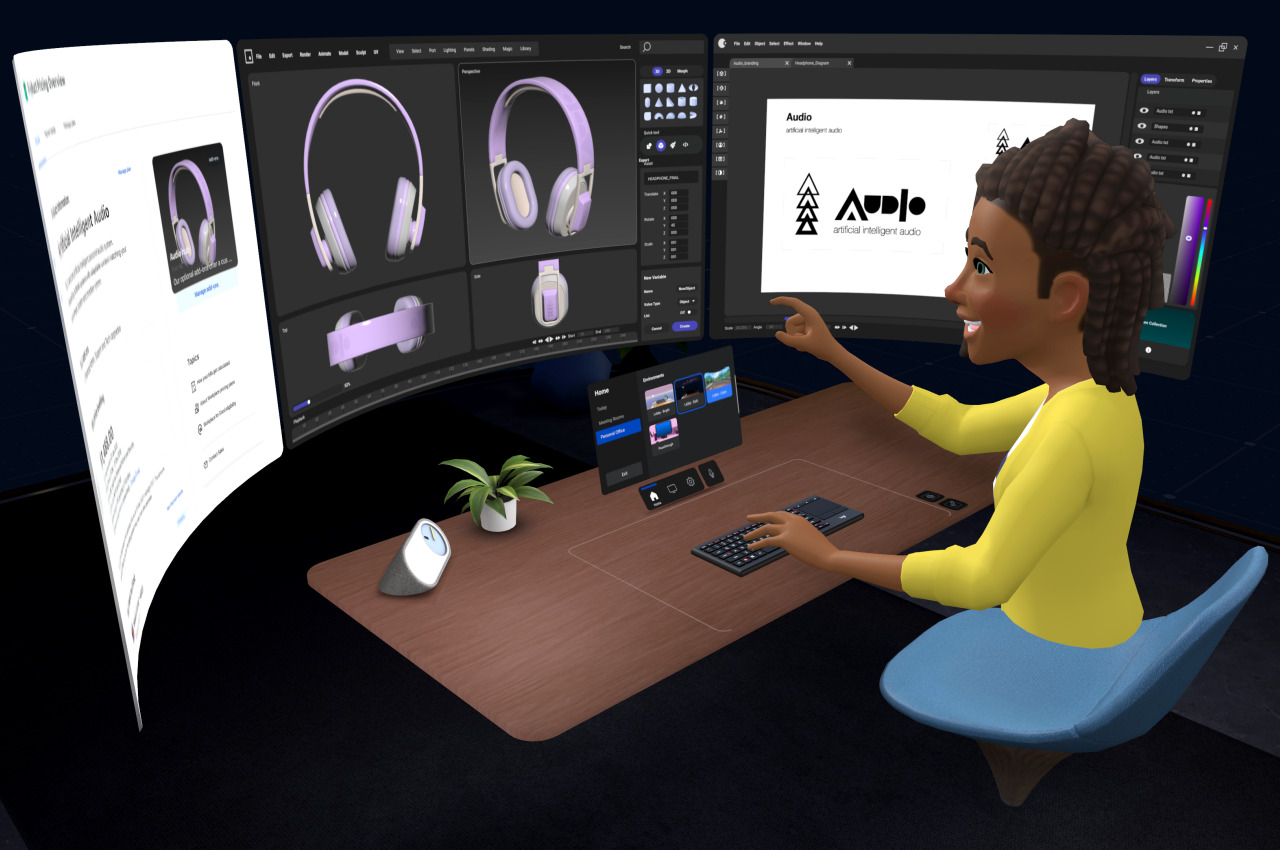
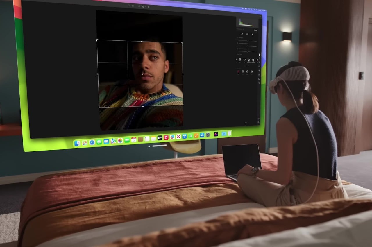
On the other hand, the Apple Vision Pro was made specifically for mixed reality, specifically spatial computing, where the real and the digital are blended seamlessly. In particular, it puts those applications, including familiar ones from macOS and iOS, in floating windows in front of you. visionOS’s special trick is to actually have the real world affect those virtual objects, from having them cast shadows to tweaking the audio to sound as if they’re bouncing off the furniture in the room. The Vision Pro can emulate the enclosed view of a VR headset by darkening everything except the virtual window you’re using, but it’s unavoidable that you’ll still see some of the real world “bleeding” through, especially in bright ambient light.
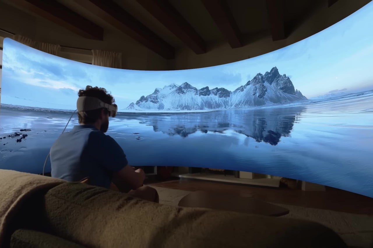
The Vision Pro’s and visionOS’s capability to blend the real and the virtual is no small feat. Not only does it enable you to use normal applications with normal computer peripherals, it also makes better use of real-world space. It lets you, for example, assign specific applications and experiences to parts of the house. Apple’s technologies also create more natural-looking interactions with people, even if your actual body parts are invisible or even absent. All these don’t come without costs, though, and it remains to be seen if people will be willing to pay that much for such a young technology.
Controls and Interaction
The Meta Quest Pro hails from a long line of VR and AR headsets, and nowhere is this more obvious than in the way you interact with virtual objects. The headset is paired with two controllers, one for each hand, which are pretty much like joysticks with buttons and motion sensors. Make no mistake, the technology has come a long way and you no longer need to have external beacons stationed elsewhere in the room just to make the system aware of your location or that of your hands. Still, holding two pieces of plastic all the time is a very far cry from how we usually manipulate things in the real world or even from the way we use computers or phones.
Apple may have acquired the holy grail of virtual computing with its more natural input method of using hand gestures without controllers or even gloves. There’s still a limited vocabulary of gestures available, but we’re almost used to that given how we have been using touch screens for the past decade or so. At the same time, however, the Vision Pro doesn’t exclude the use of more precise input instruments, including those controllers, if necessary. The fact that you can actually see the real objects makes it even easier to use any tool, which expands the Vision Pro’s uses considerably.
Philosophy and Vision
Although it’s easy to paint the Apple Vision Pro and Meta Quest Pro as two sides of the same eXtended Reality (XR) coin, the philosophies that drive their design are almost as opposed to each other as the companies themselves are. Meta CEO Mark Zuckerberg was even quoted to have pretty much said that while downplaying the Vision Pro’s innovations. In a nutshell, he doesn’t share Apple’s vision of the future of computing.
It shouldn’t come as a surprise that Zuckerberg’s vision revolves around social experiences, something that might indeed be better served by a fully virtual reality. Not only does it make out-of-this-world experiences like the Metaverse possible, it can also make inaccessible real-world places more accessible to groups of people. Meta’s marketing for the Quest Pro mostly revolves around fun and engaging experiences, content consumption, and a bit of creativity on the side.
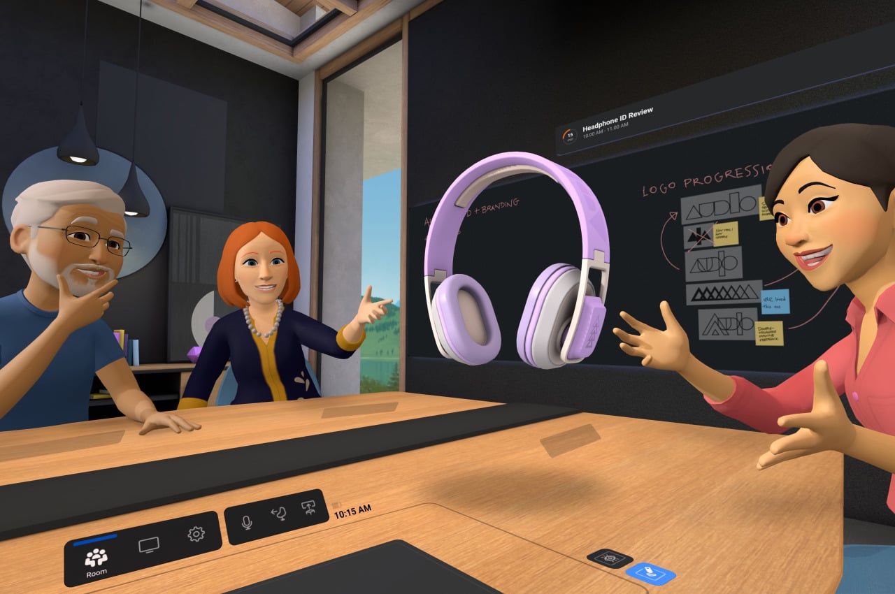

The Apple Vision Pro, on the other hand, seems to be about empowering the individual by breaking computing free from the confines of flat and limited screens. There are, of course, features related to connecting with other people, but most of the examples have been limited to FaceTime chats more than huddling around a virtual campfire. It has already been noted repeatedly how Apple’s presentation was bereft of any mention of social media, which some have taken as a knock against Facebook. Of course, social media is now an unavoidable part of life, but it exists only as just another app in visionOS rather than as a core focus.
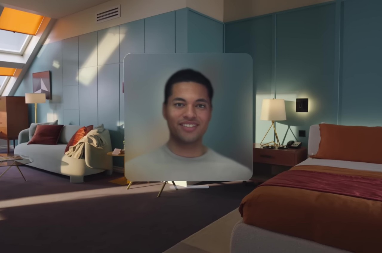
Ironically, the Vision Pro is perhaps even more social than the Quest Pro, at least as far as more natural connections are concerned. Instead of fun yet comical avatars, people will get to see a life-like semblance of your bust during meetings, complete with eye movements and facial expressions. And when someone needs your attention in the meatspace, the Vision Pro will project your eyes through the glass, making sure that the other person knows and feels that you’re actually paying attention to them.

Pricing
It’s hard to deny how impressive all the technologies inside the Vision Pro are, and it’s easy to understand why Apple took this long to finally let the cat out of the bag. As mentioned, however, these innovations don’t come without a cost, and in this case, it is a very literal one. Right off the bat, Apple’s inaugural spatial computing gear is priced at $3,499, making it cost twice as much as the average MacBook Pro. It might be destined to replace all your Apple devices in the long run, but it’s still a very steep price for an unproven piece of technology.
The Meta Quest Pro is, of course, just a third of that, starting at $1,000. Yes, it uses less expensive materials, but its technologies are also more common and have stood the test of time. The Quest platform has also gone through a few iterations of polish, with developers creating unique applications that play to the hardware’s strengths. That said, although the Quest Pro sounds more dependable, insider insights at Meta have painted a somewhat uncertain future for the company’s Metaverse ambitions. Apple’s announcement might then serve to light a fire under Meta’s seat and push it to pick up the pace and prove that its vision is the right one.
Final Thoughts
As expected of the Cupertino-based company, Apple turned heads when it announced the Vision Pro. It blew expectations not just because of the quality of its design but also because of the ambitious vision that Apple revealed for the next wave of computing. Right now, it may all sound novel and gimmicky, and it will take some time before the technology truly takes root and bears fruit. Spatial computing has the potential to truly revolutionize computing, but only if it also becomes more accessible to the masses.
The Vision Pro isn’t a death knell for the Meta Quest but more of a wake-up call. There will definitely be a need for an alternative to Apple’s technologies, especially for those who refused to live in that walled garden. Meta definitely has a lot of work to do to reach the bar that Apple just raised. Whether those alternatives come from Meta or it might come from other vendors, there’s no doubt that the extended reality market just burst to life with a single “One More Thing” from Apple.
The post Apple Vision Pro vs. Meta Quest Pro: The Design Perspective first appeared on Yanko Design.
via https://ift.tt/mL7Iy9f
Post a Comment
Note: Only a member of this blog may post a comment.