AI might not steal our jobs, but it for sure will help us become MUCH more talented. Tools like Midjourney help push our creativity to new heights by allowing us to imagine practically anything. Some artists have used it to imagine sapphire-crusted gold thrones, others have turned luxury automobiles into high-octane off-roaders, and architect Tim Fu is using Midjourney to realize large architectural marvels by using something as unusual as crumpled paper as his source of inspiration.
Simply dubbed “Crumpled Paper Architecture”, this series explores Midjourney’s Image to Image feature. All you do is upload an image, add a description or prompt, and the AI works using both as an input. Tim’s prompts featured names of prominent architectures, and the AI did the rest, turning the haphazard folds in the paper into architectural details. The results are fantastic, but more so, they open up new possibilities for ideation. Designers and architects can now look anywhere for inspiration, and rely on an AI to bring their visions to life… After all, if crumpled paper can look this good!
Designer: Tim Fu (via Midjourney)

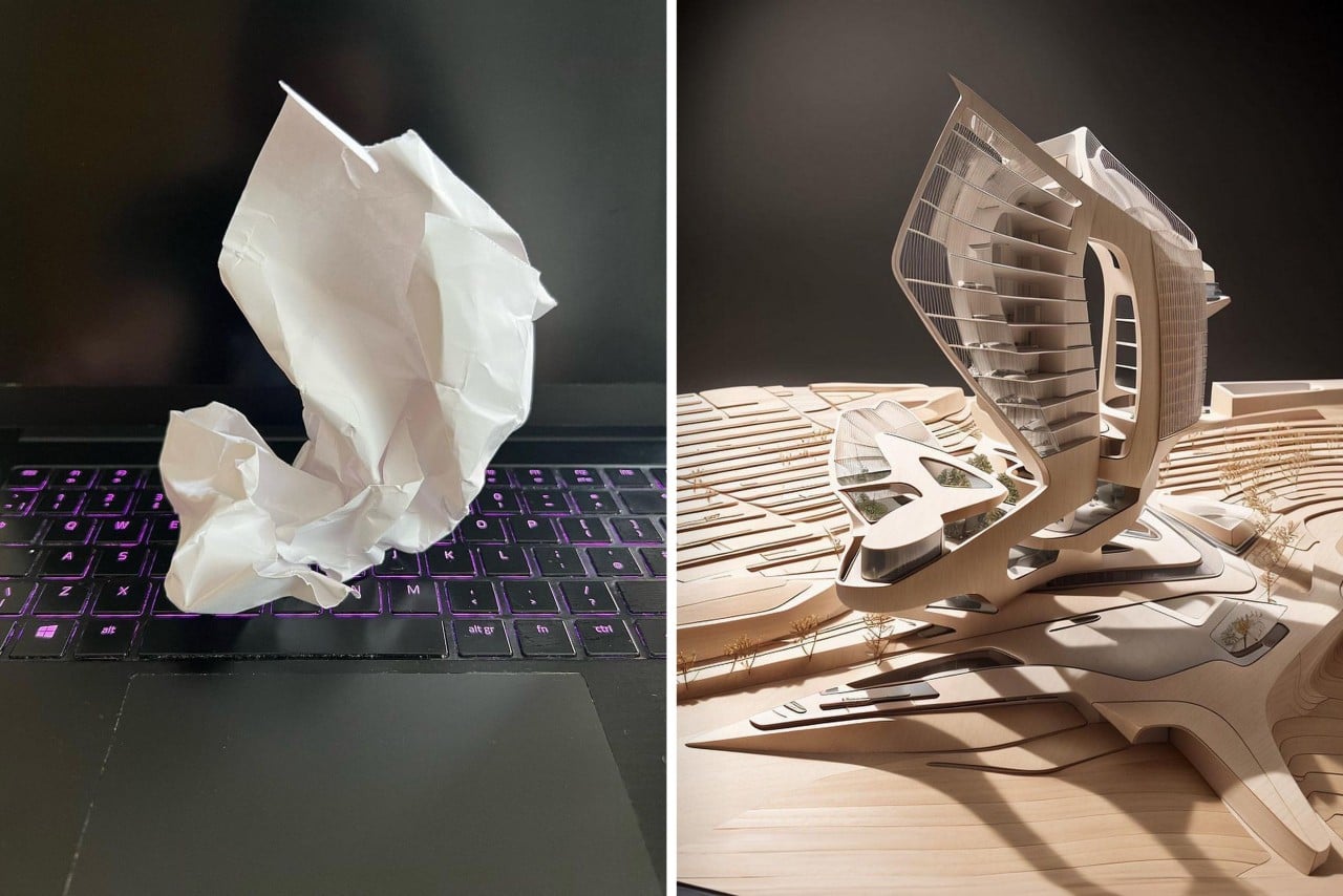
The image above served as Tim’s source file, which the AI took as a visual input. Tim simply crumpled a piece of high-GSM paper (for more detailed folds) ad placed it on his keyboard as a base. The keys of the keyboard acted as a neat perspective guide for the AI, helping it understand scale, height, perspective, etc.
The second part of the exercise was to give the AI a prompt, instructing it to manipulate the image in the style of your choosing. Below is an example of the AI harnessing the style of Pritzker-prize-winning architectural firm SANAA (Sejima And Nishizawa And Associates). Inspired by the architecture of the Sydney Modern Museum and the Apartments on Ave. Maréchal Fayolle in Paris, the AI created a multi-level building with curved, undulating facades in white. The curved architecture aims at creating dynamic spaces on the inside as well as an exterior that benefits well from direct sunlight, creating a unique interplay between highlights and shadows.

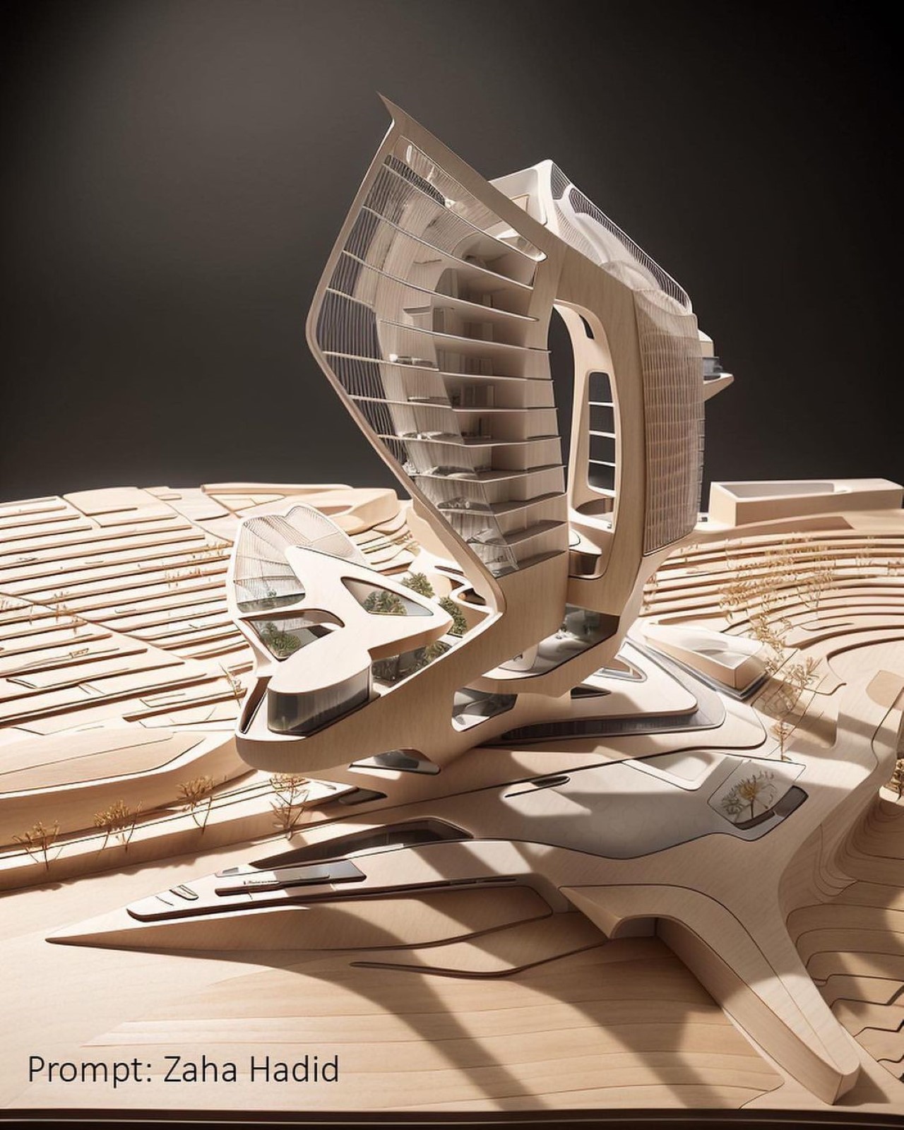
A prompt to turn the paper into the architecture of Zaha Hadid yielded some interesting results too. The late architect’s works explore immense, sometimes highly challenging forms, bridging art and engineering in an iconic way. The AI’s work is not too different, using not a single straight line in the process. Inspired by Hadid’s organic approach, the building has a fluid appeal to it too, almost as if it were carved by water, wind, and erosion.


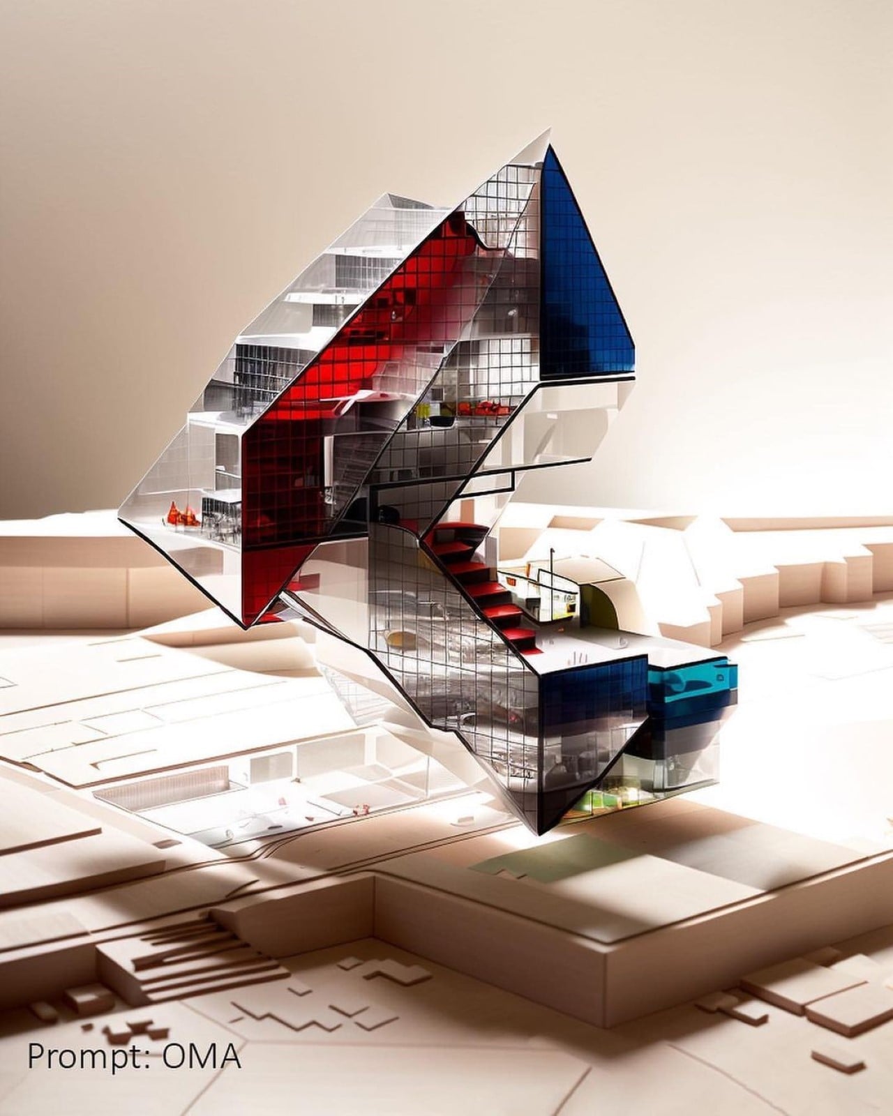
To push things further, Tim experimented with new forms, resulting in even more interesting outputs. This particular crumple had some height to it, so it was interesting to see how the AI would translate that into architecture that’s still feasible and structurally sound. For this experiment, Tim harnessed the styles of OMA or the Office for Metropolitan Architecture. Based in Germany, OMA isn’t afraid of dramatic facades, and often uses glass to bring concrete to life. In the case of the ‘building’ below, you’ll see references to Dutch artist Piet Mondrian too, with the use of abstract geometric shapes, brought to life by vibrant colors. I can only imagine how interesting the buildings must look from the inside, with natural light filtering through those tinted glass panels.

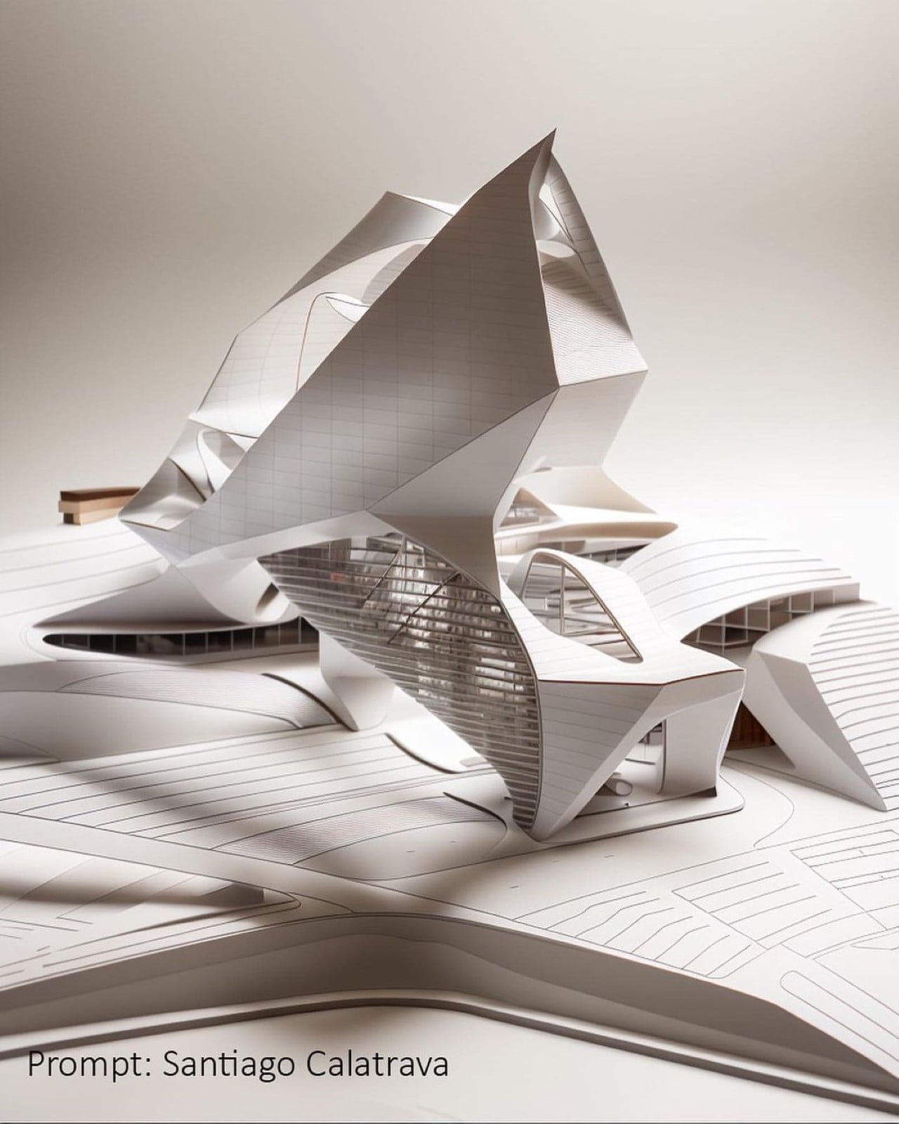
The next prompt turned the same crumpled paper into a building by Spanish architect and structural engineer, Santiago Calatrava. Calatrava’s designs are known for their organic and zoomorphic shapes that resemble living organisms. His buildings often feature sweeping curves and dramatic angles that give them a sense of movement and dynamism, which the AI captured really well. The curved facades, combined with the use of angular elements, give the building a biofuturistic appeal. Look closer and you’ll notice details like rectangular panels, supports, and window borders, just showing how capable the AI is of recreating even the overlooked details of grandiose architecture. Calatrava’s work is also known for its intricate details and ornamentation, which are often inspired by natural forms such as leaves, shells, and bones, which is pretty evident from the design choices of the AI.


The final form is perhaps the most dramatic, with a somewhat vertical design that’s still stable. In a way, crumpled paper has its own method of tipping and falling over to find equilibrium, so that plays a big role in making sure that the buildings attain some form of equilibrium and stability! Tim invoked the styles of Zaha Hadid once again, relying on the late architect’s use of organic geometry to create captivating, and sometimes structurally challenging buildings. This particular experiment highlights that, with floors that look like they’re gradually tilting the higher you climb. You can’t really fault an AI art generator for that, given that they don’t understand concepts like geometry, balance, and structural soundness. All that aside, what the AI still manages to create is beyond incredible, opening up a lot of avenues for exploration for all kinds of designers.

Hadid’s building is followed by legendary architect Frank Gehry, whose famous works include the Guggenheim Museum in Bilbao, the Walt Disney Concert Hall in LA, and the oddly appealing Dancing House in Prague. Gehry is of the opinion that straight lines are the death of art and architecture… and he tries to use them as minimally as possible, if not eliminate them entirely from his work. Looking at the base of that AI-generated building below, it seems like Midjourney may have grasped that concept. The larger vertical structure pulls more from the postmodern works of Gehry like the Hotel Marqués de Riscal in Spain, with a wraparound facade that creates a cloak of dynamism around the building itself.

After Gehry’s postmodern approach, Tim looked to Polish-American architect Daniel Libeskind’s deconstructionist architectural style – a variation of postmodern architecture characterized by fragmentation and distortion. Libeskind’s work is instantly recognizable for its unique shapes and forms that often appear to be in motion, which the AI does justice to with its own image generation. If Gehry hated straight lines, Libeskind looked at them much more favorably. Sort of like if architecture met origami, this building has a distinct, edgy appeal – which does make sense in hindsight considering that the AI’s input was literally folded paper!

The post From Trash to Treasure: How an AI Created Stunning Architecture from a Crumpled Paper first appeared on Yanko Design.
via https://ift.tt/RiXbcOn
Post a Comment
Note: Only a member of this blog may post a comment.