Last year, Carl Pei took to the stage to proclaim that Tech had become boring, and it was time to inject some fun back into the industry again. In hindsight, the Phone (1) was an ideal proof of concept to show how exciting phones could be… The Phone (2), which officially launched today, shows a more iterative, refined version of exactly where Nothing is heading as a “small team with big ambitions”.
The launch of the Phone (2) is just as informal as last year’s Phone (1) keynote, and it’s a conscious effort on Nothing’s part to make sure that phone announcements aren’t highly precise, highly engineered, rehearsed monologues that are repeated year after year (major shots fired at Apple). Instead, Carl doubles down on the idea of keeping things fun by pairing up with Casey Neistat and sitting on a rollercoaster for the first few minutes, before vlogging the keynote just like Casey would.
Designer: Nothing
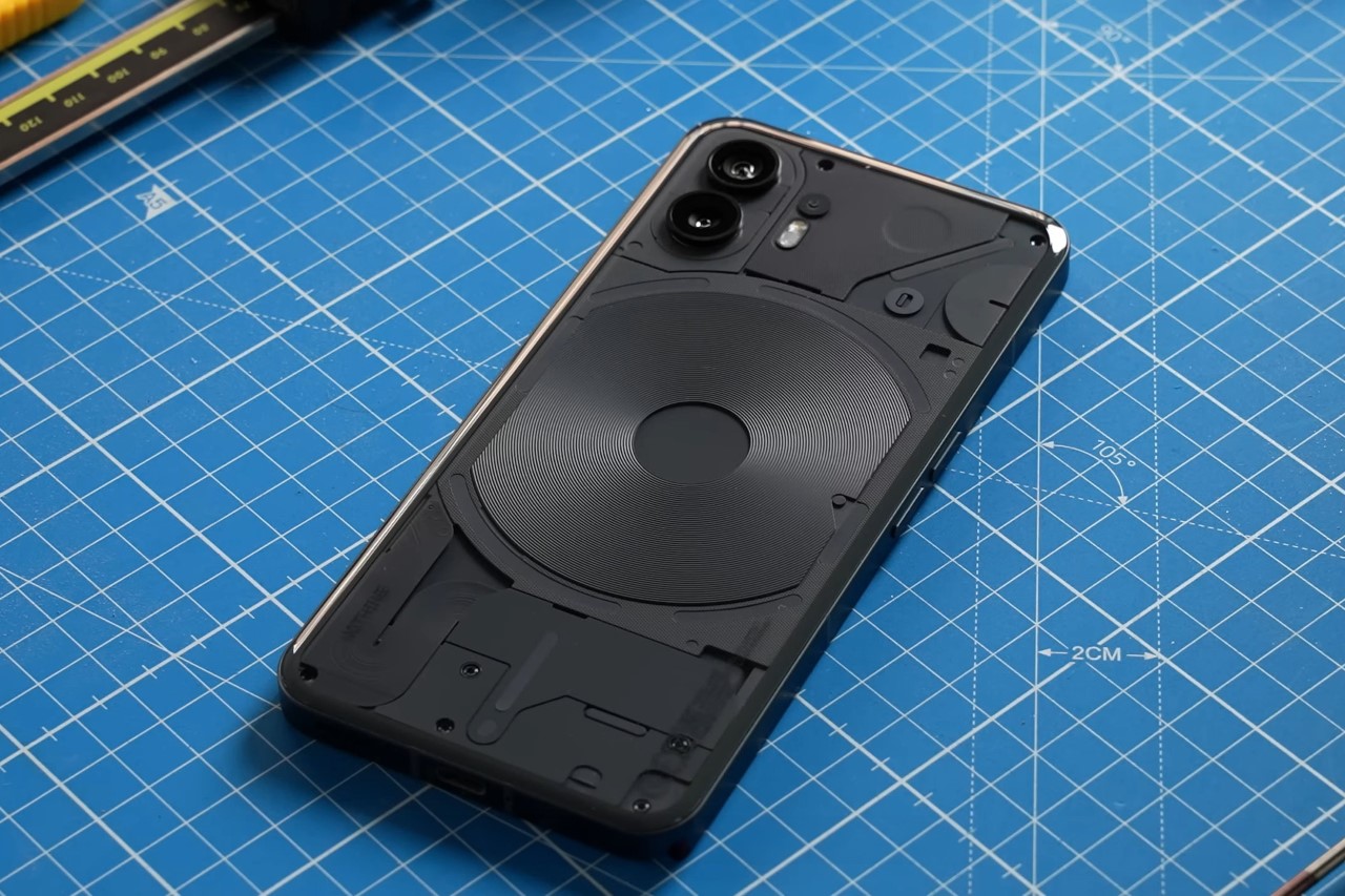
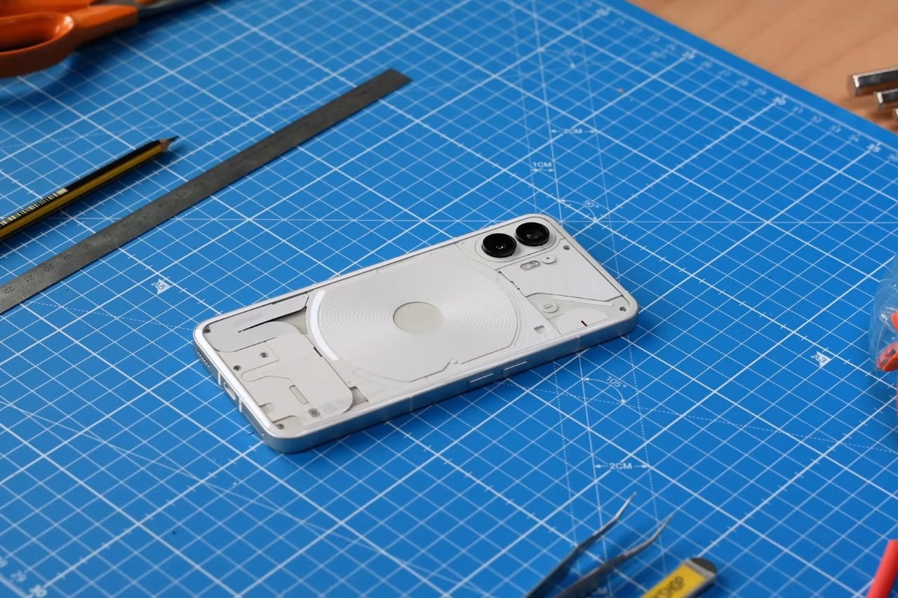
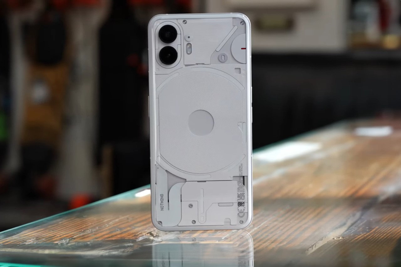
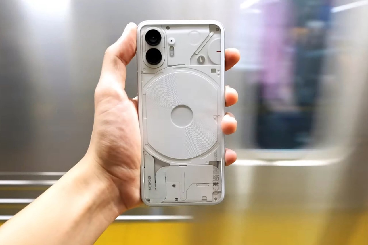
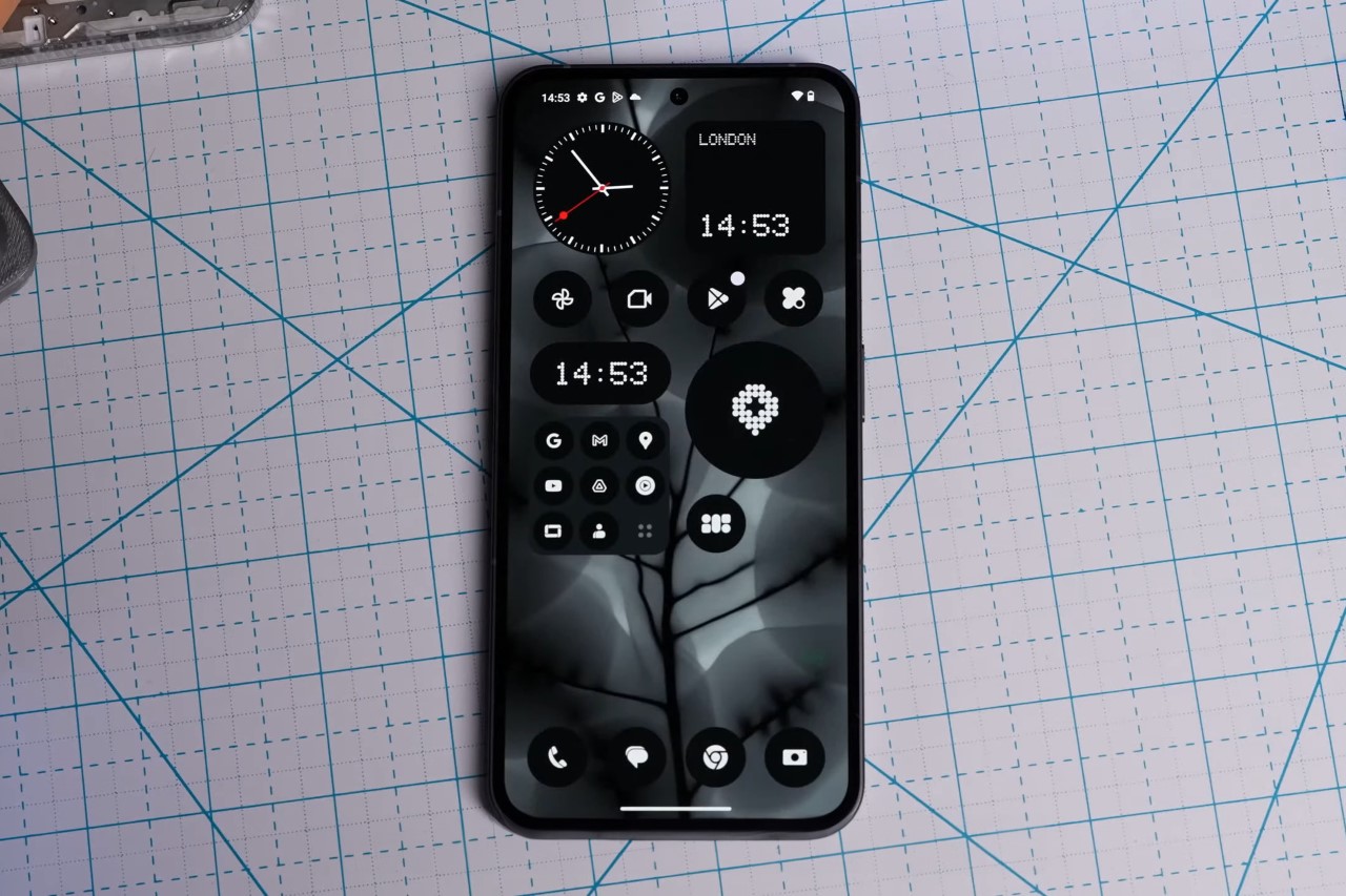
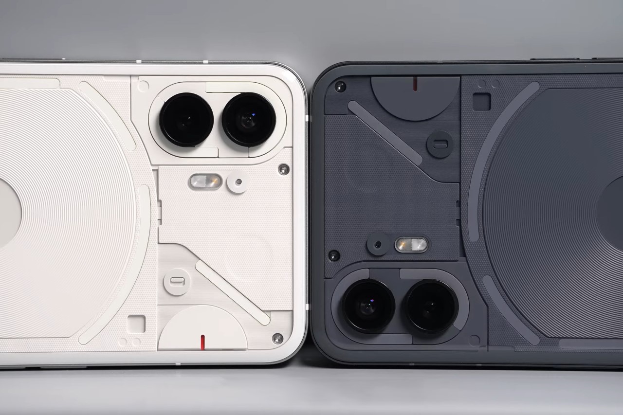
The Phone (2) comes with some significant improvements, but its design still remains familiar. The reason? Not just cost (because retooling, re-engineering, etc. eats into a lot of capital), but also to make sure that the phone’s design remains iconic and memorable. If it ain’t broken, don’t fix it… but definitely refine it to make it better. To that end, the Phone (2) comes with some pretty eye-catching visual refinements in the form of a new Glyph Interface that’s much more detailed and responsive than in the past. Unlike last year’s interface, this year has 11 individual LED panels, with individually addressable LEDs that can respond to different apps and features. The back of the phone also has a mildly curved glass that creates a uniquely comfortable experience as you hold the phone (so that edge doesn’t dig into your palm), and on the front, the selfie camera now shifts to the center instead of sitting in the corner. The phone also ditches the black colorway for a slate, anthracite-like gray that helps you appreciate the transparent rear fascia.
Pei mentions that even though Phone (1) was a proof of concept in a lot of ways, its overwhelmingly positive response proves that the company’s on the right track. Nothing has sold nearly 2 million Phone (1) units to date, and the device has even won a lot of design and tech awards (we gave the Phone (1) an award at the Mobile World Congress this year too). This has helped Nothing hire more designers, engineers, and solidify partnerships to make Phone (2) even better. Every aspect of the Phone (2) sees some form of an upgrade, from the chipset to the display, battery, camera module, and even the OS.
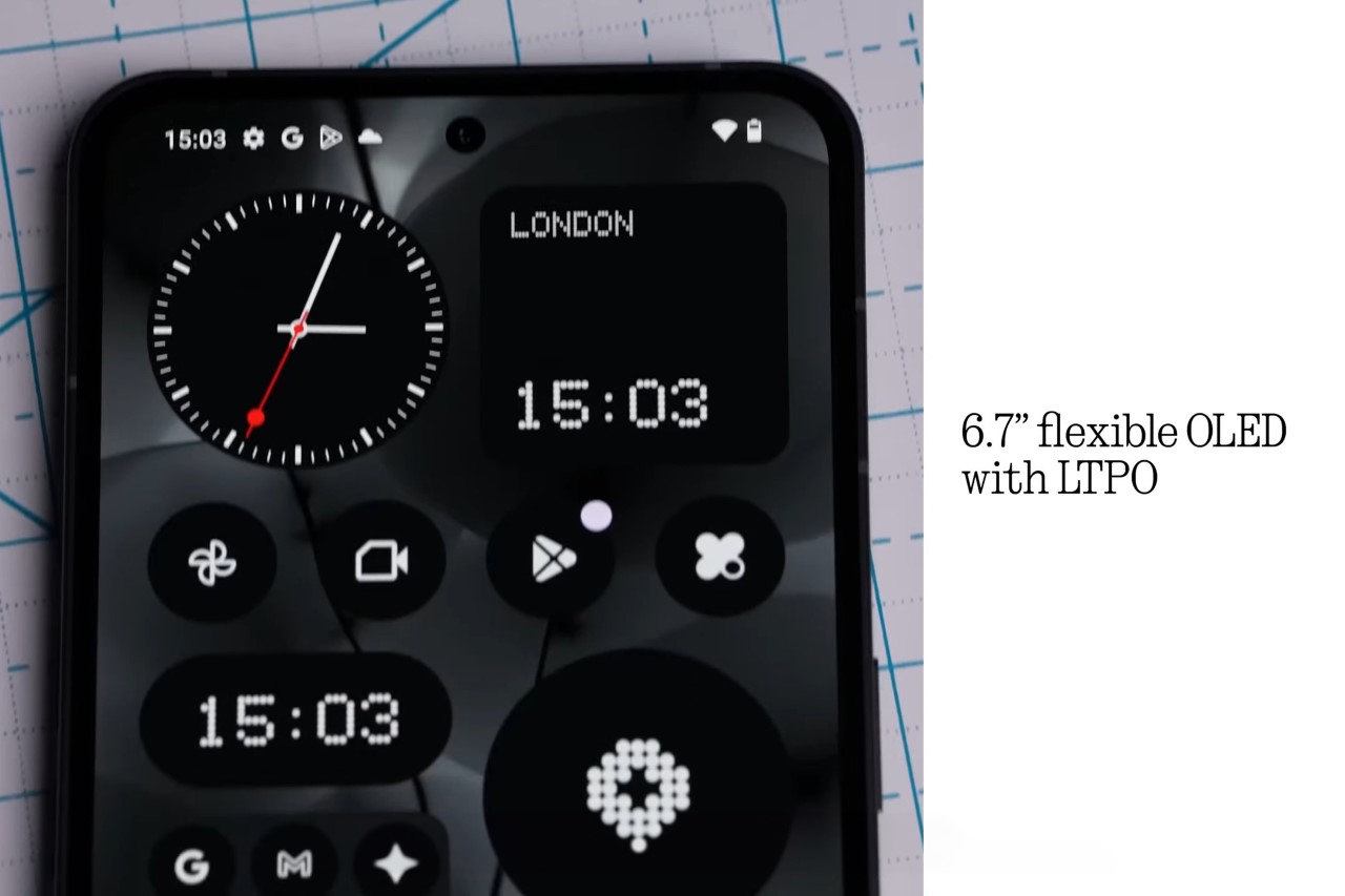
The front shows a great amount of iterative refinements on Nothing’s parts, in the form of a 6.7″ OLED display that now has 0.35mm slimmer bezels than before, and a 1600 nits peak brightness. The camera hole punch gets shifted to the center to aid the phone’s symmetric appeal and the UI, and the screen is now OLED LTPO, which means it can rapidly alternate between 120Hz and 1Hz refresh rates to reduce battery consumption and give you an always-on screen that rivals most flagships. The screen pulls power from the Phone (2)’s upgraded 4700mAh battery, and while Carl doesn’t specifically mention how the battery upgrade translates into hours of usage, he does mention a 40% bump in battery life compared to the Phone (1).
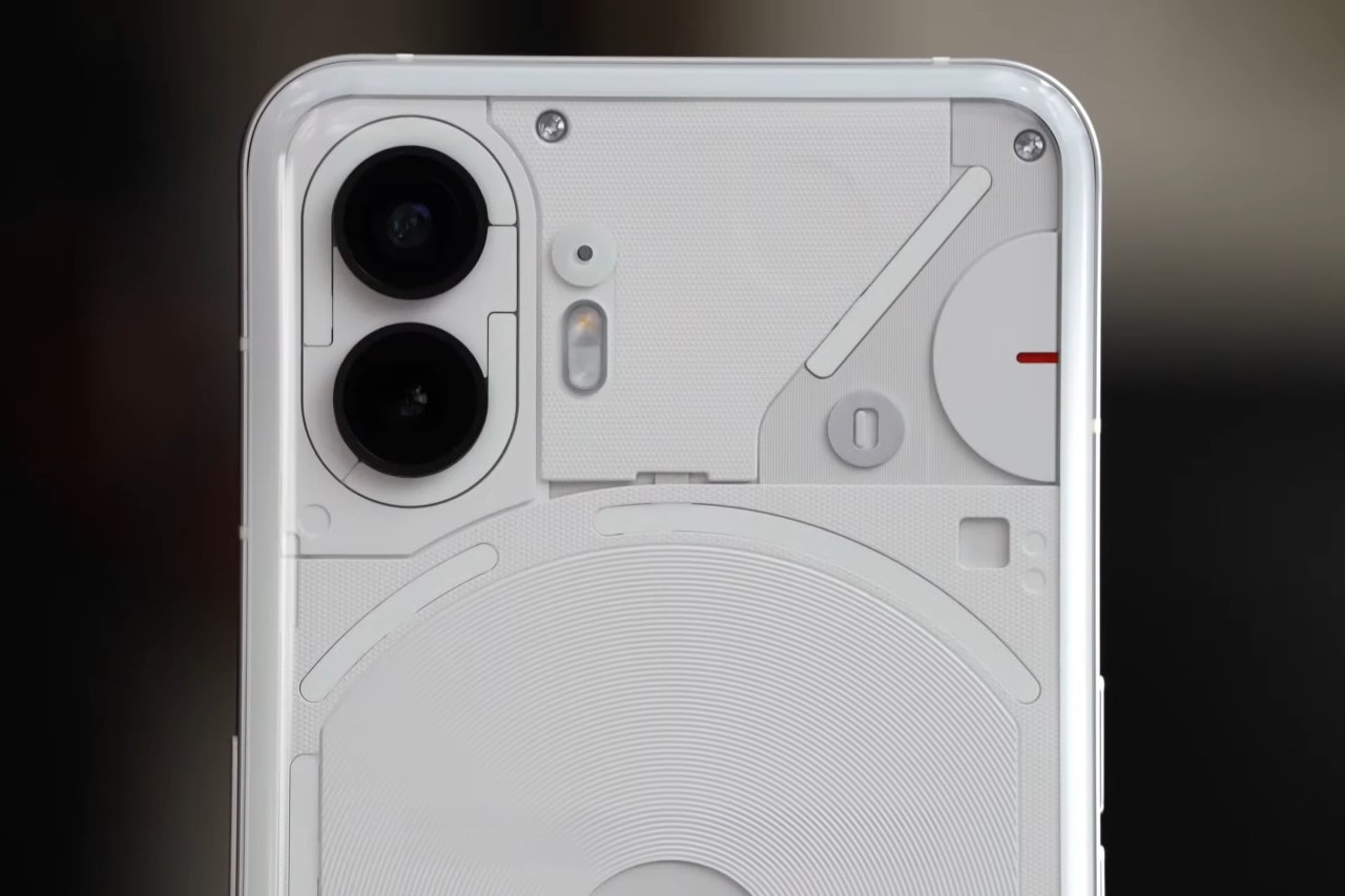
The Glyph Interface on the back is perhaps the most visible refinement of all. With multiple LED bands, it can now say and do a lot more than its predecessor. It’s a lot more responsive, customizable, and has a few tricks up its sleeve like a custom LED strip can light up to let you know you’ve got an ‘important’ notification pending. An LED arc on the top right works as a progress bar, helping you intuitively use the phone’s countdown timer; and integration with apps like Uber and India’s food delivery giant Zomato can show progress meters like how close your cab driver or delivery agent is next to you.
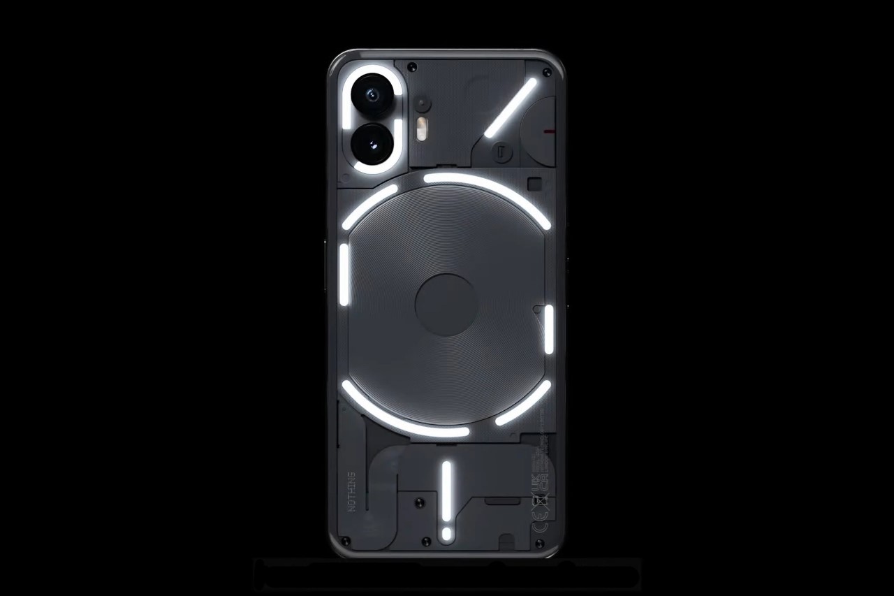
The new Glyph Interface has 11 zones instead of last year’s 5.
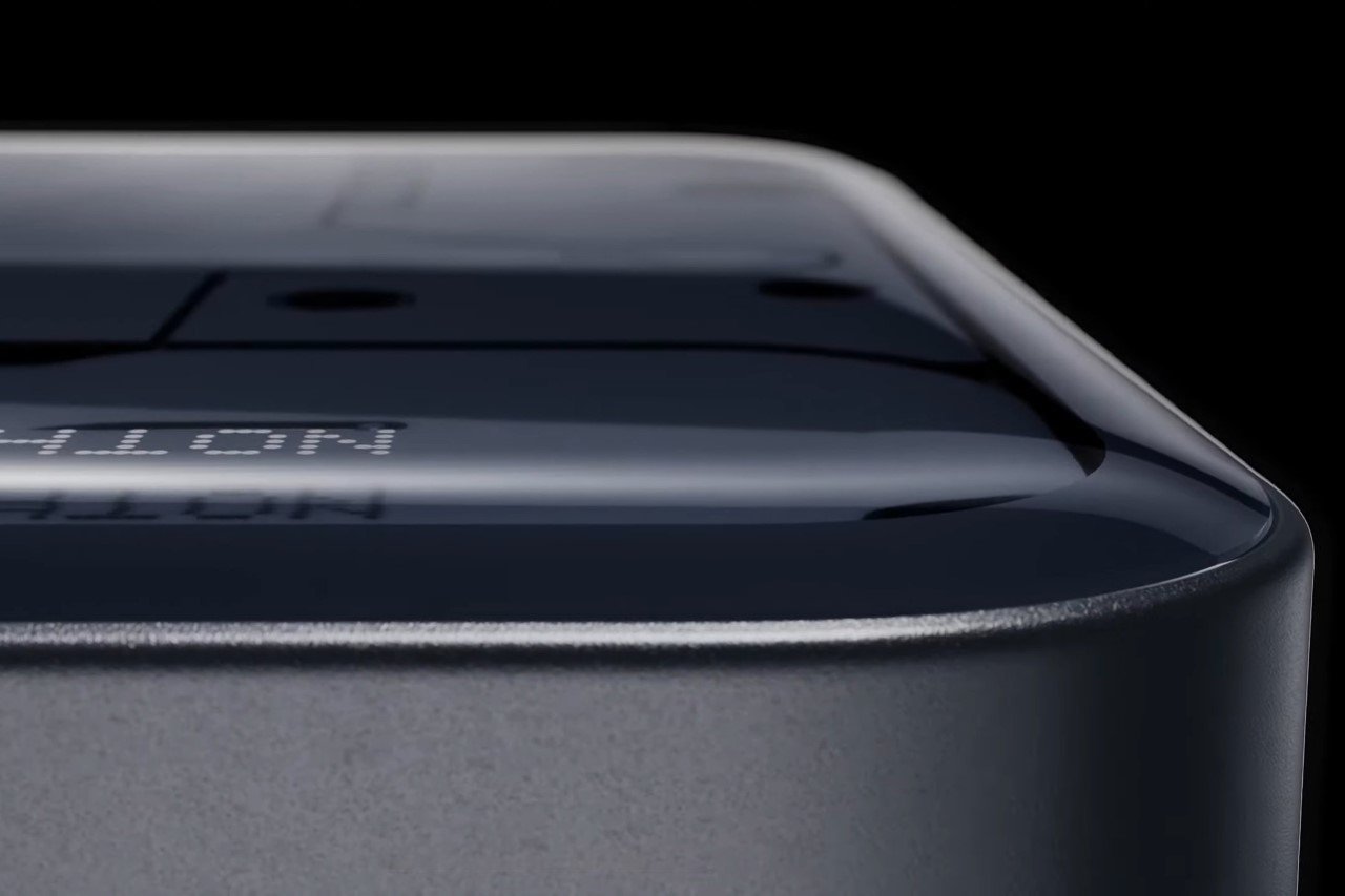
The new curved glass back highlights the phone’s premium appearance and hand-feel.
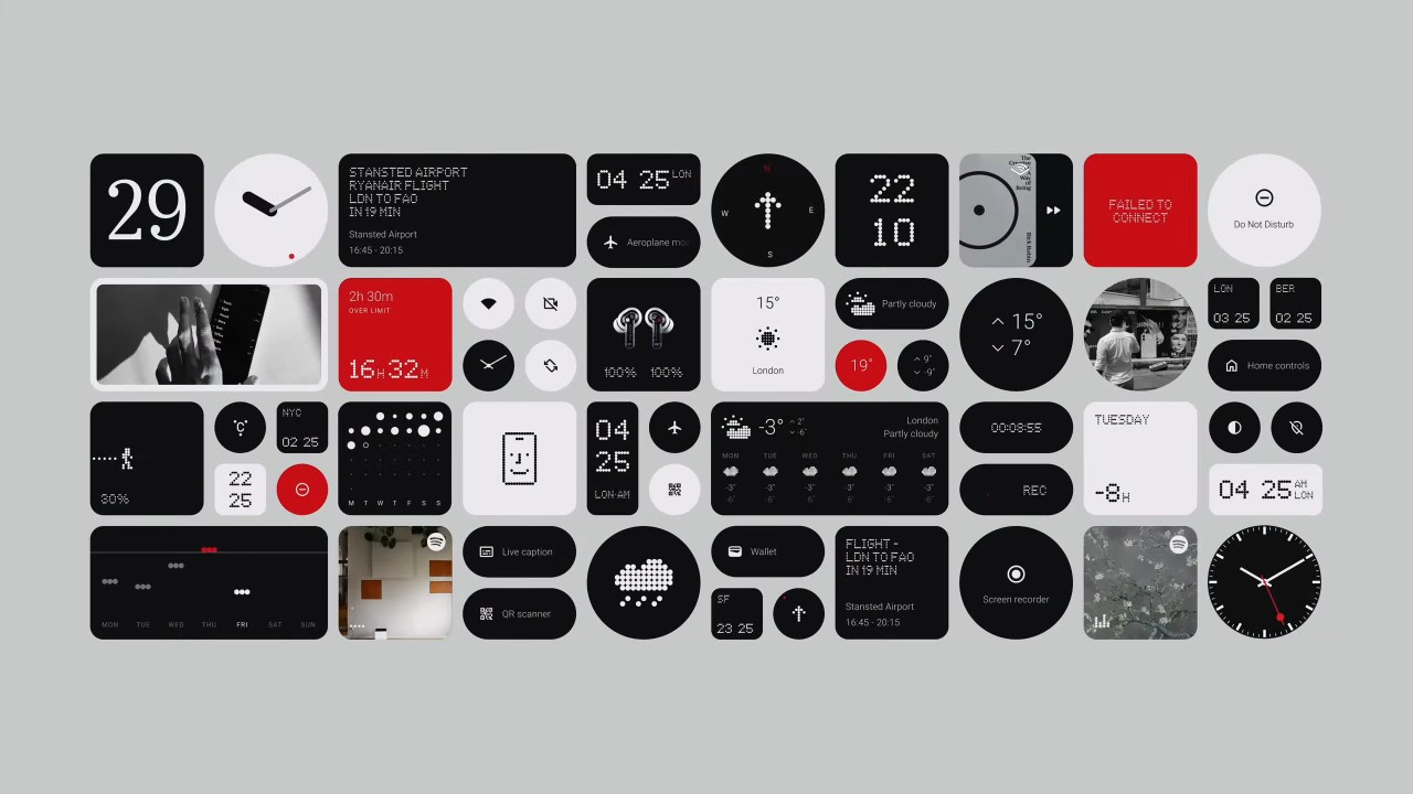
The new Nothing OS 2, which is expected to roll out soon, shows a beautiful monochromatic consistency with app icons, widgets, and other home-screen elements. Unlike other smartphones that have an explosion of color on their displays, with app icons fighting for your attention, the Nothing OS 2 focuses on, well, nothingness… or rather on Pei’s vision for a phone OS that’s fun and classy to look at. Last year, Pei revealed the Nothing OS by highlighting the company’s audio recording app. This year, Nothing unveiled a new Glyph composer feature, with a collaboration with Swedish House Mafia to help users build their own ringtones, glyph patterns, and personalized audio-visual experiences.
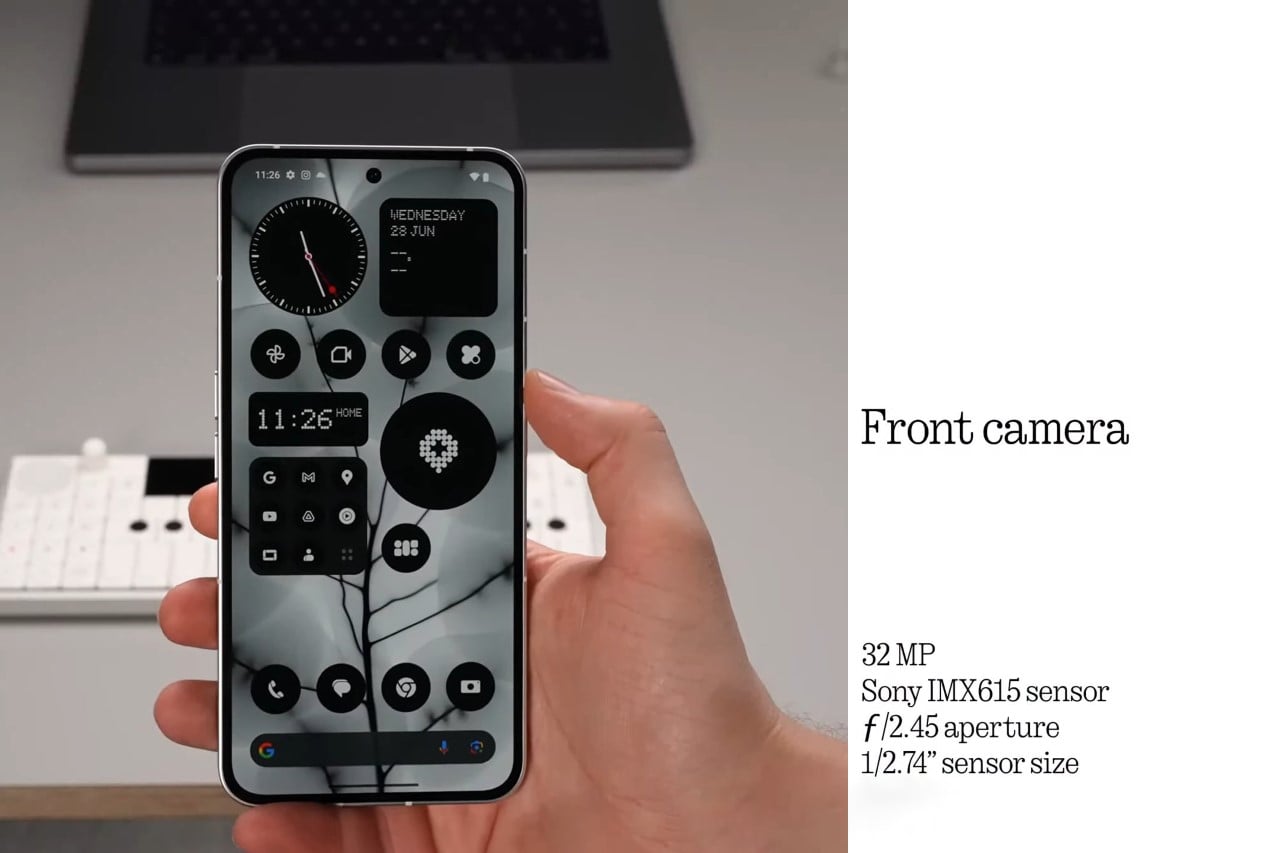
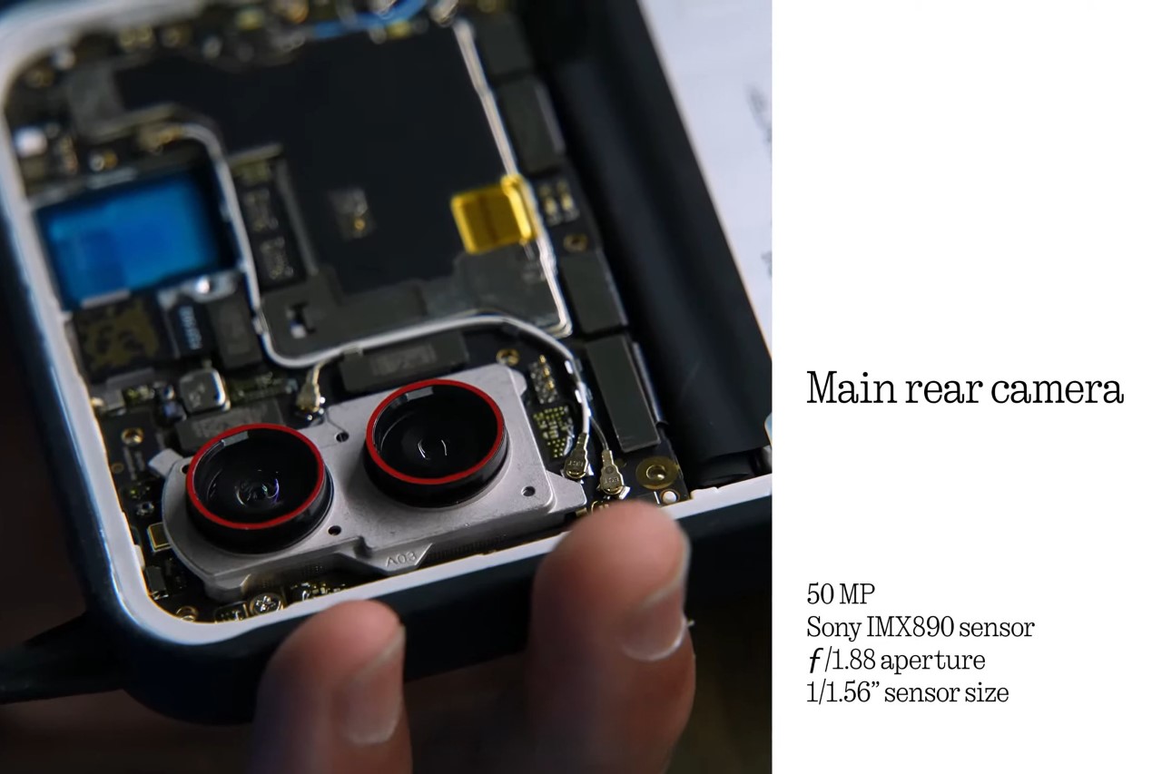
While the cameras look relatively the same, Nothing touts a few improvements on the camera front too, thanks in big part to the phone’s new Snapdragon 8+ Gen 1 chipset, and a new ISP that shoots better images and video. The front camera gets a bump up to 32 megapixels, after last year’s 16-megapixel camera, and the dual-lens primary shooter features a 50MP camera like last year, but with a few significant software upgrades including better HDR, motion detection, blur removal, and low-light photography. How this pairs up to the smartphones of 2023 is still to be determined as the phone hasn’t gone on sale yet. We’re also excited to see what MKBHD’s camera tests for this year reveal, given that the Phone (1) didn’t fare pretty well last year. Our own verdict should be out soon too, as we review the Phone (2) for ourselves.
That being said, the Phone (2) is quite an interesting development for Nothing, proving that it’s getting something right as it slowly moves towards smartphone domination as other Android competitors still push out ‘boring’ phones that all look the same and don’t deliver anything materially different. The Phone (2) goes on sale this week, with pre-orders open on the nothing.tech website, and a flagship-killing $599 price tag.
The post Nothing Phone (2): A Fine-Tuned Flagship Killer, With A Touch of ‘Fun’ first appeared on Yanko Design.
via https://ift.tt/SoygcnW
Post a Comment
Note: Only a member of this blog may post a comment.